Learn Coding Visually
Learn to code with interactive, live-preview playgrounds — HTML, CSS, JavaScript, React & more.
 HTML Playground42 lessons · Click-based · Live preview
 CSS PlaygroundLearn CSS with a live editor
 JavaScript Playground60 lessons · DOM · Async · Canvas
 React PlaygroundLearn React with a live code editor
 GSAP PlaygroundLearn GSAP animation interactively
 SVG Playground44 lessons · shapes · paths · animation
 SCSS Playground45 lessons · Sass modules · tokens
 Tailwind PlaygroundLearn Tailwind CSS with a live editor
 Bootstrap 5 Playground50 lessons · live preview
Chip Filter — Free HTML CSS JS Snippet
Chip Filter · Navigation · Plain HTML, CSS & JS · Live preview
What's included
Features
About this UI Snippet
Chip Filter — HTML CSS JavaScript
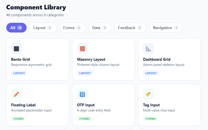
Pill-shaped filter chips that instantly filter a card grid by category. Active state, count badges, and animated cards. Zero dependencies.
Chip filters — sometimes called filter pills or tag filters — are a core navigation pattern in component libraries, design systems, marketplaces, and content-heavy interfaces. They give users a tactile, scannable way to narrow a collection without leaving the page. This snippet builds a complete chip filter system with per-category counts, active state management, and live grid filtering using pure HTML, CSS, and vanilla JavaScript.
Chip active state and styling
Each chip button uses border-radius: 999px to create a fully rounded pill shape regardless of text length. In the inactive state the chip has a 1.5px solid #e2e8f0 border on a white background with muted grey text. The .active class switches to a solid indigo fill (background: #6366f1) with white text — a single class toggle drives the full visual transition. A CSS transition on border-color, background, and color ensures the switch animates smoothly rather than snapping.
Count badges
Each chip contains a .chip-count span showing how many items belong to that category. On inactive chips the badge uses a light #f1f5f9 background; on the active chip it inherits white text with a semi-transparent white background (rgba(255,255,255,0.25)) to maintain legibility against the indigo fill. Counts are computed once on load by filtering the ITEMS array — this keeps the JS simple and avoids DOM queries for counting.
Rendering approach
Rather than toggling display or visibility on existing DOM nodes, the render() function replaces grid.innerHTML entirely with only the matching items. This is deliberately simple — for small datasets (under 200 items) it is faster and less error-prone than a dual-state approach with CSS hidden classes. For larger datasets where DOM churn is costly, a hidden class approach with position: absolute would be preferable to avoid reflow.
Data model
Each item object carries name, desc, cat, icon, and bg fields. The category string on each item matches the data-cat attribute on the corresponding chip, making the filter a simple Array.filter() call: ITEMS.filter(i => i.cat === active). Adding a new category requires only adding items with the new cat string and a matching chip button — no other logic changes.
Empty state
When no items match the active filter (impossible with the default data but relevant when connecting to dynamic data), the grid renders a centred "No components match this filter" message. The empty state div is always in the DOM but hidden; show class makes it visible.
Accessibility
The chip group has role="group" and aria-label="Filter by category". The grid has aria-live="polite" so screen readers announce when the content updates after a filter change. Chip buttons are native <button> elements so they receive keyboard focus and fire on Enter/Space by default.
Build with AI
Build, Understand, Optimize, and Extend It With AI
Rather than assuming the innerHTML-replace approach in render() is obviously fine, paste this snippet's HTML, CSS, and JS into an AI coding assistant like Claude and ask it to explain exactly why replacing the entire grid's innerHTML on every chip click is a reasonable choice for this dataset size, and at what item count it would start to matter that no DOM diffing happens. The same assistant is useful for optimizing it — ask whether updateCounts() recalculating countByCat() for every chip on every render is wasteful compared to computing all category counts once in a single pass over ITEMS. It's also a good partner for extending the filter: ask it to support multiple simultaneously active chips (a Set instead of a single string), persist the active filter to the URL query string so a filtered view is shareable, or animate cards fading out and in instead of snapping when the filter changes. Treat the code less like a finished artifact and more like a starting point for a conversation.
Prompt to recreate it
Copy this into your AI assistant of choice to build the effect from scratch, or as a jumping-off point for your own variant:
Build a "chip filter" for a card grid in plain HTML, CSS, and JavaScript — no framework, no library.

Requirements:
- A row of pill-shaped filter buttons (border-radius near 999px) generated from a fixed list of categories plus an "All" option, each showing a count badge for how many items belong to that category, computed from a single JavaScript array of item objects (not hardcoded numbers).
- Clicking a chip must mark it (and only it) as the active chip via a shared CSS class, and re-render the card grid to show only items whose category matches the clicked chip's category — with "All" showing every item.
- The active chip's visual style must differ meaningfully from inactive chips (not just a subtle color shift) — for example a filled background versus an outlined one — and the count badge's colors must also adapt so it stays legible against both the active and inactive chip backgrounds.
- Re-render the grid by rebuilding its contents from the filtered subset of the items array each time a chip is clicked, rather than toggling visibility classes on pre-existing card elements.
- When a filter produces zero matching items, replace the grid contents with a clear "no items match this filter" message instead of leaving a blank area.
- Each card must display a colored icon swatch, a name, a short description, and a small category tag whose color corresponds to that category — driven from the same per-item category field used for filtering, not a separate lookup.
- Mark the chip container with an appropriate ARIA role for a button group and mark the grid as a live region so screen readers announce when the filtered results change.
Want to tighten it up first? Run this prompt through the AI Prompt Studio to score it across 8 quality dimensions, catch anti-patterns, and tune the wording for Claude, ChatGPT, or Gemini before you paste it in.
Step by step
How to Use
- 1Click any category chipThe chip switches to the filled indigo active state and the card grid instantly re-renders with only matching components.
- 2Click "All"The "All" chip activates and all 12 cards are shown. The count badge on the chip shows the total item count.
- 3Read the count badgesEach chip shows a small badge with the number of items in that category, so users know what to expect before filtering.
- 4Hover a cardCards show a subtle indigo border and a soft shadow lift to indicate they are interactive links in a real implementation.
- 5Add your own itemsExtend the ITEMS array with your own objects — each needs name, desc, cat (matching a chip data-cat), icon, and bg color.
- 6Add a new categoryAdd a chip button with data-cat="yourcat" and add ITEMS entries with cat:"yourcat". No other code changes are required.
Real-world uses
Common Use Cases
Got questions?
Frequently Asked Questions
Change active from a string to a Set: const active = new Set(["all"]). On chip click, toggle the category in/out of the set. In render(), filter items where the set has "all" or includes item.cat. Update chip active class based on set membership.
Add an opacity:0 and transform:scale(0.95) state on .card before re-rendering. Use setTimeout to apply the new innerHTML after a 150ms fade-out. Then requestAnimationFrame to add an opacity:1 class on the new cards.
Replace the ITEMS array with a fetch() call to your API endpoint. On page load, fetch all items once, store them in the ITEMS variable, then call updateCounts() and render(). Chip clicks just re-filter the in-memory array without additional network requests.
On chip click, update the URL with history.pushState(null, "", "?cat=" + active). On page load, read the parameter with new URLSearchParams(location.search).get("cat") and set the initial active value before calling render().
Yes — replace the button text with an SVG icon and a hidden <span> for screen readers, keeping aria-label on the button. The pill shape and count badge work identically.
Yes. Click the React, Vue, Angular, or Tailwind export button above the preview. In React, store the active category (or a Set for multi-select) in useState and toggle each chip class with a conditional className; in Vue bind :class to a reactive value with @click; in Angular use [class.active] with (click). The count-badge calculation and the filtered-list re-render are framework-agnostic, so only the event binding and class-toggling syntax differ from the vanilla version. The Tailwind export converts the pill shape, active state, and badge styling into utility classes for a Tailwind codebase.