


Learn Coding Visually
Learn to code with interactive, live-preview playgrounds — HTML, CSS, JavaScript, React & more.
 HTML Playground42 lessons · Click-based · Live preview
 CSS PlaygroundLearn CSS with a live editor
 JavaScript Playground60 lessons · DOM · Async · Canvas
 React PlaygroundLearn React with a live code editor
 GSAP PlaygroundLearn GSAP animation interactively
 SVG Playground44 lessons · shapes · paths · animation
 SCSS Playground45 lessons · Sass modules · tokens
 Tailwind PlaygroundLearn Tailwind CSS with a live editor
 Bootstrap 5 Playground50 lessons · live preview
Masonry Grid — Free HTML CSS JS Pinterest Snippet
Masonry Grid · Layouts · Plain HTML, CSS & JS · Live preview
What's included
Features
About this UI Snippet
Masonry Grid — CSS columns Property, break-inside: avoid & JS Rendering
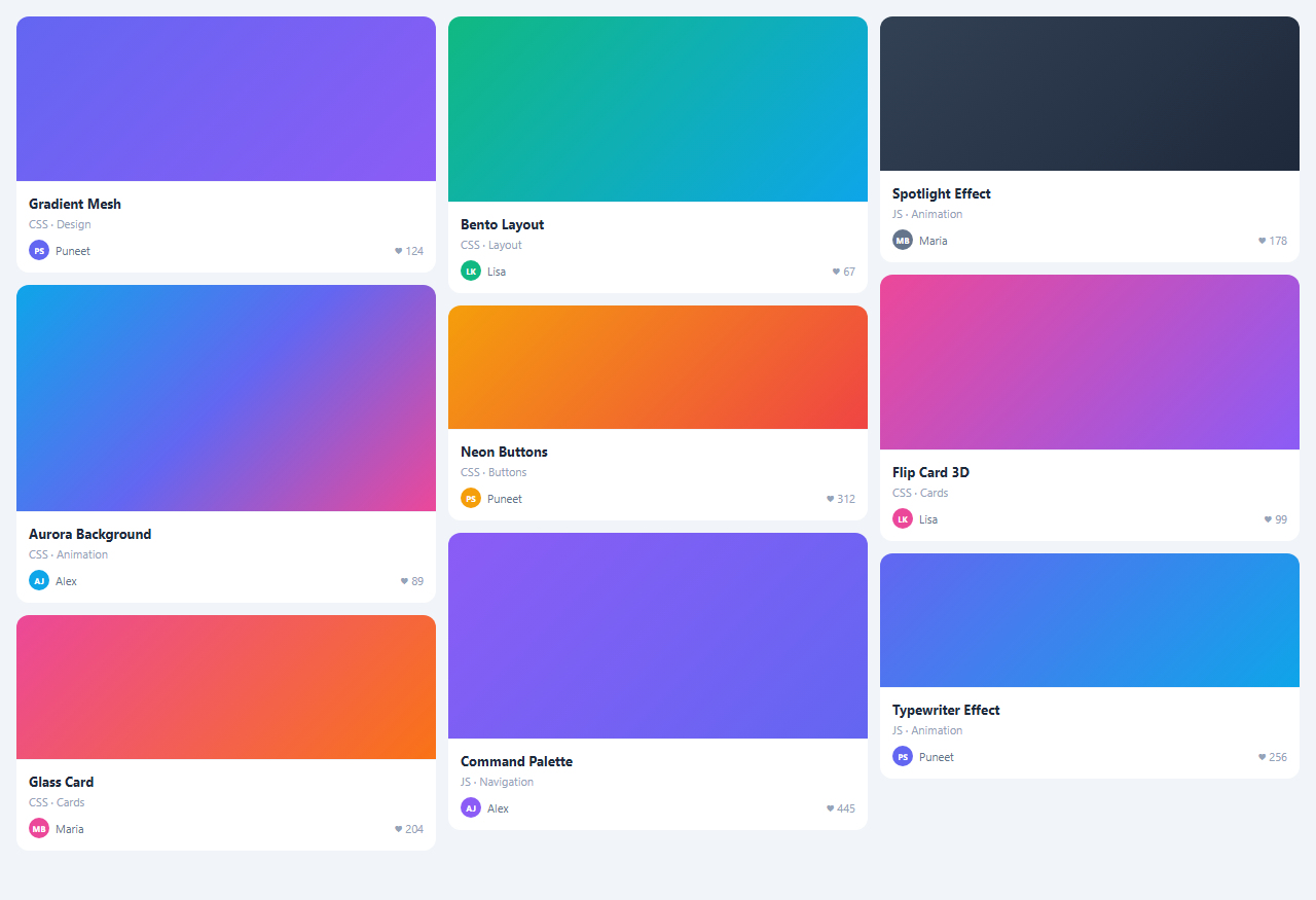
A masonry grid displays items in a multi-column layout where items of different heights fill columns naturally from top to bottom — like a Pinterest or photo gallery layout, often wired to an image lightbox on click. This snippet implements masonry using the CSS columns property.
The CSS columns approach
.masonry { columns: 3; column-gap: 12px } is the entire masonry layout. The browser fills columns from top to bottom, stacking items by height. No JavaScript positioning is needed. @media (max-width: 600px) { .masonry { columns: 2 } } reduces to two columns on mobile.
break-inside: avoid
.item { break-inside: avoid } prevents a single card from splitting across two columns. Without this, tall cards can be split at the column boundary.
JS card rendering
Cards are rendered from a JS data array rather than static HTML. Each item has a title, subtitle, height, gradient, and like count. items.forEach(item => { const div = document.createElement('div'); ... container.appendChild(div) }) builds the grid dynamically. This makes it easy to filter, sort, and update items.
How CSS columns masonry works
CSS columns: 3 divides the container into 3 equal-width columns. Child elements fill top-to-bottom in columns — left column fills first, then centre, then right. break-inside: avoid prevents a single card from splitting across two columns. The browser handles variable-height items automatically — short cards and tall cards coexist naturally without JavaScript height calculation.
Advantages over JavaScript masonry libraries
Libraries like Masonry.js calculate absolute positions for each item using JavaScript, which requires a reflow after images load and creates complex dependencies. The CSS columns approach has zero JavaScript, works without images loading, recalculates on window resize automatically, and has no dependencies. The trade-off is that columns fill left-to-right before top-to-bottom — items do not arrange by insertion order across columns.
Adding new items dynamically
Since CSS columns is layout-based, adding new items via JavaScript (container.appendChild(newCard)) automatically triggers reflow and the masonry repositions. No JavaScript layout recalculation is needed. The grid updates instantly.
Responsive masonry
Change columns count responsively: @media (max-width: 900px) { .masonry { columns: 2; } } @media (max-width: 600px) { .masonry { columns: 1; } }. Or use the CSS columns auto-fill: columns: auto; column-width: 280px — the browser places as many 280px columns as fit the container width, similar to the responsive card grid but for a top-down fill pattern.
Build with AI
Build, Understand, Optimize, and Extend It With AI
You do not need to guess why this masonry avoids Masonry.js entirely. Paste this snippet's HTML, CSS, and JS into an AI coding assistant like Claude and ask it to explain exactly why the columns CSS property fills items top-to-bottom within a column before moving to the next column, and why that column-major fill order means items no longer read left-to-right in their original array order once the grid has more than one column. The same assistant can help optimize it, for instance asking whether building each card's HTML with repeated string concatenation into grid.innerHTML on every forEach iteration causes unnecessary reflows compared to building one HTML string and setting innerHTML once. It is also useful for extending the grid: ask it to add category filtering that re-renders only the filtered subset, swap the gradient placeholders for real lazy-loaded images without breaking break-inside: avoid, or add a load-more button that appends new items without rebuilding the whole grid. Treat the code less like a finished artifact and more like a starting point for a conversation.
Prompt to recreate it
Copy this into your AI assistant of choice to build the effect from scratch, or as a jumping-off point for your own variant:
Build a "masonry grid" of variable-height cards in plain HTML, CSS, and JavaScript using the CSS columns property — no JavaScript-computed absolute positioning and no masonry library.

Requirements:
- A container styled with the CSS columns property set to a fixed count (e.g. 3), with a column-gap, and a narrower column count applied via a media query at a mobile breakpoint.
- Every card element must have break-inside: avoid so a single card is never visually split across two columns, and each card must carry its own bottom margin for consistent vertical spacing within a column.
- Render all cards from a single JavaScript array of objects, where each object defines at minimum a title, a subtitle, a distinct height for its visual header area, and an accent color, and build every card's markup from that data rather than hardcoding cards in the HTML.
- Each card must show a colored or gradient header area sized to its own height value, then a body section with the title, subtitle, an author avatar with initials colored from that item's accent color, and a like count.
- Hovering any card must apply a subtle scale-up transform and an elevated box-shadow via a CSS transition, without affecting the layout or position of neighboring cards in other columns.
- Demonstrate that adding or removing items from the underlying data array and re-rendering causes the masonry layout to reflow automatically with no manual position recalculation in JavaScript.
Want to tighten it up first? Run this prompt through the AI Prompt Studio to score it across 8 quality dimensions, catch anti-patterns, and tune the wording for Claude, ChatGPT, or Gemini before you paste it in.
Source Code
<div class="masonry" id="masonry"></div>* { box-sizing: border-box; margin: 0; padding: 0; }
body { font-family: system-ui, sans-serif; background: #f1f5f9; padding: 16px; }
.masonry {
columns: 3;
column-gap: 12px;
}
@media (max-width: 600px) { .masonry { columns: 2; } }
.item {
break-inside: avoid;
margin-bottom: 12px;
border-radius: 12px;
overflow: hidden;
cursor: pointer;
transition: transform 0.2s, box-shadow 0.2s;
}
.item:hover { transform: scale(1.02); box-shadow: 0 8px 24px rgba(0,0,0,0.12); }
.item-img {
width: 100%;
display: block;
}
.item-body {
background: #fff;
padding: 12px;
border-top: 1px solid #f1f5f9;
}
.item-title { font-size: 13px; font-weight: 700; color: #1e293b; margin-bottom: 4px; }
.item-sub { font-size: 11px; color: #94a3b8; }
.item-footer { display: flex; align-items: center; justify-content: space-between; margin-top: 8px; }
.item-author { display: flex; align-items: center; gap: 6px; font-size: 11px; color: #64748b; }
.item-av { width: 20px; height: 20px; border-radius: 50%; display: flex; align-items: center; justify-content: center; font-size: 8px; font-weight: 700; color: #fff; }
.item-likes { font-size: 11px; color: #94a3b8; }const items = [
{ title: 'Gradient Mesh', sub: 'CSS · Design', h: 160, grad: 'linear-gradient(135deg,#6366f1,#8b5cf6)', av: 'PS', color: '#6366f1', likes: '124' },
{ title: 'Aurora Background', sub: 'CSS · Animation', h: 220, grad: 'linear-gradient(135deg,#0ea5e9,#6366f1,#ec4899)', av: 'AJ', color: '#0ea5e9', likes: '89' },
{ title: 'Glass Card', sub: 'CSS · Cards', h: 140, grad: 'linear-gradient(135deg,#ec4899,#f97316)', av: 'MB', color: '#ec4899', likes: '204' },
{ title: 'Bento Layout', sub: 'CSS · Layout', h: 180, grad: 'linear-gradient(135deg,#10b981,#0ea5e9)', av: 'LK', color: '#10b981', likes: '67' },
{ title: 'Neon Buttons', sub: 'CSS · Buttons', h: 120, grad: 'linear-gradient(135deg,#f59e0b,#ef4444)', av: 'PS', color: '#f59e0b', likes: '312' },
{ title: 'Command Palette', sub: 'JS · Navigation', h: 200, grad: 'linear-gradient(135deg,#8b5cf6,#6366f1)', av: 'AJ', color: '#8b5cf6', likes: '445' },
{ title: 'Spotlight Effect', sub: 'JS · Animation', h: 150, grad: 'linear-gradient(135deg,#334155,#1e293b)', av: 'MB', color: '#64748b', likes: '178' },
{ title: 'Flip Card 3D', sub: 'CSS · Cards', h: 170, grad: 'linear-gradient(135deg,#ec4899,#8b5cf6)', av: 'LK', color: '#ec4899', likes: '99' },
{ title: 'Typewriter Effect', sub: 'JS · Animation', h: 130, grad: 'linear-gradient(135deg,#6366f1,#0ea5e9)', av: 'PS', color: '#6366f1', likes: '256' },
];
const grid = document.getElementById('masonry');
items.forEach(item => {
grid.innerHTML += `<div class="item">
<div class="item-img" style="height:${item.h}px;background:${item.grad}"></div>
<div class="item-body">
<div class="item-title">${item.title}</div>
<div class="item-sub">${item.sub}</div>
<div class="item-footer">
<div class="item-author"><div class="item-av" style="background:${item.color}">${item.av}</div>${item.av === 'PS' ? 'Puneet' : item.av === 'AJ' ? 'Alex' : item.av === 'MB' ? 'Maria' : 'Lisa'}</div>
<div class="item-likes">♥ ${item.likes}</div>
</div>
</div>
</div>`;
});Step by step
How to Use
- 1Load the snippetClick "Masonry Grid" in the sidebar. The preview shows cards of different heights filling three columns from top to bottom.
- 2Update card contentIn the JS panel, update the items array — change title, subtitle, height, gradient, and likes per item.
- 3Change column countUpdate columns: 3 in the CSS panel to 2 for a two-column layout or 4 for a denser grid.
- 4Add items with real imagesReplace the gradient div in each card with an <img> tag. The masonry layout handles any image height automatically.
- 5Add filteringFilter the items array and re-render: filteredItems = items.filter(i => i.category === sel). Re-build the grid from the filtered array.
- 6Export in your formatClick "HTML" for a standalone file, "JSX" for a React component, or "Tailwind" for a React + Tailwind version.
Real-world uses
Common Use Cases
Got questions?
Frequently Asked Questions
CSS columns: 3 tells the browser to divide the container into 3 equal-width columns. Children are placed top-to-bottom within each column before moving to the next. Items of different heights create the natural staggered masonry appearance.
break-inside: avoid on child elements prevents them from being split across column boundaries. Without it, a single card might have its top half in one column and its bottom half in the next.
CSS columns fills items top-to-bottom within columns (true masonry). CSS Grid fills items left-to-right in rows — you get equal row heights unless you use the experimental grid-template-rows: masonry property (limited browser support).
The CSS columns layout is column-ordered, not row-ordered, which makes drag-and-drop complex. For draggable masonry, use a JS masonry library (Masonry.js, react-masonry-css) that handles absolute positioning.
Yes. Click "JSX" for a React component. Map your items array to card components. The CSS columns layout applies identically in React. For more control, use the react-masonry-css library.
Filter the items array and re-render: filteredItems = items.filter(item => item.category === selectedCategory). Re-build the grid from the filtered array. The masonry layout automatically reflows.