You Might Also Like
Learn Coding Visually
Learn to code with interactive, live-preview playgrounds — HTML, CSS, JavaScript, React & more.
 HTML Playground42 lessons · Click-based · Live preview
 CSS PlaygroundLearn CSS with a live editor
 JavaScript Playground60 lessons · DOM · Async · Canvas
 React PlaygroundLearn React with a live code editor
 GSAP PlaygroundLearn GSAP animation interactively
 SVG Playground44 lessons · shapes · paths · animation
 SCSS Playground45 lessons · Sass modules · tokens
 Tailwind PlaygroundLearn Tailwind CSS with a live editor
 Bootstrap 5 Playground50 lessons · live preview
Swiper Cards Deck — Draggable Stacked Card Carousel
Swiper Cards Deck · Layouts · Plain HTML, CSS & JS · Live preview
What's included
Features
About this UI Snippet
Swiper Cards Deck — The Stacked Carousel, Configured Properly
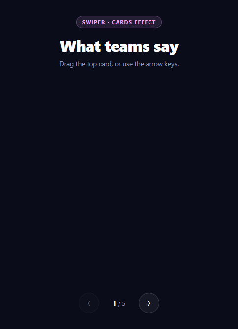
A stack of cards you can throw off the top is a genuinely different interaction from a carousel that slides sideways. It communicates a finite pile rather than an endless track, which is why it suits testimonials, onboarding steps, and anything where the user should feel they are working *through* a set.
Swiper's cards effect does this out of the box, and it does the parts that are tedious to hand-build: pointer, touch, and keyboard input on one code path, momentum and resistance at the ends, and correct behavior when the container resizes.
What the cardsEffect numbers do
The effect is entirely controlled by three values, and they are the difference between a convincing deck and a pile of misaligned rectangles:
cardsEffect: { perSlideOffset: 9, perSlideRotate: 3, rotate: true, slideShadows: true }
- `perSlideOffset: 9` — how far each card behind the top one is pushed, in percent. This is what makes the stack visible. Too low and the deck looks like a single card; too high and the back cards fan out so far the stack reads as a spread hand. - `perSlideRotate: 3` — degrees of rotation added per card down the stack. Three degrees is small on purpose. Real stacked paper is *almost* aligned, and the slight imperfection is what stops the deck looking machine-printed. - `slideShadows: true` — darkens cards further back. This is the one people disable because it looks "dirty" in isolation, and it is doing the most work: without depth shading the cards read as flat overlapping shapes rather than a stack with air between them.
Why loop is off
loop: false is deliberate, not an omission. Swiper implements looping by cloning slides, and in a stacked effect those clones sit inside the same visual pile — so at the wrap point a card can briefly render behind a copy of itself, producing a visible flicker. Sliding carousels hide this because the clone is off-screen; a deck has no off-screen. Finite decks are also the honest interaction here: a pile that never ends undermines the whole metaphor.
That decision is what makes the end states meaningful, which is why sync() disables the arrows using sw.isBeginning and sw.isEnd rather than letting users press dead buttons.
Keeping external UI in sync
The counter and arrow states are driven from Swiper's own events rather than from the click handlers:
on: { slideChange: function () { sync(this); }, init: function () { sync(this); } }
This matters because the deck can advance in three ways — dragging, arrow keys, and the buttons. Updating the counter inside the button handlers would leave it stale after a drag. Hooking slideChange means every input path converges on one update function. Including init in the same object is what sets the initial state, since slideChange does not fire for the starting slide.
Note that this inside a Swiper event handler is the Swiper instance, which is why the handler is a regular function and not an arrow — an arrow function would inherit the outer this and break the pattern.
The overflow rule that catches people
.scd-swiper { overflow: visible } overrides Swiper's own overflow: hidden. A sliding carousel needs clipping so neighbouring slides do not spill out. A card deck needs the opposite: the offset and rotation push back cards slightly outside the container bounds, and clipping shears their corners off. This one declaration is the difference between a clean deck and cards that look cropped along one edge.
keyboard: { enabled: true, onlyInViewport: true } adds arrow-key control, scoped so a deck further down the page does not hijack arrow keys while the user is reading something else.
Height, and why it is fixed
The Swiper container has an explicit height: 400px. Stacked effects position slides absolutely, so the container cannot derive height from its content the way a normal flow element would. Leaving it auto collapses the deck to zero. Cards then use margin-top: auto on the attribution row to push it to the bottom, so slides of different text lengths still align their footers.
Reusing it
Replace the slides with your own content and update nothing else — the counter reads swiper.slides.length at runtime. For a wider sliding gallery, the same library's coverflow effect is a one-word change; compare against a hand-built coverflow carousel or a testimonial slider if you would rather avoid the dependency.
Build with AI
Build, Understand, Optimize, and Extend It With AI
Most of this snippet is configuration where each value has a visible consequence, which makes it ideal to poke at rather than accept. Paste the HTML, CSS, and JS into an AI assistant like Claude and ask it to explain what perSlideOffset and perSlideRotate each control, then have it predict how the deck looks at perSlideOffset 2 versus 25 and try both. Ask specifically why loop is set to false for a stacked effect when it would be fine on a sliding one — the slide-cloning explanation is the interesting part. Then ask why the CSS overrides Swiper own overflow: hidden with overflow: visible, and remove it to see the rotated back cards get sheared. For optimization, ask whether slideShadows costs anything meaningful and how the deck behaves with fifty slides rather than five. To extend it: have it add a swipe-to-dismiss that removes the card from the DOM entirely, wire the deck to real data with a loading state, add autoplay with pause on hover, or swap effect: 'cards' for 'creative' and author a custom transform. Treat the code less like a finished artifact and more like a starting point for a conversation.
Prompt to recreate it
Copy this into your AI assistant of choice to build the effect from scratch, or as a jumping-off point for your own variant:
Build a draggable stacked card deck (testimonials) using Swiper 11 from a CDN — you must include BOTH swiper-bundle.min.css and swiper-bundle.min.js — in plain HTML, CSS, and JavaScript.

Requirements:
- Use Swiper's built-in effect: 'cards' with grabCursor enabled, and configure cardsEffect with perSlideOffset around 9, perSlideRotate around 3, rotate: true and slideShadows: true. Explain what each value does: the offset is what makes the stack visible, the small rotation mimics almost-aligned real paper, and slideShadows provides the depth shading without which the cards read as flat overlapping shapes.
- Set loop: false deliberately and explain why in a comment: Swiper loops by cloning slides, and in a stacked effect the clones sit inside the same visual pile, so at the wrap point a card can render behind a copy of itself and flicker. A finite deck is also the correct metaphor.
- Override Swiper's default container overflow with overflow: visible on the swiper element, and explain that a sliding carousel needs clipping but a card deck does not — the per-slide offset and rotation push back cards slightly outside the container, so clipping would shear their corners.
- Give the Swiper container an explicit fixed height, because stacked effects position slides absolutely and the container would otherwise collapse to zero height. Inside each card, push the author/attribution row down with margin-top: auto so footers align across slides with different text lengths.
- Enable keyboard navigation with onlyInViewport: true so a deck further down the page does not hijack arrow keys while the user reads other content.
- Add previous/next buttons and a live "N / total" counter. Drive both from Swiper's own event handlers — hook slideChange AND init in the on: {} config, calling one shared sync function — rather than updating inside the button click handlers, because the deck can also advance by dragging and keyboard. Use regular function expressions, not arrow functions, so the handler's "this" is the Swiper instance. Read the total from swiper.slides.length at runtime.
- Disable the previous/next buttons at the ends using swiper.isBeginning and swiper.isEnd, since the deck does not loop.
- Style it as a premium dark page with five vividly gradient-filled cards, a large decorative quote glyph, and circular initial avatars.
Want to tighten it up first? Run this prompt through the AI Prompt Studio to score it across 8 quality dimensions, catch anti-patterns, and tune the wording for Claude, ChatGPT, or Gemini before you paste it in.
Step by step
How to Use
- 1Add both Swiper CDNsSwiper needs its bundled CSS as well as its JS — include both.
- 2Paste HTML, CSS, and JSA five-card testimonial deck renders with the top card active.
- 3Drag the top cardThrow it aside and the next card rises to the top of the stack.
- 4Use the keyboardArrow keys move through the deck when it is in the viewport.
- 5Watch the end statesArrows disable at the first and last card since the deck does not loop.
- 6Swap the contentReplace the slides — the total counter reads slide count at runtime.
Real-world uses
Common Use Cases
Got questions?
Frequently Asked Questions
perSlideOffset is how far, in percent, each card behind the top one is pushed — it is what makes the stack visible at all. perSlideRotate is degrees of rotation added per card down the pile. Three degrees is deliberately small: real stacked paper is almost aligned, and slight imperfection is what stops the deck looking machine-printed.
Swiper loops by cloning slides, and in a stacked effect those clones live inside the same visual pile, so at the wrap point a card can render behind a copy of itself and flicker. Sliding carousels hide this because clones sit off-screen; a deck has no off-screen. A finite deck is also the more honest metaphor, which is what makes the disabled end states meaningful.
Swiper defaults its container to overflow: hidden so a sliding carousel clips neighbouring slides. In a card deck, the per-slide offset and rotation push back cards slightly outside the container bounds, so clipping shears their corners. Setting overflow: visible is what keeps the stack clean.
The deck can advance three ways — drag, arrow keys, and buttons. Updating inside the click handlers leaves the counter stale after a drag. Hooking Swiper own slideChange event routes every input path through one update function, and adding init to the same events object sets the starting state, since slideChange does not fire for the initial slide.
Stacked effects position slides absolutely, so the container cannot derive its height from content the way a normal flow element would — left on auto it collapses to zero. With a fixed height set, cards use margin-top: auto on the attribution row so footers stay aligned across slides with different text lengths.
Swiper ships official swiper/react and swiper/vue components, which handle instance lifecycle for you — register the EffectCards module and pass cardsEffect as a prop. If you use the vanilla build instead, construct it in a mount effect against a ref and call swiper.destroy(true, true) in cleanup, or remounts leave orphaned listeners. Import the CSS once globally.