You Might Also Like
Learn Coding Visually
Learn to code with interactive, live-preview playgrounds — HTML, CSS, JavaScript, React & more.
 HTML Playground42 lessons · Click-based · Live preview
 CSS PlaygroundLearn CSS with a live editor
 JavaScript Playground60 lessons · DOM · Async · Canvas
 React PlaygroundLearn React with a live code editor
 GSAP PlaygroundLearn GSAP animation interactively
 SVG Playground44 lessons · shapes · paths · animation
 SCSS Playground45 lessons · Sass modules · tokens
 Tailwind PlaygroundLearn Tailwind CSS with a live editor
 Bootstrap 5 Playground50 lessons · live preview
Flashcard Deck with Flip — HTML CSS JS Snippet
Flashcard Deck · Cards · Plain HTML, CSS & JS · Live preview
What's included
Features
About this UI Snippet
Flashcard Deck — 3D Flip with preserve-3d, Leitner-Style Re-Queueing, Gated Rating & an Animated Score Ring
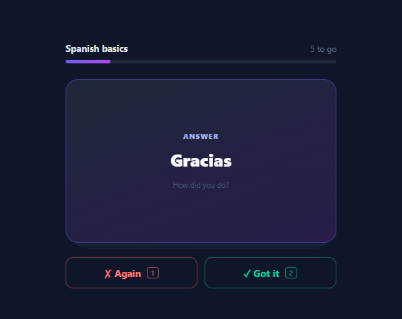
Flashcards are the most-built study UI on the web — every language app, med-school tool, and coding-interview prep site ships one — and the searches ("flashcard flip CSS", "quizlet clone") stay perennially high because the component combines three genuinely instructive techniques: a correct 3D card flip, a small spaced-repetition loop, and session-summary math. This snippet implements the full study session in vanilla HTML, CSS, and JavaScript: a stacked deck with depth ghosts, click-or-Space flipping, Again/Got-it rating that re-queues missed cards until cleared, directional leave animations, keyboard shortcuts, a progress bar, and an SVG score ring summarising first-try accuracy.
The flip, done correctly
The card is a real <button> (keyboard-focusable, Space/Enter native) containing a .card-inner with transform-style: preserve-3d, holding two absolutely stacked faces with backface-visibility: hidden — the back pre-rotated rotateY(180deg). Flipping toggles one class that rotates the inner wrapper 180°; the browser shows whichever face currently points at the viewer. perspective: 1000px on the stack gives the rotation its depth (without it the flip looks like a flat squash). This is the canonical three-layer flip structure — perspective on the parent, preserve-3d on the rotator, hidden backfaces on the leaves — and each layer answers one rendering question: how deep, rotate together, and don't draw mirrored text. The answer face gets a violet-tinted gradient and indigo border so "flipped" is legible even in a screenshot.
The study loop: a two-line Leitner system
Session state is a queue of card indexes. Rating shifts the current card; "Got it" drops it, "Again" pushes it back onto the *end* of the queue — so missed cards return after the remaining cards, the lightweight version of the Leitner spaced-repetition principle (wrong answers repeat at increasing intervals; here, one interval: the rest of the deck). The session ends only when the queue empties, meaning every card was eventually answered correctly — the "study until cleared" contract users know from Anki. Two maps record honesty for the summary: seen marks first exposure, and firstTry records whether that first exposure was correct — so re-queued cards can't inflate the score by being easy the second time.
Gated rating and directional exits
The Again/Got-it row starts disabled (opacity: 0.35; pointer-events: none) and arms only when the card is flipped — you cannot rate an answer you haven't seen, the guard that keeps the data meaningful. Rating triggers a directional exit: "Got it" flies the card off to the right with a slight clockwise rotation, "Again" off to the left — the swipe-vocabulary mapping (right = keep/pass, left = reject/retry) that Tinder normalised and study apps adopted, here reinforced by the buttons' green/red colouring. An animating flag debounces the 330ms exit so double-clicks can't skip cards, and the next card enters with a small drop-in. Two static ghost cards behind the live one (progressively offset, scaled, and faded) sell the "deck" illusion for the cost of two divs.
Progress and the score ring
The progress bar tracks *unique cards cleared* — CARDS.length − new Set(queue).size — not raw ratings, so re-queued cards don't make progress lie. The summary's ring is the standard SVG donut-meter recipe: a track circle plus a progress circle with stroke-dasharray equal to its circumference (2π × 34 ≈ 213.6) and stroke-dashoffset animated from full (empty) to circumference × (1 − pct), pre-rotated −90° so it starts at 12 o'clock. The offset is set inside requestAnimationFrame after the summary becomes visible so the CSS transition actually plays — the classic display-none-to-animated gotcha. Keyboard mappings (Space flip, 1 again, 2 got-it) make rapid-fire studying possible, matching the muscle memory Anki users expect.
Build with AI
Build, Understand, Optimize, and Extend It With AI
Two halves of this snippet reward different questions to an AI assistant. For the CSS half, paste it into Claude and ask it to break the flip on purpose three ways — remove perspective, remove preserve-3d, remove backface-visibility — and describe what you'd see in each case; the three distinct failure modes are the fastest way to make the 3D model stick, and the exit-animation's kept rotateY term is a fourth question worth asking. For the study-logic half, ask it to upgrade the within-session queue to real between-session spaced repetition: per-card streak/due persistence in localStorage, an expanding interval series, and a due-cards session builder — then ask it to explain what full SM-2 would add and whether your deck size justifies it. Product extensions worth requesting: swipe gestures via pointer events reusing the directional exits (with the buttons kept as the accessible path), a deck picker over multiple CARDS sets, cloze-deletion card fronts, and a session-report POST from the firstTry map if this feeds an LMS. Each is cleanly separable because the content model is just { front, back } — which is also why your own deck goes in first.
Prompt to recreate it
Copy this into your AI assistant of choice to build the effect from scratch, or as a jumping-off point for your own variant:
Build a study flashcard deck in plain HTML, CSS, and JavaScript — 3D flip, Again/Got-it rating with re-queueing, and a scored session summary. No libraries.

Requirements:
- A deck header (title, live "N to go" counter) over a gradient progress bar, then a card stack: two static ghost cards offset/scaled/faded behind the live card to sell depth, inside a perspective container.
- The card must be a real button (focus-visible ring, Space via native activation) containing the canonical three-layer flip: a preserve-3d inner rotator transitioning rotateY(180deg) on a class toggle, two absolutely-stacked faces with backface-visibility hidden, the back pre-rotated 180° and styled distinctly (violet-tinted gradient, accent border) with Prompt/Answer tag labels; comment what each of the three properties contributes.
- Session logic as a queue of card indexes over a { front, back } CARDS array (~6 language pairs): flipping arms the initially-disabled rating row (opacity + pointer-events gate — you cannot rate an unseen answer); "Got it" removes the card, "Again" pushes it to the END of the queue (comment this as the minimal Leitner loop), and the session ends only when the queue empties.
- Track honesty for the summary with two maps — seen (first exposure) and firstTry (was that first exposure correct) — so re-queued cards cannot inflate the score, and make the progress bar advance on UNIQUE cards cleared (deck size minus set-of-queue size), not raw ratings.
- Directional exits: got-it flies the card right with slight clockwise rotation, again flies left — both transitions keeping the rotateY(180deg) term so the card never un-flips mid-exit (comment why) — debounced by an animating flag timed just under the exit duration; new cards drop in with a keyframed entrance.
- Keyboard shortcuts: Space flips (preventDefault scrolling), 1 = again, 2 = got it, shown as small kbd chips in the buttons.
- The summary replaces the stack: an SVG score ring (track + progress circle, dasharray = 2πr, dashoffset animated to circumference × (1 − pct), −90° start) set inside requestAnimationFrame after reveal (comment the display-to-animated gotcha), a title tiered by score, "N of M on the first try · T total reviews", and a restart button that resets all state.
Want to tighten it up first? Run this prompt through the AI Prompt Studio to score it across 8 quality dimensions, catch anti-patterns, and tune the wording for Claude, ChatGPT, or Gemini before you paste it in.
Step by step
How to Use
- 1Run a study sessionClick the card (or press Space) to flip it — the Spanish answer appears and the rating buttons arm. Press "Got it" (or 2) and the card exits right; "Again" (or 1) exits left and the card returns later in the queue. Miss a couple on purpose: the counter shows them re-queued, but the progress bar only advances on unique cards cleared. Finish the deck and the score ring animates to your first-try percentage — re-queued cards count against it honestly.
- 2Load your own deckCARDS is the whole content model: an array of { front, back } strings. Swap in vocabulary, definitions, interview questions, or cloze prompts. For multiple decks, store them as an object of arrays with a picker that assigns CARDS and calls start(). Long answers wrap fine — the face uses flexbox centring — but keep fronts short; a flashcard with a paragraph prompt is a quiz, and the Quiz Card snippet fits that better.
- 3Persist progress between sessionsFor real study value, persist per-card state: after each rate(), save { cardId: { lastSeen: Date.now(), streak } } to localStorage. On start(), build the queue from cards whose review is due — streak 0 due immediately, streak n due after n days (the simplest expanding-interval schedule). That upgrade turns the session toy into a genuine spaced-repetition tool; the FAQ sketches the full algorithm.
- 4Add swipe gestures for mobileThe directional exits are already swipe-shaped — add the gesture with pointer events on the card: track pointerdown/move to drag the card-inner with translateX + slight rotate, and on pointerup past a ±80px threshold call rate(dx > 0), else spring back with a transition. The Swipe Cards snippet implements exactly this drag mechanic to copy from; keep the buttons as the accessible path.
- 5Tune the deck feelThe flip duration (0.5s) and its easing live on .card-inner; the exit animation (0.35s) on the leave classes — the animating flag's 330ms timeout must stay just under the exit duration. Ghost depth is the two .ghost transforms. For a flat single-card look, delete the ghosts and the stack height stays. To flip on hover instead of click (display decks, not study decks), see the 3D Flip Card variant.
- 6Export and composeClick JSX for React — queue, flipped, and the score maps become state; the exit animation coordinates with state via a leaving flag cleared on transition end. Compose the study suite from this library: Streak Tracker for daily habit, Progress Circle Steps for course position, Confetti Celebration Card on perfect runs, and Quiz Card for multiple-choice checks between decks.
Real-world uses
Common Use Cases
Got questions?
Frequently Asked Questions
Three properties on three elements, each answering one rendering question. perspective: 1000px on the stack container establishes the viewing depth — it defines how far the "camera" sits from the plane, so rotating children foreshorten realistically; without it, rotateY just horizontally squashes the card. transform-style: preserve-3d on .card-inner makes its children live in the parent's 3D space instead of being flattened into its plane — this is what lets the two faces occupy the same spot facing opposite directions and rotate as a rigid unit when the inner wrapper turns. backface-visibility: hidden on each face tells the renderer not to draw a face when its back points at the viewer — without it you would see the front card's text mirrored instead of the answer. The back face is pre-rotated 180° so that when the inner wrapper reaches 180°, the back's net rotation is 360° — facing forward, readable. The exit animations then show why the structure matters: they transition transform to translateX(120%) rotate(8deg) rotateY(180deg) — keeping the flip term in the value list — because transform is one property; drop the rotateY term and the card would visibly snap un-flipped as it flies away.
It is the honest minimum of the idea, and the upgrade path is short. What the queue loop implements is within-session spacing: a missed card returns after the remaining cards rather than immediately (immediate re-showing tests echo memory, not recall — the interval, even a small one, is what forces retrieval), and the session contract is Anki's "study until cleared". What it lacks is between-session scheduling, which is where the real retention gains live. The upgrade: persist per-card { streak, due } — on "Got it" increment streak and set due = now + interval(streak) with an expanding series (1 day, 3, 7, 16, 35 is a serviceable approximation of SM-2's output); on "Again" reset streak and set due = now. Each session's starting queue is then cards where due <= now. That is ~15 lines over this snippet's structure and captures most of the measured benefit of full SM-2; the remaining refinements (per-card ease factors adjusting the multiplier from rating history) matter at thousands-of-cards scale. The firstTry map already gives you the per-session signal an ease factor would consume.
Because of how style changes batch. The summary starts hidden; finish() reveals it and sets the final stroke-dashoffset. If both happen in the same synchronous block, the browser computes styles once afterwards — the element's first-ever rendered state already has the final offset, so there is no "from" state and the transition has nothing to interpolate: the ring appears full instantly. Wrapping the offset assignment in requestAnimationFrame defers it until after the browser has rendered a frame with the summary visible at the initial full-circumference offset (empty ring); the subsequent change then transitions from a real rendered state. This is the general display:none-to-animated gotcha — the same reason popovers need @starting-style and why entrance animations on freshly-inserted DOM need a frame's separation (some codebases use double-rAF or a forced reflow via offsetHeight; single rAF suffices here because the reveal and the offset are separated by it). The ring math itself: dasharray equals the circumference (2π × 34 ≈ 213.6), and dashoffset = circumference × (1 − pct/100) leaves pct% of the stroke drawn, started at 12 o'clock by the −90° pre-rotation.
React: state is { queue, flipped, seenMap, firstTryMap, phase } — but the exit animations need coordination, since removing the old card from state the instant a rating lands would skip the fly-away. The clean pattern: rate() sets a leaving: "left"|"right" state that renders the exit class, and an onTransitionEnd (or a matching setTimeout, as here) commits the queue shift and clears leaving — the same two-phase commit this vanilla code does with the animating flag, made explicit. Key the card element by the current card index so React remounts it per card, giving you the enter animation for free via an animation (not transition) as this CSS already does. Angular mirrors it with signals plus @if for the phases, and (transitionend) driving the commit. Tailwind: the stack is relative h-[230px] [perspective:1000px]; the rotator is relative size-full [transform-style:preserve-3d] transition-transform duration-500 with data-[flipped]:[transform:rotateY(180deg)]; faces are absolute inset-0 [backface-visibility:hidden] rounded-2xl bg-slate-800 border border-slate-700 flex flex-col items-center justify-center gap-3 p-6, the back adding [transform:rotateY(180deg)] bg-gradient-to-br from-slate-800 to-indigo-950 border-indigo-500/45; rating buttons use flex-1 border rounded-xl py-3 font-bold with color pairs like text-red-400 border-red-400/40 hover:bg-red-400/10 and an armed gate via group-data or a parent data-[armed] variant flipping opacity and pointer-events.