More Cards Snippets
Front-End Coding Playgrounds
Learn to code with interactive, live-preview playgrounds — HTML, CSS, JavaScript, React & more.
 HTML Playground42 lessons · Click-based · Live preview
 CSS PlaygroundLearn CSS with a live editor
 JavaScript Playground60 lessons · DOM · Async · Canvas
 React PlaygroundLearn React with a live code editor
 GSAP PlaygroundLearn GSAP animation interactively
 SVG Playground44 lessons · shapes · paths · animation
 SCSS Playground45 lessons · Sass modules · tokens
 Tailwind PlaygroundLearn Tailwind CSS with a live editor
 Bootstrap 5 Playground50 lessons · live preview
Container Query Card — Free HTML CSS JS Snippet
Container Query Card · Cards · Plain HTML, CSS & JS · Live preview
What's included
Features
About this UI Snippet
Container Query Card — container-type: inline-size, @container Breakpoints, cqi Fluid Typography & a Drag-Resize Playground
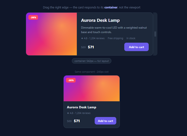
Media queries ask "how wide is the viewport?" — but components don't live in viewports, they live in sidebars, grid cells, modals, and main columns of wildly different widths on the same screen. Container queries fix responsive design's original sin by letting a component ask "how wide is *my slot*?" This snippet demonstrates the complete pattern with the classic proving ground — a product card that renders three genuinely different layouts depending on the width of its container — wrapped in a drag-to-resize playground so you can watch every breakpoint fire, plus a fixed 240px column showing the identical markup adapting independently on the same page.
Two CSS lines create the containment context
Everything starts with the wrapper: .card-container { container-type: inline-size; container-name: card }. The container-type declaration establishes the element as a query container measured on its inline axis (width, in horizontal writing modes) — and critically, it applies *size containment*, meaning the container's width can no longer be influenced by its contents. That constraint is why container queries took a decade to ship: without containment, a child changing layout could change the container's size, re-triggering the query in an infinite loop. The optional container-name lets queries target this container specifically (@container card (min-width: 340px)) rather than the nearest ancestor container — essential hygiene once components nest.
Three layouts, one markup
The card's base styles define the narrow, stacked layout: media on top, tight padding, description hidden, only the first meta item visible. At @container card (min-width: 340px) the card flips to flex-direction: row — art on the left at 34% width, the description appears, and the body fills the remainder. At (min-width: 480px) the media grows to 40%, the meta list rotates from a column to an inline row revealing all three items, and padding and button sizing step up. Note what the queries change: *layout, visibility, and density* — the component's information hierarchy adapts, not just its scale. That is the design payoff of container queries: the same <article> dropped into a 240px rail renders the compact version while its sibling in a 560px main column renders the full version, with zero props, classes, or JS involved.
Fluid type with cqi units
The title uses font-size: clamp(14px, 6cqi, 19px) — cqi is a container query *unit*, 1% of the container's inline size. Between the clamp bounds, the title scales continuously with the container rather than jumping at breakpoints, which smooths the transitions between layout states. Container units (cqw, cqh, cqi, cqb, cqmin, cqmax) work anywhere lengths do and pair naturally with clamp() for per-component fluid typography — a technique impossible to express with viewport units when the same component appears at multiple sizes on one page.
The playground: pointer capture + ResizeObserver
The container queries themselves need zero JavaScript — the JS here only powers the demo apparatus. The drag grip uses the Pointer Events pattern (setPointerCapture so the drag survives the cursor leaving the grip) to set the playground's width between 230px and its parent's width. The live readout uses a ResizeObserver on the container — not on drag events — so it reports width changes from *any* cause, including window resizes, and annotates which layout tier is active. That observer pattern is also your escape hatch on the rare occasion JS needs to know about container size changes, since no "containerquery" DOM event exists.
Browser support has been universal since early 2023 (Chrome 105+, Safari 16+, Firefox 110+), making container queries safe for production today — and this component-first responsive approach is rapidly replacing viewport breakpoints as the default in design systems.
Build with AI
Build, Understand, Optimize, and Extend It With AI
Container queries are best learned by breaking this demo, and an AI assistant makes that fast: paste the snippet into Claude and ask why the card needs a dedicated wrapper with container-type instead of declaring it on the card itself, what happens if you delete container-name and nest this card inside another container, and why the drag playground's JS would be entirely unnecessary in production. Then aim it at your codebase: give it one of your components that takes a size="sm|md|lg" prop and ask it to refactor the variants into @container tiers so the prop disappears — that refactor is the single highest-leverage use of this pattern. Ask it to hunt for width-watching ResizeObservers in your code that container queries could delete, to convert this card's CSS into Tailwind @container syntax for your stack, and to propose honest breakpoint values by reasoning from your component's content rather than device sizes. You'll get the mental model and a migration plan out of one conversation.
Prompt to recreate it
Copy this into your AI assistant of choice to build the effect from scratch, or as a jumping-off point for your own variant:
Build a container-query product card demo in plain HTML, CSS, and JavaScript that proves component-level responsiveness — one markup, three layouts, driven by container width rather than viewport width.

Requirements:
- A product card (gradient art area with a discount badge, title, description, a three-item meta list, price with strikethrough original, and an add-to-cart button) wrapped in a dedicated container element declaring container-type: inline-size and a container-name.
- Author mobile-first: the base styles render a stacked compact layout with the description hidden and only the first meta item visible; at a ~340px container breakpoint switch to a horizontal media/body split and reveal the description; at ~480px widen the media, turn the meta list into an inline row showing all items, and open up padding and button sizing — the breakpoints must change information hierarchy, not merely scale.
- Give the title fluid typography with clamp() using the cqi container unit so it scales continuously with the container between fixed bounds.
- Build a drag-to-resize playground around the card: a grip on the right edge draggable via Pointer Events with setPointerCapture, clamping the width between ~230px and the parent's width — and note in a comment that this JS is demo apparatus only, since the responsive behaviour itself is pure CSS.
- Add a live readout beneath the playground driven by a ResizeObserver on the container (not by drag events, so window resizes also update it) reporting the current container width in pixels and which named layout tier is active.
- Render the identical card markup a second time inside a fixed ~240px column on the same page, demonstrating that each instance responds to its own container independently of the viewport.
- Comment the CSS explaining why container-type imposes size containment, why queries target descendants rather than the container itself, and when to reach for named containers.
Step by step
How to Use
- 1Drag the edge and watch the breakpointsGrab the grip on the card's right edge and drag: below 340px the card is stacked and terse; from 340px it goes horizontal and the description appears; from 480px the meta row expands to three items and spacing opens up. The readout below reports the live container width and active layout tier. Note the fixed 240px column beneath — identical markup, rendering the compact layout because *its* container is narrow, regardless of your viewport.
- 2Reuse the pattern on your own componentWrap any component slot in a query container: .slot { container-type: inline-size; container-name: card }. Write the component's narrowest layout as its base styles, then add @container card (min-width: …) blocks that progressively unlock density — exactly like mobile-first media queries, but scoped. Drop the same component into a sidebar, a modal, and a main column; each instance sizes itself with no configuration.
- 3Pick honest breakpoint valuesContainer breakpoints should come from where the *content* breaks, not from device widths: shrink the playground until the layout looks cramped, and that width is your min-width value. This card breaks at 340px (room for a side-by-side split) and 480px (room for the inline meta row). Two or three tiers cover most components; more usually signals the component is doing too much.
- 4Use container units for the detailsThe title's clamp(14px, 6cqi, 19px) scales with the container between hard bounds. Apply the same to hero padding (padding: clamp(14px, 4cqi, 24px)) or icon sizes. Prefer cqi over cqw (it respects vertical writing modes), always clamp so extreme containers can't produce absurd sizes, and keep body text fixed — fluid scaling suits display elements, not paragraphs.
- 5Query by name when components nestAn unnamed @container (min-width: …) query targets the nearest ancestor container of any name — fine until a card containing a chart sits inside a dashboard cell that is also a container. Name each context (container-name: card / panel / shell) and query the one you mean: @container panel (min-width: 600px). Establish this convention early in a design system; retrofitting names is tedious.
- 6Export and integrateClick JSX for a React version — the CSS is the whole mechanism, so the component ports as markup plus stylesheet with no resize listeners or width props. Use it in card grids like the CSS Grid Cards layout, inside the Holy Grail Layout where sidebar and main column widths differ, or with the Product Card as richer content. Tailwind users: @container and @card:flex-row utilities via the official container-queries support map one-to-one.
Real-world uses
Common Use Cases
Got questions?
Frequently Asked Questions
Use container queries for components and media queries for page scaffolding. The page-level grid — how many columns the app shell has, whether the sidebar collapses, navigation switching to a hamburger — is genuinely a viewport concern and stays with media queries. Everything that renders *inside* a slot of that scaffolding (cards, widgets, forms, media objects, tables) should respond to its slot via container queries, because the same component appears at different widths on one screen and viewport width tells it nothing useful. A practical migration heuristic: any media query that exists to restyle one component (rather than restructure the page) is a container query wearing the wrong syntax, and any width-watching ResizeObserver that toggles classes is one too.
Containment breaks the circular dependency that made container queries "impossible" for years: if children could size their container while the container's size determines the children's styles, layout could oscillate forever. Declaring inline-size containment promises the browser the container's width is determined by its own context (its parent, its explicit width) and never by its contents. The practical gotchas that follow: a container can no longer shrink-wrap its content's width, so don't make inline-sized wrappers of things like buttons that should size to their label; height-based queries need container-type: size, which additionally contains height and will collapse a container that has no explicit height; and the container element itself cannot be styled by its own query (queries match descendants only), so the wrapper div stays deliberately unstyled — exactly why this snippet uses a dedicated .card-container around the card rather than making the card query itself.
Container size queries and container units have been supported in all evergreen browsers since February 2023 (Chrome/Edge 105+, Safari 16+, Firefox 110+) — global support now sits above 93%, so for most products no fallback is needed. Where you must serve older browsers, the degradation story is graceful by construction: browsers that don't understand @container simply keep the base (narrow/stacked) layout, which is fully functional — the same posture as mobile-first media queries. You can also gate enhancements with @supports (container-type: inline-size) { … } if you want to apply alternative media-query-based styling only where container queries are absent. Style queries (@container style(--variant: featured)) are newer and Chromium-only as of 2026 — treat those as progressive enhancement, but size queries like this snippet uses are production-safe everywhere.
Tailwind has first-class support (built into v4; the official @tailwindcss/container-queries plugin for v3): mark the wrapper with @container (or @container/card to name it) and prefix utilities with the breakpoint — <div class="@container/card"><article class="flex flex-col @[340px]/card:flex-row @[480px]/card:gap-2.5">…</article></div>; arbitrary container units work as text-[clamp(14px,6cqi,19px)]. In React and Angular the mechanism is pure CSS, so nothing framework-specific is required — the component ships as markup plus stylesheet with no resize listeners, no width props, and no hydration concerns, which is precisely its advantage over JS-measured responsive components; in Angular, put the @container rules in the component's styles with ViewEncapsulation intact since the queries only need to match descendants. The only JS in this snippet (pointer-capture drag and the ResizeObserver readout) is demo apparatus you drop entirely in production.