
Learn Coding Visually
Learn to code with interactive, live-preview playgrounds — HTML, CSS, JavaScript, React & more.
 HTML Playground42 lessons · Click-based · Live preview
 CSS PlaygroundLearn CSS with a live editor
 JavaScript Playground60 lessons · DOM · Async · Canvas
 React PlaygroundLearn React with a live code editor
 GSAP PlaygroundLearn GSAP animation interactively
 SVG Playground44 lessons · shapes · paths · animation
 SCSS Playground45 lessons · Sass modules · tokens
 Tailwind PlaygroundLearn Tailwind CSS with a live editor
 Bootstrap 5 Playground50 lessons · live preview
Glassmorphism Card — Free HTML CSS backdrop-filter Snippet
Glass Card · Cards · Plain HTML & CSS · Live preview
What's included
Features
About this UI Snippet
Glassmorphism Card — CSS Frosted Glass Effect with backdrop-filter
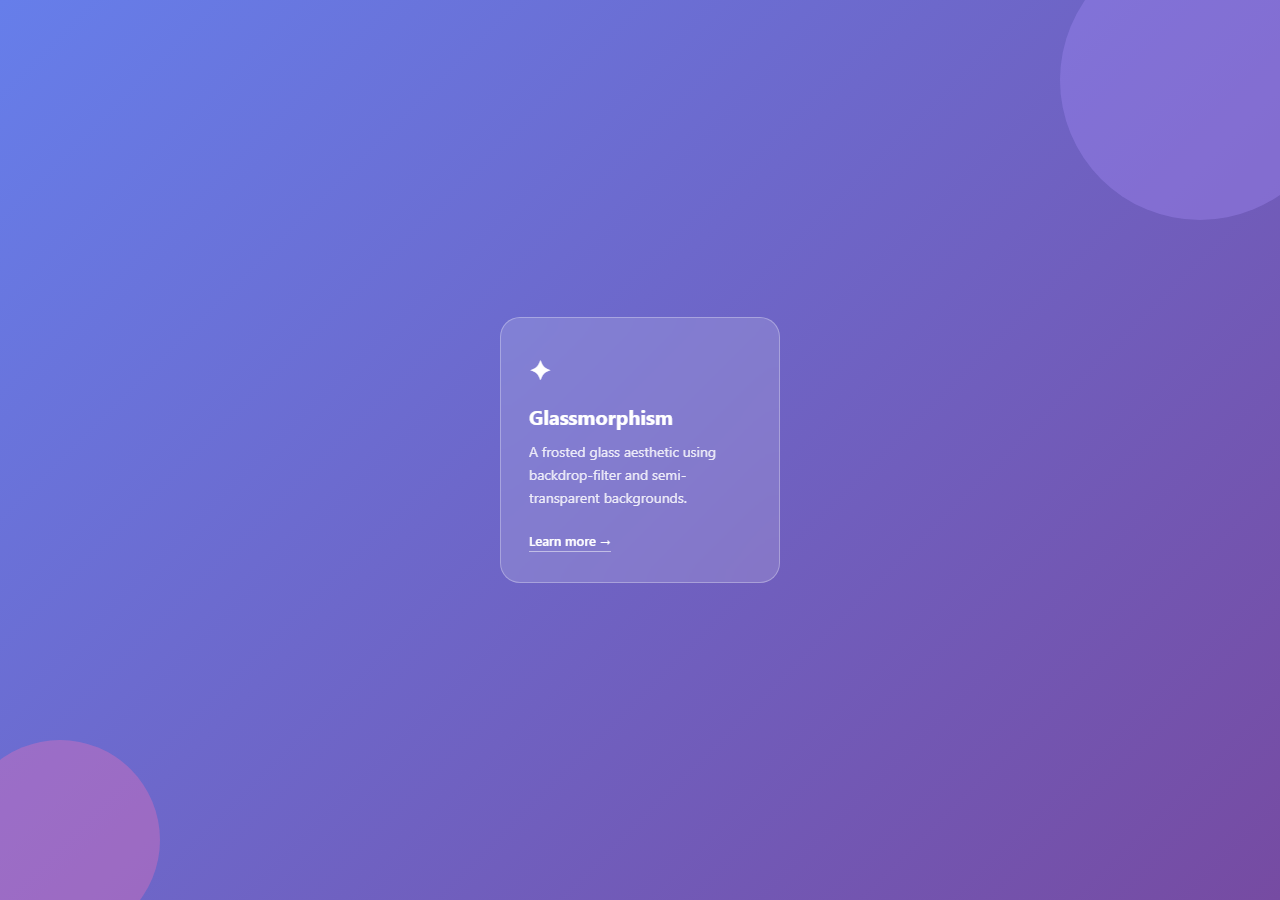
Glassmorphism is a design trend that simulates frosted or etched glass — a card that appears translucent, blurring and tinting the colourful content visible through it. The style became mainstream around 2020 with Apple's macOS Big Sur and has since spread across fintech apps, crypto dashboards, SaaS landing pages, and design tools — see the glassmorphism login for a form example, or the neumorphism and claymorphism card trends. It communicates a premium, modern aesthetic with minimal code.
This snippet gives you a complete glassmorphism card in plain HTML and CSS — no JavaScript required. The card sits over a purple-to-violet gradient scene with two decorative colour blobs, demonstrating exactly how the effect looks in production.
Why four CSS properties are required
Glassmorphism is not a single CSS property — it needs four working together.
First: backdrop-filter: blur(16px) blurs everything rendered directly behind the element in the browser's compositor. This is the defining property. Without it, the card is just a transparent box with no visual depth.
Second: background: rgba(255,255,255,0.15) gives the card a 15% white fill. This is the balance point — if the background is fully opaque, the blur is invisible because no content shows through. If it is 0%, the card disappears entirely. Values between 10% and 25% produce the best glass effect over most backgrounds.
Third: border: 1px solid rgba(255,255,255,0.3) adds a subtle semi-transparent white border. This simulates the way light catches the edge of real glass — a thin bright line around the perimeter that gives the card physical presence.
Fourth: border-radius: 20px rounds the corners, which is stylistically expected in glassmorphism designs and softens the contrast between the card and its background.
Why the background scene matters
backdrop-filter blurs what is rendered directly behind the element. If the background is a solid colour, blurring it produces that same solid colour — no visible effect. Glassmorphism only works over content with visual variety: gradients, photographs, particle effects, or animated orbs. This snippet provides a gradient scene with two colour blobs via ::before and ::after pseudo-elements on .scene to demonstrate the full effect. When using in your project, place the card over a hero image, gradient section, or background animation.
Safari and the -webkit- prefix
backdrop-filter requires the -webkit-backdrop-filter prefix in older Safari versions. This snippet includes both declarations:
backdrop-filter: blur(16px); and -webkit-backdrop-filter: blur(16px); — always include both for maximum compatibility.
Creating a dark glassmorphism variant
To create a dark glass effect (common in dark-themed dashboards), change background: rgba(255,255,255,0.15) to background: rgba(0,0,0,0.25) and border: 1px solid rgba(255,255,255,0.3) to rgba(255,255,255,0.1). Adjust text colour to white. The blur remains the same — only the tint changes.
Using glassmorphism on a navigation bar
Apply the same properties to a position: fixed nav element. As users scroll, the page content blurs beneath the header, creating a live frosted glass effect. The hamburger nav snippet in this library already uses this technique.
Adjusting blur strength and opacity
For a subtle effect use blur(8px) with rgba(255,255,255,0.1). For a heavy frosted look use blur(24px) with rgba(255,255,255,0.2). High blur values can impact performance on mobile — test at the 375px preview before shipping.
Saving your customised version
After editing, click "Save as" in the editor header, type a name, and press Enter. Saves to IndexedDB and appears in the Saved tab.
Build with AI
Build, Understand, Optimize, and Extend It With AI
Instead of guessing why a tweak looks wrong, paste this snippet's HTML and CSS into an AI coding assistant like Claude and ask it to explain exactly why backdrop-filter produces nothing visible over a flat background but works over the two blurred color blobs behind this card, and how the balance between the blur radius and the rgba alpha value on the card's background changes the strength of the glass illusion. It can also help you optimize the effect, for example weighing whether a heavy blur value is worth the compositor cost on low-end mobile devices versus a lighter, still-convincing setting. For extending it, ask for a dark-tinted variant, a version whose blobs animate slowly behind the card, or a reusable class that applies the same glass treatment to a fixed navigation bar. Treat the code less like a finished artifact and more like a starting point for a conversation.
Prompt to recreate it
Copy this into your AI assistant of choice to build the effect from scratch, or as a jumping-off point for your own variant:
Build a glassmorphism card in plain HTML and CSS only, using no JavaScript, that creates a genuine frosted-glass effect rather than a faked translucent panel.

Requirements:
- A full-height scene container with a diagonal linear-gradient background and two large, softly colored circular blobs positioned with the ::before and ::after pseudo-elements so there is visually rich content for the glass to blur.
- A card element layered above the blobs using position: relative and a higher z-index, styled with background: rgba(255,255,255, an alpha between 0.1 and 0.25), backdrop-filter: blur at roughly 16px, both the unprefixed backdrop-filter and the -webkit-backdrop-filter declaration for Safari, a semi-transparent 1px border around 0.3 alpha white, and a rounded border-radius.
- Confirm the effect is genuinely dependent on the blurred content behind it: describe or comment why the same card over a flat solid color would show no visible frost.
- Include card content (an icon, heading, paragraph, and a text link) styled in white with reduced opacity on the body copy so it reads clearly against the blurred background.
- The card must degrade gracefully in browsers without backdrop-filter support, remaining a readable semi-transparent bordered box.
Want to tighten it up first? Run this prompt through the AI Prompt Studio to score it across 8 quality dimensions, catch anti-patterns, and tune the wording for Claude, ChatGPT, or Gemini before you paste it in.
Source Code
<div class="scene">
  <div class="card">
    <div class="icon">✦</div>
    <h3>Glassmorphism</h3>
    <p>A frosted glass aesthetic using backdrop-filter and semi-transparent backgrounds.</p>
    <a href="#" class="link">Learn more →</a>
  </div>
</div>
* { box-sizing: border-box; margin: 0; padding: 0; }
body { font-family: system-ui, sans-serif; }
.scene {
min-height: 100vh;
display: flex;
align-items: center;
justify-content: center;
background: linear-gradient(135deg, #667eea 0%, #764ba2 100%);
padding: 20px;
position: relative;
overflow: hidden;
}
.scene::before, .scene::after {
content: '';
position: absolute;
border-radius: 50%;
opacity: 0.35;
}
.scene::before { width: 280px; height: 280px; background: #a78bfa; top: -60px; right: -60px; }
.scene::after { width: 200px; height: 200px; background: #f472b6; bottom: -40px; left: -40px; }
.card {
background: rgba(255,255,255,0.15);
backdrop-filter: blur(16px);
-webkit-backdrop-filter: blur(16px);
border: 1px solid rgba(255,255,255,0.3);
border-radius: 20px;
padding: 32px 28px;
width: 280px;
color: #fff;
position: relative;
z-index: 1;
}
.icon {
font-size: 28px;
margin-bottom: 16px;
}
h3 { font-size: 20px; font-weight: 700; margin-bottom: 10px; }
p { font-size: 14px; line-height: 1.65; opacity: 0.85; margin-bottom: 20px; }
.link {
font-size: 13px;
font-weight: 600;
color: #fff;
text-decoration: none;
border-bottom: 1px solid rgba(255,255,255,0.5);
padding-bottom: 2px;
transition: border-color 0.15s;
}
.link:hover { border-color: #fff; }Step by step
How to Use
- 1Load the snippetClick "Glass Card" in the sidebar. The preview shows the card over a purple gradient with colour blobs — the blur and transparency create the frosted glass appearance.
- 2Edit the card contentIn the HTML panel, change the icon emoji, h3 title, p description, and link text to your own content.
- 3Adjust blur and opacityIn the CSS panel, change 16px in backdrop-filter: blur(16px) for blur strength, and 0.15 in rgba(255,255,255,0.15) for card opacity. Preview updates live.
- 4Change the background gradientUpdate the linear-gradient values on .scene to match your project colours. Or replace the entire .scene background with a CSS image URL.
- 5Extract just the cardCopy only the .card HTML and CSS to use in your project. Remove the .scene and blob pseudo-element styles and place the card over your own background.
- 6Export in your formatClick "HTML" for a standalone file, "JSX" for a React component, or "Tailwind" for a React + Tailwind CSS version.
Real-world uses
Common Use Cases
Got questions?
Frequently Asked Questions
Glassmorphism is a UI style that simulates frosted glass using four CSS properties together: backdrop-filter: blur() to blur content behind the element, a semi-transparent rgba background, a subtle rgba border, and border-radius for rounded corners. It requires a colourful or varied background to be visually effective.
backdrop-filter blurs what is rendered directly behind the element. Blurring a solid colour produces that same solid colour — there is nothing to blur. The effect is only visible over content with visual variety: gradients, photos, colour blobs, or animations. Always place a glass card over a colourful or varied background.
backdrop-filter is supported in Chrome 76+, Safari 9+ (with -webkit- prefix), Edge 79+, and Firefox 103+. This snippet includes both -webkit-backdrop-filter and backdrop-filter declarations for maximum compatibility. Without support, the card shows as a semi-transparent box with border — readable but without the blur.
Change the pixel value in backdrop-filter: blur(16px) — 8px is subtle, 24px is heavy. Change the alpha in rgba(255,255,255,0.15) — 0.08 to 0.1 is very transparent, 0.3 to 0.4 is more opaque. High blur values can affect rendering performance on mobile, so test at the 375px preview.
Change background: rgba(255,255,255,0.15) to rgba(0,0,0,0.25) for a dark tint instead of white. Change the border to rgba(255,255,255,0.1). Set text colour to white. The blur effect works the same way — only the fill colour changes.
Yes. Add backdrop-filter: blur(12px), -webkit-backdrop-filter: blur(12px), and background: rgba(255,255,255,0.1) to a position: fixed nav element. As users scroll, the page content blurs behind the header. The Hamburger Nav snippet in this library already uses this technique.
Yes. Click "JSX" to download a React component or "Tailwind" for a React + Tailwind version. Note that Tailwind uses backdrop-blur-lg for backdrop-filter: blur(16px) and bg-white/15 for the rgba background. The -webkit- prefix is handled automatically by PostCSS autoprefixer in most Tailwind setups.