More Cards Snippets
Neumorphism Card — Soft UI CSS Shadow Snippet
Neumorphism Card · Cards · Plain HTML, CSS & JS · Live preview
What's included
Features
About this UI Snippet
Neumorphism Card — Dual Box-Shadows, Inset Wells & Pressable Soft UI
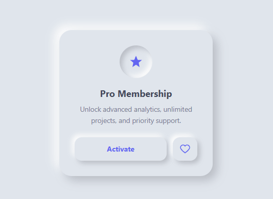
Neumorphism — also called "soft UI" — is one of the most-searched CSS design trends, alongside the glassmorphism and claymorphism card styles, because it produces a clean, tactile look where elements appear gently extruded from, or pressed into, the background. This snippet is a complete neumorphic card: an extruded container, an inset icon well, and buttons that press in on click (compare the 3D push button). It is pure CSS, and once you understand the two-shadow formula you can apply it to any element.
The core formula: two opposite shadows
Every neumorphic element uses two box-shadows at once — a dark shadow offset toward the bottom-right and a light highlight offset toward the top-left, both the same blur. The card uses box-shadow: 9px 9px 18px #b8bcc4, -9px -9px 18px #ffffff. The dark shadow (#b8bcc4) implies light coming from the top-left, so the bottom-right edge is in shadow; the white highlight (#ffffff) brightens the top-left edge. Together they make the element look like it was extruded from the surface — a single piece of the same material gently raised. This dual-shadow trick is the entire foundation of neumorphism.
Why the background color is everything
Neumorphism only works on a mid-tone background, never pure white or black. The body uses #e0e5ec, a light gray, and — critically — the card, icon, and buttons all share that exact same background. The shadows are simply a darker and a lighter tint of #e0e5ec. If the element were a different color than its surroundings, the illusion of it being "pushed out of" the surface would break. This is why every neumorphic element must match its parent's background: the effect is the surface deforming, not a separate object sitting on top. Pick your background first, then derive the dark shadow (~12% darker) and light highlight (white or ~8% lighter) from it.
Inset shadows: the pressed-in well
To make something look pressed *into* the surface instead of raised out of it, you flip the shadows to inset. The icon container uses box-shadow: inset 5px 5px 10px #b8bcc4, inset -5px -5px 10px #ffffff. The inset keyword draws the shadow inside the element, so the dark shadow now sits on the top-left interior and the highlight on the bottom-right — the exact inverse of the raised card. The result is a smooth circular "well" that the icon sits inside. Raised (outer shadow) and pressed (inset shadow) are the only two neumorphic states, and combining them in one component — a raised card containing an inset well — is what gives soft UI its depth.
Buttons that physically press
The buttons are raised by default with box-shadow: 5px 5px 10px #b8bcc4, -5px -5px 10px #ffffff. On :active, the shadow swaps to the inset version (inset 4px 4px 8px …), so the button visibly sinks into the surface when pressed, then pops back when released. A transition: box-shadow 0.18s smooths the change. This raised-to-inset toggle is the most satisfying neumorphic interaction and the clearest way to show the technique: the same element, the same color, only the shadow direction changes between out and in.
Strengths and the contrast caveat
Neumorphism looks elegant and modern, and it is trivially themeable — change one background color and re-derive the two shadow tints. Its well-known weakness is contrast: because elements share their background color and rely on subtle shadows, edges can be hard to see, which is an accessibility concern for low-vision users and fails WCAG contrast for boundaries. Use neumorphism for decorative containers and secondary controls, and make sure text and icons inside have strong contrast against the surface (here the indigo icons and dark gray text are clearly legible on the light gray). For primary actions where visibility is critical, consider pairing neumorphism with a clearly colored accent or a visible focus ring so the control is unmistakable.
Tuning the depth
The shadow offset and blur control how "deep" the effect looks. The card's 9px 9px 18px reads as a firmly raised panel; smaller offsets like 5px 5px 10px (used on the buttons) feel subtler and closer to the surface. Keep the blur roughly double the offset for a soft, realistic falloff. For a more dramatic, chunky look, increase both; for a barely-there soft UI, decrease them. Always change the dark and light shadows together and keep their offsets mirrored (e.g. 9px 9px and -9px -9px) so the implied light direction stays consistent across every element.
Customizing the card
To re-theme, change the shared background (e.g. to a soft blue #dde3ec or a warm #ece5dd), then update both shadow colors to a darker and lighter version of it — that single change re-skins the card, icon well, and buttons at once. Swap the icon SVG and the heading/description text for your content. Round the corners more or less with border-radius. Add a second inset well for an avatar or a progress ring. Because every piece follows the same two-shadow rule, the card stays visually consistent no matter how you extend it.
Step by step
How to Use
- 1Match the backgroundSet the card, icon, and buttons to the SAME background as the page (here #e0e5ec). Neumorphism only works when elements share the surface color.
- 2Use the dual-shadow formulaApply a dark shadow bottom-right and a light highlight top-left of equal blur for a raised look (box-shadow: 9px 9px 18px dark, -9px -9px 18px light).
- 3Add inset wellsFor pressed-in elements (icon container, active buttons), add the inset keyword so the shadows draw inside.
- 4Re-theme from one colorPick a new mid-tone background, then derive the dark shadow (~12% darker) and light highlight (white) from it and update both everywhere.
- 5Tune the depthIncrease the shadow offset/blur for a deeper raise; keep blur about double the offset and mirror the offsets.
- 6Export in your formatClick "HTML" for a standalone file, "JSX" for a React component, or "Tailwind" for a React + Tailwind version.
Real-world uses
Common Use Cases
Got questions?
Frequently Asked Questions
Neumorphism (soft UI) makes elements look extruded from or pressed into the background using two box-shadows at once — a dark shadow offset one way and a light highlight offset the opposite way, both tints of a shared mid-tone background. The result is a soft, tactile, single-material look.
The effect is the surface itself deforming, not an object placed on top. If the element were a different color, it would look like a separate sticker rather than a raised part of the same surface. So the card, icon, and buttons all share the page background, and only the shadows differ.
Add the inset keyword to both shadows. inset draws the shadow inside the element, inverting the light direction so it reads as a well pressed into the surface. The icon container and active buttons use this.
Pick a new mid-tone background, then derive a darker shadow (about 12% darker) and a lighter highlight (white or slightly lighter) from it, and update both shadow colors everywhere. Changing those three values re-skins the whole component.
It can have contrast issues because elements share their background and rely on subtle shadows, which can make edges hard to see. Use it for decorative containers and keep text/icons high-contrast; add a visible focus ring to important controls so they remain clearly perceivable.
Yes. Click "JSX" for a React component or "Tailwind" for a React + Tailwind version. The effect is pure CSS box-shadow, so it works identically in React — just keep the shared background color on the card and its children.
Neumorphism Card — Export as HTML, React, Vue, Angular & Tailwind
<!DOCTYPE html>
<html lang="en">
<head>
<meta charset="UTF-8" />
<meta name="viewport" content="width=device-width, initial-scale=1.0" />
<title>Neumorphism Card</title>
<style>
* { box-sizing: border-box; margin: 0; padding: 0; }
body {
font-family: system-ui, sans-serif;
/* Neumorphism needs a mid-tone background — shadows are tints of it */
background: #e0e5ec;
min-height: 100vh;
display: flex; align-items: center; justify-content: center;
}
.neu-card {
width: 300px;
background: #e0e5ec;
border-radius: 24px;
padding: 30px;
text-align: center;
/* Two shadows: dark bottom-right, light top-left = extruded look */
box-shadow: 9px 9px 18px #b8bcc4, -9px -9px 18px #ffffff;
}
.icon {
width: 64px; height: 64px;
margin: 0 auto 18px;
border-radius: 50%;
display: grid; place-items: center;
background: #e0e5ec;
/* Inset shadow = pressed-in well */
box-shadow: inset 5px 5px 10px #b8bcc4, inset -5px -5px 10px #ffffff;
}
.icon svg { width: 28px; height: 28px; fill: #6366f1; }
.neu-title { font-size: 18px; color: #44495a; margin-bottom: 8px; }
p { font-size: 13.5px; color: #7a8095; line-height: 1.6; margin-bottom: 22px; }
.stats { display: flex; gap: 12px; }
.neu-btn {
flex: 1;
padding: 13px;
border: none;
border-radius: 14px;
background: #e0e5ec;
color: #6366f1;
font-size: 14px; font-weight: 700; font-family: inherit;
cursor: pointer;
box-shadow: 5px 5px 10px #b8bcc4, -5px -5px 10px #ffffff;
transition: box-shadow 0.18s, color 0.18s;
}
.neu-btn:hover { color: #4f46e5; }
/* Press: swap to inset shadow so the button looks pushed in */
.neu-btn:active {
box-shadow: inset 4px 4px 8px #b8bcc4, inset -4px -4px 8px #ffffff;
}
.icon-btn { flex: 0 0 48px; display: grid; place-items: center; }
.icon-btn svg { width: 20px; height: 20px; fill: none; stroke: #6366f1; stroke-width: 2; }
</style>
</head>
<body>
<div class="neu-card">
<div class="icon">
<svg viewBox="0 0 24 24"><path d="M12 2l3 7h7l-5.5 4.5L18 21l-6-4-6 4 1.5-7.5L2 9h7z"/></svg>
</div>
<h3 class="neu-title">Pro Membership</h3>
<p>Unlock advanced analytics, unlimited projects, and priority support.</p>
<div class="stats">
<button class="neu-btn">Activate</button>
<button class="neu-btn icon-btn" aria-label="Favorite">
<svg viewBox="0 0 24 24"><path d="M12 21s-7-4.6-9.5-9A5.2 5.2 0 0 1 12 5a5.2 5.2 0 0 1 9.5 7c-2.5 4.4-9.5 9-9.5 9z"/></svg>
</button>
</div>
</div>
<script>
// Pure CSS neumorphism — no JavaScript required.
// Press the buttons to see the shadow flip from raised to inset.
document.querySelectorAll('.neu-btn').forEach(b => {
b.addEventListener('click', () => console.log('Neumorphic press'));
});
</script>
</body>
</html><!DOCTYPE html>
<html lang="en">
<head>
<meta charset="UTF-8" />
<meta name="viewport" content="width=device-width, initial-scale=1.0" />
<title>Neumorphism Card</title>
<!-- Tailwind CSS v3+ — arbitrary value classes (e.g. bg-[#0f172a]) are valid -->
<script src="https://cdn.tailwindcss.com"></script>
<style>
* {
box-sizing: border-box; margin: 0; padding: 0;
}
body {
font-family: system-ui, sans-serif;
background: #e0e5ec;
min-height: 100vh;
display: flex; align-items: center; justify-content: center;
}
.icon svg {
width: 28px; height: 28px; fill: #6366f1;
}
p {
font-size: 13.5px; color: #7a8095; line-height: 1.6; margin-bottom: 22px;
}
.icon-btn svg {
width: 20px; height: 20px; fill: none; stroke: #6366f1; stroke-width: 2;
}
</style>
</head>
<body>
<div class="w-[300px] bg-[#e0e5ec] rounded-3xl p-[30px] text-center shadow-[9px_9px_18px_#b8bcc4,_-9px_-9px_18px_#ffffff]">
<div class="icon w-16 h-16 mt-0 mx-auto mb-[18px] rounded-full grid [place-items:center] bg-[#e0e5ec] shadow-[inset_5px_5px_10px_#b8bcc4,_inset_-5px_-5px_10px_#ffffff]">
<svg viewBox="0 0 24 24"><path d="M12 2l3 7h7l-5.5 4.5L18 21l-6-4-6 4 1.5-7.5L2 9h7z"/></svg>
</div>
<h3 class="text-lg text-[#44495a] mb-2">Pro Membership</h3>
<p>Unlock advanced analytics, unlimited projects, and priority support.</p>
<div class="flex gap-3">
<button class="neu-btn flex-1 p-[13px] border-0 rounded-[14px] bg-[#e0e5ec] text-[#6366f1] text-sm font-bold font-[inherit] cursor-pointer shadow-[5px_5px_10px_#b8bcc4,_-5px_-5px_10px_#ffffff] [transition:box-shadow_0.18s,_color_0.18s] hover:text-[#4f46e5] active:shadow-[inset_4px_4px_8px_#b8bcc4,_inset_-4px_-4px_8px_#ffffff]">Activate</button>
<button class="neu-btn flex-1 p-[13px] border-0 rounded-[14px] bg-[#e0e5ec] text-[#6366f1] text-sm font-bold font-[inherit] cursor-pointer shadow-[5px_5px_10px_#b8bcc4,_-5px_-5px_10px_#ffffff] [transition:box-shadow_0.18s,_color_0.18s] hover:text-[#4f46e5] active:shadow-[inset_4px_4px_8px_#b8bcc4,_inset_-4px_-4px_8px_#ffffff] icon-btn flex-[0 0 48px] grid [place-items:center]" aria-label="Favorite">
<svg viewBox="0 0 24 24"><path d="M12 21s-7-4.6-9.5-9A5.2 5.2 0 0 1 12 5a5.2 5.2 0 0 1 9.5 7c-2.5 4.4-9.5 9-9.5 9z"/></svg>
</button>
</div>
</div>
<script>
// Pure CSS neumorphism — no JavaScript required.
// Press the buttons to see the shadow flip from raised to inset.
document.querySelectorAll('.neu-btn').forEach(b => {
b.addEventListener('click', () => console.log('Neumorphic press'));
});
</script>
</body>
</html>import React, { useEffect } from 'react';
// CSS — optionally move to NeumorphismCard.module.css
const css = `
* { box-sizing: border-box; margin: 0; padding: 0; }
body {
font-family: system-ui, sans-serif;
/* Neumorphism needs a mid-tone background — shadows are tints of it */
background: #e0e5ec;
min-height: 100vh;
display: flex; align-items: center; justify-content: center;
}
.neu-card {
width: 300px;
background: #e0e5ec;
border-radius: 24px;
padding: 30px;
text-align: center;
/* Two shadows: dark bottom-right, light top-left = extruded look */
box-shadow: 9px 9px 18px #b8bcc4, -9px -9px 18px #ffffff;
}
.icon {
width: 64px; height: 64px;
margin: 0 auto 18px;
border-radius: 50%;
display: grid; place-items: center;
background: #e0e5ec;
/* Inset shadow = pressed-in well */
box-shadow: inset 5px 5px 10px #b8bcc4, inset -5px -5px 10px #ffffff;
}
.icon svg { width: 28px; height: 28px; fill: #6366f1; }
.neu-title { font-size: 18px; color: #44495a; margin-bottom: 8px; }
p { font-size: 13.5px; color: #7a8095; line-height: 1.6; margin-bottom: 22px; }
.stats { display: flex; gap: 12px; }
.neu-btn {
flex: 1;
padding: 13px;
border: none;
border-radius: 14px;
background: #e0e5ec;
color: #6366f1;
font-size: 14px; font-weight: 700; font-family: inherit;
cursor: pointer;
box-shadow: 5px 5px 10px #b8bcc4, -5px -5px 10px #ffffff;
transition: box-shadow 0.18s, color 0.18s;
}
.neu-btn:hover { color: #4f46e5; }
/* Press: swap to inset shadow so the button looks pushed in */
.neu-btn:active {
box-shadow: inset 4px 4px 8px #b8bcc4, inset -4px -4px 8px #ffffff;
}
.icon-btn { flex: 0 0 48px; display: grid; place-items: center; }
.icon-btn svg { width: 20px; height: 20px; fill: none; stroke: #6366f1; stroke-width: 2; }
`;
export default function NeumorphismCard() {
// Auto-generated escape hatch: the original snippet's vanilla JS runs once
// after mount and queries the rendered DOM. For idiomatic React, lift this
// into state + handlers.
useEffect(() => {
const _listeners = [];
const _originalAddEventListener = EventTarget.prototype.addEventListener;
EventTarget.prototype.addEventListener = function(type, listener, options) {
_listeners.push({ target: this, type, listener, options });
return _originalAddEventListener.call(this, type, listener, options);
};
// Pure CSS neumorphism — no JavaScript required.
// Press the buttons to see the shadow flip from raised to inset.
document.querySelectorAll('.neu-btn').forEach(b => {
b.addEventListener('click', () => console.log('Neumorphic press'));
});
// Cleanup: restore addEventListener and remove all listeners
return () => {
EventTarget.prototype.addEventListener = _originalAddEventListener;
for (const { target, type, listener, options } of _listeners) {
target.removeEventListener(type, listener, options);
}
};
}, []);
return (
<>
<style>{css}</style>
<div className="neu-card">
<div className="icon">
<svg viewBox="0 0 24 24"><path d="M12 2l3 7h7l-5.5 4.5L18 21l-6-4-6 4 1.5-7.5L2 9h7z"/></svg>
</div>
<h3 className="neu-title">Pro Membership</h3>
<p>Unlock advanced analytics, unlimited projects, and priority support.</p>
<div className="stats">
<button className="neu-btn">Activate</button>
<button className="neu-btn icon-btn" aria-label="Favorite">
<svg viewBox="0 0 24 24"><path d="M12 21s-7-4.6-9.5-9A5.2 5.2 0 0 1 12 5a5.2 5.2 0 0 1 9.5 7c-2.5 4.4-9.5 9-9.5 9z"/></svg>
</button>
</div>
</div>
</>
);
}import React, { useEffect } from 'react';
// Requires Tailwind CSS v3+ — https://tailwindcss.com/docs/installation
// Arbitrary value classes (e.g. bg-[#0f172a]) are valid Tailwind v3+
export default function NeumorphismCard() {
// Auto-generated escape hatch: the original snippet's vanilla JS runs once
// after mount and queries the rendered DOM. For idiomatic React, lift this
// into state + handlers.
useEffect(() => {
const _listeners = [];
const _originalAddEventListener = EventTarget.prototype.addEventListener;
EventTarget.prototype.addEventListener = function(type, listener, options) {
_listeners.push({ target: this, type, listener, options });
return _originalAddEventListener.call(this, type, listener, options);
};
// Pure CSS neumorphism — no JavaScript required.
// Press the buttons to see the shadow flip from raised to inset.
document.querySelectorAll('.neu-btn').forEach(b => {
b.addEventListener('click', () => console.log('Neumorphic press'));
});
// Cleanup: restore addEventListener and remove all listeners
return () => {
EventTarget.prototype.addEventListener = _originalAddEventListener;
for (const { target, type, listener, options } of _listeners) {
target.removeEventListener(type, listener, options);
}
};
}, []);
return (
<>
<style>{`
* {
box-sizing: border-box; margin: 0; padding: 0;
}
body {
font-family: system-ui, sans-serif;
background: #e0e5ec;
min-height: 100vh;
display: flex; align-items: center; justify-content: center;
}
.icon svg {
width: 28px; height: 28px; fill: #6366f1;
}
p {
font-size: 13.5px; color: #7a8095; line-height: 1.6; margin-bottom: 22px;
}
.icon-btn svg {
width: 20px; height: 20px; fill: none; stroke: #6366f1; stroke-width: 2;
}
`}</style>
<div className="w-[300px] bg-[#e0e5ec] rounded-3xl p-[30px] text-center shadow-[9px_9px_18px_#b8bcc4,_-9px_-9px_18px_#ffffff]">
<div className="icon w-16 h-16 mt-0 mx-auto mb-[18px] rounded-full grid [place-items:center] bg-[#e0e5ec] shadow-[inset_5px_5px_10px_#b8bcc4,_inset_-5px_-5px_10px_#ffffff]">
<svg viewBox="0 0 24 24"><path d="M12 2l3 7h7l-5.5 4.5L18 21l-6-4-6 4 1.5-7.5L2 9h7z"/></svg>
</div>
<h3 className="text-lg text-[#44495a] mb-2">Pro Membership</h3>
<p>Unlock advanced analytics, unlimited projects, and priority support.</p>
<div className="flex gap-3">
<button className="neu-btn flex-1 p-[13px] border-0 rounded-[14px] bg-[#e0e5ec] text-[#6366f1] text-sm font-bold font-[inherit] cursor-pointer shadow-[5px_5px_10px_#b8bcc4,_-5px_-5px_10px_#ffffff] [transition:box-shadow_0.18s,_color_0.18s] hover:text-[#4f46e5] active:shadow-[inset_4px_4px_8px_#b8bcc4,_inset_-4px_-4px_8px_#ffffff]">Activate</button>
<button className="neu-btn flex-1 p-[13px] border-0 rounded-[14px] bg-[#e0e5ec] text-[#6366f1] text-sm font-bold font-[inherit] cursor-pointer shadow-[5px_5px_10px_#b8bcc4,_-5px_-5px_10px_#ffffff] [transition:box-shadow_0.18s,_color_0.18s] hover:text-[#4f46e5] active:shadow-[inset_4px_4px_8px_#b8bcc4,_inset_-4px_-4px_8px_#ffffff] icon-btn flex-[0 0 48px] grid [place-items:center]" aria-label="Favorite">
<svg viewBox="0 0 24 24"><path d="M12 21s-7-4.6-9.5-9A5.2 5.2 0 0 1 12 5a5.2 5.2 0 0 1 9.5 7c-2.5 4.4-9.5 9-9.5 9z"/></svg>
</button>
</div>
</div>
</>
);
}<template>
<div class="neu-card">
<div class="icon">
<svg viewBox="0 0 24 24"><path d="M12 2l3 7h7l-5.5 4.5L18 21l-6-4-6 4 1.5-7.5L2 9h7z"/></svg>
</div>
<h3 class="neu-title">Pro Membership</h3>
<p>Unlock advanced analytics, unlimited projects, and priority support.</p>
<div class="stats">
<button class="neu-btn">Activate</button>
<button class="neu-btn icon-btn" aria-label="Favorite">
<svg viewBox="0 0 24 24"><path d="M12 21s-7-4.6-9.5-9A5.2 5.2 0 0 1 12 5a5.2 5.2 0 0 1 9.5 7c-2.5 4.4-9.5 9-9.5 9z"/></svg>
</button>
</div>
</div>
</template>
<script setup>
import { onMounted } from 'vue';
onMounted(() => {
// Pure CSS neumorphism — no JavaScript required.
// Press the buttons to see the shadow flip from raised to inset.
document.querySelectorAll('.neu-btn').forEach(b => {
b.addEventListener('click', () => console.log('Neumorphic press'));
});
});
</script>
<style scoped>
* { box-sizing: border-box; margin: 0; padding: 0; }
body {
font-family: system-ui, sans-serif;
/* Neumorphism needs a mid-tone background — shadows are tints of it */
background: #e0e5ec;
min-height: 100vh;
display: flex; align-items: center; justify-content: center;
}
.neu-card {
width: 300px;
background: #e0e5ec;
border-radius: 24px;
padding: 30px;
text-align: center;
/* Two shadows: dark bottom-right, light top-left = extruded look */
box-shadow: 9px 9px 18px #b8bcc4, -9px -9px 18px #ffffff;
}
.icon {
width: 64px; height: 64px;
margin: 0 auto 18px;
border-radius: 50%;
display: grid; place-items: center;
background: #e0e5ec;
/* Inset shadow = pressed-in well */
box-shadow: inset 5px 5px 10px #b8bcc4, inset -5px -5px 10px #ffffff;
}
.icon svg { width: 28px; height: 28px; fill: #6366f1; }
.neu-title { font-size: 18px; color: #44495a; margin-bottom: 8px; }
p { font-size: 13.5px; color: #7a8095; line-height: 1.6; margin-bottom: 22px; }
.stats { display: flex; gap: 12px; }
.neu-btn {
flex: 1;
padding: 13px;
border: none;
border-radius: 14px;
background: #e0e5ec;
color: #6366f1;
font-size: 14px; font-weight: 700; font-family: inherit;
cursor: pointer;
box-shadow: 5px 5px 10px #b8bcc4, -5px -5px 10px #ffffff;
transition: box-shadow 0.18s, color 0.18s;
}
.neu-btn:hover { color: #4f46e5; }
/* Press: swap to inset shadow so the button looks pushed in */
.neu-btn:active {
box-shadow: inset 4px 4px 8px #b8bcc4, inset -4px -4px 8px #ffffff;
}
.icon-btn { flex: 0 0 48px; display: grid; place-items: center; }
.icon-btn svg { width: 20px; height: 20px; fill: none; stroke: #6366f1; stroke-width: 2; }
</style>// @ts-nocheck
// Note: vanilla JS DOM manipulation is preserved as-is inside ngAfterViewInit().
// For idiomatic Angular, replace document.getElementById() with @ViewChild() refs
// and move state into component properties with two-way binding.
import { Component, AfterViewInit, ViewEncapsulation } from '@angular/core';
import { CommonModule } from '@angular/common';
@Component({
selector: 'app-neumorphism-card',
standalone: true,
imports: [CommonModule],
encapsulation: ViewEncapsulation.None,
template: `
<div class="neu-card">
<div class="icon">
<svg viewBox="0 0 24 24"><path d="M12 2l3 7h7l-5.5 4.5L18 21l-6-4-6 4 1.5-7.5L2 9h7z"/></svg>
</div>
<h3 class="neu-title">Pro Membership</h3>
<p>Unlock advanced analytics, unlimited projects, and priority support.</p>
<div class="stats">
<button class="neu-btn">Activate</button>
<button class="neu-btn icon-btn" aria-label="Favorite">
<svg viewBox="0 0 24 24"><path d="M12 21s-7-4.6-9.5-9A5.2 5.2 0 0 1 12 5a5.2 5.2 0 0 1 9.5 7c-2.5 4.4-9.5 9-9.5 9z"/></svg>
</button>
</div>
</div>
`,
styles: [`
* { box-sizing: border-box; margin: 0; padding: 0; }
body {
font-family: system-ui, sans-serif;
/* Neumorphism needs a mid-tone background — shadows are tints of it */
background: #e0e5ec;
min-height: 100vh;
display: flex; align-items: center; justify-content: center;
}
.neu-card {
width: 300px;
background: #e0e5ec;
border-radius: 24px;
padding: 30px;
text-align: center;
/* Two shadows: dark bottom-right, light top-left = extruded look */
box-shadow: 9px 9px 18px #b8bcc4, -9px -9px 18px #ffffff;
}
.icon {
width: 64px; height: 64px;
margin: 0 auto 18px;
border-radius: 50%;
display: grid; place-items: center;
background: #e0e5ec;
/* Inset shadow = pressed-in well */
box-shadow: inset 5px 5px 10px #b8bcc4, inset -5px -5px 10px #ffffff;
}
.icon svg { width: 28px; height: 28px; fill: #6366f1; }
.neu-title { font-size: 18px; color: #44495a; margin-bottom: 8px; }
p { font-size: 13.5px; color: #7a8095; line-height: 1.6; margin-bottom: 22px; }
.stats { display: flex; gap: 12px; }
.neu-btn {
flex: 1;
padding: 13px;
border: none;
border-radius: 14px;
background: #e0e5ec;
color: #6366f1;
font-size: 14px; font-weight: 700; font-family: inherit;
cursor: pointer;
box-shadow: 5px 5px 10px #b8bcc4, -5px -5px 10px #ffffff;
transition: box-shadow 0.18s, color 0.18s;
}
.neu-btn:hover { color: #4f46e5; }
/* Press: swap to inset shadow so the button looks pushed in */
.neu-btn:active {
box-shadow: inset 4px 4px 8px #b8bcc4, inset -4px -4px 8px #ffffff;
}
.icon-btn { flex: 0 0 48px; display: grid; place-items: center; }
.icon-btn svg { width: 20px; height: 20px; fill: none; stroke: #6366f1; stroke-width: 2; }
`]
})
export class NeumorphismCardComponent implements AfterViewInit {
ngAfterViewInit(): void {
// Pure CSS neumorphism — no JavaScript required.
// Press the buttons to see the shadow flip from raised to inset.
document.querySelectorAll('.neu-btn').forEach(b => {
b.addEventListener('click', () => console.log('Neumorphic press'));
});
}
}