Claymorphism Card — Puffy 3D Clay UI Snippet

Claymorphism Card · Cards · Plain HTML, CSS & JS · Live preview

Share & Support

What's included

Features

Signature puffy clay look from one outer shadow + two inset highlights
Bright white inset highlight that creates the inflated, soft-clay feel
Very large border-radius for the edgeless, molded clay shape
Nested clay: a raised icon blob sitting on the clay card
Pressable button that swaps to inset-only shadows on :active (poked-in)
Single-hue recipe — re-skin the whole card by changing one accent color
Higher contrast and accessibility than neumorphism
Pure CSS — JavaScript optional, only logs the click
GPU-friendly: only transform and box-shadow animate on interaction
Export as HTML file, React JSX, or React + Tailwind CSS

About this UI Snippet

Claymorphism Card — Puffy 3D Clay Look from Outer Shadow + Inner Highlights
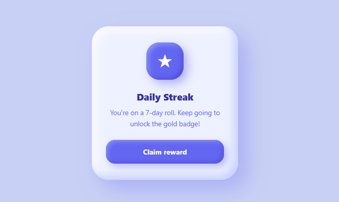
Screenshot of the Claymorphism Card snippet rendered live

Claymorphism — the soft, puffy, "squishy 3D clay" aesthetic popularized by playful apps, 3D illustration kits, and gamified UIs — is a rising design trend (alongside neumorphism and glassmorphism) that developers search for because the effect looks complex but is entirely achievable with CSS box-shadow. This snippet is a complete claymorphic card: a chunky rounded container, a raised icon "blob", and a pressable button (see also the 3D push button), all sharing the same clay recipe. It is pure CSS, and once you learn the three-shadow formula you can make any element look like inflated clay.

The claymorphism recipe: one outer + two inner shadows

The clay look comes from stacking three shadows on every element: one large, soft, colored outer drop shadow that lifts the shape off the page, and two inset shadows — a dark one and a light one on opposite interior edges — that round the inside so the element looks inflated, like a piece of pressed clay. The card uses 18px 18px 40px rgba(99,102,241,0.30) for the big outer shadow, then inset -8px -8px 16px rgba(165,180,252,0.55) (a soft purple inner shadow on the bottom-right) and inset 8px 8px 18px rgba(255,255,255,0.9) (a bright white inner highlight on the top-left). The white inset highlight is what gives clay its signature "puffy and soft" rounded-inward feel; without it, you just have a flat card with a drop shadow.

Why huge border-radius is essential

Claymorphism only reads as "clay" with very large corner radii — the card uses border-radius: 34px, the icon 26px, the button 18px. Clay is soft and has no sharp edges, so generous rounding is mandatory; small radii make the inner shadows look like a bevel rather than inflated clay. Pair the big radius with the inner highlights and the shape looks like it was molded, not drawn. This is the most common mistake people make trying to copy the style — they use the shadows but keep tight corners, and it falls flat.

How claymorphism differs from neumorphism

Both use inset shadows, but the look and rules are different. Neumorphism is monochrome and low-contrast: the element must match its background exactly, and the effect is a subtle extrusion of the same surface. Claymorphism is colorful and high-contrast: elements are a different, often pastel color from the background, the outer shadow is large and tinted, and the inner highlights are strong (especially the bright white one), producing a bold, toy-like, three-dimensional pop rather than a flat embossed surface. Claymorphism also fixes neumorphism's biggest weakness — poor contrast — because the elements are distinctly colored and clearly raised, so they remain legible and obviously interactive.

The raised icon blob

The icon container is its own little clay blob: a colored square with the same three-shadow treatment, so it appears to float above the card surface. It uses the indigo accent for fill, a colored outer shadow, and inset shadows tuned to its color (a darker indigo inset and a lighter periwinkle highlight). This nesting — a clay icon sitting on a clay card — is what gives claymorphic designs their layered, tactile depth. The white SVG icon inside stays crisp and high-contrast against the indigo blob.

The pressable clay button

The button is raised by default with the clay shadows, lifts slightly on hover (translateY(-2px)), and on :active swaps to only inset shadows — which makes it look pressed *into* the surface, like poking soft clay. This raised-to-pressed toggle is the most satisfying claymorphic interaction and reinforces the material metaphor: the button physically deforms when you press it. Because only transform and box-shadow change, it stays smooth on the GPU.

Customizing the clay

Claymorphism is built around a single hue. To re-theme, pick a pastel background, a slightly lighter element color, and an accent for the icon/button, then derive the shadow colors: the outer shadow is a translucent tint of the accent, the dark inset is a darker shade, and the light inset is white or a very light tint. Change all three together to keep the material consistent. Increase the outer shadow blur and offset for a more "floating" look, or boost the inset opacities for a puffier, more inflated feel. Keep the radii large. Because every element follows the same recipe, swapping the hue re-skins the whole card at once.

Accessibility note

Unlike neumorphism, claymorphism's strong color contrast and clear elevation make it more accessible by default — buttons and cards are obviously distinct from the background and clearly interactive. Still, ensure the text color has sufficient contrast against the element (the dark indigo title and indigo body text here read clearly on the light lavender card), and add a visible :focus-visible ring to interactive elements so keyboard users can see focus, since the clay shadows alone do not indicate it.

Step by step

How to Use

  1. 1
    Apply the three-shadow recipeGive each element one large soft colored outer shadow plus two inset shadows — a dark one and a bright white one on opposite interior edges. The white inset creates the puffy look.
  2. 2
    Use very large border-radiusClay has no sharp edges. Keep radii generous (30px+ on cards) or the effect reads as a bevel instead of inflated clay.
  3. 3
    Pick one hueChoose a pastel background, a lighter element color, and an accent. Derive the shadow colors from the accent (translucent tint outer, darker + white insets).
  4. 4
    Add a pressed stateOn :active, swap the button to inset-only shadows so it looks poked into the surface, like soft clay.
  5. 5
    Add a focus ringAdd a :focus-visible outline to buttons so keyboard focus is visible — the clay shadows alone do not show it.
  6. 6
    Export in your formatClick "HTML" for a standalone file, "JSX" for a React component, or "Tailwind" for a React + Tailwind version.

Real-world uses

Common Use Cases

Gamified & playful app UIs
Streak cards, reward badges, and achievement tiles where the toy-like clay look fits a fun, motivating product.
Trendy 3D-style landing pages
Pair claymorphic cards with 3D illustrations for a soft, modern aesthetic that stands out from flat designs.
Kids, education, and wellness apps
The friendly, squishy look suits learning apps, habit trackers, and wellness products aimed at a broad audience.
Learn the clay shadow recipe
Understand the one-outer-plus-two-inset formula and why a large radius and a white inset highlight make it read as clay.
Compare clay vs neumorphism
See how claymorphism uses color and high contrast to fix neumorphism's legibility problems while keeping the soft 3D feel.
Reusable clay primitives
Build raised and pressed clay utility styles once and apply them to cards, icons, and buttons across a playful design system.

Got questions?

Frequently Asked Questions

Claymorphism is a soft, puffy "3D clay" UI style made with three box-shadows on each element: one large, soft, colored outer drop shadow that lifts the shape, plus two inset shadows — a dark one and a bright white one on opposite interior edges — that round the inside so it looks inflated. Paired with very large border-radius, elements look molded from clay.

Neumorphism is monochrome and low-contrast — elements match the background and look subtly embossed. Claymorphism is colorful and high-contrast — elements are a different pastel color, the outer shadow is large and tinted, and a strong white inset highlight makes shapes pop in 3D. Claymorphism is more legible and obviously interactive as a result.

Clay is soft with no sharp edges, so generous rounding (30px+ on cards) is essential. With tight corners the inset shadows look like a bevel rather than inflated clay, which is the most common reason copies of the style fall flat.

On :active, replace the button's raised shadows with inset-only shadows. That inverts the light direction so the button appears poked into the surface, like pressing soft clay, then it pops back when released.

Pick a single hue: a pastel background, a lighter element color, and an accent. Derive the three shadow colors from the accent — a translucent tint for the outer shadow, a darker shade for the dark inset, and white for the light inset — and change them together to keep the material consistent.

Yes. Click "JSX" for a React component or "Tailwind" for a React + Tailwind version. The effect is pure CSS box-shadow and border-radius, so it works identically in React — just keep the three-shadow recipe and large radii on each element.

Claymorphism Card — Export as HTML, React, Vue, Angular & Tailwind

HTML
<!DOCTYPE html>
<html lang="en">
<head>
  <meta charset="UTF-8" />
  <meta name="viewport" content="width=device-width, initial-scale=1.0" />
  <title>Claymorphism Card</title>
  <style>
    * { box-sizing: border-box; margin: 0; padding: 0; }
    body {
      font-family: system-ui, sans-serif;
      background: #c8d0f5;
      min-height: 100vh;
      display: flex; align-items: center; justify-content: center;
    }
    
    .clay-card {
      width: 290px;
      background: #eef1ff;
      border-radius: 34px;
      padding: 32px 28px;
      text-align: center;
      /* Claymorphism = big soft outer drop shadow + two inner highlights/shadows */
      box-shadow:
        18px 18px 40px rgba(99,102,241,0.30),
        inset -8px -8px 16px rgba(165,180,252,0.55),
        inset 8px 8px 18px rgba(255,255,255,0.9);
    }
    
    .clay-icon {
      width: 74px; height: 74px;
      margin: 0 auto 20px;
      display: grid; place-items: center;
      border-radius: 26px;
      background: #6366f1;
      box-shadow:
        8px 8px 18px rgba(99,102,241,0.45),
        inset -4px -4px 10px rgba(67,56,202,0.6),
        inset 4px 4px 10px rgba(165,180,252,0.7);
    }
    .clay-icon svg { width: 34px; height: 34px; fill: #fff; }
    
    .clay-title { font-size: 19px; font-weight: 800; color: #3730a3; margin-bottom: 8px; }
    .clay-text { font-size: 13.5px; color: #6366f1; line-height: 1.6; margin-bottom: 22px; }
    
    .clay-btn {
      width: 100%;
      padding: 14px;
      border: none;
      border-radius: 18px;
      background: #6366f1; color: #fff;
      font-size: 14px; font-weight: 700; font-family: inherit;
      cursor: pointer;
      box-shadow:
        6px 6px 14px rgba(99,102,241,0.4),
        inset -3px -3px 8px rgba(67,56,202,0.55),
        inset 3px 3px 8px rgba(165,180,252,0.65);
      transition: transform 0.15s, box-shadow 0.15s;
    }
    .clay-btn:hover { transform: translateY(-2px); }
    .clay-btn:active {
      transform: translateY(0);
      box-shadow: inset 4px 4px 10px rgba(67,56,202,0.6), inset -4px -4px 10px rgba(165,180,252,0.6);
    }
  </style>
</head>
<body>
  <div class="clay-card">
    <div class="clay-icon">
      <svg viewBox="0 0 24 24"><path d="M12 2l2.4 7.4H22l-6 4.4 2.3 7.2L12 16.6 5.7 21l2.3-7.2-6-4.4h7.6z"/></svg>
    </div>
    <h3 class="clay-title">Daily Streak</h3>
    <p class="clay-text">You're on a 7-day roll. Keep going to unlock the gold badge!</p>
    <button class="clay-btn">Claim reward</button>
  </div>
  <script>
    // Pure CSS claymorphism — the only script is an optional click log.
    // Delegated on document so it works whether the button mounts before or after this runs.
    document.addEventListener('click', (e) => {
      if (e.target.closest('.clay-btn')) console.log('Reward claimed');
    });
  </script>
</body>
</html>
Tailwind
<!DOCTYPE html>
<html lang="en">
<head>
  <meta charset="UTF-8" />
  <meta name="viewport" content="width=device-width, initial-scale=1.0" />
  <title>Claymorphism Card</title>
  <!-- Tailwind CSS v3+ — arbitrary value classes (e.g. bg-[#0f172a]) are valid -->
  <script src="https://cdn.tailwindcss.com"></script>
  <style>
    * {
      box-sizing: border-box; margin: 0; padding: 0;
    }

    body {
      font-family: system-ui, sans-serif;
      background: #c8d0f5;
      min-height: 100vh;
      display: flex; align-items: center; justify-content: center;
    }

    .clay-icon svg {
      width: 34px; height: 34px; fill: #fff;
    }
  </style>
</head>
<body>
  <div class="w-[290px] bg-[#eef1ff] rounded-[34px] py-8 px-7 text-center shadow-[18px_18px_40px_rgba(99,102,241,0.30),
  ____inset_-8px_-8px_16px_rgba(165,180,252,0.55),
  ____inset_8px_8px_18px_rgba(255,255,255,0.9)]">
    <div class="clay-icon w-[74px] h-[74px] mt-0 mx-auto mb-5 grid [place-items:center] rounded-[26px] bg-[#6366f1] shadow-[8px_8px_18px_rgba(99,102,241,0.45),
  ____inset_-4px_-4px_10px_rgba(67,56,202,0.6),
  ____inset_4px_4px_10px_rgba(165,180,252,0.7)]">
      <svg viewBox="0 0 24 24"><path d="M12 2l2.4 7.4H22l-6 4.4 2.3 7.2L12 16.6 5.7 21l2.3-7.2-6-4.4h7.6z"/></svg>
    </div>
    <h3 class="text-[19px] font-extrabold text-[#3730a3] mb-2">Daily Streak</h3>
    <p class="text-[13.5px] text-[#6366f1] leading-[1.6] mb-[22px]">You're on a 7-day roll. Keep going to unlock the gold badge!</p>
    <button class="clay-btn w-full p-3.5 border-0 rounded-[18px] bg-[#6366f1] text-[#fff] text-sm font-bold font-[inherit] cursor-pointer shadow-[6px_6px_14px_rgba(99,102,241,0.4),
  ____inset_-3px_-3px_8px_rgba(67,56,202,0.55),
  ____inset_3px_3px_8px_rgba(165,180,252,0.65)] [transition:transform_0.15s,_box-shadow_0.15s] hover:[transform:translateY(-2px)] active:[transform:translateY(0)] active:shadow-[inset_4px_4px_10px_rgba(67,56,202,0.6),_inset_-4px_-4px_10px_rgba(165,180,252,0.6)]">Claim reward</button>
  </div>
  <script>
    // Pure CSS claymorphism — the only script is an optional click log.
    // Delegated on document so it works whether the button mounts before or after this runs.
    document.addEventListener('click', (e) => {
      if (e.target.closest('.clay-btn')) console.log('Reward claimed');
    });
  </script>
</body>
</html>
React
import React, { useEffect } from 'react';

// CSS — optionally move to ClaymorphismCard.module.css
const css = `
* { box-sizing: border-box; margin: 0; padding: 0; }
body {
  font-family: system-ui, sans-serif;
  background: #c8d0f5;
  min-height: 100vh;
  display: flex; align-items: center; justify-content: center;
}

.clay-card {
  width: 290px;
  background: #eef1ff;
  border-radius: 34px;
  padding: 32px 28px;
  text-align: center;
  /* Claymorphism = big soft outer drop shadow + two inner highlights/shadows */
  box-shadow:
    18px 18px 40px rgba(99,102,241,0.30),
    inset -8px -8px 16px rgba(165,180,252,0.55),
    inset 8px 8px 18px rgba(255,255,255,0.9);
}

.clay-icon {
  width: 74px; height: 74px;
  margin: 0 auto 20px;
  display: grid; place-items: center;
  border-radius: 26px;
  background: #6366f1;
  box-shadow:
    8px 8px 18px rgba(99,102,241,0.45),
    inset -4px -4px 10px rgba(67,56,202,0.6),
    inset 4px 4px 10px rgba(165,180,252,0.7);
}
.clay-icon svg { width: 34px; height: 34px; fill: #fff; }

.clay-title { font-size: 19px; font-weight: 800; color: #3730a3; margin-bottom: 8px; }
.clay-text { font-size: 13.5px; color: #6366f1; line-height: 1.6; margin-bottom: 22px; }

.clay-btn {
  width: 100%;
  padding: 14px;
  border: none;
  border-radius: 18px;
  background: #6366f1; color: #fff;
  font-size: 14px; font-weight: 700; font-family: inherit;
  cursor: pointer;
  box-shadow:
    6px 6px 14px rgba(99,102,241,0.4),
    inset -3px -3px 8px rgba(67,56,202,0.55),
    inset 3px 3px 8px rgba(165,180,252,0.65);
  transition: transform 0.15s, box-shadow 0.15s;
}
.clay-btn:hover { transform: translateY(-2px); }
.clay-btn:active {
  transform: translateY(0);
  box-shadow: inset 4px 4px 10px rgba(67,56,202,0.6), inset -4px -4px 10px rgba(165,180,252,0.6);
}
`;

export default function ClaymorphismCard() {
  // Auto-generated escape hatch: the original snippet's vanilla JS runs once
  // after mount and queries the rendered DOM. For idiomatic React, lift this
  // into state + handlers.
  useEffect(() => {
    const _listeners = [];
    const _originalAddEventListener = EventTarget.prototype.addEventListener;
    EventTarget.prototype.addEventListener = function(type, listener, options) {
      _listeners.push({ target: this, type, listener, options });
      return _originalAddEventListener.call(this, type, listener, options);
    };
    // Pure CSS claymorphism — the only script is an optional click log.
    // Delegated on document so it works whether the button mounts before or after this runs.
    document.addEventListener('click', (e) => {
      if (e.target.closest('.clay-btn')) console.log('Reward claimed');
    });
    // Cleanup: restore addEventListener and remove all listeners
    return () => {
      EventTarget.prototype.addEventListener = _originalAddEventListener;
      for (const { target, type, listener, options } of _listeners) {
        target.removeEventListener(type, listener, options);
      }
    };
  }, []);

  return (
    <>
      <style>{css}</style>
      <div className="clay-card">
        <div className="clay-icon">
          <svg viewBox="0 0 24 24"><path d="M12 2l2.4 7.4H22l-6 4.4 2.3 7.2L12 16.6 5.7 21l2.3-7.2-6-4.4h7.6z"/></svg>
        </div>
        <h3 className="clay-title">Daily Streak</h3>
        <p className="clay-text">You're on a 7-day roll. Keep going to unlock the gold badge!</p>
        <button className="clay-btn">Claim reward</button>
      </div>
    </>
  );
}
React + Tailwind
import React, { useEffect } from 'react';
// Requires Tailwind CSS v3+ — https://tailwindcss.com/docs/installation
// Arbitrary value classes (e.g. bg-[#0f172a]) are valid Tailwind v3+

export default function ClaymorphismCard() {
  // Auto-generated escape hatch: the original snippet's vanilla JS runs once
  // after mount and queries the rendered DOM. For idiomatic React, lift this
  // into state + handlers.
  useEffect(() => {
    const _listeners = [];
    const _originalAddEventListener = EventTarget.prototype.addEventListener;
    EventTarget.prototype.addEventListener = function(type, listener, options) {
      _listeners.push({ target: this, type, listener, options });
      return _originalAddEventListener.call(this, type, listener, options);
    };
    // Pure CSS claymorphism — the only script is an optional click log.
    // Delegated on document so it works whether the button mounts before or after this runs.
    document.addEventListener('click', (e) => {
      if (e.target.closest('.clay-btn')) console.log('Reward claimed');
    });
    // Cleanup: restore addEventListener and remove all listeners
    return () => {
      EventTarget.prototype.addEventListener = _originalAddEventListener;
      for (const { target, type, listener, options } of _listeners) {
        target.removeEventListener(type, listener, options);
      }
    };
  }, []);

  return (
    <>
      <style>{`
* {
  box-sizing: border-box; margin: 0; padding: 0;
}

body {
  font-family: system-ui, sans-serif;
  background: #c8d0f5;
  min-height: 100vh;
  display: flex; align-items: center; justify-content: center;
}

.clay-icon svg {
  width: 34px; height: 34px; fill: #fff;
}
      `}</style>
      <div className="w-[290px] bg-[#eef1ff] rounded-[34px] py-8 px-7 text-center shadow-[18px_18px_40px_rgba(99,102,241,0.30),
      ____inset_-8px_-8px_16px_rgba(165,180,252,0.55),
      ____inset_8px_8px_18px_rgba(255,255,255,0.9)]">
        <div className="clay-icon w-[74px] h-[74px] mt-0 mx-auto mb-5 grid [place-items:center] rounded-[26px] bg-[#6366f1] shadow-[8px_8px_18px_rgba(99,102,241,0.45),
      ____inset_-4px_-4px_10px_rgba(67,56,202,0.6),
      ____inset_4px_4px_10px_rgba(165,180,252,0.7)]">
          <svg viewBox="0 0 24 24"><path d="M12 2l2.4 7.4H22l-6 4.4 2.3 7.2L12 16.6 5.7 21l2.3-7.2-6-4.4h7.6z"/></svg>
        </div>
        <h3 className="text-[19px] font-extrabold text-[#3730a3] mb-2">Daily Streak</h3>
        <p className="text-[13.5px] text-[#6366f1] leading-[1.6] mb-[22px]">You're on a 7-day roll. Keep going to unlock the gold badge!</p>
        <button className="clay-btn w-full p-3.5 border-0 rounded-[18px] bg-[#6366f1] text-[#fff] text-sm font-bold font-[inherit] cursor-pointer shadow-[6px_6px_14px_rgba(99,102,241,0.4),
      ____inset_-3px_-3px_8px_rgba(67,56,202,0.55),
      ____inset_3px_3px_8px_rgba(165,180,252,0.65)] [transition:transform_0.15s,_box-shadow_0.15s] hover:[transform:translateY(-2px)] active:[transform:translateY(0)] active:shadow-[inset_4px_4px_10px_rgba(67,56,202,0.6),_inset_-4px_-4px_10px_rgba(165,180,252,0.6)]">Claim reward</button>
      </div>
    </>
  );
}
Vue
<template>
  <div class="clay-card">
    <div class="clay-icon">
      <svg viewBox="0 0 24 24"><path d="M12 2l2.4 7.4H22l-6 4.4 2.3 7.2L12 16.6 5.7 21l2.3-7.2-6-4.4h7.6z"/></svg>
    </div>
    <h3 class="clay-title">Daily Streak</h3>
    <p class="clay-text">You're on a 7-day roll. Keep going to unlock the gold badge!</p>
    <button class="clay-btn">Claim reward</button>
  </div>
</template>

<script setup>
import { onMounted } from 'vue';

onMounted(() => {
  // Pure CSS claymorphism — the only script is an optional click log.
  // Delegated on document so it works whether the button mounts before or after this runs.
  document.addEventListener('click', (e) => {
    if (e.target.closest('.clay-btn')) console.log('Reward claimed');
  });
});
</script>

<style scoped>
* { box-sizing: border-box; margin: 0; padding: 0; }
body {
  font-family: system-ui, sans-serif;
  background: #c8d0f5;
  min-height: 100vh;
  display: flex; align-items: center; justify-content: center;
}

.clay-card {
  width: 290px;
  background: #eef1ff;
  border-radius: 34px;
  padding: 32px 28px;
  text-align: center;
  /* Claymorphism = big soft outer drop shadow + two inner highlights/shadows */
  box-shadow:
    18px 18px 40px rgba(99,102,241,0.30),
    inset -8px -8px 16px rgba(165,180,252,0.55),
    inset 8px 8px 18px rgba(255,255,255,0.9);
}

.clay-icon {
  width: 74px; height: 74px;
  margin: 0 auto 20px;
  display: grid; place-items: center;
  border-radius: 26px;
  background: #6366f1;
  box-shadow:
    8px 8px 18px rgba(99,102,241,0.45),
    inset -4px -4px 10px rgba(67,56,202,0.6),
    inset 4px 4px 10px rgba(165,180,252,0.7);
}
.clay-icon svg { width: 34px; height: 34px; fill: #fff; }

.clay-title { font-size: 19px; font-weight: 800; color: #3730a3; margin-bottom: 8px; }
.clay-text { font-size: 13.5px; color: #6366f1; line-height: 1.6; margin-bottom: 22px; }

.clay-btn {
  width: 100%;
  padding: 14px;
  border: none;
  border-radius: 18px;
  background: #6366f1; color: #fff;
  font-size: 14px; font-weight: 700; font-family: inherit;
  cursor: pointer;
  box-shadow:
    6px 6px 14px rgba(99,102,241,0.4),
    inset -3px -3px 8px rgba(67,56,202,0.55),
    inset 3px 3px 8px rgba(165,180,252,0.65);
  transition: transform 0.15s, box-shadow 0.15s;
}
.clay-btn:hover { transform: translateY(-2px); }
.clay-btn:active {
  transform: translateY(0);
  box-shadow: inset 4px 4px 10px rgba(67,56,202,0.6), inset -4px -4px 10px rgba(165,180,252,0.6);
}
</style>
Angular
// @ts-nocheck
// Note: vanilla JS DOM manipulation is preserved as-is inside ngAfterViewInit().
// For idiomatic Angular, replace document.getElementById() with @ViewChild() refs
// and move state into component properties with two-way binding.
import { Component, AfterViewInit, ViewEncapsulation } from '@angular/core';
import { CommonModule } from '@angular/common';

@Component({
  selector: 'app-claymorphism-card',
  standalone: true,
  imports: [CommonModule],
  encapsulation: ViewEncapsulation.None,
  template: `
    <div class="clay-card">
      <div class="clay-icon">
        <svg viewBox="0 0 24 24"><path d="M12 2l2.4 7.4H22l-6 4.4 2.3 7.2L12 16.6 5.7 21l2.3-7.2-6-4.4h7.6z"/></svg>
      </div>
      <h3 class="clay-title">Daily Streak</h3>
      <p class="clay-text">You're on a 7-day roll. Keep going to unlock the gold badge!</p>
      <button class="clay-btn">Claim reward</button>
    </div>
  `,
  styles: [`
    * { box-sizing: border-box; margin: 0; padding: 0; }
    body {
      font-family: system-ui, sans-serif;
      background: #c8d0f5;
      min-height: 100vh;
      display: flex; align-items: center; justify-content: center;
    }
    
    .clay-card {
      width: 290px;
      background: #eef1ff;
      border-radius: 34px;
      padding: 32px 28px;
      text-align: center;
      /* Claymorphism = big soft outer drop shadow + two inner highlights/shadows */
      box-shadow:
        18px 18px 40px rgba(99,102,241,0.30),
        inset -8px -8px 16px rgba(165,180,252,0.55),
        inset 8px 8px 18px rgba(255,255,255,0.9);
    }
    
    .clay-icon {
      width: 74px; height: 74px;
      margin: 0 auto 20px;
      display: grid; place-items: center;
      border-radius: 26px;
      background: #6366f1;
      box-shadow:
        8px 8px 18px rgba(99,102,241,0.45),
        inset -4px -4px 10px rgba(67,56,202,0.6),
        inset 4px 4px 10px rgba(165,180,252,0.7);
    }
    .clay-icon svg { width: 34px; height: 34px; fill: #fff; }
    
    .clay-title { font-size: 19px; font-weight: 800; color: #3730a3; margin-bottom: 8px; }
    .clay-text { font-size: 13.5px; color: #6366f1; line-height: 1.6; margin-bottom: 22px; }
    
    .clay-btn {
      width: 100%;
      padding: 14px;
      border: none;
      border-radius: 18px;
      background: #6366f1; color: #fff;
      font-size: 14px; font-weight: 700; font-family: inherit;
      cursor: pointer;
      box-shadow:
        6px 6px 14px rgba(99,102,241,0.4),
        inset -3px -3px 8px rgba(67,56,202,0.55),
        inset 3px 3px 8px rgba(165,180,252,0.65);
      transition: transform 0.15s, box-shadow 0.15s;
    }
    .clay-btn:hover { transform: translateY(-2px); }
    .clay-btn:active {
      transform: translateY(0);
      box-shadow: inset 4px 4px 10px rgba(67,56,202,0.6), inset -4px -4px 10px rgba(165,180,252,0.6);
    }
  `]
})
export class ClaymorphismCardComponent implements AfterViewInit {
  ngAfterViewInit(): void {
    // Pure CSS claymorphism — the only script is an optional click log.
    // Delegated on document so it works whether the button mounts before or after this runs.
    document.addEventListener('click', (e) => {
      if (e.target.closest('.clay-btn')) console.log('Reward claimed');
    });
  }
}