
Learn Coding Visually
Learn to code with interactive, live-preview playgrounds — HTML, CSS, JavaScript, React & more.
 HTML Playground42 lessons · Click-based · Live preview
 CSS PlaygroundLearn CSS with a live editor
 JavaScript Playground60 lessons · DOM · Async · Canvas
 React PlaygroundLearn React with a live code editor
 GSAP PlaygroundLearn GSAP animation interactively
 SVG Playground44 lessons · shapes · paths · animation
 SCSS Playground45 lessons · Sass modules · tokens
 Tailwind PlaygroundLearn Tailwind CSS with a live editor
 Bootstrap 5 Playground50 lessons · live preview
Glassmorphism Login Form HTML CSS JS — Frosted Glass
Glassmorphism Login Form · Forms · Plain HTML, CSS & JS · Live preview
What's included
Features
About this UI Snippet
Glassmorphism Login Form — How to Build a Frosted Glass Login UI with CSS backdrop-filter, Animated Blobs, and 3D Flip Card
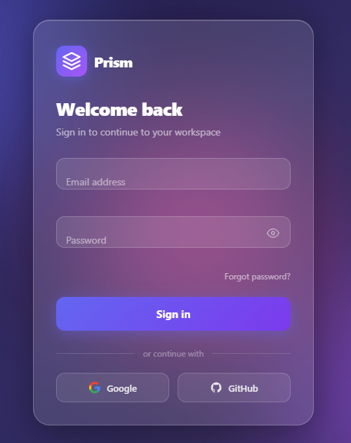
Glassmorphism is the UI trend that gives elements the appearance of frosted glass — a translucent surface with blurred content visible behind it. It became the defining aesthetic of macOS Big Sur and has since spread across web dashboards, authentication screens, and marketing pages. Achieving the effect correctly requires three specific CSS properties working in concert, plus a carefully designed background scene to blur.
This snippet builds a complete glassmorphism login form with animated background blobs, real-time form validation, a password strength-aware eye toggle, social login buttons, and a 3D card flip animation that reveals a success state on submit.
The Glassmorphism Effect
Three CSS properties produce the frosted glass appearance:
`backdrop-filter: blur(16px)` blurs all content rendered behind the element. This is the core glassmorphism technique. The blur radius (16px here) controls how frosted the glass looks — higher values are more opaque-feeling, lower values more transparent.
`background: rgba(255, 255, 255, 0.12)` applies a semi-transparent white tint over the blurred background. Without this, the element would be invisible. The alpha value (0.12) controls transparency — lower = more see-through, higher = more opaque.
`border: 1px solid rgba(255, 255, 255, 0.25)` adds a bright edge that simulates the light catching the glass edge. This border is what makes glassmorphism look three-dimensional rather than flat.
Critically, these three properties only produce the intended effect when there is rich, colorful content behind the element to blur. That is why glassmorphism UIs always pair the glass card with a vibrant gradient background or animated elements.
Animated Background Blobs
The animated color blobs behind the login card are <div class="blob"> elements positioned with position: absolute in a full-screen scene container. Each blob uses a CSS @keyframes animation that morphs its border-radius between different asymmetric values and translates it along a looping path.
The blob shapes use border-radius values like 60% 40% 30% 70% / 60% 30% 70% 40% — the slash syntax sets per-corner radii independently for horizontal and vertical radii, producing organic blob shapes rather than circles or pills. The animation uses 8-second and 12-second durations with alternate direction to create non-repeating blob movements that never feel mechanical.
Form Validation
Validation fires on blur (when the user leaves a field) and on submit. For the email field: /^[^\s@]+@[^\s@]+\.[^\s@]+$/.test(value) — a minimal but effective email regex that checks for at-sign and dot without complex backtracking. For the password field: value.length >= 8 — a minimum length check only, appropriate for a login form (password strength is for registration, not login).
Errors display as red text in a <span class="field-error"> element beneath each field. On error: the field wrapper gets a has-error class (red border and background tint), the error span becomes visible, and the field shakes via a CSS keyframe animation (translateX oscillating ±4px, 300ms). On correction: the has-error class is removed and the error span clears.
Password Eye Toggle
The eye button toggles passInput.type between password and text. The icon swaps between two SVG paths: the open eye (circle with surrounding arc) and the eye-off (same paths with a diagonal slash line). SVG path data is stored in two constants (SVG_EYE, SVG_EYE_OFF) and swapped via eyeIcon.innerHTML. This avoids external icon fonts and keeps the toggle entirely self-contained.
3D Card Flip on Success
On successful form submission, the login card performs a 3D flip animation to reveal a success state. This uses transform-style: preserve-3d on the card container, with the login panel at rotateY(0deg) (front face) and the success panel at rotateY(180deg) (back face, visible only when flipped). Both panels have backface-visibility: hidden — each becomes invisible when rotated more than 90° away from the viewer.
The flip is triggered by adding a flipped class to the card element: .card.flipped { transform: rotateY(180deg); } with transition: transform 0.7s cubic-bezier(0.4, 0, 0.2, 1). The transition produces a smooth, physics-feel rotation. The CSS perspective: 1000px on the parent scene element creates the 3D depth that makes the rotation look three-dimensional rather than flat.
Loading State During Submission
The submit button has three states: idle (Sign In), loading (spinner + Signing in…), and success (handled by the flip). The loading state is triggered by calling setLoading(true) — which adds loading class, disables the button, and sets aria-busy="true". A CSS keyframe rotates a spinner SVG. setTimeout simulates the API response delay before triggering the success flip. In production, replace the timeout with your actual authentication API call.
Social Login Buttons
Google, GitHub, and email buttons are cosmetic in the demo — they fire click events that in production would redirect to OAuth provider URLs or trigger window.location.href redirects. Each button has the provider's brand icon as an inline SVG and a text label. The divider between social and email login uses the classic "OR" text with CSS borders: ::before and ::after pseudo-elements with flex: 1; height: 1px; background: rgba(255,255,255,0.2).
Build with AI
Build, Understand, Optimize, and Extend It With AI
Rather than tracing the flip and validation logic yourself, paste this snippet's HTML, CSS, and JS into an AI coding assistant like Claude and ask it to explain precisely how the card-front and card-success panels use transform-style: preserve-3d with backface-visibility: hidden to stay a single flat card until the flipped class rotates the whole thing 180 degrees on rotateY, and why the shake animation needs the void card.offsetWidth reflow trick to restart reliably on repeated failed submits. It's also worth asking it to optimize the form, for example whether the three floating blob animations are worth pausing when the tab is backgrounded, or whether the email regex is too permissive for production. For extending it, ask for a real fetch-based auth call replacing the setTimeout, a "remember me" checkbox, or a password-strength meter reused from the sign-up variant. Treat the code less like a finished artifact and more like a starting point for a conversation.
Prompt to recreate it
Copy this into your AI assistant of choice to build the effect from scratch, or as a jumping-off point for your own variant:
Build a glassmorphism login form in plain HTML, CSS, and JavaScript using CSS 3D transforms for a flip-on-success card, with no external libraries.

Requirements:
- An animated background of at least three large blurred circular blobs, each positioned absolutely and animated independently with CSS keyframes moving translate and scale values on staggered, differing durations so their motion never synchronizes.
- A login card using backdrop-filter: blur with a semi-transparent white background and a translucent border for a genuine frosted-glass look, including the -webkit-backdrop-filter prefix.
- Two stacked panels inside the card, a front login panel and a back success panel, both with backface-visibility: hidden, inside a card container with transform-style: preserve-3d; toggling a single flipped class on the card must rotate it 180 degrees on the Y axis to reveal the success panel, driven purely by a CSS transition, with a perspective value set on the parent so the rotation reads as genuinely three-dimensional.
- Email and password fields using the floating-label pattern purely in CSS, where the label sits over the placeholder text and animates to a small label above the field when the input is focused or has a value, using the :not(:placeholder-shown) and :focus pseudo-classes with no JavaScript needed for the label motion.
- A password visibility toggle button that switches the input's type attribute between password and text and swaps between two inline SVG icon states.
- Client-side validation on submit that checks for a valid email pattern and a minimum password length, applying an error class and message per invalid field, and shaking the whole card via a CSS keyframe animation when validation fails, restarting the animation correctly even on consecutive failures.
- A loading state on submit that disables the button, swaps its label for a spinner, and after a simulated delay flips the card to the success panel.
Want to tighten it up first? Run this prompt through the AI Prompt Studio to score it across 8 quality dimensions, catch anti-patterns, and tune the wording for Claude, ChatGPT, or Gemini before you paste it in.
Source Code
<div class="scene">
  <!-- Animated blobs -->
  <div class="blob blob-1"></div>
  <div class="blob blob-2"></div>
  <div class="blob blob-3"></div>

  <!-- Login card -->
  <div class="card" id="card">

    <!-- Default panel -->
    <div class="card-front" id="card-front">
      <div class="logo-area">
        <div class="logo-icon">
          <svg width="28" height="28" viewBox="0 0 24 24" fill="none" stroke="currentColor" stroke-width="2" stroke-linecap="round" stroke-linejoin="round">
            <path d="M12 2L2 7l10 5 10-5-10-5z"/>
            <path d="M2 17l10 5 10-5"/>
            <path d="M2 12l10 5 10-5"/>
          </svg>
        </div>
        <span class="logo-name">Prism</span>
      </div>

      <h1 class="heading">Welcome back</h1>
      <p class="subheading">Sign in to continue to your workspace</p>

      <form class="form" id="login-form" novalidate>
        <!-- Email field -->
        <div class="field" id="field-email">
          <input type="email" id="email" placeholder=" " autocomplete="email" />
          <label for="email">Email address</label>
          <span class="field-error" id="error-email"></span>
        </div>

        <!-- Password field -->
        <div class="field" id="field-password">
          <input type="password" id="password" placeholder=" " autocomplete="current-password" />
          <label for="password">Password</label>
          <button type="button" class="eye-btn" id="eye-btn" aria-label="Toggle password visibility">
            <svg class="eye-icon" id="eye-icon" width="18" height="18" viewBox="0 0 24 24" fill="none" stroke="currentColor" stroke-width="2" stroke-linecap="round" stroke-linejoin="round">
              <path d="M1 12s4-8 11-8 11 8 11 8-4 8-11 8-11-8-11-8z"/>
              <circle cx="12" cy="12" r="3"/>
            </svg>
          </button>
          <span class="field-error" id="error-password"></span>
        </div>

        <div class="form-meta">
          <a href="#" class="forgot-link">Forgot password?</a>
        </div>

        <button type="submit" class="submit-btn" id="submit-btn">
          <span class="btn-text">Sign in</span>
          <span class="btn-spinner" id="btn-spinner" aria-hidden="true"></span>
        </button>
      </form>

      <div class="divider">
        <span>or continue with</span>
      </div>

      <div class="social-row">
        <button type="button" class="social-btn" id="btn-google">
          <svg width="18" height="18" viewBox="0 0 24 24" fill="none">
            <path d="M22.56 12.25c0-.78-.07-1.53-.2-2.25H12v4.26h5.92c-.26 1.37-1.04 2.53-2.21 3.31v2.77h3.57c2.08-1.92 3.28-4.74 3.28-8.09z" fill="#4285F4"/>
            <path d="M12 23c2.97 0 5.46-.98 7.28-2.66l-3.57-2.77c-.98.66-2.23 1.06-3.71 1.06-2.86 0-5.29-1.93-6.16-4.53H2.18v2.84C3.99 20.53 7.7 23 12 23z" fill="#34A853"/>
            <path d="M5.84 14.09c-.22-.66-.35-1.36-.35-2.09s.13-1.43.35-2.09V7.07H2.18C1.43 8.55 1 10.22 1 12s.43 3.45 1.18 4.93l3.66-2.84z" fill="#FBBC05"/>
            <path d="M12 5.38c1.62 0 3.06.56 4.21 1.64l3.15-3.15C17.45 2.09 14.97 1 12 1 7.7 1 3.99 3.47 2.18 7.07l3.66 2.84c.87-2.6 3.3-4.53 6.16-4.53z" fill="#EA4335"/>
          </svg>
          Google
        </button>
        <button type="button" class="social-btn" id="btn-github">
          <svg width="18" height="18" viewBox="0 0 24 24" fill="currentColor">
            <path d="M12 2C6.477 2 2 6.477 2 12c0 4.42 2.865 8.166 6.839 9.489.5.092.682-.217.682-.483 0-.237-.008-.868-.013-1.703-2.782.605-3.369-1.343-3.369-1.343-.454-1.158-1.11-1.466-1.11-1.466-.908-.62.069-.608.069-.608 1.003.07 1.531 1.032 1.531 1.032.892 1.53 2.341 1.088 2.91.832.092-.647.35-1.088.636-1.338-2.22-.253-4.555-1.113-4.555-4.951 0-1.093.39-1.988 1.029-2.688-.103-.253-.446-1.272.098-2.65 0 0 .84-.27 2.75 1.026A9.564 9.564 0 0112 6.844c.85.004 1.705.115 2.504.337 1.909-1.296 2.747-1.027 2.747-1.027.546 1.379.202 2.398.1 2.651.64.7 1.028 1.595 1.028 2.688 0 3.848-2.339 4.695-4.566 4.943.359.309.678.92.678 1.855 0 1.338-.012 2.419-.012 2.747 0 .268.18.58.688.482A10.019 10.019 0 0022 12c0-5.523-4.477-10-10-10z"/>
          </svg>
          GitHub
        </button>
      </div>
    </div>

    <!-- Success panel -->
    <div class="card-success" id="card-success">
      <div class="success-icon">
        <svg width="40" height="40" viewBox="0 0 24 24" fill="none" stroke="currentColor" stroke-width="2.5" stroke-linecap="round" stroke-linejoin="round">
          <polyline points="20 6 9 17 4 12"/>
        </svg>
      </div>
      <h2 class="success-heading">Welcome back, Alex!</h2>
      <p class="success-sub">You've signed in successfully. Redirecting you to your dashboard…</p>
      <button type="button" class="reset-btn" id="reset-btn">Try again</button>
    </div>

  </div>
</div>*, *::before, *::after { box-sizing: border-box; margin: 0; padding: 0; }
body {
font-family: system-ui, -apple-system, sans-serif;
min-height: 100vh;
display: flex;
align-items: center;
justify-content: center;
background: #0f0c29;
overflow: hidden;
}
/* ─── Blob background ─── */
.scene {
position: relative;
width: 100%;
min-height: 100vh;
display: flex;
align-items: center;
justify-content: center;
background: linear-gradient(135deg, #0f0c29 0%, #302b63 50%, #24243e 100%);
overflow: hidden;
padding: 24px;
perspective: 1200px;
}
.blob {
position: absolute;
border-radius: 50%;
filter: blur(80px);
opacity: 0.55;
will-change: transform;
}
.blob-1 {
width: 420px;
height: 420px;
background: #6366f1;
top: -100px;
left: -80px;
animation: blobFloat1 14s ease-in-out infinite;
}
.blob-2 {
width: 360px;
height: 360px;
background: #a855f7;
bottom: -80px;
right: -60px;
animation: blobFloat2 17s ease-in-out infinite;
}
.blob-3 {
width: 300px;
height: 300px;
background: #ec4899;
top: 50%;
left: 55%;
transform: translate(-50%, -50%);
animation: blobFloat3 20s ease-in-out infinite;
}
@keyframes blobFloat1 {
0%, 100% { transform: translate(0, 0) scale(1); }
33% { transform: translate(40px, 30px) scale(1.08); }
66% { transform: translate(-20px, 50px) scale(0.95); }
}
@keyframes blobFloat2 {
0%, 100% { transform: translate(0, 0) scale(1); }
40% { transform: translate(-50px, -35px) scale(1.1); }
70% { transform: translate(30px, -20px) scale(0.93); }
}
@keyframes blobFloat3 {
0%, 100% { transform: translate(-50%, -50%) scale(1); }
30% { transform: translate(-55%, -45%) scale(1.12); }
65% { transform: translate(-44%, -54%) scale(0.92); }
}
/* ─── Glass card ─── */
.card {
position: relative;
width: 100%;
max-width: 400px;
transform-style: preserve-3d;
transition: transform 0.7s cubic-bezier(0.4, 0, 0.2, 1);
z-index: 1;
}
.card.flipped {
transform: rotateY(180deg);
}
.card.shake {
animation: shakeCard 0.45s cubic-bezier(.36,.07,.19,.97);
}
@keyframes shakeCard {
0%, 100% { transform: translateX(0); }
15% { transform: translateX(-8px); }
30% { transform: translateX(7px); }
45% { transform: translateX(-6px); }
60% { transform: translateX(5px); }
75% { transform: translateX(-3px); }
90% { transform: translateX(2px); }
}
/* ─── Card front ─── */
.card-front {
padding: 36px 32px 32px;
background: rgba(255, 255, 255, 0.12);
backdrop-filter: blur(20px);
-webkit-backdrop-filter: blur(20px);
border: 1px solid rgba(255, 255, 255, 0.22);
border-radius: 24px;
box-shadow: 0 8px 48px rgba(0, 0, 0, 0.35), inset 0 1px 0 rgba(255,255,255,0.18);
overflow: hidden;
backface-visibility: hidden;
-webkit-backface-visibility: hidden;
}
/* ─── Logo ─── */
.logo-area {
display: flex;
align-items: center;
gap: 10px;
margin-bottom: 28px;
}
.logo-icon {
width: 44px;
height: 44px;
border-radius: 12px;
background: linear-gradient(135deg, #6366f1, #a855f7);
display: flex;
align-items: center;
justify-content: center;
color: #fff;
flex-shrink: 0;
box-shadow: 0 4px 16px rgba(99,102,241,0.45);
}
.logo-name {
font-size: 20px;
font-weight: 800;
color: #fff;
letter-spacing: -0.02em;
}
/* ─── Headings ─── */
.heading {
font-size: 26px;
font-weight: 800;
color: #fff;
letter-spacing: -0.02em;
margin-bottom: 6px;
}
.subheading {
font-size: 14px;
color: rgba(255,255,255,0.58);
margin-bottom: 28px;
}
/* ─── Form ─── */
.form {
display: flex;
flex-direction: column;
gap: 18px;
}
/* ─── Floating label field ─── */
.field {
position: relative;
}
.field input {
width: 100%;
padding: 18px 14px 6px;
font-size: 14px;
font-family: inherit;
background: rgba(255, 255, 255, 0.1);
border: 1.5px solid rgba(255, 255, 255, 0.2);
border-radius: 12px;
color: #fff;
outline: none;
transition: border-color 0.18s, background 0.18s;
}
.field input::placeholder { color: transparent; }
.field input:focus {
border-color: rgba(99,102,241,0.8);
background: rgba(255,255,255,0.14);
}
.field.error input {
border-color: rgba(239,68,68,0.8) !important;
}
.field label {
position: absolute;
left: 14px;
top: 50%;
transform: translateY(-50%);
font-size: 14px;
color: rgba(255,255,255,0.5);
pointer-events: none;
transition: all 0.18s;
background: transparent;
}
.field input:not(:placeholder-shown) ~ label,
.field input:focus ~ label {
top: 8px;
transform: translateY(0);
font-size: 10px;
font-weight: 600;
color: rgba(99,102,241,0.95);
letter-spacing: 0.04em;
text-transform: uppercase;
}
.field.error label {
color: rgba(239,68,68,0.9) !important;
}
/* Password field has padding-right for eye button */
#field-password input {
padding-right: 44px;
}
/* ─── Eye button ─── */
.eye-btn {
position: absolute;
right: 12px;
top: 50%;
transform: translateY(-50%);
background: none;
border: none;
cursor: pointer;
color: rgba(255,255,255,0.5);
padding: 4px;
display: flex;
align-items: center;
justify-content: center;
transition: color 0.15s;
margin-top: -9px;
}
.eye-btn:hover { color: rgba(255,255,255,0.9); }
/* ─── Field error message ─── */
.field-error {
display: block;
font-size: 11px;
color: #f87171;
min-height: 16px;
margin-top: 4px;
padding-left: 2px;
transition: opacity 0.15s;
}
/* ─── Form meta row ─── */
.form-meta {
display: flex;
justify-content: flex-end;
margin-top: -6px;
}
.forgot-link {
font-size: 12px;
color: rgba(255,255,255,0.55);
text-decoration: none;
transition: color 0.15s;
}
.forgot-link:hover { color: #fff; }
/* ─── Submit button ─── */
.submit-btn {
width: 100%;
padding: 14px;
background: linear-gradient(135deg, #6366f1, #7c3aed);
color: #fff;
border: none;
border-radius: 12px;
font-size: 15px;
font-weight: 700;
font-family: inherit;
cursor: pointer;
display: flex;
align-items: center;
justify-content: center;
gap: 10px;
transition: opacity 0.18s, transform 0.18s, box-shadow 0.18s;
box-shadow: 0 4px 20px rgba(99,102,241,0.45);
margin-top: 4px;
position: relative;
overflow: hidden;
}
.submit-btn:hover:not(:disabled) {
opacity: 0.92;
transform: translateY(-1px);
box-shadow: 0 6px 28px rgba(99,102,241,0.55);
}
.submit-btn:active:not(:disabled) {
transform: translateY(0);
}
.submit-btn:disabled {
cursor: not-allowed;
opacity: 0.75;
}
.submit-btn.loading .btn-text { opacity: 0; }
.submit-btn.loading .btn-spinner { opacity: 1; }
.btn-text { transition: opacity 0.15s; }
.btn-spinner {
width: 18px;
height: 18px;
border: 2.5px solid rgba(255,255,255,0.35);
border-top-color: #fff;
border-radius: 50%;
position: absolute;
animation: spin 0.7s linear infinite;
opacity: 0;
transition: opacity 0.15s;
}
@keyframes spin {
to { transform: rotate(360deg); }
}
/* ─── Divider ─── */
.divider {
display: flex;
align-items: center;
gap: 12px;
margin: 24px 0 20px;
color: rgba(255,255,255,0.35);
font-size: 12px;
}
.divider::before,
.divider::after {
content: '';
flex: 1;
height: 1px;
background: rgba(255,255,255,0.15);
}
/* ─── Social buttons ─── */
.social-row {
display: flex;
gap: 12px;
}
.social-btn {
flex: 1;
display: flex;
align-items: center;
justify-content: center;
gap: 8px;
padding: 11px 14px;
background: rgba(255,255,255,0.08);
border: 1px solid rgba(255,255,255,0.18);
border-radius: 12px;
color: rgba(255,255,255,0.85);
font-size: 13px;
font-weight: 600;
font-family: inherit;
cursor: pointer;
transition: background 0.15s, border-color 0.15s, transform 0.15s;
}
.social-btn:hover {
background: rgba(255,255,255,0.15);
border-color: rgba(255,255,255,0.3);
transform: translateY(-1px);
}
/* ─── Success panel ─── */
.card-success {
position: absolute;
top: 0; left: 0; right: 0; bottom: 0;
padding: 48px 32px 40px;
display: flex;
flex-direction: column;
align-items: center;
justify-content: center;
text-align: center;
background: rgba(255, 255, 255, 0.12);
backdrop-filter: blur(20px);
-webkit-backdrop-filter: blur(20px);
border: 1px solid rgba(255, 255, 255, 0.22);
border-radius: 24px;
box-shadow: 0 8px 48px rgba(0, 0, 0, 0.35), inset 0 1px 0 rgba(255,255,255,0.18);
overflow: hidden;
backface-visibility: hidden;
-webkit-backface-visibility: hidden;
transform: rotateY(180deg);
pointer-events: none;
}
.card.flipped .card-success {
pointer-events: auto;
}
.card.flipped .card-front {
pointer-events: none;
}
.success-icon {
width: 72px;
height: 72px;
border-radius: 50%;
background: linear-gradient(135deg, #10b981, #059669);
display: flex;
align-items: center;
justify-content: center;
color: #fff;
margin-bottom: 20px;
box-shadow: 0 4px 24px rgba(16,185,129,0.45);
animation: successPop 0.4s cubic-bezier(0.34,1.56,0.64,1) 0.2s both;
}
@keyframes successPop {
from { transform: scale(0.5); opacity: 0; }
to { transform: scale(1); opacity: 1; }
}
.success-heading {
font-size: 22px;
font-weight: 800;
color: #fff;
letter-spacing: -0.02em;
margin-bottom: 10px;
}
.success-sub {
font-size: 14px;
color: rgba(255,255,255,0.58);
line-height: 1.65;
margin-bottom: 28px;
max-width: 280px;
}
.reset-btn {
padding: 10px 24px;
background: rgba(255,255,255,0.1);
border: 1px solid rgba(255,255,255,0.2);
border-radius: 10px;
color: rgba(255,255,255,0.8);
font-size: 13px;
font-weight: 600;
font-family: inherit;
cursor: pointer;
transition: background 0.15s, color 0.15s;
}
.reset-btn:hover {
background: rgba(255,255,255,0.18);
color: #fff;
}(function () {
const form = document.getElementById('login-form');
const emailInput = document.getElementById('email');
const passInput = document.getElementById('password');
const fieldEmail = document.getElementById('field-email');
const fieldPass = document.getElementById('field-password');
const errEmail = document.getElementById('error-email');
const errPass = document.getElementById('error-password');
const submitBtn = document.getElementById('submit-btn');
const eyeBtn = document.getElementById('eye-btn');
const eyeIcon = document.getElementById('eye-icon');
const card = document.getElementById('card');
const cardFront = document.getElementById('card-front');
const cardSuccess = document.getElementById('card-success');
const resetBtn = document.getElementById('reset-btn');
// ── SVG paths for eye / eye-off ──────────────────────────────────────────
const SVG_EYE = `
<path d="M1 12s4-8 11-8 11 8 11 8-4 8-11 8-11-8-11-8z"/>
<circle cx="12" cy="12" r="3"/>
`;
const SVG_EYE_OFF = `
<path d="M17.94 17.94A10.07 10.07 0 0 1 12 20c-7 0-11-8-11-8a18.45 18.45 0 0 1 5.06-5.94"/>
<path d="M9.9 4.24A9.12 9.12 0 0 1 12 4c7 0 11 8 11 8a18.5 18.5 0 0 1-2.16 3.19"/>
<line x1="1" y1="1" x2="23" y2="23"/>
`;
// ── Password visibility toggle ───────────────────────────────────────────
eyeBtn.addEventListener('click', function () {
const isPassword = passInput.type === 'password';
passInput.type = isPassword ? 'text' : 'password';
eyeIcon.innerHTML = isPassword ? SVG_EYE_OFF : SVG_EYE;
});
// ── Validation helpers ───────────────────────────────────────────────────
function isValidEmail(val) {
return /^[^\s@]+@[^\s@]+\.[^\s@]+$/.test(val.trim());
}
function setError(field, errEl, msg) {
field.classList.add('error');
errEl.textContent = msg;
}
function clearError(field, errEl) {
field.classList.remove('error');
errEl.textContent = '';
}
function validateAll() {
let valid = true;
const emailVal = emailInput.value.trim();
if (!emailVal) {
setError(fieldEmail, errEmail, 'Email is required.');
valid = false;
} else if (!isValidEmail(emailVal)) {
setError(fieldEmail, errEmail, 'Please enter a valid email address.');
valid = false;
} else {
clearError(fieldEmail, errEmail);
}
const passVal = passInput.value;
if (!passVal) {
setError(fieldPass, errPass, 'Password is required.');
valid = false;
} else if (passVal.length < 6) {
setError(fieldPass, errPass, 'Password must be at least 6 characters.');
valid = false;
} else {
clearError(fieldPass, errPass);
}
return valid;
}
// Clear error on input
emailInput.addEventListener('input', function () { clearError(fieldEmail, errEmail); });
passInput.addEventListener('input', function () { clearError(fieldPass, errPass); });
// ── Form submit ──────────────────────────────────────────────────────────
form.addEventListener('submit', function (e) {
e.preventDefault();
if (!validateAll()) {
// Shake card on validation failure
card.classList.remove('shake');
void card.offsetWidth; // reflow to restart animation
card.classList.add('shake');
card.addEventListener('animationend', function handler() {
card.classList.remove('shake');
card.removeEventListener('animationend', handler);
});
return;
}
// Loading state
setLoading(true);
// Simulate async authentication (1.5s)
setTimeout(showSuccess, 1500);
});
// ── Loading state ────────────────────────────────────────────────────────
function setLoading(on) {
submitBtn.disabled = on;
submitBtn.classList.toggle('loading', on);
submitBtn.setAttribute('aria-busy', String(on));
}
// ── Success transition ───────────────────────────────────────────────────
function showSuccess() {
setLoading(false);
card.classList.add('flipped');
}
function resetForm() {
card.classList.remove('flipped');
emailInput.value = '';
passInput.value = '';
passInput.type = 'password';
eyeIcon.innerHTML = SVG_EYE;
clearError(fieldEmail, errEmail);
clearError(fieldPass, errPass);
}
resetBtn.addEventListener('click', resetForm);
// ── Social buttons (cosmetic) ────────────────────────────────────────────
document.getElementById('btn-google').addEventListener('click', function () {
// No-op in demo — wire to your OAuth flow
});
document.getElementById('btn-github').addEventListener('click', function () {
// No-op in demo — wire to your OAuth flow
});
})();Step by step
How to Use
- 1See the glassmorphism cardThe login card renders over three animated color blobs. The frosted glass effect is visible — the blobs show through the card as blurred color.
- 2Try form validationClick in the email field and leave it empty, then tab out. The field turns red with an error message and a shake animation. Enter an invalid email for the same effect.
- 3Toggle the passwordClick the eye icon in the password field to reveal or hide the password text. The icon swaps between the open and closed eye SVG.
- 4Submit the formEnter any email and a password of 8+ characters, then click Sign In. The button shows a loading spinner, then the card flips to reveal the success state.
- 5Connect to your auth backendIn the submit handler, replace the setTimeout simulation with a fetch() POST to your login endpoint. On success: call flipToSuccess(). On failure: set a general error message and re-enable the submit button.
- 6Adjust the glass effectModify backdrop-filter blur amount (16px), background alpha (0.12), and border alpha (0.25) in the CSS to tune the frosted glass appearance. Higher blur = more frosted, higher alpha = more opaque.
Real-world uses
Common Use Cases
Got questions?
Frequently Asked Questions
backdrop-filter: blur() blurs the content rendered behind the element. On a plain solid-color background, blurring a flat color produces the same flat color — there is nothing to blur. Glassmorphism requires rich, colorful, or varied content behind the card: a gradient, a photo, the animated color blobs in this snippet, or other UI elements showing through. The effect is only visible when there are visible color variations behind the card.
The card container has transform-style: preserve-3d and transition: transform 0.7s. The front panel has no transform. The back panel has transform: rotateY(180deg) applied permanently — it starts already flipped. Both panels have backface-visibility: hidden, which makes each panel invisible when rotated more than 90° from the viewer. Adding class="flipped" to the card applies transform: rotateY(180deg), bringing the back face forward and hiding the front face. The parent has perspective: 1000px for the 3D depth effect.
In the form submit handler, replace the setTimeout with: try { const res = await fetch("/api/login", { method: "POST", headers: { "Content-Type": "application/json" }, body: JSON.stringify({ email, password }) }); if (res.ok) { flipToSuccess(); } else { const err = await res.json(); showError(err.message); } } catch { showError("Network error. Try again."); }. The flipToSuccess() function adds the .flipped class to the card element. The showError() function sets a general error message and re-enables the submit button.
Add a strength meter div below the password field. In the password input's input event handler, run four regex tests: minimum 8 chars, uppercase letter, digit, special character. Score 0–4 based on how many pass. Map the score to a width percentage and color: red (0–1), orange (2), yellow (3), green (4). Update the strength bar width and label text on each keystroke. This is the same technique used in the password strength snippet.
Each blob has a CSS animation with a duration and keyframe path. Increase the animation duration (e.g., from 8s to 16s) for slower, more subtle movement. Decrease for faster. Change the translateX and translateY values in the @keyframes to control the movement range. Change border-radius values in the keyframes for different blob shape morphing. Each blob has its own animation-delay so they move independently — stagger the delays for less synchronization.
Yes. Click JSX for React, Vue for a Vue 3 SFC, Angular for a standalone component, or Tailwind for utility classes — backdrop-blur, bg-white/15, and border-white/30 map directly to Tailwind. Wire the form submit to your auth API and keep input values in controlled state.