More Layouts Snippets
Front-End Coding Playgrounds
Learn to code with interactive, live-preview playgrounds — HTML, CSS, JavaScript, React & more.
 HTML Playground42 lessons · Click-based · Live preview
 CSS PlaygroundLearn CSS with a live editor
 JavaScript Playground60 lessons · DOM · Async · Canvas
 React PlaygroundLearn React with a live code editor
 GSAP PlaygroundLearn GSAP animation interactively
 SVG Playground44 lessons · shapes · paths · animation
 SCSS Playground45 lessons · Sass modules · tokens
 Tailwind PlaygroundLearn Tailwind CSS with a live editor
 Bootstrap 5 Playground50 lessons · live preview
Holy Grail Layout — CSS Grid Header Nav Aside Footer
Holy Grail Layout · Layouts · Plain HTML, CSS & JS · Live preview
What's included
Features
About this UI Snippet
Holy Grail Layout — Header, Footer, Two Sidebars & a Fluid Centre in CSS Grid
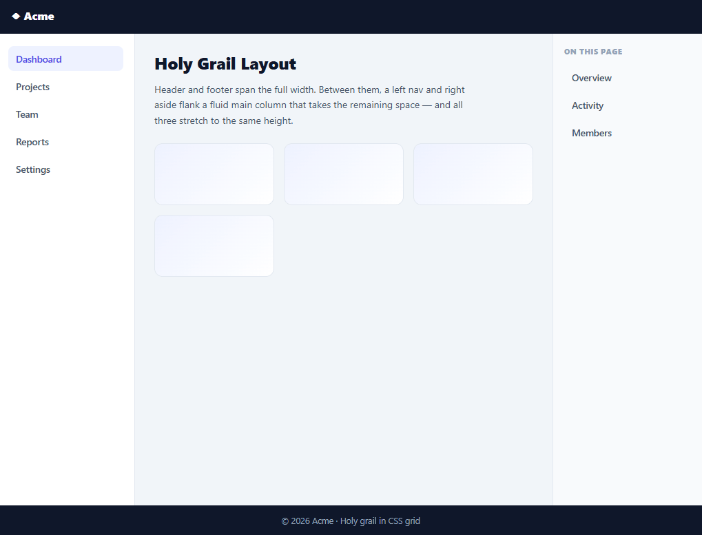
The "holy grail" layout — a full-width header and footer with three columns between them (a fixed-width left nav, a fluid main content area, and a fixed-width right aside, all equal height) — was famously hard in the float era. With CSS grid it's a handful of lines. This snippet builds the complete, responsive holy-grail layout in plain HTML and CSS, with a small bit of JavaScript only for the mobile nav toggle, and no library.
The page as a three-row grid
The outer container is a grid with grid-template-rows: auto 1fr auto — the header and footer size to their content while the middle row expands to fill the viewport, which is what pins the footer to the bottom on short pages (a "sticky footer" for free). min-height: 100vh ensures the layout always fills the screen. This row structure is the skeleton every app shell shares.
The grail row in one line
The middle row is itself a grid: grid-template-columns: 200px 1fr 220px. That single declaration is the entire trick the float era struggled with — fixed-fluid-fixed columns that the browser sizes automatically, with all three stretching to the same height because grid items fill their row by default. No clearfix, no negative margins, no source-order gymnastics: the nav, main, and aside appear in natural reading order in the HTML and the grid places them correctly.
Responsive collapse in two steps
The layout degrades gracefully at two breakpoints. On tablets the right aside drops below the main content by spanning the full grid width (grid-column: 1 / -1) and laying its links out in a row — keeping the nav and main side by side where there's still room. On phones the columns collapse to a single column and the nav becomes an off-canvas drawer behind a hamburger, sliding in with a transform. This two-stage approach reflows for the space available rather than forcing one mobile layout everywhere.
Accessible, progressive mobile nav
The hamburger is a real button with aria-expanded that toggles as the drawer opens and closes, and choosing any nav link auto-closes the drawer — the expected behaviour on mobile. Crucially, the nav is part of the normal layout on desktop and only becomes a drawer at the small breakpoint, so there's no JavaScript dependency for the layout itself: the JS does nothing but toggle a class on small screens.
A reference app shell
Because it's the canonical structure behind dashboards, docs sites, and admin panels, this layout is a drop-in starting shell — fill the main with your content and wire the nav to your routes. It's also the clearest possible demonstration of why CSS grid replaced the float-and-clear contortions that made this layout a "holy grail" in the first place.
Build with AI
Build, Understand, Optimize, and Extend It With AI
You don't have to work through the grid cascade in your head. Paste this snippet's HTML and CSS into an AI coding assistant like Claude and ask it to explain exactly how grid-template-rows: auto 1fr auto pins the footer to the bottom on short pages, or why the three body columns end up equal height without any explicit height rule on the nav or aside. The same assistant is useful for optimizing it — ask whether the two separate media query breakpoints (860px and 560px) could be consolidated or whether a container query would be more appropriate for a layout that gets reused inside variable-width parents. It's just as handy for extending the shell: ask it to add a collapsible (not just off-canvas) desktop sidebar that toggles between 200px and a slim icon-only width, persist the collapsed state in localStorage, or add a breadcrumb row between the header and main content. Treat the code less like a finished artifact and more like a starting point for a conversation.
Prompt to recreate it
Copy this into your AI assistant of choice to build the effect from scratch, or as a jumping-off point for your own variant:
Build the classic "holy grail" page layout in plain HTML and CSS using CSS Grid only — no floats, no flexbox for the outer structure, minimal JavaScript.

Requirements:
- An outer page container that is a CSS grid with three rows: an auto-sized header, a flexible middle row that consumes all remaining vertical space, and an auto-sized footer, combined with a full-viewport minimum height so the footer sticks to the bottom of the viewport on short pages without any absolute positioning.
- The middle row must itself be a CSS grid with three columns: a fixed-width left navigation, a flexible fluid main content column, and a fixed-width right aside — all three elements must stretch to equal height automatically via the grid's default item stretching, with no explicit height set on any of them.
- The nav, main, and aside must appear in that natural reading order in the HTML source (no visual reordering via CSS that would break source order for assistive tech).
- At a tablet-width breakpoint, make the aside span the full grid width and drop below the main content while the nav and main remain side by side.
- At a phone-width breakpoint, collapse the grid to a single column, turn the left nav into an off-canvas drawer that is hidden via a CSS transform translateX and slides into view when an "open" class is toggled, and show a hamburger button that only appears at this breakpoint.
- The hamburger button must be a real button element with an aria-expanded attribute that JavaScript updates to true/false when toggling the drawer, and clicking any link inside the drawer must close it again.
- Ensure the desktop and tablet layouts require zero JavaScript — only the phone-width drawer toggle should depend on the script.
Step by step
How to Use
- 1Paste HTML, CSS, and JSA full holy-grail layout renders: header, left nav, main, right aside, and footer.
- 2Resize the windowAt tablet width the aside drops below main; at phone width the nav becomes a hamburger drawer.
- 3Open the mobile navOn a narrow screen, tap the hamburger to slide in the nav; picking a link closes it.
- 4Fill in your contentReplace the main column's placeholder content and wire the nav links to your routes.
- 5Adjust column widthsChange the 200px / 1fr / 220px grid-template-columns to fit your nav and aside.
- 6Tune the breakpointsEdit the 860px and 560px media queries to match your design's reflow points.
Real-world uses
Common Use Cases
Got questions?
Frequently Asked Questions
For years it was the hard-to-achieve ideal: a header and footer spanning full width, with a fixed left sidebar, a fluid centre, and a fixed right sidebar between them — all equal height, with the content in natural source order for accessibility. Floats and tables could only approximate it with hacks. CSS grid makes it trivial, which is why it's the canonical "look how much grid simplified things" example.
The page container is a grid with grid-template-rows: auto 1fr auto and min-height: 100vh. The header and footer rows size to their content (auto), while the middle row takes all remaining space (1fr). On a short page the 1fr row stretches to fill the viewport, pushing the footer to the bottom; on a long page everything grows naturally. No JavaScript or absolute positioning needed.
Grid items stretch to fill their grid area by default (align-items defaults to stretch). Because the nav, main, and aside all sit in the same grid row, they each fill that row's full height automatically — so the sidebars match the main column's height regardless of which has the most content. This was the single hardest part to achieve with floats.
No — the layout is pure CSS grid. JavaScript is used only to toggle the off-canvas nav drawer on phone-width screens (open/close a class and update aria-expanded). On tablet and desktop the nav is part of the grid and the JS does nothing, so the core layout works even with scripts disabled.
Wrap it as a layout component with slots/children for header, nav, main, aside, and footer; in React put it in a layout component (or Next.js layout.tsx), in Vue use <slot>s, in Angular use <ng-content>. The grid CSS is framework-agnostic — only the mobile-drawer open state moves into component state with a class binding.