

Learn Coding Visually
Learn to code with interactive, live-preview playgrounds — HTML, CSS, JavaScript, React & more.
 HTML Playground42 lessons · Click-based · Live preview
 CSS PlaygroundLearn CSS with a live editor
 JavaScript Playground60 lessons · DOM · Async · Canvas
 React PlaygroundLearn React with a live code editor
 GSAP PlaygroundLearn GSAP animation interactively
 SVG Playground44 lessons · shapes · paths · animation
 SCSS Playground45 lessons · Sass modules · tokens
 Tailwind PlaygroundLearn Tailwind CSS with a live editor
 Bootstrap 5 Playground50 lessons · live preview
Gradient Border Card — Free HTML CSS Snippet
Gradient Border Card · Cards · Plain HTML & CSS · Live preview
What's included
Features
About this UI Snippet
Gradient Border Card — Animated Conic Gradient Border with ::before Pseudo-Element
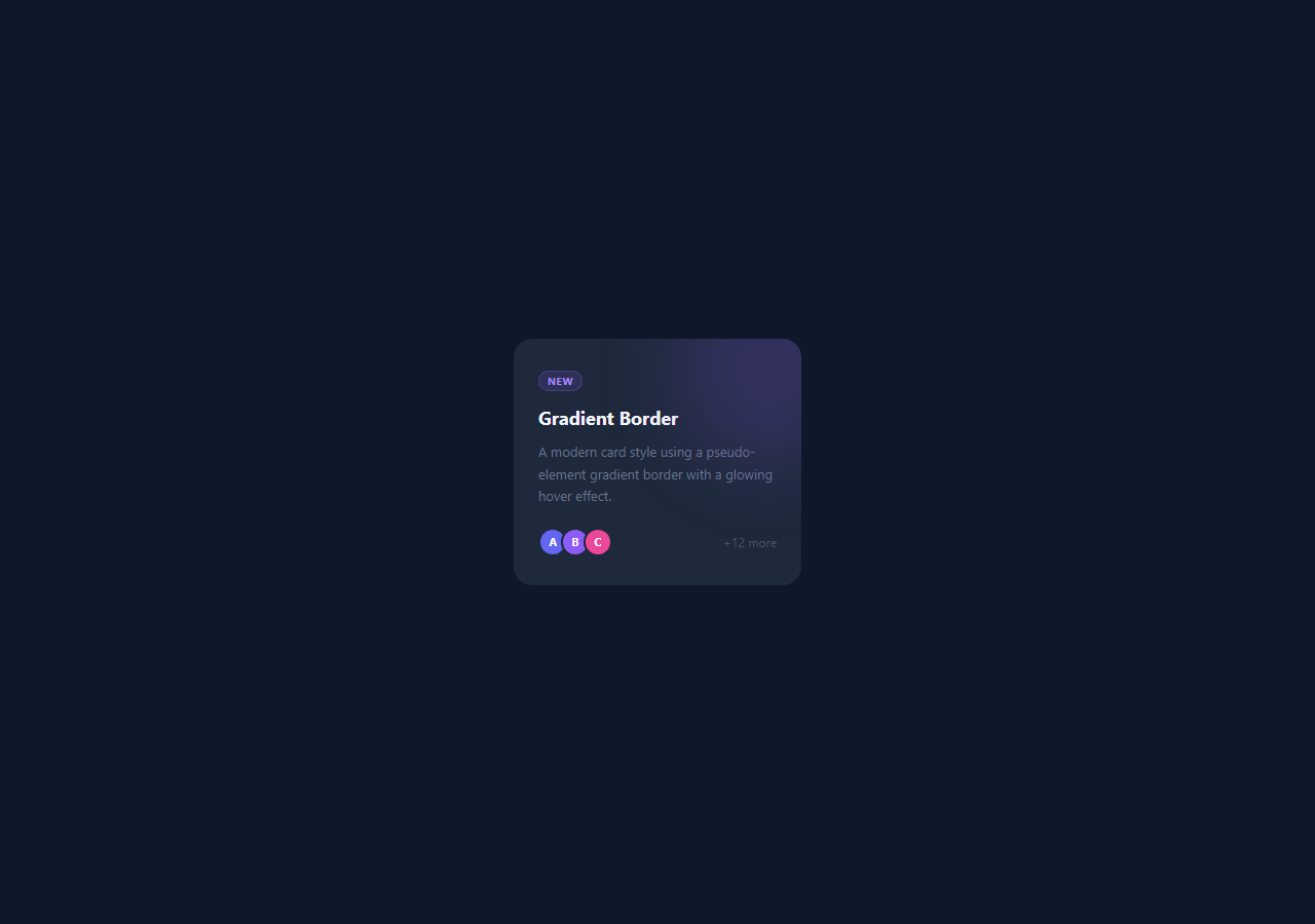
A gradient border on a card is one of the most visually distinctive CSS techniques — a smoothly animated rainbow-like border that cycles through colours. It gives cards a premium, glowing quality (much like neon glow buttons) used extensively in crypto, AI, and SaaS product interfaces. This snippet implements it with a single CSS pseudo-element and a keyframe animation.
How the animated gradient border works
The technique uses .card::before positioned behind the card content. The pseudo-element has position: absolute; inset: -1.5px — it extends 1.5px beyond the card on all sides, creating the "border" area. Its border-radius: 19px is 1px larger than the card's 18px to match the corner shape. z-index: -1 places it behind the card background, so only the 1.5px strip around the edge is visible.
The background is linear-gradient(135deg, #6366f1, #8b5cf6, #ec4899, #6366f1) with background-size: 300% 300%. The gradient is three times larger than the element. The @keyframes borderAnim shifts background-position from 0% 50% to 100% 50% and back, cycling the gradient colours across the border strip over 4 seconds — the same animated-gradient trick used by the gradient button and gradient text.
Why overflow: hidden is required
The card has overflow: hidden. Without it, the ::before pseudo-element's 1.5px extension beyond the card boundary would be visible as a colour bleed outside the card's rounded corners. overflow: hidden clips the pseudo-element precisely at the card boundary.
The purple glow blob
A .glow div inside the card uses position: absolute; filter: blur(40px) to create a soft radial glow in the top-right corner. It is decorative only — pointer-events: none ensures it does not intercept clicks.
Adapting to any card
To apply the gradient border to any existing card: add position: relative; overflow: hidden to the card, copy the ::before CSS block, and adjust the inset value to control border thickness. The gradient colours and animation speed are configurable in the CSS panel.
The ::before animated border technique
The gradient border uses a ::before pseudo-element with position: absolute; inset: -2px (extending 2px beyond the card edges). The ::before background is the gradient. The card itself has a solid background colour that covers the ::before everywhere except the 2px border area. This is more flexible than CSS border-image — it supports border-radius, hover effects, and animations.
The conic-gradient animation
The border uses background: conic-gradient(from 0deg, #6366f1, #ec4899, #0ea5e9, #6366f1). A @keyframes rotates the gradient: @keyframes borderSpin { to { background: conic-gradient(from 360deg, ...) } } — or more efficiently, use a CSS variable for the angle: @property --angle { syntax: '<angle>'; initial-value: 0deg; inherits: false; } and animate that. The @property approach creates a smooth rotation; the keyframe approach creates a sudden swap.
The inset value and card gap
The inset: -2px extends the ::before by 2px on all sides. This 2px is the visible border thickness. Use a larger inset (e.g., -3px) for a thicker border. The card's background must match the page background to create the "border" illusion. For dark backgrounds, set the card background to the dark colour rather than transparent.
Build with AI
Build, Understand, Optimize, and Extend It With AI
You don't need to reverse-engineer the border illusion by staring at the CSS alone. Paste this snippet's HTML and CSS into an AI coding assistant like Claude and ask it to explain precisely why the card's before pseudo-element needs both a negative z-index and an inset of -1.5px combined with overflow hidden on the parent to read as a border rather than a background layer. The same assistant can help you optimize it too — ask whether animating background-position on an oversized 300% gradient is cheaper than switching to a rotating conic-gradient driven by a registered CSS custom property, especially if you plan to place dozens of these cards on one page. It's also a quick way to extend the effect: have it add a second glow blob that reacts to cursor position, generate a set of preset gradient themes you can swap with one class, or make the border thickness and animation speed configurable through CSS variables. Treat the code less like a finished artifact and more like a starting point for a conversation.
Prompt to recreate it
Copy this into your AI assistant of choice to build the effect from scratch, or as a jumping-off point for your own variant:
Build an animated gradient-border card in plain HTML and CSS only, no JavaScript, using a single pseudo-element for the border.

Requirements:
- A card with position: relative, overflow: hidden, a solid background color, and rounded corners.
- A before pseudo-element that is the actual border: position absolute, inset a small negative value (like -1.5px) so it extends just past the card edge on all sides, a border-radius exactly 1px larger than the card's so the corners line up, and z-index -1 so it sits behind the card's own background and content.
- The before element's background must be a multi-stop linear-gradient at 135deg with background-size set to 300% 300%, oversized relative to the element.
- A keyframe animation on the before element that shifts background-position back and forth between 0% 50% and 100% 50% on an infinite loop, so the oversized gradient appears to cycle colors around the border strip.
- overflow: hidden on the card itself is mandatory so the pseudo-element's slight overextension never bleeds outside the rounded corners.
- Add a soft decorative glow: an absolutely positioned circular div with a semi-transparent background color and a heavy blur filter, positioned in one corner, with pointer-events: none so it never intercepts clicks.
- Include a card footer with an overlapping avatar stack built from circular spans with negative left margins and a border matching the card background so they visually separate.
Want to tighten it up first? Run this prompt through the AI Prompt Studio to score it across 8 quality dimensions, catch anti-patterns, and tune the wording for Claude, ChatGPT, or Gemini before you paste it in.
Source Code
<div class="scene">
  <div class="card">
    <div class="glow"></div>
    <div class="tag">New</div>
    <h3>Gradient Border</h3>
    <p>A modern card style using a pseudo-element gradient border with a glowing hover effect.</p>
    <div class="footer">
      <div class="avatars">
        <span class="av" style="background:#6366f1">A</span>
        <span class="av" style="background:#8b5cf6">B</span>
        <span class="av" style="background:#ec4899">C</span>
      </div>
      <span class="count">+12 more</span>
    </div>
  </div>
</div>
* { box-sizing: border-box; margin: 0; padding: 0; }
body { font-family: system-ui, sans-serif; }
.scene { min-height: 100vh; display: flex; align-items: center; justify-content: center; background: #0f172a; padding: 40px; }
.card {
position: relative; background: #1e293b;
border-radius: 18px; padding: 28px 24px; width: 280px;
overflow: hidden; cursor: pointer;
}
.card::before {
content: ''; position: absolute; inset: -1.5px; border-radius: 19px;
background: linear-gradient(135deg, #6366f1, #8b5cf6, #ec4899, #6366f1);
background-size: 300% 300%;
animation: borderAnim 4s ease infinite; z-index: -1;
}
@keyframes borderAnim { 0%,100% { background-position: 0% 50%; } 50% { background-position: 100% 50%; } }
.glow { position: absolute; width: 180px; height: 180px; background: rgba(139,92,246,0.2); border-radius: 50%; top: -60px; right: -60px; filter: blur(40px); pointer-events: none; }
.tag { display: inline-block; font-size: 10px; font-weight: 700; text-transform: uppercase; letter-spacing: 0.5px; color: #a78bfa; background: rgba(139,92,246,0.15); border: 1px solid rgba(139,92,246,0.3); padding: 2px 8px; border-radius: 20px; margin-bottom: 14px; }
h3 { font-size: 18px; font-weight: 700; color: #f1f5f9; margin-bottom: 10px; }
p { font-size: 13px; color: #64748b; line-height: 1.65; margin-bottom: 20px; }
.footer { display: flex; align-items: center; justify-content: space-between; }
.avatars { display: flex; }
.av { width: 28px; height: 28px; border-radius: 50%; display: flex; align-items: center; justify-content: center; font-size: 11px; font-weight: 700; color: #fff; margin-left: -6px; border: 2px solid #1e293b; }
.av:first-child { margin-left: 0; }
.count { font-size: 12px; color: #475569; }Step by step
How to Use
- 1Load the snippetClick "Gradient Border Card" in the sidebar. The preview shows the card over a dark background with the animated gradient border cycling.
- 2Change the gradient coloursIn the CSS panel, find the linear-gradient on .card::before and update the colour stops to your brand colours.
- 3Adjust border thicknessChange the inset: -1.5px value on .card::before to -2px or -3px for a thicker border. Also update border-radius to match: card-radius + border-thickness.
- 4Change animation speedUpdate 4s in animation: borderAnim 4s ease infinite to speed up or slow down the colour cycling.
- 5Update the card contentIn the HTML panel, change the .tag, h3, p, avatar initials, and count text to your own content.
- 6Export in your formatClick "HTML" for a standalone file, "JSX" for a React component, or "Tailwind" for a React + Tailwind version.
Real-world uses
Common Use Cases
Got questions?
Frequently Asked Questions
The ::before pseudo-element is positioned absolutely with inset: -1.5px, making it 1.5px larger than the card on all four sides. The card background covers the pseudo-element except for that 1.5px strip around the edge, which shows through as the "border". z-index: -1 keeps the pseudo-element behind the card content.
Without overflow: hidden, the 1.5px extension of ::before beyond the card boundary would be visible as a colour bleed outside the rounded corners. overflow: hidden clips the pseudo-element exactly at the card edge, keeping the border inside the rounded shape.
The gradient has background-size: 300% 300%, making it three times larger than the element. The keyframe animation shifts background-position from 0% 50% to 100% 50% and back, which slides the oversized gradient across the visible strip. This creates the cycling colour effect without repainting.
Change the inset: -1.5px value. A larger negative value like -3px creates a thicker border. Also update the border-radius on ::before to equal the card border-radius plus the inset amount — this keeps the corners matching.
Yes. Change the card background from #1e293b to any colour. The gradient border is independent of the card background. For a white card, you may want to change the gradient colours to have higher contrast against the white background.
Yes. Click "JSX" to download a React component. The CSS ::before pseudo-element approach works identically in React — no special handling needed. In Tailwind, use the before: modifier with Tailwind arbitrary values for the gradient and animation.