You Might Also Like
Learn Coding Visually
Learn to code with interactive, live-preview playgrounds — HTML, CSS, JavaScript, React & more.
 HTML Playground42 lessons · Click-based · Live preview
 CSS PlaygroundLearn CSS with a live editor
 JavaScript Playground60 lessons · DOM · Async · Canvas
 React PlaygroundLearn React with a live code editor
 GSAP PlaygroundLearn GSAP animation interactively
 SVG Playground44 lessons · shapes · paths · animation
 SCSS Playground45 lessons · Sass modules · tokens
 Tailwind PlaygroundLearn Tailwind CSS with a live editor
 Bootstrap 5 Playground50 lessons · live preview
Stacked Cards Deck — Free HTML CSS JS Snippet
Stacked Cards Deck · Cards · Plain HTML, CSS & JS · Live preview
What's included
Features
scale() and translateY() transforms on each layer create a convincing physical deck illusion — no 3D perspective or canvas needed.cubic-bezier(.34,1.56,.64,1) — a spring ease with slight overshoot — giving the cards a natural, physical feel when they shift up.translateX(-120%) rotate(-8deg) and fade out, matching the swipe-to-dismiss pattern users expect from mobile apps.pointerdown/pointerup handler works on mouse, touch, and stylus without duplicating code for touch events. Threshold of 50px prevents accidental swipes.(i - current + N) % N so the deck is logically circular — no array splicing, just a single integer index and CSS-driven reflow.About this UI Snippet
Stacked Cards Deck — CSS Stack Transforms, Swipe Gestures & Animated Card Cycling in Vanilla JS
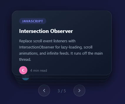
Stacked card UIs signal depth and discovery — they're used in dating apps, flashcard tools, recommendation feeds, and onboarding sequences to present a curated set of items while hinting more content lies beneath. This snippet builds a five-card dark-theme deck with progressive scale and Y-offset transforms creating a convincing physical stack, smooth exit-left slide animation for dismissal, swipe gesture support, and prev/next controls — all in pure HTML, CSS, and vanilla JavaScript.
Stacked card UIs appear across product categories — Tinder-style swiping, flashcard learning apps, featured article carousels, and onboarding slides all use the visual metaphor of a physical deck to signal that items can be cycled through. This snippet creates a five-card dark-theme deck with a CSS-only depth effect, smooth card exit animations, pointer-event swipe support, and prev/next buttons — built entirely in HTML, CSS, and vanilla JavaScript with zero dependencies.
CSS stack depth with scale and translateY
The depth illusion is achieved by a data-pos attribute that the JavaScript updates on every card after each navigation step. Five [data-pos] CSS rules define the transform for each layer: position 0 (top card) has translateY(0) scale(1) opacity:1, position 1 has translateY(10px) scale(0.97) opacity:0.85, and so on down to position 4 at translateY(40px) scale(0.88) opacity:0.2. The scale shrinks by 3% per layer and Y offset grows by 10px — two parameters you can tune to taste. Because the transforms are applied via CSS and only the data attribute changes in JS, the browser handles interpolation: every card transition between layers animates via transition: transform .45s cubic-bezier(.34,1.56,.64,1). The cubic-bezier is a spring ease (the middle two control points above and beyond 1) giving a slight overshoot that feels physical.
Exit animation with a separate CSS class
When the user advances forward, the top card is given the class exit-left which translates it off-screen to the left while rotating −8° and fading to opacity 0. A setTimeout of 380ms (slightly shorter than the 400ms CSS transition) waits for the animation to finish, then removes the class, increments current, and calls applyPositions() to re-stack the deck. The removed card re-enters at position 4 (bottom of the stack) instantly since its exit-left class is removed before data-pos is recalculated — it snaps to the back position without a visible jump.
Pointer-event swipe detection
Swipe support is implemented with three pointer events: pointerdown records startX, pointerup computes dx = clientX - startX. If |dx| > 50px, the swipe is treated as intentional — left swipe advances, right swipe goes back. Using the Pointer Events API (rather than Touch Events + Mouse Events) gives a single code path that works on touch screens, mouse drag, and stylus input without any e.preventDefault() dance.
Modular rotation: keeping position indices circular
applyPositions() uses modulo arithmetic: (i - current + N) % N maps each card's absolute index to a position 0–N−1 relative to the current top card. This means when current increments past the last card, the modulo wraps earlier cards back to the bottom of the stack without an array splice — the deck is logically circular. Only positions 0–4 are styled; any card at a position ≥ 5 shares position 4's rules and is visually buried.
Customising the deck
Swap the card content for your own data by editing the .card-inner markup — the outer .card wrapper and data-index attribute must remain. Change the number of cards by adding or removing .card divs and updating the five [data-pos] CSS rules to match. The colour scheme lives in two variables at the top of the CSS: the background gradient and the card gradient. Pair with a profile card design for a people-browsing feature.
Build with AI
Build, Understand, Optimize, and Extend It With AI
You don't need to work out the modulo-based position math by hand. Paste this snippet's HTML, CSS, and JS into an AI coding assistant like Claude and ask it to explain exactly how (i - current + N) % N maps each card's fixed index to its visual depth position, or why the exit-left class's 380ms setTimeout is deliberately shorter than its 400ms CSS transition duration. The same assistant can help optimize it, for example checking whether removing all data-pos attributes on every single card during every applyPositions call (rather than just updating the changed ones) is wasteful for a much larger deck. It's also useful for extending the feature: ask it to add live pointermove dragging so the top card follows the cursor before committing to a swipe (the FAQ already sketches this), add auto-advance with pause-on-hover, or make the back-navigation animate instead of snapping. Treat the code less like a finished artifact and more like a starting point for a conversation.
Prompt to recreate it
Copy this into your AI assistant of choice to build the effect from scratch, or as a jumping-off point for your own variant:
Build a stacked, swipeable card deck in plain HTML, CSS, and JavaScript, no framework, no libraries.

Requirements:
- A fixed set of card elements absolutely positioned on top of each other, each assigned a data-pos attribute by JavaScript that determines its depth via distinct CSS rules per position value (position 0 fully visible at full scale, increasingly smaller/more-offset/more-transparent for higher position values, capping visually at some maximum depth).
- Compute each card's position using modular arithmetic based on a single current index and the total card count, so the deck is logically circular (advancing past the last card and going back before the first must both be handled by the same formula, with no array splicing).
- Clicking Next must add an exit class to the current top card that slides and rotates it off-screen to one side while fading out, wait via a timeout slightly shorter than the CSS transition's duration, then remove the class, increment the current index, and recompute every card's position so the exited card reappears instantly at the back of the stack with no visible jump.
- Clicking Prev must instantly decrement the index and recompute positions with no exit animation, distinct from the forward navigation.
- Implement swipe gesture support using the Pointer Events API (not separate touch and mouse event handlers) that records the horizontal start position on pointerdown and, on pointerup, advances or goes back if the horizontal delta exceeds a minimum threshold in pixels.
- Disable the Prev button on the first card and the Next button on the last card, and display a running "current / total" counter that updates after every navigation.
- Use a CSS transition with a spring-like cubic-bezier easing (overshoot) for the position-to-position stack reflow, distinct from the exit animation's easing.
Want to tighten it up first? Run this prompt through the AI Prompt Studio to score it across 8 quality dimensions, catch anti-patterns, and tune the wording for Claude, ChatGPT, or Gemini before you paste it in.
Step by step
How to Use
- 1Load the snippetPaste the HTML, CSS, and JS into your page. Five dark cards appear in a stacked perspective — the top card is fully visible, the others recede with scale and offset behind it.
- 2Click Next (→) to advanceThe top card slides left with a slight rotation and fades out. The remaining cards animate upward in the stack, and what was card 2 becomes the new top card.
- 3Swipe left or right on mobileTouch or click-drag the deck horizontally by more than 50px to trigger a swipe. Left swipe advances to the next card; right swipe goes back.
- 4Use the Back buttonThe Prev (←) button is disabled on card 1 and enables once you advance. Clicking it snaps the previous card back to the top instantly.
- 5Track position with the counterThe "1 / 5" counter below the deck updates after each navigation step so users always know their position.
- 6Customise card contentEdit the
.card-innerHTML for each card — change the tag colour, title, body, and avatar letter. Add or remove.cardwrappers to resize the deck.
Real-world uses
Common Use Cases
Got questions?
Frequently Asked Questions
Add more .card divs in the HTML (each needs a unique data-index). The JS N variable reads cards.length automatically. Add matching [data-pos="5"], [data-pos="6"] etc. rules in CSS following the same scale/offset pattern, or cap all positions ≥ 4 at the [data-pos="4"] style.
Yes — call advance("next") inside a setInterval. Add a pause-on-hover: set a flag in mouseenter/mouseleave handlers and check it in the interval callback. Clear the interval when current === N - 1 to stop at the last card.
Listen to pointermove in addition to pointerdown/pointerup. During drag, apply transform: translateX(dx) rotate(dx * 0.05deg) directly to the top card. On pointerup, if |dx| > threshold trigger advance("next"), otherwise spring the card back to translateX(0) rotate(0) by removing the inline style.
Yes. Use the JSX, Vue, Angular, or Tailwind export buttons on this page. In React, keep current in useState and derive each card's data-pos in the render loop — the CSS transition animates the transform change automatically. Attach the pointer handlers with onPointerDown/onPointerUp props. In Vue, bind :data-pos and @pointerdown/@pointerup.
Going back snaps instantly by design — like physically pulling a card from beneath the deck. If you prefer an animated reverse, add a enter-right CSS class that slides from the right and apply it to the card that becomes the new top, then remove it after a frame with requestAnimationFrame.