Learn Coding Visually
Learn to code with interactive, live-preview playgrounds — HTML, CSS, JavaScript, React & more.
 HTML Playground42 lessons · Click-based · Live preview
 CSS PlaygroundLearn CSS with a live editor
 JavaScript Playground60 lessons · DOM · Async · Canvas
 React PlaygroundLearn React with a live code editor
 GSAP PlaygroundLearn GSAP animation interactively
 SVG Playground44 lessons · shapes · paths · animation
 SCSS Playground45 lessons · Sass modules · tokens
 Tailwind PlaygroundLearn Tailwind CSS with a live editor
 Bootstrap 5 Playground50 lessons · live preview
Image Hover Reveal Cards — CSS Overlay Animation Snippet
Image Hover Reveal Cards · Cards · Plain HTML, CSS & JS · Live preview
What's included
Features
opacity: 0 → opacity: 1 on hover with a bottom-heavy linear-gradient — dark at the bottom for text legibility, fading to transparent at the top to preserve the image.transition-delay (0.05s, 0.1s, 0.15s, 0.18s, 0.22s) — a rising cascade purely in CSS, no JavaScript.cubic-bezier(.25,.46,.45,.94). Combined with overflow:hidden on the card, the zoom is contained and feels natural.grid-row: span 2. Creates visual hierarchy without JavaScript masonry libraries.tabindex="0" and :focus-visible styles that trigger the same overlay as hover. JS adds Enter/Space toggle for full keyboard operability.<img> tags use loading="lazy" — images outside the viewport don't load until scrolled into view, improving initial page performance.About this UI Snippet
Image Hover Reveal — Gradient Overlay, Staggered translateY Reveal & CSS Grid Layout
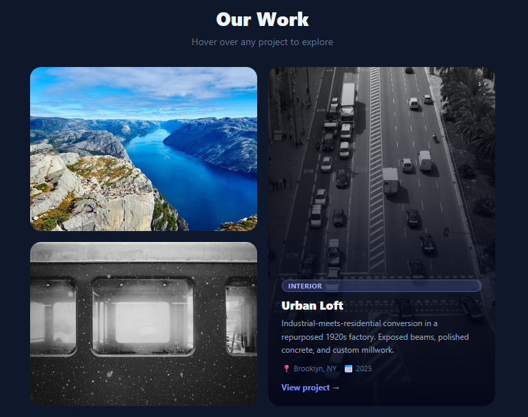
Image hover reveal cards are a staple of portfolio sites, agency showcases, and editorial grids — a clean image at rest, with rich content that appears as the user approaches. This snippet builds a four-card asymmetric grid with a gradient overlay that fades in on hover, each content element (tag, title, description, metadata, link) animating in from below with a staggered delay that creates a natural cascading reveal effect — entirely in CSS.
The technique is widely used across Awwwards-winning portfolio sites, photography galleries, architecture firm showcases, and e-commerce collection grids because it maximises image real estate while hiding secondary content until needed. The challenge is making the reveal feel graceful rather than abrupt, and making it accessible without JavaScript.
The gradient overlay reveal
The overlay div sits position: absolute; inset: 0 over the image and starts at opacity: 0. On :hover (and :focus-visible for keyboard users), it transitions to opacity: 1. The overlay background is linear-gradient(to top, rgba(2,6,23,.98) 0%, rgba(2,6,23,.75) 45%, rgba(2,6,23,.1) 100%) — dark and opaque at the bottom where text lives, fading to near-transparent at the top where the image should remain visible. This gradient is tuned so the image is still recognisable while text remains readable at any contrast level.
Staggered translateY animation
Each element within the overlay — tag, title, description, metadata, link — starts at transform: translateY(16px); opacity: 0. On hover, each transitions to translateY(0); opacity: 1 with increasing transition-delay values: 0.05s, 0.1s, 0.15s, 0.18s, 0.22s. This staggered cascade makes the content appear to rise up from the bottom naturally, as if emerging from below the image edge. The effect is achieved without JavaScript or @keyframes — pure CSS transitions on the child elements within the hover context.
Image scale on hover
The image itself scales from 1.0 to 1.08 with transition: transform .6s cubic-bezier(.25,.46,.45,.94). The scale is subtle (8%) — enough to signal interaction but not enough to be distracting. The longer duration (0.6s) and deceleration easing make the zoom feel organic rather than mechanical.
Asymmetric CSS Grid layout
The grid uses grid-template-columns: repeat(2, 1fr) with a tall card (.card-tall) spanning two rows via grid-row: span 2. This asymmetric Masonry-like layout creates visual interest and hierarchy — the tall card draws the eye first. All dimensions use fixed pixel row heights for predictable behaviour in the demo; in production, adapt with aspect-ratio on the image for fluid heights. Pair with an image lightbox to open images full-screen after the hover reveal.
Build with AI
Build, Understand, Optimize, and Extend It With AI
You don't have to work out the cascade timing by hand. Paste this snippet's HTML, CSS, and JS into an AI coding assistant like Claude and ask it to explain exactly how the increasing transition-delay values on the tag, title, description, meta, and link (0.05s through 0.22s) combine with their shared translateY and opacity transitions to create the rising cascade effect, or why focus-visible is paired with hover on every rule rather than relying on hover alone. The same assistant is useful for optimizing it — ask whether five separate transition-delay values hardcoded per element is harder to maintain than a CSS custom property scaled by a data attribute, and how you'd refactor it that way. It's just as handy for extending the cards: ask it to make the grid-row span 2 tall-card pattern rearrange itself for different numbers of items, add a subtle parallax tilt on mouse movement within each card, or swap the keyboard toggle's force-hover class for a proper aria-expanded announcement. Treat the code less like a finished artifact and more like a starting point for a conversation.
Prompt to recreate it
Copy this into your AI assistant of choice to build the effect from scratch, or as a jumping-off point for your own variant:
Build an image hover-reveal card grid in plain HTML, CSS, and JavaScript — no library.

Requirements:
- A CSS grid of cards with at least one card spanning two rows (an asymmetric grid, not all cards the same size), each card containing a full-cover image and an absolutely-positioned overlay div sitting on top of it.
- The overlay must be a bottom-heavy linear gradient (opaque near the bottom fading to nearly transparent near the top) so the image stays visible near the top while text is legible near the bottom, starting fully transparent and only becoming fully opaque on hover or keyboard focus.
- Inside the overlay, place at least five separate pieces of content (a category tag, a title, a description, a metadata row, and a link), each one starting shifted downward and transparent, and each transitioning to its resting position and full opacity with a distinct, increasing transition-delay so they visibly cascade into view one after another rather than all appearing simultaneously.
- The card's image itself must scale up slightly (a modest zoom, not dramatic) on hover using a slow, eased transform transition, clipped by overflow hidden on the card so the zoom never bleeds outside the card's rounded corners.
- Every hover-triggered CSS rule must also trigger on focus-visible (not just :hover) so the reveal works identically for sighted keyboard users tabbing through the cards, and each card must be focusable via tabindex.
- Add a small amount of JavaScript that listens for Enter or Space being pressed while a card is focused and toggles a class that forces the same revealed state, so the effect is fully operable without relying on native focus behavior alone.
- Make the grid collapse to a single column on narrow viewports, with the tall card reverting to a normal single-row span.
Want to tighten it up first? Run this prompt through the AI Prompt Studio to score it across 8 quality dimensions, catch anti-patterns, and tune the wording for Claude, ChatGPT, or Gemini before you paste it in.
Step by step
How to Use
- 1Paste HTML, CSS, and JSFour cards appear in an asymmetric grid on a dark background — three square cards and one tall card spanning two rows. All show images from picsum.photos.
- 2Hover over any cardA gradient overlay fades in. The tag, title, description, metadata, and link each animate upward in sequence with a 50ms stagger — creating a cascading reveal.
- 3Notice the image zoomThe background image scales to 108% while hovering — a slow 0.6s ease that feels organic. The
overflow:hiddenon the card clips the scale to the card boundary. - 4Test keyboard navigationTab to a card and press Enter or Space — the overlay reveals. Tab to the "View project →" link inside and follow it. Press Enter/Space again to dismiss.
- 5Replace with your imagesSwap the
srcon each<img>tag with your own images. Updatealt, card titles, descriptions, tags, and metadata to match your content. - 6Add or remove cardsCopy an
<article class="card">block and add it to the grid. To make a card tall, addcard-tallclass. Adjust the gridgrid-template-rowsto add more rows.
Real-world uses
Common Use Cases
Got questions?
Frequently Asked Questions
Remove the opacity: 0 and transform: translateY(16px) from .card-title in CSS, and remove its hover/focus reset. The overlay will still fade in on hover for the description and link, while the title stays permanently visible at the bottom of each card.
On the .img-wrap, set aspect-ratio: 4/3 (or your preferred ratio) and remove the fixed pixel grid-template-rows. Set height: 100% on the .img. This makes cards size to their image content, which is better for responsive grids.
Yes — replace the <img> with a <video autoplay muted loop playsinline>. The overlay and reveal CSS work the same way. Set object-fit: cover on the video and ensure the .img-wrap has overflow: hidden and the height constrained.
Map your data array to <article className="card"> elements. tabIndex={0} and onKeyDown handle keyboard. The stagger animation is CSS-only so it works in React without any extra state — just ensure className strings map correctly.