You Might Also Like
Learn Coding Visually
Learn to code with interactive, live-preview playgrounds — HTML, CSS, JavaScript, React & more.
 HTML Playground42 lessons · Click-based · Live preview
 CSS PlaygroundLearn CSS with a live editor
 JavaScript Playground60 lessons · DOM · Async · Canvas
 React PlaygroundLearn React with a live code editor
 GSAP PlaygroundLearn GSAP animation interactively
 SVG Playground44 lessons · shapes · paths · animation
 SCSS Playground45 lessons · Sass modules · tokens
 Tailwind PlaygroundLearn Tailwind CSS with a live editor
 Bootstrap 5 Playground50 lessons · live preview
Gradient Stat Ring — Free HTML CSS JS Progress Ring Snippet
Gradient Stat Ring · Charts · Plain HTML, CSS & JS · Live preview
What's included
Features
About this UI Snippet
Gradient Stat Ring — Circular Progress With a Counting Label
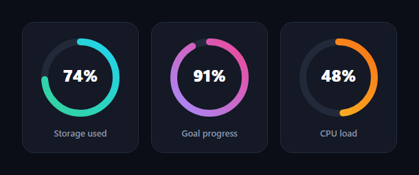
The gradient stat ring is the circular progress indicator you see on dashboards and fitness apps — a gradient arc that sweeps around to represent a percentage while the number in the centre counts up to match. This snippet builds a responsive grid of them with pure SVG, CSS, and a small vanilla JavaScript driver, with no charting library.
Stroke-dash geometry
Each ring is two stacked SVG circles: a muted track and a coloured fill, both with the same radius. The fill's progress is controlled by the classic stroke-dasharray / stroke-dashoffset trick. The dash array is set to the full circumference (2πr) so a single dash wraps the whole circle, and the offset is then set to the same length to hide it entirely. Animating the offset down to circumference × (1 − value/100) reveals exactly that fraction of the arc, which is how the ring "fills".
Why the SVG is rotated
By default SVG circles start their stroke at 3 o'clock, so the whole <svg> is rotated -90deg to move the start point to 12 o'clock — the natural top-of-the-clock origin people expect from a progress ring. The centre percentage <text> is then counter-rotated 90deg around the ring's centre so the label stays upright despite the parent rotation.
Gradient strokes
Each fill is painted with stroke="url(#id)" referencing an SVG <linearGradient>, giving the arc a two-colour gradient that reads as premium and distinguishes one metric from another. Because the gradient is defined per-SVG with a unique id, several rings can carry different colour ramps on the same page without clashing.
Synchronised sweep and count
The arc animation is pure CSS — a transition on stroke-dashoffset with an ease-out cubic-bezier so it decelerates as it lands. The centre number is animated separately in JavaScript with requestAnimationFrame over the same duration and an ease-out curve, so the label and the arc finish together. The figure uses font-variant-numeric: tabular-nums so it does not jitter horizontally while counting.
Scroll-triggered, once
An IntersectionObserver starts every ring when the grid is 30% in view and then disconnects, so the fill and count play exactly once as the section appears — the standard performant trigger, with no scroll listener. Values are clamped to 0–100 so out-of-range data can't overdraw the arc.
Customizing it
Set each ring's target with a data-value attribute, change the gradient stops, adjust the stroke-width for thicker or thinner arcs, or tune the transition duration. Add more cards and the grid wraps responsively. Pair the rings with a metric card grid or a glass stat card for a complete dashboard panel.
Build with AI
Build, Understand, Optimize, and Extend It With AI
Rather than working out the trigonometry of the stroke-dash trick by hand, hand this snippet's HTML, CSS, and JS to an AI coding assistant like Claude and ask it to explain precisely why the svg element is rotated -90 degrees while the percentage text inside it is separately counter-rotated 90 degrees around the ring's own center, and how the stroke-dashoffset formula circumference times one minus value over 100 actually reveals the arc. The same assistant is useful for optimization too — ask whether running a requestAnimationFrame loop per ring scales fine for a dozen rings on one dashboard or whether the count-up should share a single rAF driver across all rings. It's also a quick way to extend the effect: ask it to add a second, thinner ring showing a target or comparison value, support negative or over-100 values with a visual warning color, or replay the animation whenever the underlying data value changes rather than only once on scroll. Treat the code less like a finished artifact and more like a starting point for a conversation.
Prompt to recreate it
Copy this into your AI assistant of choice to build the effect from scratch, or as a jumping-off point for your own variant:
Build a grid of circular gradient progress rings in plain SVG, CSS, and vanilla JavaScript, no charting library, triggered once via IntersectionObserver.

Requirements:
- Each ring is an svg containing two concentric circles of the same radius: a muted track circle and a colored fill circle, plus a linearGradient definition with a unique id per ring referenced by the fill circle's stroke attribute as a url reference.
- The fill circle's progress must be controlled with stroke-dasharray set to the full circumference (2 times pi times the radius) so one dash wraps the entire circle, and stroke-dashoffset animated from the full circumference (fully hidden) down to circumference times one minus the target value over 100 (revealing that fraction of the arc).
- The whole svg element must be rotated -90 degrees so the arc begins at the 12 o'clock position instead of the default 3 o'clock start, and the centered percentage text element must be separately rotated 90 degrees around the ring's own center point so it reads upright despite the parent rotation.
- The stroke-dashoffset change should animate via a CSS transition with an ease-out cubic-bezier curve, and independently, a centered percentage label must count up from 0 to the target value using requestAnimationFrame with a matching ease-out easing function over the same duration, so the number and the arc finish together.
- Use font-variant-numeric: tabular-nums on the percentage label so the digits do not shift horizontally while counting.
- Clamp every target value to between 0 and 100 before using it in any calculation.
- Use a single IntersectionObserver watching the ring grid's container, firing the sweep-and-count animation for every ring only once when at least 30 percent of the grid is visible, then disconnecting the observer.
Want to tighten it up first? Run this prompt through the AI Prompt Studio to score it across 8 quality dimensions, catch anti-patterns, and tune the wording for Claude, ChatGPT, or Gemini before you paste it in.
Step by step
How to Use
- 1Paste HTML, CSS, and JSThree stat rings render empty at 0%.
- 2Scroll them into viewEach arc sweeps to its value and the number counts up.
- 3Note the gradientsEvery ring carries its own two-colour stroke.
- 4Set a valueChange a ring's data-value attribute.
- 5Recolor a ringEdit its linearGradient stops.
- 6Adjust thicknessTune the stroke-width on track and fill.
Real-world uses
Common Use Cases
Got questions?
Frequently Asked Questions
Each ring is two SVG circles — a track and a fill — with the fill controlled by stroke-dasharray and stroke-dashoffset. The dash array equals the circumference, 2 times pi times r, so one dash wraps the circle; the offset starts at the full length to hide it, then animates down to circumference times (1 minus value over 100) to reveal exactly that fraction.
By default an SVG circle's stroke begins at 3 o'clock, so the whole svg is rotated -90 degrees to move the start to 12 o'clock, the origin people expect from a progress ring. The centre percentage text is counter-rotated 90 degrees around the ring's centre so the label stays upright.
The arc uses a CSS transition on stroke-dashoffset with an ease-out cubic-bezier. The centre number is animated separately with requestAnimationFrame over the same duration and an ease-out curve, so both finish together. The figure uses tabular-nums so it does not shift horizontally while counting.
Yes. Each fill references its own SVG linearGradient by id with stroke="url(#id)", so every ring can carry a distinct two-colour ramp on the same page without clashing. Change the gradient stops to recolour a ring, and keep the ids unique per ring.
Render the SVG in your template and compute strokeDashoffset from a value prop as circumference times (1 minus value/100). Run the centre count-up in a mount effect with requestAnimationFrame, writing to a ref'd text node, and start it from an IntersectionObserver. Give each gradient a unique id (e.g. include the component key) so multiple instances do not collide.