You Might Also Like
Learn Coding Visually
Learn to code with interactive, live-preview playgrounds — HTML, CSS, JavaScript, React & more.
 HTML Playground42 lessons · Click-based · Live preview
 CSS PlaygroundLearn CSS with a live editor
 JavaScript Playground60 lessons · DOM · Async · Canvas
 React PlaygroundLearn React with a live code editor
 GSAP PlaygroundLearn GSAP animation interactively
 SVG Playground44 lessons · shapes · paths · animation
 SCSS Playground45 lessons · Sass modules · tokens
 Tailwind PlaygroundLearn Tailwind CSS with a live editor
 Bootstrap 5 Playground50 lessons · live preview
Chart.js Gradient Revenue Chart — Animated Area Chart
Chart.js Gradient Revenue Chart · Charts · Plain HTML, CSS & JS · Live preview
What's included
Features
About this UI Snippet
Chart.js Gradient Revenue Chart — Scriptable Options and Animated Updates
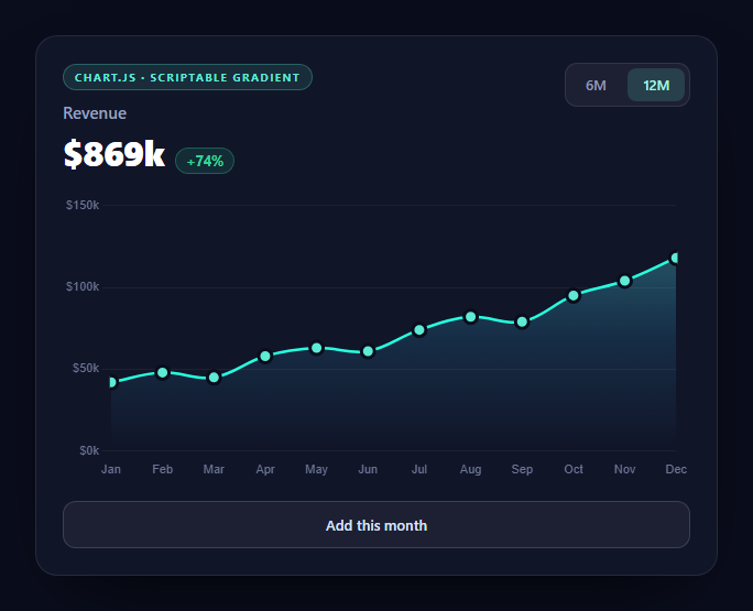
Chart.js gets you a working chart in about ten lines. Getting one that looks like it belongs in a designed product takes a handful of specific options, and two of them are the source of nearly every Stack Overflow question about the library.
The gradient that crashes on first render
A vertical gradient under an area line is the most requested Chart.js customization, and the naive version throws:
var g = ctx.createLinearGradient(0, chartArea.top, 0, chartArea.bottom); // TypeError
The reason is ordering. A canvas gradient needs pixel coordinates, and the chart does not know its own plot area until it has laid out — but backgroundColor is read *during* that layout. On the first pass chart.chartArea is genuinely undefined.
The fix is to pass a scriptable option — a function rather than a value — and guard it:
if (!area) return 'rgba(94,234,212,0.18)';
Chart.js calls the function again once layout completes, so the flat fallback color is only ever used for a single frame. The same pattern applies to any option that needs to know the chart's geometry, and it also means the gradient regenerates on resize automatically, which a gradient created once at setup would not.
interaction.mode, the option that fixes tooltips
Default Chart.js only shows a tooltip when the cursor is close to an actual data point. On a smooth line with pointRadius: 0, that means hovering feels broken — the user waves the mouse across the chart and nothing happens.
interaction: { mode: 'index', intersect: false }
intersect: false stops requiring a direct hit, and mode: 'index' selects whichever x-position the cursor is nearest. Together they turn the chart into a continuous readout: move anywhere along it and the tooltip tracks the nearest month. This single option does more for perceived quality than any styling.
Points are then hidden at rest (pointRadius: 0) and only appear on hover (pointHoverRadius: 6) with a background-colored border, which makes the hovered point read as punched out of the line rather than sitting on top of it.
Updating without destroying
The most common mistake in dashboards is calling chart.destroy() and constructing a new chart whenever data changes. That throws away the animation state, so every update flashes.
chart.data.datasets[0].data = d.vals; chart.update('active');
Mutating the data in place and calling update() makes Chart.js interpolate from current values to new ones, so the line visibly glides. The 'active' argument reuses the running animation configuration rather than replaying the initial one. Because the range toggle and the add-a-month button both route through one refresh() function, every update path animates identically and the summary figures can never disagree with the chart.
Styling that gets out of the way
The defaults are built for standalone charts, not embedded panels. Four changes do most of the work:
- legend: { display: false } — a single series does not need a legend explaining it.
- grid: { display: false } on the x axis and a very faint rgba(255,255,255,.055) on the y — horizontal guides help read values; vertical ones are noise.
- border: { display: false } on both axes — the Chart.js 4 way to remove axis spines, which moved out of gridLines in v3.
- maxTicksLimit: 5 — caps y-axis labels regardless of the value range, so the axis never crowds.
tension: 0.38 curves the line. It is worth knowing this is a *smoothing* value with no relationship to the underlying data — high tension on volatile data invents peaks between points that were never measured. For revenue it is honest enough; for anything where exact values matter, keep it low.
Sizing
maintainAspectRatio: false plus a fixed-height wrapper (.crc-canvas { height: 260px }) is the correct pattern for a chart inside a layout. Left on, Chart.js enforces its own aspect ratio and fights your container. The canvas needs a *positioned, sized* parent — sizing the canvas element directly does not work reliably.
Reusing it
Replace FULL with your series and everything downstream follows, including the total and the period-over-period delta. For a sparkline-sized version, drop the axes and tooltip; for a dependency-free alternative, compare area chart or realtime line chart.
Build with AI
Build, Understand, Optimize, and Extend It With AI
Two of the options in this chart account for most of the frustration people have with Chart.js, so it is worth having them explained properly. Paste the HTML, CSS, and JS into an AI assistant like Claude and ask it to explain why chart.chartArea is undefined the first time the backgroundColor function runs, and what the sequence of layout and option evaluation actually is — then remove the guard clause to reproduce the crash. Ask why interaction: { mode: 'index', intersect: false } changes the hover experience so much on a line with pointRadius 0. Then ask what chart.update('active') does differently from destroying and reconstructing the chart, and what visual difference you would see. For optimization, ask whether regenerating the gradient on every scriptable call is wasteful and how you would memoize it against the chart area dimensions. To extend it: have it add a second dataset with its own gradient, add a vertical crosshair line on hover via a custom plugin, stream live data with a rolling window, or make tension configurable and explain the honesty trade-off. Treat the code less like a finished artifact and more like a starting point for a conversation.
Prompt to recreate it
Copy this into your AI assistant of choice to build the effect from scratch, or as a jumping-off point for your own variant:
Build a dark dashboard-style revenue area chart with Chart.js 4 (from a CDN, global Chart) in plain HTML, CSS, and JavaScript.

Requirements:
- Fill the area under the line with a vertical canvas gradient created as a SCRIPTABLE option (a function passed to backgroundColor, not a value). Inside it, read chart.chartArea and if it is undefined return a flat fallback color instead. Explain in a comment that Chart.js evaluates scriptable options during layout, before the chart knows its own plot area, so the first pass genuinely has no chartArea — and that using a function also means the gradient regenerates correctly on resize, which a gradient built once at setup would not.
- Set interaction: { mode: 'index', intersect: false } and explain why: by default Chart.js only shows a tooltip when the cursor intersects an actual point, which feels broken on a smooth line with pointRadius 0. Index mode with intersect off makes the tooltip track the nearest x position from anywhere in the plot.
- Hide points at rest with pointRadius 0 and reveal them on hover with pointHoverRadius plus a border in the card's background color, so the hovered point reads as punched out of the line.
- Style it as an embedded dashboard panel rather than a standalone chart: no legend, no vertical grid lines, a very faint horizontal grid, axis borders/spines removed (in Chart.js 4 this is the border option on each scale), a maxTicksLimit on the y axis, and currency-formatted tick and tooltip callbacks.
- Set maintainAspectRatio: false and give the canvas a parent with an explicit fixed height, explaining that otherwise Chart.js enforces its own aspect ratio and fights the container, and that sizing the canvas element directly is unreliable.
- Provide a 6M/12M range toggle and an "add this month" button. BOTH must go through one shared refresh function that mutates chart.data.labels and chart.data.datasets[0].data in place and calls chart.update('active') — never destroy and recreate the chart. Explain that mutate-and-update makes Chart.js interpolate from current to new values so the line glides, whereas recreating discards animation state and flashes.
- Have the same refresh function recompute a headline total and a period-over-period percentage delta from the visible data, toggling a positive/negative style on the delta pill, so the summary figures can never disagree with the chart.
- Use a tension around 0.38 for line smoothing, and note that tension is purely cosmetic with no relationship to the data, so it should be kept low wherever exact values matter.
Want to tighten it up first? Run this prompt through the AI Prompt Studio to score it across 8 quality dimensions, catch anti-patterns, and tune the wording for Claude, ChatGPT, or Gemini before you paste it in.
Step by step
How to Use
- 1Add the Chart.js CDNInclude the chart.umd build from the CDN panel — global Chart.
- 2Paste HTML, CSS, and JSA gradient area chart animates in with a live total and delta.
- 3Hover anywhereIndex-mode tooltips track the nearest month without needing a direct hit.
- 4Switch the range6M and 12M mutate the dataset and animate between them.
- 5Add a monthNew points glide in — the chart is updated, never destroyed.
- 6Plug in your dataReplace the FULL array; total and delta derive from it.
Real-world uses
Common Use Cases
Got questions?
Frequently Asked Questions
A canvas gradient needs pixel coordinates from chart.chartArea, but backgroundColor is read during layout — before the chart knows its own plot area. On the first pass chartArea is undefined. Passing a scriptable function that returns a flat fallback color when chartArea is missing fixes it, and Chart.js calls the function again after layout so the gradient appears immediately.
Chart.js defaults to requiring the cursor to intersect an actual data point, which feels broken on a smooth line with hidden points. Setting interaction to { mode: "index", intersect: false } removes the hit requirement and selects the nearest x position instead, so hovering anywhere over the plot reads the nearest value.
Destroying discards the animation state, so every data change flashes. Mutating chart.data in place and calling chart.update() makes Chart.js interpolate from the current values to the new ones, so the line glides. Passing "active" reuses the running animation configuration rather than replaying the initial entrance.
It applies bezier smoothing between points. It is purely cosmetic and has no relationship to the underlying data, so high tension on volatile series invents visual peaks between measurements that never existed. It is fine for a smooth revenue trend, but keep it low or at zero wherever exact values matter.
Left on, Chart.js enforces its own width-to-height ratio and fights whatever container it is in. Turning it off and giving the canvas a positioned parent with an explicit height lets the layout own the sizing. Setting dimensions on the canvas element directly does not work reliably.
react-chartjs-2 and vue-chartjs wrap the lifecycle for you and accept the same data and options objects. With the vanilla build, create the chart in a mount effect against a canvas ref, keep the instance in a ref, and call chart.destroy() in cleanup or remounts leak canvases. Update by mutating the instance data and calling update() rather than recreating on every render.