You Might Also Like
Learn Coding Visually
Learn to code with interactive, live-preview playgrounds — HTML, CSS, JavaScript, React & more.
 HTML Playground42 lessons · Click-based · Live preview
 CSS PlaygroundLearn CSS with a live editor
 JavaScript Playground60 lessons · DOM · Async · Canvas
 React PlaygroundLearn React with a live code editor
 GSAP PlaygroundLearn GSAP animation interactively
 SVG Playground44 lessons · shapes · paths · animation
 SCSS Playground45 lessons · Sass modules · tokens
 Tailwind PlaygroundLearn Tailwind CSS with a live editor
 Bootstrap 5 Playground50 lessons · live preview
Dumbbell Chart — Free Before After Comparison JS Snippet
Dumbbell Chart · Charts · Plain HTML, CSS & JS · Live preview
What's included
Features
About this UI Snippet
Dumbbell Chart — Two-Point Before / After Comparison
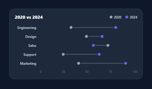
A dumbbell chart (also called a DNA or connected-dot plot) compares two values for each category — before and after, two years, two groups — by placing a dot for each on a shared axis and joining them with a line. The length and direction of the connector make the change between the two points obvious at a glance, which is exactly what a side-by-side pair of bars hides. This snippet builds one in plain HTML, CSS, and vanilla JavaScript, no SVG and no charting library.
Two dots and a connector from three numbers
Each row is a CSS grid of a label and a track. Inside the track sit a thin connector .db-bar and two .db-dots. The dots are absolutely positioned at value / max * 100%, and the connector is positioned at the *lower* of the two values with a width equal to the gap between them — left: pos(lo), width: pos(hi) - pos(lo). That single calculation draws the bar exactly between the points regardless of which value is larger.
Encoding the change, not just the values
The reason to choose a dumbbell over grouped bars is that the eye reads the *distance and direction* between the two dots as the change itself. A wide gap means a big shift; the side the higher dot sits on tells you whether it grew or shrank. With grouped bars you'd have to mentally subtract two heights for every category — here the connector does that subtraction visually.
Animated draw-on with the double-rAF trick
On load the connector grows and the dots scale in from zero. Because elements start at their initial state, the code waits two requestAnimationFrames before setting the final positions, guaranteeing the browser has committed the starting styles so the CSS transition actually runs instead of snapping. The dots use a slightly delayed scale so they pop in after the bar settles.
Layering and hit targets
The two dots overlap when values are close, so z-index keeps the "after" dot (b) above the "before" dot (a), and each carries a native title tooltip with its exact value. A :hover brightness bump gives feedback without extra JavaScript.
Data-driven and easy to extend
The chart derives entirely from a { name, a, b } array and a MAX for the axis, so adding categories or swapping the two series is an edit to data. Re-label the legend and axis to fit your comparison — survey waves, A/B test arms, regional figures — and the rendering logic stays identical.
Build with AI
Build, Understand, Optimize, and Extend It With AI
Instead of working out the positioning formula in your head, paste this snippet's HTML, CSS, and JS into an AI coding assistant like Claude and ask it to explain exactly why the connector bar's left and width are derived from Math.min and Math.max of the two values rather than always from a to b, and why the code waits for two nested requestAnimationFrame calls before setting the final left/width/scale values on the bar and dots. The same assistant can help optimize it, for instance checking whether rebuilding every row's innerHTML from scratch on each data update is necessary or whether only the bar and dot positions need to change for a live-updating dashboard. It's also useful for extending the chart: ask it to add a third comparison point per row (three dots instead of two), sort rows by the size of the gap to surface the biggest movers first, or add a text label showing the numeric delta next to each connector. Treat the code less like a finished artifact and more like a starting point for a conversation.
Prompt to recreate it
Copy this into your AI assistant of choice to build the effect from scratch, or as a jumping-off point for your own variant:
Build a dumbbell (connected dot) comparison chart in plain HTML, CSS, and JavaScript with no SVG and no charting library.

Requirements:
- Render one row per category from a data array of objects each containing a name and two numeric values, using a CSS grid layout with a label column and a track column.
- Inside each row's track, create one thin connector element and two circular dot elements, all absolutely positioned as percentages of a shared maximum value, not pixels, so the layout is responsive to any container width.
- Compute the connector's position and width from the smaller and larger of the two values (not simply the first and second value in that order), so the bar always spans correctly regardless of which of the two values happens to be greater for a given row.
- On load, animate every row's connector growing from zero width and both dots scaling in from zero, but only after two nested requestAnimationFrame calls have elapsed following the initial DOM insertion, so the browser has committed the starting (invisible/zero-width) state before the CSS transition to the final state begins.
- Give the two dots different colors and use z-index to guarantee the second value's dot always renders above the first value's dot when they overlap or are very close together, and give each dot a native title attribute showing its exact value on hover.
- Include a legend identifying which color represents which of the two compared periods or groups, and a shared numeric axis below the rows showing evenly spaced value labels from 0 to the maximum.
Want to tighten it up first? Run this prompt through the AI Prompt Studio to score it across 8 quality dimensions, catch anti-patterns, and tune the wording for Claude, ChatGPT, or Gemini before you paste it in.
Step by step
How to Use
- 1Paste HTML, CSS, and JSA dumbbell chart renders with a legend and a value axis.
- 2Watch the draw-onConnectors grow and dots scale in from zero on load.
- 3Read the gapsThe distance between paired dots shows the change per category.
- 4Hover a dotA tooltip shows the exact value and the dot brightens.
- 5Edit the dataChange the { name, a, b } array to plot your own pairs.
- 6Relabel for your caseUpdate the legend and axis for years, groups, or test arms.
Real-world uses
Common Use Cases
Got questions?
Frequently Asked Questions
Use it when the story is the change between two values per category. A dumbbell encodes that change as the distance and direction between two dots, so the eye reads it directly. Grouped bars force the viewer to compare two heights and subtract them mentally for every category, which is slower and easy to misjudge.
The connector is set with left: pos(lo) and width: pos(hi) - pos(lo), where lo and hi are the smaller and larger of the two values. Computing the span from the min and max means the bar always reaches exactly from one dot to the other, no matter which value is higher.
Elements start at their initial CSS state, and a transition only runs if the browser has committed that starting state before the new values are applied. Waiting two animation frames guarantees the start styles are painted first, so setting the final left and width animates smoothly instead of jumping straight to the end.
The dots overlap, so z-index keeps the after dot (b) layered above the before dot (a) and the connector shrinks to a short stub. Each dot still carries its own title tooltip, so you can hover to read both exact values even when they sit on top of each other.
Map your data array to rows in the template and compute each dot's left and the connector's left/width as percentages of the max. Trigger the draw-on by setting the final positions in a mount effect (useEffect, onMounted, ngAfterViewInit). In Tailwind, position the dots and bar with inline percentage styles and use utilities for colors and spacing.