You Might Also Like
Learn Coding Visually
Learn to code with interactive, live-preview playgrounds — HTML, CSS, JavaScript, React & more.
 HTML Playground42 lessons · Click-based · Live preview
 CSS PlaygroundLearn CSS with a live editor
 JavaScript Playground60 lessons · DOM · Async · Canvas
 React PlaygroundLearn React with a live code editor
 GSAP PlaygroundLearn GSAP animation interactively
 SVG Playground44 lessons · shapes · paths · animation
 SCSS Playground45 lessons · Sass modules · tokens
 Tailwind PlaygroundLearn Tailwind CSS with a live editor
 Bootstrap 5 Playground50 lessons · live preview
Slope Chart — HTML CSS JS Slopegraph (No Library)
Slope Chart · Charts · Plain HTML, CSS & JS · Live preview
What's included
Features
About this UI Snippet
Slope Chart — Before-and-After Lines That Show Change at a Glance
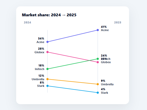
A slope chart (or slopegraph, popularised by Edward Tufte) compares two points in time by drawing a line for each category between its before and after value on two parallel axes. The slope of each line — up, down, steep, flat — instantly communicates the direction and size of change, and crossings show rank shifts. This snippet builds it in plain HTML, CSS, SVG, and vanilla JavaScript, with labelled endpoints and hover focus — no charting library.
Two axes, one line per category
The chart has two vertical axes — left for the "before" period, right for "after" — and each category is a single line connecting its two values, with a dot at each end. A line that climbs rose; one that falls dropped; a steep line changed a lot. This direct encoding of change as slope is what a slopegraph does better than a grouped bar chart or two pies: the eye reads the trend without comparing bar heights across a gap.
A shared scale for honest slopes
Both axes share one scale computed from the combined min and max of all values, so a slope's steepness genuinely reflects the magnitude of change and lines are comparable across categories. The y() function maps each value to a pixel position on that shared range (inverted for SVG). Using one scale for both columns is essential — separate scales would make the slopes meaningless.
Endpoints labelled on both sides
Each line is labelled at both ends: the category name and its before value on the left, its after value and name on the right. Labelling both endpoints (rather than relying on a legend) lets the reader follow any line across without losing track of which is which — the convention that makes a slopegraph readable even with crossing lines.
Hover to focus
Hovering a line dims all the others and thickens the focused one, with a tooltip showing the exact change in points. This focus-and-dim interaction is what tames a busy slope chart: when several lines cross, hovering isolates the one you care about so you can trace it cleanly. The whole row (line, dots, labels) is one SVG group, so it highlights together.
Data-driven and drop-in
It renders from a DATA array of { name, before, after, color }. Swap in any two-period comparison — market share, rankings, prices, survey results across two years — and the slopes, scale, and labels follow. It is a clear, dependency-free reference for slopegraph construction: shared-scale endpoints, connecting lines, and focus interaction. A slope chart only scales gracefully to a dozen or so categories before the left and right labels start overlapping vertically — past that point, either label only the lines a viewer is most likely to care about (the biggest movers) and let the rest go unlabeled until hovered, or switch to small multiples grouping related categories into separate, less crowded slope charts.
Build with AI
Build, Understand, Optimize, and Extend It With AI
You don't have to work out the shared-scale math by hand. Paste this snippet's HTML, CSS, and JS into an AI coding assistant like Claude and ask it to explain exactly why the y() function derives its min and max from every before and after value combined rather than scaling each axis independently, or how the mousemove handler uses closest('.sl-row') plus a dim class to isolate one line among crossing ones. The same assistant can help optimize it, for instance checking whether rebuilding the entire SVG with innerHTML equals '' plus re-creating every element on each render() call is wasteful for data that updates frequently versus patching existing nodes. It is just as useful for extending the chart: ask it to add a third time period as a middle column, sort the DATA array by change magnitude and only label the biggest movers to avoid overlap with many categories, or animate the lines drawing in in on load using stroke-dashoffset. Treat the code less like a finished artifact and more like a starting point for a conversation.
Prompt to recreate it
Copy this into your AI assistant of choice to build the effect from scratch, or as a jumping-off point for your own variant:
Build a "slope chart" (slopegraph) comparing a before and after value per category in plain HTML, CSS, and inline SVG built with JavaScript — no charting library.

Requirements:
- Two parallel vertical axis lines, one for the "before" period and one for "after", with one straight line per category connecting its before value's y-position on the left axis to its after value's y-position on the right axis, plus a small circle marker at each end.
- Compute a single shared vertical scale from the combined minimum and maximum across every before and after value in the dataset, and use that one scale function for both axis positions — never compute separate independent scales for the two axes, since that would make slope steepness meaningless between categories.
- Label both ends of every line: the category name and its value at the left endpoint, and the value and category name again at the right endpoint, so a viewer can trace any single line across the chart without needing a color legend.
- Group each line, its two dot markers, and its four text labels into one SVG group element per category, so they can be selected and styled together as a unit.
- On mousemove over the chart, detect which row group the pointer is over (using event target's closest ancestor match), thicken that row's line and enlarge its dots, add a dimming class to every other row's group, and show a tooltip near the cursor stating the exact numeric change (with a plus or minus sign) for the hovered category. On mouseleave, clear the dimming and hide the tooltip.
- Render everything from a plain JavaScript array of objects (name, before, after, color) so swapping in new data requires no changes to the rendering logic.
Want to tighten it up first? Run this prompt through the AI Prompt Studio to score it across 8 quality dimensions, catch anti-patterns, and tune the wording for Claude, ChatGPT, or Gemini before you paste it in.
Step by step
How to Use
- 1Paste HTML, CSS, and JSA slope chart renders connecting each company's 2024 and 2025 market share.
- 2Read the slopesUpward lines rose, downward fell; steeper means a bigger change, crossings mean rank shifts.
- 3Hover a lineThe others dim and a tooltip shows the change in points for the focused line.
- 4Swap in your dataReplace the DATA array with your own { name, before, after, color } items.
- 5Use for any two periodsYears, before/after, baseline/result — any two comparable points work.
- 6Wire to an APIMap your two-period data into the DATA shape and call render().
Real-world uses
Common Use Cases
Got questions?
Frequently Asked Questions
Comparing exactly two points — usually two time periods — across several categories. Each category becomes a line whose slope shows the direction and size of change, and crossings reveal rank swaps. It communicates change more directly than grouped bars (no comparing heights across a gap) or two pies (no tracking slices between them), which is why Tufte popularised it for before/after comparisons.
The whole point of a slope chart is that the steepness of a line reflects how much a value changed. If each axis had its own scale, identical changes would render as different slopes and the chart would mislead. The snippet computes one min/max from all values across both periods and maps both endpoints through the same y() function, so every slope is comparable and honest.
When several lines are close together or cross, a legend forces the reader to match colours back and forth. Labelling each line's name and value at both endpoints lets the eye follow any line straight across the chart without losing it. This dual labelling is the standard slopegraph convention and is what keeps it readable as the number of categories grows.
With many categories the lines can overlap and cross, making one hard to trace. Hovering a line adds a dim class to all the other rows and thickens the focused line and its dots, visually isolating it, while a tooltip shows its exact change. Because each line, its dots, and labels are grouped in one SVG <g>, they highlight and dim together.
In React, hold the data in useState and render the line groups from .map() (or run render() in a useEffect with a ref), tracking the hovered index in state for the dim effect; in Vue, use v-for with a hovered ref; in Angular, *ngFor with a property. The shared-scale y() math is framework-agnostic and ports unchanged.