You Might Also Like
Learn Coding Visually
Learn to code with interactive, live-preview playgrounds — HTML, CSS, JavaScript, React & more.
 HTML Playground42 lessons · Click-based · Live preview
 CSS PlaygroundLearn CSS with a live editor
 JavaScript Playground60 lessons · DOM · Async · Canvas
 React PlaygroundLearn React with a live code editor
 GSAP PlaygroundLearn GSAP animation interactively
 SVG Playground44 lessons · shapes · paths · animation
 SCSS Playground45 lessons · Sass modules · tokens
 Tailwind PlaygroundLearn Tailwind CSS with a live editor
 Bootstrap 5 Playground50 lessons · live preview
Waffle Chart — HTML CSS JS Square-Grid Percentage Chart
Waffle Chart · Charts · Plain HTML, CSS & JS · Live preview
What's included
Features
About this UI Snippet
Waffle Chart — A 100-Square Grid Where Each Cell Is One Percent
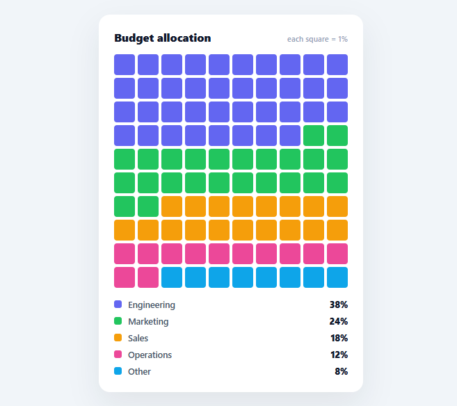
A waffle chart shows part-to-whole composition as a 10×10 grid of 100 squares, each representing one percent, coloured by category. It is often easier to read than a pie chart because counting squares is more intuitive than judging angles. This snippet builds it in plain HTML, CSS, and vanilla JavaScript, with correct rounding so the categories always fill exactly 100 cells — no charting library.
The grid is the chart
A CSS grid of 100 square cells (10 columns, aspect-ratio: 1) is the entire canvas. Each category claims a run of cells in its colour, filled in order, so the coloured blocks read as proportions of the whole. Using a real grid of elements (rather than a drawn chart) means every cell is a DOM node you can hover, and the layout is naturally responsive — the squares scale with the card width.
Largest-remainder rounding (the hard part)
The subtle problem every waffle chart faces: percentages rarely round to whole cells that sum to 100. If you naively round each category, you might end up with 99 or 101 cells. The snippet uses the largest-remainder method: floor each category's cell count, then hand out the leftover cells one at a time to the categories with the biggest fractional remainders. This guarantees the grid sums to exactly 100 while distributing rounding as fairly as possible — the same apportionment method used for allocating seats from vote shares. Getting this right is what keeps the waffle honest and gap-free.
Color runs and an empty fallback
Cells are generated category by category, so each colour forms a contiguous run across the grid (left-to-right, top-to-bottom). Any unallocated cells (which should not occur once rounding sums to 100) fall back to a neutral empty colour, so the grid never breaks. Hovering a coloured cell shows its category name in a tooltip.
A legend with the rounded values
The legend lists each category with its colour and its *rounded* cell count (the number actually shown), not the raw percentage — so the legend always agrees with what is on the grid. Showing the displayed value rather than the source number avoids the confusing case where the legend says 38% but you can count 37 squares.
Data-driven and drop-in
It renders from a DATA array of { name, value, color }; values need not pre-sum to 100 (they are normalised). Swap in budget splits, market share, time allocation, or survey results and it lays out the grid. It is a clear, dependency-free reference for waffle layout and the largest-remainder rounding that part-to-whole square charts require. The same largest-remainder method generalises beyond charts — it's the standard algorithm for apportioning parliamentary seats by vote share, splitting a fixed pool of anything (budget headcount, inventory units) across categories by percentage, and any other case where rounded shares of a whole must still sum to the whole exactly. It's worth implementing once as a small, generic allocate(values, total) helper rather than re-deriving it per chart, since the floor-then-distribute-remainders logic here doesn't reference anything specific to waffle rendering — the exact same function would apportion budget headcount across departments or seats across parties from vote percentages.
Build with AI
Build, Understand, Optimize, and Extend It With AI
Instead of tracing the rounding algorithm by hand, paste this snippet's HTML, CSS, and JS into an AI coding assistant like Claude and ask it to explain exactly how allocate() uses Math.floor on each category's raw share, then sorts by descending fractional remainder to decide which categories receive the leftover whole cells, and why that specific approach guarantees the total always lands on exactly 100 rather than 99 or 101. It's worth asking it to verify the edge case too — what happens if two categories tie exactly on their fractional remainder. For extending it, have it generalize allocate() into a standalone utility usable outside chart rendering (e.g. apportioning a fixed headcount across departments by percentage), add a way to sort the legend by value, or support a second row of squares to double the resolution to half-percent cells. Treat the code less like a finished artifact and more like a starting point for a conversation.
Prompt to recreate it
Copy this into your AI assistant of choice to build the effect from scratch, or as a jumping-off point for your own variant:
Build a waffle chart (a 10x10 grid of 100 squares representing percentages) in plain HTML, CSS, and vanilla JavaScript with no charting library.

Requirements:
- A CSS grid of exactly 100 square cells (10 columns) representing 100% of a whole, filled with colored squares in contiguous runs per category, ordered by category.
- Accept an input array of categories each with a name, a raw numeric value, and a color; the raw values do not need to sum to 100 — normalize each category's share as its value divided by the sum of all values, times 100.
- Implement the allocation using the largest-remainder rounding method: floor each category's normalized share to get a whole-cell count, sum the floors to find how many cells are still unassigned, then sort categories by the descending size of their fractional remainder (the part lost to flooring) and hand out one additional cell each, in that sorted order, until the total reaches exactly 100 cells. Do not use plain Math.round per category, since that can make the total sum to something other than 100.
- Any leftover unallocated cells (which should never occur if the algorithm is correct) must render as a neutral, uncolored fallback square rather than breaking the layout.
- Render a legend listing each category's color swatch, name, and its rounded cell count (not the raw input value or unrounded percentage), so the legend always agrees exactly with what's visibly countable on the grid.
- Add a mouseover tooltip that follows the cursor and shows the category name when hovering any colored cell, and hides when the pointer leaves the grid.
Want to tighten it up first? Run this prompt through the AI Prompt Studio to score it across 8 quality dimensions, catch anti-patterns, and tune the wording for Claude, ChatGPT, or Gemini before you paste it in.
Step by step
How to Use
- 1Paste HTML, CSS, and JSA 10x10 waffle chart renders, each square representing 1% of the whole.
- 2Read the blocksEach colour's run of squares is its share; the legend lists the percentages.
- 3Hover a squareSee which category a cell belongs to in a tooltip.
- 4Swap in your dataReplace the DATA array with your own { name, value, color } items.
- 5Values need not total 100They are normalised, and rounding ensures the grid always fills exactly 100 cells.
- 6Resize the gridChange the grid-template-columns count (and TOTAL) for a different cell count.
Real-world uses
Common Use Cases
Got questions?
Frequently Asked Questions
Each category's share rarely converts to a whole number of cells, and naively rounding each one can make the total come out to 99 or 101 instead of 100. The largest-remainder method floors every count, then distributes the leftover cells one at a time to the categories with the largest fractional parts. This guarantees the grid sums to exactly 100 while keeping the rounding as fair as possible.
No. The values are normalised — each category's cell count is value ÷ total × 100 — so you can pass raw amounts (dollars, counts, hours) and the chart converts them to percentages of their sum. The largest-remainder rounding then ensures those convert to whole cells that fill the grid exactly.
Because rounding can make the displayed squares differ slightly from the source percentage (38.4% becomes 38 cells). Showing the rounded cell count in the legend means the legend always matches what you can count on the grid, avoiding the confusing case where the legend and the visible squares disagree.
Yes. Change grid-template-columns to a different column count and set TOTAL to the number of cells (e.g. 5x5 = 25, or 10x20 = 200 for half-percent resolution). The allocation scales to whatever TOTAL you choose, so each cell represents 100/TOTAL percent. Keep TOTAL and the column count consistent for square cells.
In React, hold the data in useState, compute the cell allocation with useMemo, and render the grid from it; in Vue, use a computed counts array with v-for; in Angular, a getter with *ngFor. The allocate() largest-remainder logic is framework-agnostic — only the state and rendering move into the framework.