You Might Also Like
Learn Coding Visually
Learn to code with interactive, live-preview playgrounds — HTML, CSS, JavaScript, React & more.
 HTML Playground42 lessons · Click-based · Live preview
 CSS PlaygroundLearn CSS with a live editor
 JavaScript Playground60 lessons · DOM · Async · Canvas
 React PlaygroundLearn React with a live code editor
 GSAP PlaygroundLearn GSAP animation interactively
 SVG Playground44 lessons · shapes · paths · animation
 SCSS Playground45 lessons · Sass modules · tokens
 Tailwind PlaygroundLearn Tailwind CSS with a live editor
 Bootstrap 5 Playground50 lessons · live preview
Box Plot — HTML CSS JS Box-and-Whisker (No Library)
Box Plot · Charts · Plain HTML, CSS & JS · Live preview
What's included
Features
About this UI Snippet
Box Plot — Quartiles, IQR Whiskers, and Outliers Computed from Raw Data
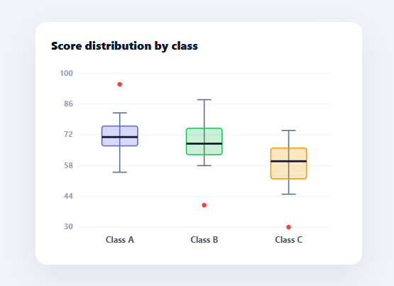
A box plot (box-and-whisker) is the standard way to summarise a distribution: the box spans the middle 50% of values, a line marks the median, whiskers reach the typical range, and dots flag outliers. It compares spread and skew across groups far better than a bar of averages. This snippet builds it in plain HTML, CSS, SVG, and vanilla JavaScript, computing all the statistics from raw samples itself — no charting library.
It computes the real statistics
Given a raw array of numbers per group, stats() sorts them and derives the five-number summary using linear-interpolation quantiles: Q1 (25th percentile), the median (50th), and Q3 (75th). From those it computes the interquartile range (IQR = Q3 − Q1) and the Tukey fences at 1.5×IQR beyond each quartile. This quantile-and-IQR math is the heart of a box plot, and doing it from raw data (rather than pre-computed values) is what makes it a genuine statistical chart rather than a styled bar.
Whiskers that stop at the data, plus outliers
A correct box plot does not run its whiskers to the absolute min and max — it runs them to the most extreme points still *within* the 1.5×IQR fences, and draws anything beyond as individual outlier dots. The snippet filters the sorted data by the fences to find the whisker ends, then plots the out-of-fence points as red circles. This Tukey convention is the detail most hand-rolled box plots get wrong (running whiskers to the extremes hides outliers); getting it right is what makes the chart trustworthy.
Drawn as labelled SVG glyphs
Each group renders as a vertical whisker line with end caps, a translucent box from Q1 to Q3 in the group colour, a bold median line across it, and outlier dots — all positioned by a shared y() scale mapping data values to pixels (rounded to a clean axis range). Gridlines and axis ticks give reference levels, and a label sits under each box. Because the box is its own SVG node, hovering it shows the full five-number summary in a tooltip.
A shared axis for comparison
All groups share one y-axis computed from the combined data range, so their boxes are directly comparable — you can see at a glance which class has the higher median, the wider spread, or the skew (median off-centre in its box). Comparing distributions side by side on one scale is the main reason to use box plots over separate summaries.
Data-driven and drop-in
Feed it any array of { name, color, data } with raw samples and it computes and draws the plot. It is a clear, dependency-free reference for the quartile, IQR, whisker, and outlier math behind every box-and-whisker chart.
Build with AI
Build, Understand, Optimize, and Extend It With AI
You don't have to re-derive the quantile interpolation or the Tukey fence math by hand to trust this chart. Paste this snippet's HTML, CSS, and JS into an AI coding assistant like Claude and ask it to explain exactly how the quantile function interpolates between two sorted values to compute Q1, the median, and Q3, and why the whiskers are drawn from the most extreme in-fence points rather than the raw min and max. The same assistant can help optimize it — asking whether re-sorting each group's full array on every render() call matters at scale, or whether the SVG could be rebuilt incrementally instead of clearing innerHTML and rebuilding every node on each redraw. It's also useful for extending the chart: ask it to add notched boxes for a visual confidence-interval indicator, support horizontal box plots, or animate the box and whiskers growing in on load. Treat the code less like a finished artifact and more like a starting point for a conversation.
Prompt to recreate it
Copy this into your AI assistant of choice to build the effect from scratch, or as a jumping-off point for your own variant:
Build a "box-and-whisker plot" that computes real statistics from raw sample arrays in plain HTML, CSS, and SVG built with vanilla JavaScript — no charting library, no pre-computed quartiles supplied by the caller.

Requirements:
- Accept input as a plain array of groups, each with a name, a color, and a raw array of numeric samples (not pre-computed statistics).
- Compute Q1, median, and Q3 per group using linear-interpolation quantiles on the sorted sample array (interpolating between the two nearest ranked values, not simple nearest-rank).
- Compute the interquartile range and Tukey fences at 1.5 times the IQR beyond Q1 and Q3, and draw the whiskers only out to the most extreme sample values that still fall within those fences — never to the raw dataset minimum and maximum.
- Draw every sample outside the fences as its own individually plotted outlier point, distinct in color from the box and whiskers.
- Render each group as: a vertical whisker line with horizontal end caps, a semi-transparent rectangle spanning Q1 to Q3 in the group's color, and a bold horizontal median line drawn across the box at the correct height.
- Use one shared y-axis scale computed from the combined minimum and maximum across all groups (rounded to a clean range) so every group's box is positioned on a directly comparable scale, with gridlines and axis tick labels.
- On hovering a box, show a tooltip listing that group's name, minimum, Q1, median, Q3, and maximum, positioned near the cursor.
Want to tighten it up first? Run this prompt through the AI Prompt Studio to score it across 8 quality dimensions, catch anti-patterns, and tune the wording for Claude, ChatGPT, or Gemini before you paste it in.
Step by step
How to Use
- 1Paste HTML, CSS, and JSA box plot renders for three classes, each computed from its raw scores.
- 2Read the boxesThe box is the middle 50% (Q1 to Q3), the bold line is the median, whiskers reach the IQR range.
- 3Spot outliersRed dots beyond the whiskers are values outside the 1.5x IQR fences.
- 4Hover a boxSee the full five-number summary (min, Q1, median, Q3, max) in a tooltip.
- 5Swap in your dataReplace the GROUPS array with your own { name, color, data } raw samples.
- 6Wire to an APIFetch your samples, map them into GROUPS, and call render().
Real-world uses
Common Use Cases
Got questions?
Frequently Asked Questions
stats() sorts the raw data and uses linear-interpolation quantiles: for a percentile q, it finds the fractional position q × (n − 1), then interpolates between the two surrounding sorted values. This gives Q1 (q=0.25), the median (0.5), and Q3 (0.75). It is the same method most statistical tools use, and computing from raw samples is what makes this a real box plot rather than a styled bar.
By the standard Tukey convention, whiskers extend only to the most extreme data points still within 1.5x the interquartile range beyond Q1 and Q3 (the fences). Anything past the fences is an outlier, drawn as its own dot. Running whiskers to the absolute extremes would hide outliers, which defeats the purpose — so the snippet filters by the fences to find the whisker ends and plots the rest as outlier circles.
The box spans Q1 to Q3 — the middle 50% of the data — so a taller box means more spread. The median line shows the centre; when it sits off-centre within the box, the distribution is skewed toward the longer side. Comparing boxes across groups on the shared axis reveals differences in centre, spread, and skew that an average alone would hide.
Edit the GROUPS array — each entry is { name, color, data } where data is the raw sample array. Add, remove, or change groups and the quartiles, whiskers, outliers, shared axis, and labels all recompute on the next render(). For real data, fetch your samples, map them into that shape, and call render(); the layout adapts to any number of groups.
In React, hold the groups in state and compute stats with useMemo, rendering the SVG glyphs from them (or run render() in a useEffect with a ref); in Vue, use a computed stats array with v-for; in Angular, a getter with *ngFor. The quantile/IQR/outlier math is framework-agnostic and ports unchanged.