You Might Also Like
Learn Coding Visually
Learn to code with interactive, live-preview playgrounds — HTML, CSS, JavaScript, React & more.
 HTML Playground42 lessons · Click-based · Live preview
 CSS PlaygroundLearn CSS with a live editor
 JavaScript Playground60 lessons · DOM · Async · Canvas
 React PlaygroundLearn React with a live code editor
 GSAP PlaygroundLearn GSAP animation interactively
 SVG Playground44 lessons · shapes · paths · animation
 SCSS Playground45 lessons · Sass modules · tokens
 Tailwind PlaygroundLearn Tailwind CSS with a live editor
 Bootstrap 5 Playground50 lessons · live preview
Histogram — HTML CSS JS SVG Histogram (No Library)
Histogram · Charts · Plain HTML, CSS & JS · Live preview
What's included
Features
About this UI Snippet
Histogram — Bin Raw Data into Adjustable Buckets and Draw the Distribution
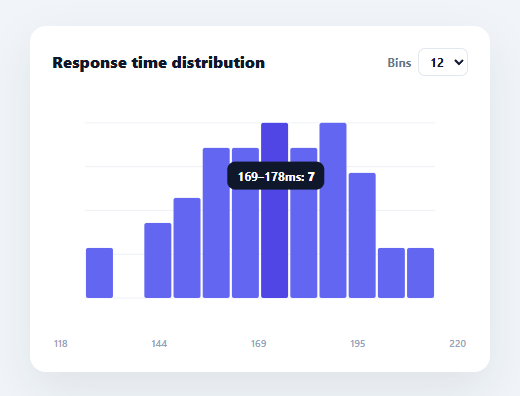
A histogram answers "how is this data distributed?" — it bins a set of raw measurements into ranges and shows how many values fall in each, revealing the shape (normal, skewed, bimodal) that a list of numbers hides. This snippet builds a real histogram in plain HTML, CSS, SVG, and vanilla JavaScript: it bins raw data itself, lets you change the bin count live, and draws adjoining bars with hover tooltips — no charting library.
Binning is the actual work
Unlike a bar chart (where you supply pre-aggregated values), a histogram takes *raw* numbers and computes the buckets. bin(count) finds the data's min and max, divides that range into equal-width bins, then drops each value into its bin by index (floor((v − min) / width)), with the maximum value clamped into the last bin so the top edge isn't lost. The output is an array of { lo, hi, n } — the frequency per range. This binning logic is what makes it a histogram rather than a bar chart, and it's the part people get subtly wrong (off-by-one at the upper edge).
Adjustable bin count
The number of bins dramatically changes a histogram's story — too few hides structure, too many turns it into noise. A selector lets you switch between 8, 12, and 20 bins and re-bins live, so you can find the resolution that reveals the distribution's real shape. Re-binning recomputes everything from the raw data, so the bars, scaling, and axis all update together.
Adjoining bars, scaled to the tallest bin
Histogram bars touch (unlike a categorical bar chart's gapped bars) because the x-axis is a continuous range, not discrete categories — the snippet draws them edge-to-edge with only a hairline separation. Each bar's height is its count as a fraction of the busiest bin, drawn as an SVG rect from the baseline up, with gridlines behind for reading frequencies.
Tooltips with the range and count
Hovering a bar shows its value range and exact count ("165–172ms: 9"), positioned at the cursor via getBoundingClientRect, with one delegated mousemove listener on the SVG. The range labels come from the bin edges, so the reader sees exactly which values each bar represents — essential for a histogram, where the bar's position encodes a range rather than a single label.
Data-driven and drop-in
Point it at any array of raw numbers — response times, ages, scores, prices — and it bins and draws the distribution. Because it's dependency-free SVG, it's crisp at any size and a clear reference for the binning algorithm and frequency scaling that underpin every histogram and distribution chart. One thing worth noting if your raw values include outliers: equal-width binning (used here) puts a handful of extreme values into mostly-empty bins out at the edges, stretching the range and squashing the interesting part of the distribution into fewer bins — for heavily skewed data, computing bin edges over a clipped percentile range instead of the true min/max usually tells a clearer story.
Build with AI
Build, Understand, Optimize, and Extend It With AI
You don't have to trace the binning math by hand. Paste this snippet's HTML, CSS, and JS into an AI coding assistant like Claude and ask it to explain exactly why the bin function clamps the max value's index with Math.min(count - 1, ...), or how changing the bin count selector recomputes the entire distribution from the raw DATA array. The same assistant is useful for optimizing it — ask whether equal-width binning is the right choice for heavily skewed data with outliers, or whether percentile-clipped bin edges would tell a clearer story, as the about section hints at. It's just as handy for extending the chart: ask it to add a toggle between equal-width and equal-frequency (quantile) binning, overlay a normal-distribution curve for comparison, or add a brush-select interaction that highlights a range of bins and reports their combined count. Treat the code less like a finished artifact and more like a starting point for a conversation.
Prompt to recreate it
Copy this into your AI assistant of choice to build the effect from scratch, or as a jumping-off point for your own variant:
Build a histogram chart in plain HTML, CSS, and SVG built with vanilla JavaScript — no charting library.

Requirements:
- Start from a flat array of raw numeric measurements (not pre-aggregated categories).
- Write a binning function that takes a bin count, finds the data's min and max, divides that range into that many equal-width buckets, and counts how many raw values fall into each bucket using floor((value - min) / binWidth) as the index — with the index clamped to the last bin so the maximum value is never dropped due to an off-by-one edge case.
- Render the bins as adjoining SVG rect bars (touching edge to edge with only a hairline gap, not the gapped bars of a categorical bar chart), scaled so the tallest bin's bar reaches the full chart height and the rest are proportional to it.
- Include a selector control that lets the user switch between at least three different bin counts, and re-run the entire binning and redraw whenever it changes.
- Draw a few horizontal gridlines behind the bars and a row of axis labels beneath the chart showing the data's min, quartiles, and max values.
- Attach a single delegated mousemove listener on the SVG (not one listener per bar) that detects which bar is under the cursor via closest, and shows a tooltip with that bin's value range and exact count positioned near the cursor using the container's bounding rect.
- Make the whole chart re-derivable from a new raw data array with no structural changes — swapping the array and calling the render function should be sufficient.
Want to tighten it up first? Run this prompt through the AI Prompt Studio to score it across 8 quality dimensions, catch anti-patterns, and tune the wording for Claude, ChatGPT, or Gemini before you paste it in.
Step by step
How to Use
- 1Paste HTML, CSS, and JSA histogram renders, binning 50 sample measurements into adjoining frequency bars.
- 2Change the bin countUse the Bins selector (8/12/20) to re-bin the data live and see the distribution at different resolutions.
- 3Hover a barSee that bin's value range and exact count in a tooltip.
- 4Swap in your dataReplace the DATA array with your own raw numbers — binning is automatic.
- 5Add bin optionsAdd more <option> values to the selector for finer or coarser binning.
- 6Wire to an APIFetch raw values, assign them to DATA, and call render() to draw the live distribution.
Real-world uses
Common Use Cases
Got questions?
Frequently Asked Questions
A bar chart plots pre-aggregated values for discrete categories with gaps between bars. A histogram takes raw continuous data, bins it into equal-width ranges, and counts how many values fall in each — so its bars touch (the x-axis is a continuous scale) and represent ranges, not labels. This snippet does the binning itself, which is what makes it a true histogram.
Each value's bin index is floor((value − min) / binWidth). The maximum value would compute to an index equal to the bin count (one past the last bin), so it's clamped with Math.min(count − 1, …) into the final bin. Without this clamp the largest value would be dropped — the classic off-by-one error in histogram binning.
The number of bins controls the histogram's resolution. Too few bins smooth away real structure (you might miss that the data is bimodal); too many produce a spiky, noisy chart where each bin holds one or two values. Letting you switch bin counts live lets you find the count that best reveals the distribution's true shape — a core part of reading histograms.
Because the x-axis is a continuous numeric range, not a set of separate categories. Adjacent bars represent adjacent value ranges with no gap between them, so they're drawn edge-to-edge (here with a 1px hairline for legibility). Gapped bars would imply discrete categories, which is a bar chart, not a histogram.
In React, hold the raw data and bin count in useState, compute bins with useMemo, and render rects from .map() (or run the imperative render in useEffect with a ref); in Vue, use a computed bins array; in Angular, a getter with *ngFor. The bin() algorithm and scaling are framework-agnostic and port unchanged.