You Might Also Like
Learn Coding Visually
Learn to code with interactive, live-preview playgrounds — HTML, CSS, JavaScript, React & more.
 HTML Playground42 lessons · Click-based · Live preview
 CSS PlaygroundLearn CSS with a live editor
 JavaScript Playground60 lessons · DOM · Async · Canvas
 React PlaygroundLearn React with a live code editor
 GSAP PlaygroundLearn GSAP animation interactively
 SVG Playground44 lessons · shapes · paths · animation
 SCSS Playground45 lessons · Sass modules · tokens
 Tailwind PlaygroundLearn Tailwind CSS with a live editor
 Bootstrap 5 Playground50 lessons · live preview
Polar Area Chart — HTML CSS JS Rose Chart (No Lib)
Polar Area Chart · Charts · Plain HTML, CSS & JS · Live preview
What's included
Features
About this UI Snippet
Polar Area Chart — Equal-Angle Slices Whose Radius Encodes the Value
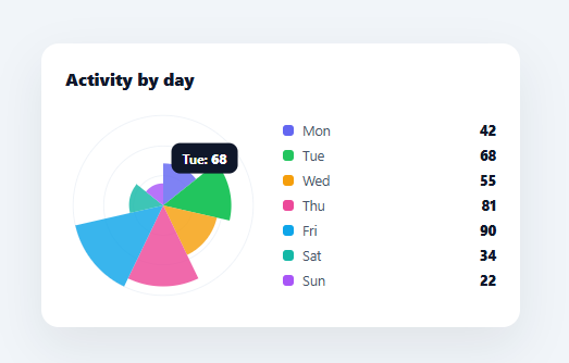
A polar area chart — also called a Nightingale rose or coxcomb chart, after Florence Nightingale who popularised it — is a circular chart where every slice takes an *equal* angle but extends to a *different* radius based on its value. It's a striking alternative to a bar chart for cyclical data like days of the week or months, where the circular form reinforces the cycle. This snippet builds it in plain HTML, CSS, SVG, and vanilla JavaScript, with reference rings, a legend, and hover tooltips — no charting library.
Equal angles, value-driven radii
This is the defining difference from a pie chart, and the snippet makes it explicit. In a pie, the *angle* of each slice encodes its value and the radius is constant. In a polar area chart, the *angle* is constant — every slice spans 1/n of the circle — and the *radius* encodes the value (value / max × maxRadius). So a busier day reaches further out while still occupying its fixed angular wedge. Each slice is drawn as an SVG arc-path wedge from the centre out to its value-scaled radius, using the same cos/sin arc math as a pie but with the radius varying per slice.
Reference rings for reading values
Because radius (not angle) carries the meaning, the eye needs concentric reference rings to judge how far each slice extends — the polar equivalent of a bar chart's gridlines. The snippet draws rings at a third, two-thirds, and full radius, so a viewer can estimate each slice's value by which ring it reaches. Without these rings a polar area chart is pretty but hard to read; with them it's quantitative.
Honest arc geometry
Each wedge moves to the centre, lines out to the start of its arc at the slice's radius, sweeps the arc to the end angle, and closes — with the large-arc-flag set correctly for any slice spanning more than half the circle (relevant if you chart few categories). Starting at twelve o'clock (the −90° offset) matches the convention people expect for circular charts.
Legend and tooltips
A legend lists every slice with its colour and value, and hovering a wedge shows its name and value at the cursor via getBoundingClientRect, with one delegated mousemove listener. Because each wedge is its own SVG path, every slice is independently hoverable and could be animated or highlighted.
Data-driven and drop-in
Feed it any array of { name, value, color } and it draws equal-angle, value-radius slices. It's especially suited to cyclical categories (days, months, hours, wind directions), and it's a clear reference for the polar-area construction and how it differs from a pie — the same arc math, applied to radius instead of angle.
Build with AI
Build, Understand, Optimize, and Extend It With AI
You don't have to work out the equal-angle-versus-value-radius distinction by staring at the math. Paste this snippet's HTML, CSS, and JS into an AI coding assistant like Claude and ask it to explain exactly how each slice gets a fixed 1/n angular span while its individual radius is scaled by value divided by the maximum value in the dataset, and why the three reference rings at a third, two-thirds, and full radius are essential for reading the chart quantitatively rather than just decoratively. The same assistant can help optimize it, for example checking whether the reference ring values should be computed dynamically instead of hardcoded to thirds, or whether the arc math correctly handles a dataset with only one or two categories. It's also useful for extending the effect: ask it to animate each slice growing outward from the center on load, add numeric value labels directly on or near each wedge, or add a way to sort the slices by value instead of by their original array order. Treat the code less like a finished artifact and more like a starting point for a conversation.
Prompt to recreate it
Copy this into your AI assistant of choice to build the effect from scratch, or as a jumping-off point for your own variant:
Build a polar area chart (Nightingale rose chart) in plain HTML, CSS, and vanilla JavaScript using hand-drawn SVG path arcs — no charting library.

Requirements:
- A data array of objects each with a name, a numeric value, and a color, where every entry gets an equal angular slice of the full circle (360 degrees divided by the number of entries) but each slice's radius is independently scaled to that entry's value divided by the maximum value across the whole dataset, times a fixed maximum radius — this is the key difference from a pie chart, where angle (not radius) normally encodes value.
- Draw at least three concentric reference circles (for example at one third, two thirds, and full radius) underneath the data slices so a viewer can visually judge how far each wedge reaches relative to the maximum.
- Write a point-on-circle helper that takes a fraction of the circle and a radius and returns the x/y coordinate using cosine and sine, offset by -90 degrees so the first slice starts at the twelve o'clock position.
- Build each slice as an SVG path: move to the chart's center, line out to the start of the arc at that slice's own scaled radius, sweep an elliptical arc to the end of the slice at the same radius, then close — correctly setting the large-arc-flag to 1 for any slice spanning more than half the circle.
- Render a legend listing every entry's name, color swatch, and raw value, and add a tooltip that follows the cursor while hovering any wedge, showing that wedge's name and value, positioned using getBoundingClientRect relative to the chart's container.
- Keep the whole render data-driven from the array so changing values, adding entries, or removing entries automatically reflows both the angles and the radii on the next render.
Want to tighten it up first? Run this prompt through the AI Prompt Studio to score it across 8 quality dimensions, catch anti-patterns, and tune the wording for Claude, ChatGPT, or Gemini before you paste it in.
Step by step
How to Use
- 1Paste HTML, CSS, and JSA polar area chart renders with seven equal-angle slices reaching different radii by value.
- 2Read with the ringsUse the concentric reference rings to judge how far each slice extends.
- 3Hover a sliceSee that slice's name and value in a tooltip.
- 4Swap in your dataReplace the DATA array with your own { name, value, color } items.
- 5Best for cyclical dataUse it for days, months, hours, or directions where the circular form reinforces the cycle.
- 6Wire to an APIFetch your figures, map them into the DATA shape, and call render().
Real-world uses
Common Use Cases
Got questions?
Frequently Asked Questions
In a pie chart, each slice's angle encodes its value and every slice shares the same radius. In a polar area (Nightingale rose) chart, it's reversed: every slice takes an equal angle (1/n of the circle) and the radius encodes the value, so larger values reach further out. This snippet computes equal angular wedges and scales each wedge's radius to its value.
Because radius carries the meaning, not angle, the viewer needs a scale to judge how far each slice extends — concentric rings are the polar equivalent of a bar chart's gridlines. Without them the chart looks decorative but is hard to read quantitatively; the rings at a third, two-thirds, and full radius let you estimate each slice's value at a glance.
It shines for cyclical categories — days of the week, months, hours of the day, compass directions — where arranging the data in a circle reinforces the natural cycle and lets you spot patterns (a weekend dip, a seasonal peak). For non-cyclical comparison, a bar chart is usually clearer; for part-to-whole, a pie. Use polar area when the cycle is part of the story.
Each wedge is an SVG path: move to the centre, line out to the slice's start angle at its value-scaled radius, sweep an arc to the end angle (same radius), and close. The angles are evenly divided across the circle and offset by −90° to start at twelve o'clock; the large-arc-flag is set for any slice over half the circle. It's the same arc math as a pie, applied with a per-slice radius.
In React, hold the data in useState and render paths/legend from .map() (or run render() in a useEffect with a ref); in Vue, use v-for or a template ref with onMounted; in Angular, *ngFor or ViewChild with ngAfterViewInit. The pt() arc math and radius scaling are framework-agnostic and port unchanged.