You Might Also Like
Learn Coding Visually
Learn to code with interactive, live-preview playgrounds — HTML, CSS, JavaScript, React & more.
 HTML Playground42 lessons · Click-based · Live preview
 CSS PlaygroundLearn CSS with a live editor
 JavaScript Playground60 lessons · DOM · Async · Canvas
 React PlaygroundLearn React with a live code editor
 GSAP PlaygroundLearn GSAP animation interactively
 SVG Playground44 lessons · shapes · paths · animation
 SCSS Playground45 lessons · Sass modules · tokens
 Tailwind PlaygroundLearn Tailwind CSS with a live editor
 Bootstrap 5 Playground50 lessons · live preview
Range Bar Chart — HTML CSS JS Floating Bars (No Lib)
Range Bar Chart · Charts · Plain HTML, CSS & JS · Live preview
What's included
Features
About this UI Snippet
Range Bar Chart — Floating Bars for Each Category Low-to-High Range
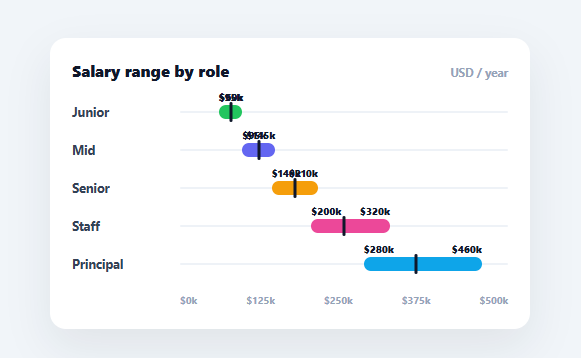
A range bar chart (also called a floating-bar or range-column chart) draws each bar from a *start* value to an *end* value rather than from zero — perfect for showing spans: salary ranges by role, daily temperature high/low, project start-to-end dates, or any min–max band. This snippet builds it in plain HTML, CSS, and vanilla JavaScript, with bars positioned on a shared axis, low/high captions, and a median marker — no charting library.
Bars that start where the data starts
The defining feature is that a bar doesn't begin at zero. Each bar is absolutely positioned along a track: its left is the low value's position on the axis and its width is the span from low to high (both as percentages of the axis range via pct()). So the bar floats between its two endpoints, encoding the *range* by its position and length. This is the right chart whenever the meaningful information is a span, not a single magnitude — a plain bar from zero would waste space and hide the actual range.
A shared axis so ranges are comparable
Every bar is scaled against one axis (0 to a clean step above the largest high value), with tick labels beneath, so ranges across categories line up and can be compared directly — you can see at a glance that Senior's band overlaps Mid's, or that Principal's range is far wider. A faint rail behind each bar marks the full axis extent, giving the floating bar context for where it sits.
Low, high, and median in one row
Each bar carries small captions at its two ends showing the low and high values, and a dark median marker sits at the median's position within the bar — so a single row communicates the bottom, top, and typical value of the range. Showing the median turns a simple range into a richer summary (it's the bar-chart cousin of a box plot's median line), which is exactly what's useful for things like salary bands.
Animated growth from the low edge
The bars animate in by scaling from their low edge (transform-origin: left with a scaleX from 0 to 1) on the next animation frame — the standard requestAnimationFrame trick so the CSS transition runs from the start state. Growing from the low edge (rather than from zero) reinforces that the bar represents a span anchored at its start.
Data-driven and drop-in
Each row comes from { label, low, median, high, color }, and the axis auto-scales to the data. Swap in temperatures, date ranges, or score bands and it draws the floating bars. It's a clear reference for from-to bar positioning and shared-axis scaling that apply to any range or Gantt-style visualisation.
Build with AI
Build, Understand, Optimize, and Extend It With AI
You do not have to work through the floating-bar positioning math by hand. Paste this snippet's HTML, CSS, and JS into an AI coding assistant like Claude and ask it to explain exactly why the bar's left and width are both computed from the same pct() function against one shared AXIS_MAX rather than each bar scaling to its own range, and why transform-origin is set to left with a scaleX animation instead of animating width directly. The same assistant can help you optimize it — ask whether AXIS_MAX being derived once from Math.max across all bars means adding a single outlier row would force every other bar to visually compress, and how you'd handle that gracefully. It's also useful for extending the chart: ask it to add a hover tooltip showing exact low/median/high values, support sorting rows by range width or median, or add a second overlaid marker for a target or benchmark value. Treat the code less like a finished artifact and more like a starting point for a conversation.
Prompt to recreate it
Copy this into your AI assistant of choice to build the effect from scratch, or as a jumping-off point for your own variant:
Build a range (floating) bar chart in plain HTML, CSS, and JavaScript with no charting library — bars that start at a low value and end at a high value rather than starting at zero.

Requirements:
- Take a data array of objects, each with a label, a low value, a median value, a high value, and a color, and compute one shared axis maximum by rounding up the largest high value across all rows to a clean step (e.g. the nearest 50).
- Position each bar using percentages of that one shared axis: the bar's left offset must equal the low value's percentage position on the axis, and the bar's width must equal the percentage span between the low and high values — the bar must never start at zero.
- Draw a faint full-width rail behind each bar showing the complete axis extent for context, plus small caption labels at the bar's two ends showing the exact low and high values.
- Add a distinct marker (a small vertical line or dot, visually different from the bar itself) positioned at the median value's percentage location within the bar, so each row communicates low, median, and high in a single glance.
- Animate each bar growing in from its low edge on load: use transform-origin set to the left edge and animate a scaleX transform from 0 to 1 (not a width transition), triggered one animation frame after the bar is added to the DOM so the transition actually plays.
- Add evenly spaced axis tick labels beneath the chart showing values across the shared 0-to-max range, aligned with the bar track columns (not the row labels column).
Want to tighten it up first? Run this prompt through the AI Prompt Studio to score it across 8 quality dimensions, catch anti-patterns, and tune the wording for Claude, ChatGPT, or Gemini before you paste it in.
Step by step
How to Use
- 1Paste HTML, CSS, and JSA range bar chart renders showing salary low–high bands per role with median markers.
- 2Read the rangesEach floating bar spans its low to high; the dark marker shows the median, captions show the values.
- 3Compare on the axisBars share one axis, so you can see overlaps and which ranges are wider.
- 4Swap in your dataReplace the DATA array with your own { label, low, median, high, color } items.
- 5Use for any spansTemperatures, date ranges, score bands — any min–max data fits.
- 6Wire to an APIFetch your ranges, map them into the DATA shape, and call render().
Real-world uses
Common Use Cases
Got questions?
Frequently Asked Questions
A normal bar starts at zero and its length encodes a single value. A range (floating) bar starts at a low value and ends at a high value, so its position and length together encode a span — a min-to-max range. This snippet positions each bar by its low value (left) and sizes it by the span (width), both as percentages of a shared axis.
A range alone tells you the extremes but not where values typically fall. Adding a median marker shows the central/typical value within the span — so a salary band, for example, communicates not just min and max but the midpoint candidates can expect. It's the same idea as a box plot's median line, condensed into a single floating bar.
Every bar is scaled against one shared axis that runs from zero to a clean step above the largest high value across the data. Because all bars use the same pct() mapping, their positions and widths are directly comparable — you can see overlaps between ranges and which bands are wider, which is the whole point of putting ranges on one axis.
The bars use transform-origin: left and animate scaleX from 0 to 1 on the next animation frame (so the CSS transition runs from its start state). Growing from the low edge — where the bar is anchored on the axis — reinforces that the bar represents a span starting at its low value, rather than a magnitude from zero. It's the same requestAnimationFrame technique any animated bar uses.
In React, hold the data in useState and render rows from .map(), adding the grow class in a useEffect so bars animate after mount; in Vue, use v-for with onMounted; in Angular, *ngFor with ngAfterViewInit. The pct() scaling and positioning are framework-agnostic — only the state and the deferred animation trigger move into the framework.