You Might Also Like
Learn Coding Visually
Learn to code with interactive, live-preview playgrounds — HTML, CSS, JavaScript, React & more.
 HTML Playground42 lessons · Click-based · Live preview
 CSS PlaygroundLearn CSS with a live editor
 JavaScript Playground60 lessons · DOM · Async · Canvas
 React PlaygroundLearn React with a live code editor
 GSAP PlaygroundLearn GSAP animation interactively
 SVG Playground44 lessons · shapes · paths · animation
 SCSS Playground45 lessons · Sass modules · tokens
 Tailwind PlaygroundLearn Tailwind CSS with a live editor
 Bootstrap 5 Playground50 lessons · live preview
Bullet Chart — HTML CSS JS KPI vs Target Graph
Bullet Chart · Charts · Plain HTML, CSS & JS · Live preview
What's included
Features
About this UI Snippet
Bullet Chart — KPI vs. Target with Qualitative Bands in One Compact Row
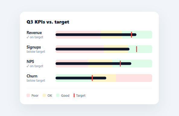
A bullet chart — Stephen Few's bullet graph — is the most information-dense way to show a single KPI: in one slim horizontal bar it shows the actual value, the target to beat, and qualitative "poor / OK / good" context, all at a glance. It's the gauge done right, fitting many KPIs into the space one dial would waste. This snippet builds a complete bullet chart in plain HTML, CSS, and vanilla JavaScript, with shaded performance bands, a target marker, an animated measure bar, and support for inverted metrics — no charting library.
Three layers in one track
Each KPI row stacks three things in a single track. The background is split into three shaded qualitative ranges (poor, OK, good) sized from the metric's band thresholds as percentages of its axis maximum. On top, a thin dark "measure" bar shows the actual value. And a vertical red marker shows the target. Reading it is instant: is the dark bar past the red line, and which colour band does it land in? That's the whole point of a bullet graph — comparison and context without a single number to parse.
Each KPI on its own scale
Real dashboards mix metrics with wildly different ranges — dollars, counts, percentages, scores. Every KPI here carries its own max, target, and band thresholds, and everything (ranges, measure, target) is computed as a percentage of that KPI's own max. So revenue in the hundreds and NPS out of 60 each get a correctly-proportioned bar, and they line up visually as a tidy column despite measuring completely different things.
Inverted metrics, handled correctly
Some KPIs are better when lower — churn, cost, response time. The snippet supports an invert flag that reverses two things: the shaded bands flip so green sits at the low end, and the "on target" test becomes "value ≤ target" instead of "value ≥ target." This matters because a bullet chart that shows churn with green on the high end would be actively misleading. Handling the inverted case is what makes the component honest across every kind of metric.
Animated measure, status label
The measure bar animates from zero to its value on the next animation frame — the same requestAnimationFrame trick that lets a CSS width transition run from a freshly-created element. Each row also shows a tiny status line ("✓ on target" or "below target") computed from the value-versus-target comparison, so the verdict is spelled out alongside the visual.
Data-driven and drop-in
Every row renders from a KPIS array of { name, value, target, max, bands, invert }. Add a KPI, change a target, or wire in live numbers and the bands, measure, target marker, and status all follow. Because it's compact, dependency-free, and stacks neatly, a bullet chart is the ideal way to put a whole scorecard of KPIs on one screen — far more scannable than a wall of gauges.
Build with AI
Build, Understand, Optimize, and Extend It With AI
You don't have to work out the invert flag's ripple effects by hand to trust this chart. Paste this snippet's HTML, CSS, and JS into an AI coding assistant like Claude and ask it to explain exactly how the invert flag simultaneously reverses the shades array ordering and flips the on-target comparison from value greater-or-equal target to value less-or-equal target, and why both changes are necessary together rather than just one. The same assistant can help optimize it — asking whether computing percentages inline inside the template string on every render call versus precomputing them in a mapped array would matter for a scorecard with dozens of KPIs, or whether the requestAnimationFrame width-set could be replaced with a CSS custom property animation. It's also useful for extending the chart: ask it to add a second comparison marker for last period's value, support more than three qualitative bands, or add a compact sparkline of historical values next to each row. Treat the code less like a finished artifact and more like a starting point for a conversation.
Prompt to recreate it
Copy this into your AI assistant of choice to build the effect from scratch, or as a jumping-off point for your own variant:
Build a "bullet chart" (Stephen Few style KPI-vs-target graph) in plain HTML, CSS, and JavaScript using only div elements for the bars — no SVG, no charting library.

Requirements:
- Accept KPI data as a plain array of objects, each with a name, a current value, a target value, an axis maximum, two band thresholds marking poor/OK/good ranges, and an optional invert boolean flag.
- For every KPI, render one compact horizontal track containing three background segments shaded to represent poor, OK, and good ranges (sized as percentages of the axis maximum using the two band thresholds), a single thin dark "measure" bar overlaid on top representing the actual current value, and a distinct vertical marker line representing the target value, all positioned as percentages of that same axis maximum so different KPIs with wildly different scales (dollars, percentages, raw counts) still render as proportionally correct, same-width tracks.
- When a KPI's invert flag is true, reverse the order of the three qualitative shade colors (so the "good" shade appears at the low end of the scale instead of the high end) and reverse the on-target comparison so that being at or below the target counts as on-target instead of at or above it — both changes must apply together for any inverted KPI.
- Show a short status label per row (e.g. "on target" versus "below target") computed directly from comparing the value to the target using the correct (possibly inverted) comparison direction.
- Animate the measure bar growing from zero width to its true computed width after the row is inserted into the DOM, using a requestAnimationFrame callback (or equivalent technique) so the CSS width transition actually plays rather than snapping instantly to its final value.
- Include a small legend explaining the three shade colors and the target marker so the chart is readable without prior context.
Want to tighten it up first? Run this prompt through the AI Prompt Studio to score it across 8 quality dimensions, catch anti-patterns, and tune the wording for Claude, ChatGPT, or Gemini before you paste it in.
Step by step
How to Use
- 1Paste HTML, CSS, and JSA bullet chart renders with four KPIs, each showing actual vs. target over shaded bands.
- 2Read each rowCheck whether the dark measure bar passes the red target marker and which colour band it lands in.
- 3Swap in your KPIsReplace the KPIS array with { name, value, target, max, bands } items for your own metrics.
- 4Flag inverted metricsAdd invert: true to any KPI that's better when lower (churn, cost) to flip the bands and target test.
- 5Tune the bandsAdjust each KPI's bands thresholds to set where poor/OK/good begin on its scale.
- 6Wire to an APIFetch your figures, map them into the KPIS shape, and call render() to draw the live scorecard.
Real-world uses
Common Use Cases
Got questions?
Frequently Asked Questions
A bullet chart (bullet graph, designed by Stephen Few) packs a KPI's actual value, its target, and qualitative poor/OK/good context into one slim horizontal bar. It conveys everything a circular gauge does but in a fraction of the space and with a clearer actual-vs-target comparison — so you can stack a whole scorecard of KPIs in the room one gauge would occupy, and scan them all at once.
Each KPI carries its own max, and the bands, measure bar, and target marker are all computed as percentages of that KPI's max. So a revenue metric in the hundreds and an NPS out of 60 each fill their track proportionally and align into a tidy column, even though they measure completely different things on completely different scales.
Setting invert: true on a KPI does two things: it reverses the band shading so green sits at the low end (where low is good), and it changes the on-target test from value ≥ target to value ≤ target. This keeps the chart honest for metrics that are better when smaller — churn, cost, response time — which would otherwise be shown with the colours and verdict backwards.
Each KPI's bands array holds two thresholds on its own scale — the first ends the "poor" range and starts "OK", the second ends "OK" and starts "good". They're converted to percentages of the KPI's max to size the three shaded regions. Pick thresholds that reflect your real performance tiers; for inverted metrics the shading order flips automatically.
In React, hold the KPIS in useState and render the rows from .map(), setting the measure widths in a useEffect so they animate after mount; in Vue, use v-for with onMounted; in Angular, use *ngFor with ngAfterViewInit. The percentage math for bands, measure, and target is framework-agnostic — only the state and the deferred width-set move into the framework.