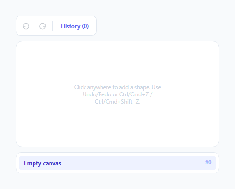
Undo/Redo History Toolbar with Jump-to-State
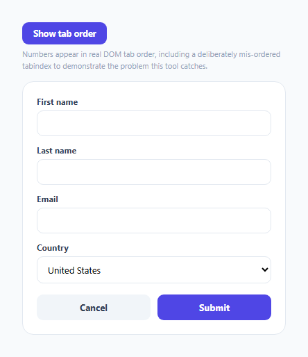
Keyboard Focus Order Debugger — Numbered Tab-Order Overlay
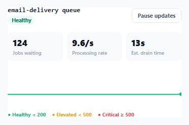
Job Queue Depth Monitor — Live Backlog Trend with Threshold Alerts
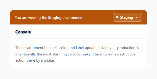
Environment Switcher with Color-Coded Persistent Banner
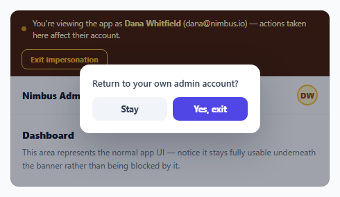
Admin Impersonation Mode Banner — "Viewing As" with Safe Exit
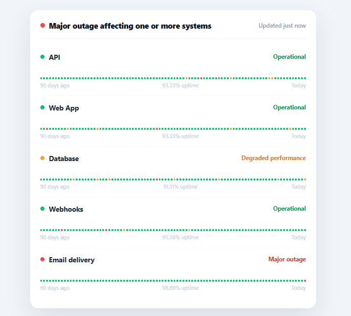
Uptime Status Page
Learn Coding Visually
Learn to code with interactive, live-preview playgrounds — HTML, CSS, JavaScript, React & more.
 HTML Playground42 lessons · Click-based · Live preview
 CSS PlaygroundLearn CSS with a live editor
 JavaScript Playground60 lessons · DOM · Async · Canvas
 React PlaygroundLearn React with a live code editor
 GSAP PlaygroundLearn GSAP animation interactively
 SVG Playground44 lessons · shapes · paths · animation
 SCSS Playground45 lessons · Sass modules · tokens
 Tailwind PlaygroundLearn Tailwind CSS with a live editor
 Bootstrap 5 Playground50 lessons · live preview
Uptime Status Page — Service History Bars HTML CSS
Uptime Status Page · Dashboards · Plain HTML, CSS & JS · Live preview
What's included
Features
About this UI Snippet
Uptime Status Page — 90-Day History Bars, Hover Tooltips & Aggregated Status
A public status page exists to answer one question fast — "is it just me, or is the whole service down?" — and the format every major status page (Statuspage, Better Uptime, Cachet) converges on is the same: a banner summarizing overall health, and a row of tiny colored bars per service showing recent history at a glance. This snippet builds that exact pattern in plain HTML, CSS, and vanilla JavaScript.
History bars as data, not images
Each service renders 90 thin <div> bars in a flex row, one per day, colored green/amber/red for operational/degraded/outage. genHistory() generates a randomized history that's mostly green with rare amber and red days, and the *last* bar always reflects the service's actual current status — so the simulated history stays consistent with the live status shown in the row above it. Replace genHistory() with real incident data and the rendering needs no changes.
Hover tooltips without a tooltip library
Each bar carries its day-relative label and status in a data-tip attribute, and a pure-CSS ::after pseudo-element reads it via content: attr(data-tip) on hover — no JavaScript positioning logic and no extra DOM nodes per bar, which matters here since there are 90 bars × however many services. This is the same zero-JS tooltip technique used for lightweight hint text throughout this library.
Uptime percentage, computed from the bars themselves
uptimePct() doesn't take a separate "99.9% uptime" number from anywhere — it counts how many of the 90 generated bars are operational and divides by the total. This guarantees the displayed percentage and the visual bar row can never contradict each other, which is a real bug class in hand-maintained status pages where the number and the history graphic are updated separately and drift apart.
Aggregated overall status
The top banner doesn't just say "operational" by default — updateOverall() reduces every service's status to find the *worst* one present (outage beats degraded beats operational) and reflects that exact severity in both the banner's color and its message. A single degraded service is enough to turn the whole banner amber; a single outage turns it red — exactly how users expect "is everything okay?" to be answered.
Why a status page exists separately from internal monitoring
Internal dashboards (Grafana, Datadog) are built for engineers diagnosing a problem; a public status page is built for everyone else asking one question fast. Keeping it as its own simple, low-dependency page — rather than exposing the internal monitoring tool directly — also means it can stay up and informative even during an incident that's affecting other parts of the infrastructure, which is exactly the moment a status page matters most.
Build with AI
Build, Understand, Optimize, and Extend It With AI
Instead of working through the aggregation logic by hand, paste this snippet's HTML, CSS, and JS into an AI coding assistant like Claude and ask it to explain exactly how updateOverall() uses the rank object to reduce five independent service statuses down to a single worst-case banner state, and why uptimePct() recomputes its percentage by counting the same bars array rather than storing a separately maintained number. It's also worth asking about the hover tooltips — have it explain why data-tip plus a CSS ::after avoids creating ninety extra DOM nodes per service, and whether that approach still holds up with many more services or a longer history window. For extending it, have it add a written incident log that links specific degraded/outage days to a description, a way to filter the service list, or an auto-refresh polling loop that re-fetches live status on an interval. Treat the code less like a finished artifact and more like a starting point for a conversation.
Prompt to recreate it
Copy this into your AI assistant of choice to build the effect from scratch, or as a jumping-off point for your own variant:
Build a public uptime status page in plain HTML, CSS, and vanilla JavaScript with no libraries.

Requirements:
- A list of services, each with a name and a current status of "operational", "degraded", or "outage".
- For each service, generate a 90-day history of daily statuses, mostly operational with rare degraded/outage days, but force the most recent (today's) entry to always match that service's actual current status so the generated history never contradicts the live status shown above it.
- Render each day of history as its own thin colored bar in a horizontal row (not as an image), colored per its status, with a tooltip that appears on hover showing that day's relative label (e.g. "12d ago") and status — implemented purely with a data attribute and a CSS ::after pseudo-element reading it via content: attr(), with no JavaScript-positioned tooltip element and no extra DOM node per bar.
- Compute each service's displayed uptime percentage by counting how many of its own 90 generated history bars are "operational" and dividing by the total — never from a separate hardcoded number — so the displayed percentage and the visual bar row can never disagree.
- Compute one aggregated overall status banner by reducing every service's status to find the single worst one present (outage ranks worse than degraded, which ranks worse than operational), and reflect that severity in both the banner's color and its message text.
- Make it possible to regenerate the entire page (all bars, percentages, and the banner) from a single function call after editing the underlying service list or statuses.
Want to tighten it up first? Run this prompt through the AI Prompt Studio to score it across 8 quality dimensions, catch anti-patterns, and tune the wording for Claude, ChatGPT, or Gemini before you paste it in.
Source Code
<div class="usp-card">
  <div class="usp-head">
    <div class="usp-overall" id="uspOverall">
      <span class="usp-overall-dot"></span>
      <span id="uspOverallText">All systems operational</span>
    </div>
    <span class="usp-updated">Updated just now</span>
  </div>

  <div class="usp-services" id="uspServices"></div>
</div>*{box-sizing:border-box;margin:0;padding:0}
body{font-family:system-ui,-apple-system,sans-serif;background:#f1f5f9;min-height:100vh;display:flex;align-items:center;justify-content:center;padding:24px}
.usp-card{background:#fff;border-radius:16px;padding:20px;width:100%;max-width:560px;box-shadow:0 18px 44px rgba(15,23,42,.1)}
.usp-head{display:flex;align-items:center;justify-content:space-between;padding-bottom:14px;border-bottom:1px solid #f1f5f9;margin-bottom:14px}
.usp-overall{display:flex;align-items:center;gap:8px;font-size:14.5px;font-weight:800;color:#0f172a}
.usp-overall-dot{width:9px;height:9px;border-radius:50%;background:#22c55e}
.usp-overall.degraded .usp-overall-dot{background:#f59e0b}
.usp-overall.outage .usp-overall-dot{background:#ef4444}
.usp-updated{font-size:11.5px;color:#94a3b8;font-weight:600}
.usp-service{padding:13px 0;border-bottom:1px solid #f8fafc}
.usp-service:last-child{border-bottom:none}
.usp-row{display:flex;align-items:center;justify-content:space-between;margin-bottom:9px}
.usp-name{display:flex;align-items:center;gap:9px;font-size:13.5px;font-weight:700;color:#1e293b}
.usp-status-dot{width:8px;height:8px;border-radius:50%;flex-shrink:0}
.usp-status-dot.operational{background:#22c55e}
.usp-status-dot.degraded{background:#f59e0b}
.usp-status-dot.outage{background:#ef4444}
.usp-status-label{font-size:11.5px;font-weight:700}
.usp-status-label.operational{color:#16a34a}
.usp-status-label.degraded{color:#d97706}
.usp-status-label.outage{color:#dc2626}
.usp-bars{display:flex;gap:2px;align-items:flex-end;height:26px}
.usp-bar{flex:1;border-radius:2px;min-height:4px;background:#22c55e;cursor:pointer;position:relative}
.usp-bar.degraded{background:#f59e0b}
.usp-bar.outage{background:#ef4444}
.usp-bar:hover::after{content:attr(data-tip);position:absolute;bottom:calc(100% + 6px);left:50%;transform:translateX(-50%);
background:#1e293b;color:#fff;font-size:10.5px;font-weight:600;padding:4px 7px;border-radius:5px;white-space:nowrap;z-index:5}
.usp-uptime{display:flex;justify-content:space-between;margin-top:5px;font-size:10.5px;color:#cbd5e1;font-weight:600}var SERVICES = [
{ name: 'API', status: 'operational' },
{ name: 'Web App', status: 'operational' },
{ name: 'Database', status: 'degraded' },
{ name: 'Webhooks', status: 'operational' },
{ name: 'Email delivery', status: 'outage' },
];
var DAYS = 90;
function genHistory(currentStatus) {
var bars = [];
for (var i = 0; i < DAYS; i++) {
var isToday = i === DAYS - 1;
var r = Math.random();
var status = isToday ? currentStatus : (r > 0.985 ? 'outage' : r > 0.95 ? 'degraded' : 'operational');
bars.push(status);
}
return bars;
}
function uptimePct(bars) {
var healthy = bars.filter(function (s) { return s === 'operational'; }).length;
return ((healthy / bars.length) * 100).toFixed(2);
}
function labelFor(status) {
return { operational: 'Operational', degraded: 'Degraded performance', outage: 'Major outage' }[status];
}
function buildServices() {
var html = SERVICES.map(function (svc, si) {
var history = genHistory(svc.status);
var pct = uptimePct(history);
var bars = history.map(function (s, i) {
var daysAgo = DAYS - 1 - i;
var tip = (daysAgo === 0 ? 'Today' : daysAgo + 'd ago') + ' · ' + labelFor(s);
return '<div class="usp-bar ' + (s === 'operational' ? '' : s) + '" data-tip="' + tip + '"></div>';
}).join('');
return '<div class="usp-service" data-i="' + si + '">' +
'<div class="usp-row">' +
'<span class="usp-name"><i class="usp-status-dot ' + svc.status + '"></i>' + svc.name + '</span>' +
'<span class="usp-status-label ' + svc.status + '">' + labelFor(svc.status) + '</span>' +
'</div>' +
'<div class="usp-bars">' + bars + '</div>' +
'<div class="usp-uptime"><span>' + DAYS + ' days ago</span><span>' + pct + '% uptime</span><span>Today</span></div>' +
'</div>';
}).join('');
document.getElementById('uspServices').innerHTML = html;
updateOverall();
}
function updateOverall() {
var worst = SERVICES.reduce(function (acc, s) {
var rank = { operational: 0, degraded: 1, outage: 2 };
return rank[s.status] > rank[acc] ? s.status : acc;
}, 'operational');
var box = document.getElementById('uspOverall');
box.className = 'usp-overall' + (worst === 'operational' ? '' : ' ' + worst);
document.getElementById('uspOverallText').textContent = worst === 'operational'
? 'All systems operational'
: worst === 'degraded'
? 'Some systems experiencing degraded performance'
: 'Major outage affecting one or more systems';
}
buildServices();Step by step
How to Use
- 1Paste HTML, CSS, and JSA status page renders with an overall banner and five services, each with a row of 90 colored history bars.
- 2Read the overall bannerIts color and message reflect the single worst status across every service — amber for any degraded service, red for any outage.
- 3Hover a history barA tooltip shows that day's relative date and status (e.g. "12d ago · Operational") without any extra markup per bar.
- 4Check the uptime percentageEach service's footer shows a percentage computed directly from its own visible 90-day bar history.
- 5Edit the servicesChange any entry's name or status in SERVICES, then call buildServices() to regenerate the whole page including the overall banner.
- 6Connect real incident dataReplace genHistory()'s random generator with your actual per-day status history fetched from an incident/monitoring API.
Real-world uses
Common Use Cases
Got questions?
Frequently Asked Questions
Replace genHistory()'s random-status loop with a fetch to your monitoring or incident-management API, mapping each returned day to 'operational', 'degraded', or 'outage'; keep the same array shape so buildServices() and uptimePct() need no other changes.
For days with a 'degraded' or 'outage' status, attach an incident summary string and render a list of those summaries (with dates) beneath the bar row or in a separate "Past incidents" section, linking each entry back to the relevant day.
Change the DAYS constant — genHistory(), the bar rendering, and uptimePct() all derive their loop length and percentage calculation from that single value.
Wrap a fetch-and-rebuild call in setInterval (e.g. every 60 seconds), updating each service's live status from your API before calling buildServices() again, and update the "Updated just now" label with the current timestamp.
In React, keep services in state and derive history/uptime with useMemo per service, rendering bars with .map(); in Vue, use a computed services array with nested v-for; in Angular, use *ngFor with a pipe for the uptime percentage. The worst-status reduction for the overall banner ports directly into each framework.