Learn Coding Visually
Learn to code with interactive, live-preview playgrounds — HTML, CSS, JavaScript, React & more.
 HTML Playground42 lessons · Click-based · Live preview
 CSS PlaygroundLearn CSS with a live editor
 JavaScript Playground60 lessons · DOM · Async · Canvas
 React PlaygroundLearn React with a live code editor
 GSAP PlaygroundLearn GSAP animation interactively
 SVG Playground44 lessons · shapes · paths · animation
 SCSS Playground45 lessons · Sass modules · tokens
 Tailwind PlaygroundLearn Tailwind CSS with a live editor
 Bootstrap 5 Playground50 lessons · live preview
System Status Dashboard — Uptime Widget HTML CSS JS
System Status Dashboard Widget · Dashboards · Plain HTML, CSS & JS · Live preview
What's included
Features
About this UI Snippet
System Status Dashboard — 90-Day Uptime Bars, Status Badges & Incident Callout
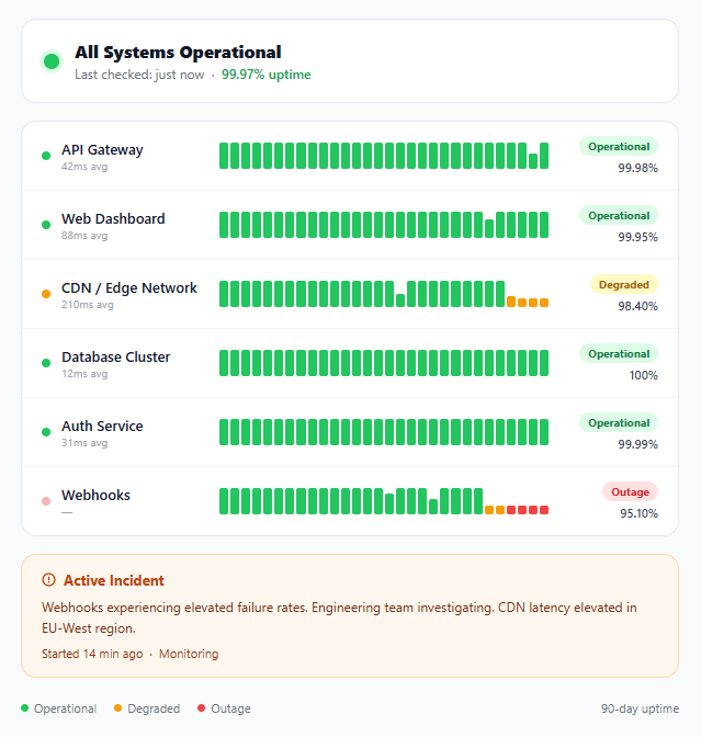
A system status dashboard communicates service health to end users, support teams, and stakeholders. It answers three questions instantly: is everything working right now, which services have had issues recently, and is there an active incident being worked on? This snippet implements a complete status page widget with six service rows, 30-bar uptime histograms, colour-coded status badges, an active incident callout box, and an animated pulsing dot for live outages.
Uptime bar chart generation
The 30 uptime bars are generated programmatically from a DATA object mapping service IDs to arrays of 30 values (0–1). A value of 1 means fully operational, 0 means outage, and intermediate values represent degraded performance. JavaScript creates one <div class="bar"> per value, sets its height proportionally (Math.max(8, Math.round(v * 24))px), and adds class out or deg for colouring. The minimum height of 8px ensures that even zero-uptime days are visible as a thin red bar rather than disappearing entirely.
Status colour system
Three states use a consistent colour system across the entire component: green (#22c55e) for operational, amber (#f59e0b) for degraded, red (#ef4444) for outage. Each state has a badge variant (light background tint + dark text), a dot variant (solid circle), and a bar variant (coloured fill). By using the same three colours throughout, users can instantly scan the entire page and understand the pattern without reading every label.
Animated outage pulse
The outage dot uses a CSS @keyframes pulse animation that cycles opacity between 1 and 0.4 every 1.2 seconds. This mimics the "live" indicator pattern used in broadcast media and emergency dashboards — the motion attracts attention to the one service that needs immediate focus. Only the outage dot pulses; operational and degraded dots are static, so the animation carries signal rather than noise.
Incident callout box
When an incident is active, an amber callout box below the service list provides human-readable context: what is affected, the current status (investigating/monitoring/resolved), and time since the incident started. The warm orange palette (#fff7ed background, #fed7aa border) visually connects to the amber degraded state but is distinct from the red outage badges — it signals "something is being worked on" rather than "everything is broken".
Service row layout
Each service row is a flex container with three zones: left (dot + service name + latency), center (uptime bar chart), right (badge + percentage). The center zone has flex: 1 so it expands to fill available space. The right zone has min-width: 88px and text-align: right to keep badges and percentages aligned across rows. The left zone has min-width: 150px to prevent service names from wrapping.
React integration
Define a SERVICES array where each entry has id, name, latency, status, uptime (percentage string), and bars (30-element array). Map over it to render <ServiceRow /> components. The uptime bars render inside a useEffect or directly as JSX with .map() — prefer JSX mapping over imperative DOM manipulation in React. The active incident can be a separate incident prop on the parent StatusDashboard component.
Real-world integration
In production, replace the hardcoded DATA object with API responses from a status monitoring service (Betterstack, PagerDuty, or your own health-check endpoints). Poll every 30 seconds with setInterval and update the bars array. Store historical uptime in a time-series database and query the last 90 days on page load. The visual component stays identical — only the data source changes.
See also the metric card grid snippet for KPI dashboards, the line chart widget snippet for time-series data visualization, and the activity heatmap snippet for calendar-based uptime visualization.
Build with AI
Build, Understand, Optimize, and Extend It With AI
You don't need to work out the bar-generation and color-mapping logic by hand. Paste this snippet's HTML, CSS, and JS into an AI coding assistant like Claude and ask it to explain exactly how the DATA object's 0 to 1 values get converted into bar heights and out or deg classes in that Object.entries loop, or why every zero-uptime bar still gets a minimum 8px height instead of collapsing to nothing. The same assistant can help optimize it, for example checking whether rebuilding every service's 30 bars from scratch on each poll (rather than diffing and updating only changed days) matters once this is wired to a live health-check API on a 30-second interval. It's also useful for extending the feature: ask it to add a per-bar hover tooltip showing the actual date and incident detail instead of just the status word, add a toggle between 30-day and 90-day views, or wire the overall status dot and incident box to update automatically whenever any individual service degrades. Treat the code less like a finished artifact and more like a starting point for a conversation.
Prompt to recreate it
Copy this into your AI assistant of choice to build the effect from scratch, or as a jumping-off point for your own variant:
Build a system status dashboard with uptime history bars in plain HTML, CSS, and JavaScript, no framework, no libraries.

Requirements:
- An overall status header showing one large status dot (colored by an operational, degraded, or outage class) next to a headline and a global uptime percentage.
- A list of individual service rows, each showing a small status dot, the service name, its average latency, an uptime bar-history chart, a colored status badge, and an individual uptime percentage — laid out so the left label section, the center bar chart, and the right badge section stay column-aligned across every row regardless of content length.
- Generate each service's uptime bar history entirely from a data object mapping each service's element id to an array of numeric values between 0 and 1 (1 meaning fully operational, 0 meaning full outage, values in between meaning degraded), looping through that data to create one bar element per value.
- Each generated bar's height must scale proportionally to its value within a fixed maximum pixel height, but must never shrink below a small minimum height (so a full outage day is still visible as a thin bar, not invisible), and its color/class must be assigned based on threshold ranges of that same value (full color for 1, a degraded color for a mid-range, an outage color for 0).
- Reuse exactly the same three-color system (green, amber, red) consistently across the overall status dot, every per-service dot, every bar, and every badge, so a user can scan the whole page by color alone without reading labels.
- Add a pulsing opacity animation to the status dot only for services currently in an outage state, leaving operational and degraded dots static so the animation signals urgency rather than being decorative noise.
- Include a conditionally-shown incident callout box with a distinct warm warning color palette (different from the outage red) containing a description of the affected services, current investigation status, and how long ago the incident started.
Want to tighten it up first? Run this prompt through the AI Prompt Studio to score it across 8 quality dimensions, catch anti-patterns, and tune the wording for Claude, ChatGPT, or Gemini before you paste it in.
Step by step
How to Use
- 1Copy the full HTML structureThe status page needs all sections: .status-header, .services-list, .incident-box, and .status-footer. The JS targets elements by ID so keep all IDs intact.
- 2Update service names and dataEdit the service names in .svc-name spans and update the DATA object in JS. Each entry maps a bars-{id} element ID to a 30-element array of 0–1 values.
- 3Set the overall statusChange .overall-dot class between operational, degraded, and outage. Update the .overall-title text and .uptime-global percentage to match current reality.
- 4Manage the incident boxShow or hide .incident-box based on whether an active incident exists. Update the .inc-body text and .inc-meta timestamp when incidents occur.
- 5Connect to a real monitoring APIReplace the hardcoded DATA with a fetch to your health-check API. Poll every 30 seconds with setInterval and re-render bars to reflect live uptime data.
Real-world uses
Common Use Cases
Got questions?
Frequently Asked Questions
Define a SERVICES array with name, status, latency, uptime, and bars props. Map over it to render ServiceRow components. Render bars as JSX map instead of imperative DOM creation.
Replace the DATA object with a fetch call to your health-check endpoint. Use setInterval to poll every 30 seconds and update the bars array and status badges dynamically.
Add a status field to the incident data (active/monitoring/resolved). Use conditional CSS classes: green border for resolved, amber for monitoring, red for active.
Yes — just change the data granularity. Use 24 values for 24-hour view or 168 for 7-day hourly. Adjust the bar width by changing the gap and removing flex:1 for fixed pixel widths.
Open the Export menu (or the Test Exports preview) in the snippet toolbar. It generates a plain React component, a React + Tailwind version where the row, badge, and bar styles become utility classes, a Vue 3 single-file component, and an Angular standalone component. Each converter preserves the markup, the uptime-bar layout, and the outage-pulse animation, so the dashboard renders identically across React, Vue, and Angular. For production, drive the SERVICES array from your health-check API and poll it inside the framework lifecycle (useEffect, onMounted, or ngOnInit) instead of the hardcoded DATA object.
Average each service uptime, or weight by request volume if you have it, then format to two decimals such as 99.97%. For the 90-day bars, derive the figure from the count of operational versus degraded or outage segments so the headline number always matches the visual history users can see in the chart.