
Learn Coding Visually
Learn to code with interactive, live-preview playgrounds — HTML, CSS, JavaScript, React & more.
 HTML Playground42 lessons · Click-based · Live preview
 CSS PlaygroundLearn CSS with a live editor
 JavaScript Playground60 lessons · DOM · Async · Canvas
 React PlaygroundLearn React with a live code editor
 GSAP PlaygroundLearn GSAP animation interactively
 SVG Playground44 lessons · shapes · paths · animation
 SCSS Playground45 lessons · Sass modules · tokens
 Tailwind PlaygroundLearn Tailwind CSS with a live editor
 Bootstrap 5 Playground50 lessons · live preview
Job Queue Depth Monitor — Live Backlog Trend, Threshold Status, and Drain Estimate
Job Queue Depth Monitor — Live Backlog Trend with Threshold Alerts · Dashboards · Plain HTML, CSS & JS · Live preview
What's included
Features
About this UI Snippet
Job Queue Depth Monitor — Building a Trustworthy Live Backlog Indicator
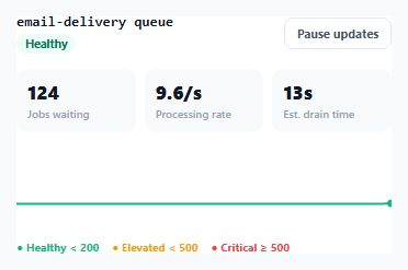
A raw "jobs in queue: 340" number tells an on-call engineer very little on its own — is 340 normal, or is it climbing toward an incident? This snippet builds a genuine monitoring tile: live depth, a processing rate, a trend sparkline, a threshold-derived health status, and — the trickiest part to get right — an honest estimate of how long the backlog will take to drain, one that refuses to show a misleading number when the math doesn't actually support one.
One shared `classify()` function, not two independently-checked threshold sets
Both the status label's color (healthy/elevated/critical) and the sparkline's stroke color are derived from calling the exact same classify(currentDepth) function and looking up the result in STATUS_LABEL or STROKE_COLOR respectively. If the threshold logic were instead duplicated — one if chain for the status badge, a separate one for the sparkline color — the two could silently drift apart over time as one gets updated and the other doesn't, showing a dashboard where the badge says "Critical" but the sparkline still renders green. Having exactly one classification function used everywhere makes that class of bug impossible.
Why the drain-time estimate can show "stalled" instead of a number
The naive formula for "time to drain" is depth / processingRate — but if the processing rate is at or near zero (the queue's workers are stuck, crashed, or simply not keeping up at all), that formula produces either a wildly enormous number or a division-by-zero Infinity. Rather than displaying either of those (both actively misleading to someone glancing at a dashboard during an incident, who might read "47000s" and assume the number is simply large-but-finite rather than realizing the queue isn't draining at all), the code explicitly checks whether the processing rate is meaningfully above zero and shows "stalled" when it isn't — an honest, immediately-understandable signal that no genuine estimate is currently possible.
The sparkline redraws from a fixed-length rolling history array
history is a fixed-size array (HISTORY_LEN entries) that tick() updates with push/shift — pushing the newest depth reading onto the end and shifting the oldest one off the front, keeping the array's length constant forever. renderSpark() rebuilds the entire SVG polyline from this array on every tick rather than trying to incrementally append a single new point to existing SVG markup — simpler to reason about, and correctly handles the sparkline's shared Y-axis scale needing to be recalculated (Math.max(...history, 500)) every time the visible window of data changes.
Pausing stops polling but doesn't hide anything already shown
The pause button toggles an actual setInterval/clearInterval pair rather than merely hiding updates client-side — this matters for a real implementation where tick() would be replaced with an actual network request to a metrics backend; pausing here genuinely stops that polling traffic rather than just freezing the display while continuing to silently fetch data in the background.
Build with AI
Build, Understand, Optimize, and Extend It With AI
Ask an AI assistant to explain why showing "stalled" is more honest and useful than displaying a technically-computed but enormous drain-time number, and to discuss what other dashboard metrics commonly suffer from this same "divide by a near-zero rate" problem. It's also worth asking for a version that adds a browser notification or audible alert when the status first crosses into critical, or one that shows separate sparklines for arrival rate and processing rate side by side to make the actual imbalance driving backlog growth more visible.
Prompt to recreate it
Copy this into your AI assistant of choice to build the effect from scratch, or as a jumping-off point for your own variant:
Build a live job-queue depth monitoring tile in HTML, CSS, and vanilla JavaScript — no external chart library, use inline SVG for the trend line.

Requirements:
- A tile showing the current queue depth (number of jobs waiting), a current processing rate, and an estimated drain time, all updating on a fixed polling interval (simulate realistic queue dynamics with randomized arrival and processing rates that sometimes cause the backlog to grow and sometimes shrink).
- Define numeric thresholds for "healthy," "elevated," and "critical" queue depth exactly once, in a single function, and use that same function's result to color BOTH a status badge label AND an inline SVG sparkline trend line showing recent depth history — the two must never be able to show conflicting status colors.
- Compute the drain-time estimate as depth divided by processing rate, but explicitly detect when the processing rate is at or near zero and show a distinct "stalled" state instead of a computed number in that case — do not show an extremely large or infinite numeric estimate, since that would be misleading to someone monitoring the dashboard during an incident.
- Maintain the sparkline's historical data as a fixed-length rolling array (push newest, shift oldest) so memory use and the visible time window stay bounded regardless of how long the page stays open, redrawing the full SVG polyline from that array on every update.
- Include a pause/resume control that actually stops and restarts the underlying polling interval (not just the visual display), so the pattern is clear for a real implementation that would be polling a live backend.
- Show a small legend clarifying the numeric threshold that defines each status color.
Want to tighten it up first? Run this prompt through the AI Prompt Studio to score it across 8 quality dimensions, catch anti-patterns, and tune the wording for Claude, ChatGPT, or Gemini before you paste it in.
Source Code
<div class="demo">
<div class="queue-card">
<div class="queue-header">
<div>
<span class="queue-title">email-delivery queue</span>
<span class="queue-status" id="queueStatus">Healthy</span>
</div>
<button class="queue-pause" id="queuePauseBtn">Pause updates</button>
</div>
<div class="queue-stats">
<div class="queue-stat">
<span class="queue-stat-value" id="queueDepthValue">0</span>
<span class="queue-stat-label">Jobs waiting</span>
</div>
<div class="queue-stat">
<span class="queue-stat-value" id="queueRateValue">0/s</span>
<span class="queue-stat-label">Processing rate</span>
</div>
<div class="queue-stat">
<span class="queue-stat-value" id="queueEtaValue">—</span>
<span class="queue-stat-label">Est. drain time</span>
</div>
</div>
<svg class="queue-spark" id="queueSpark" viewBox="0 0 300 70" preserveAspectRatio="none"></svg>
<div class="queue-thresholds">
<span class="thresh healthy">● Healthy < 200</span>
<span class="thresh warn">● Elevated < 500</span>
<span class="thresh crit">● Critical ≥ 500</span>
</div>
</div>
</div>* { box-sizing: border-box; margin: 0; padding: 0; }
body { font-family: system-ui, sans-serif; background: #f8fafc; display: flex; align-items: center; justify-content: center; min-height: 100vh; padding: 24px; }
.demo { width: 380px; max-width: 100%; }
.queue-card { background: #fff; border: 1px solid #e2e8f0; border-radius: 16px; padding: 18px; display: flex; flex-direction: column; gap: 14px; }
.queue-header { display: flex; align-items: center; justify-content: space-between; }
.queue-title { display: block; font-size: 13px; font-weight: 800; color: #111827; font-family: 'SFMono-Regular', Consolas, monospace; }
.queue-status { display: inline-block; margin-top: 3px; font-size: 10.5px; font-weight: 700; padding: 2px 8px; border-radius: 999px; background: #ecfdf5; color: #047857; transition: background 0.2s, color 0.2s; }
.queue-status.warn { background: #fffbeb; color: #b45309; }
.queue-status.crit { background: #fef2f2; color: #b91c1c; }
.queue-pause { border: 1.5px solid #e2e8f0; background: #fff; color: #475569; font-size: 11px; font-weight: 700; padding: 6px 11px; border-radius: 8px; cursor: pointer; font-family: inherit; }
.queue-pause:hover { border-color: #6366f1; color: #4338ca; }
.queue-stats { display: grid; grid-template-columns: repeat(3,1fr); gap: 8px; }
.queue-stat { display: flex; flex-direction: column; gap: 2px; padding: 10px; background: #f8fafc; border-radius: 10px; }
.queue-stat-value { font-size: 17px; font-weight: 800; color: #111827; font-variant-numeric: tabular-nums; }
.queue-stat-label { font-size: 10px; color: #94a3b8; font-weight: 600; }
.queue-spark { width: 100%; height: 70px; display: block; }
.queue-thresholds { display: flex; gap: 12px; flex-wrap: wrap; }
.thresh { font-size: 10px; font-weight: 700; }
.thresh.healthy { color: #10b981; }
.thresh.warn { color: #f59e0b; }
.thresh.crit { color: #ef4444; }const depthValue = document.getElementById('queueDepthValue');
const rateValue = document.getElementById('queueRateValue');
const etaValue = document.getElementById('queueEtaValue');
const statusEl = document.getElementById('queueStatus');
const sparkSvg = document.getElementById('queueSpark');
const pauseBtn = document.getElementById('queuePauseBtn');
const HISTORY_LEN = 40;
const history = Array.from({ length: HISTORY_LEN }, () => 120);
let currentDepth = 120;
let paused = false;
let intervalId = null;
// Thresholds are defined once and reused for both the numeric status label
// and the sparkline's stroke color — a single source of truth for "what
// counts as healthy vs elevated vs critical" rather than two independently
// maintained threshold checks that could disagree with each other.
function classify(depth) {
if (depth >= 500) return 'crit';
if (depth >= 200) return 'warn';
return 'healthy';
}
const STATUS_LABEL = { healthy: 'Healthy', warn: 'Elevated', crit: 'Critical' };
const STROKE_COLOR = { healthy: '#10b981', warn: '#f59e0b', crit: '#ef4444' };
function renderSpark() {
const max = Math.max(...history, 500);
const points = history.map((v, i) => {
const x = (i / (HISTORY_LEN - 1)) * 300;
const y = 66 - (v / max) * 60;
return `${x.toFixed(1)},${y.toFixed(1)}`;
}).join(' ');
const state = classify(currentDepth);
sparkSvg.innerHTML = `
<polyline points="${points}" fill="none" stroke="${STROKE_COLOR[state]}" stroke-width="2" stroke-linecap="round" stroke-linejoin="round" />
<circle cx="300" cy="${(66 - (currentDepth / max) * 60).toFixed(1)}" r="3.5" fill="${STROKE_COLOR[state]}" />
`;
}
function render(processingRate) {
const state = classify(currentDepth);
depthValue.textContent = Math.round(currentDepth).toLocaleString();
rateValue.textContent = processingRate.toFixed(1) + '/s';
statusEl.textContent = STATUS_LABEL[state];
statusEl.className = 'queue-status ' + (state === 'healthy' ? '' : state);
// Drain-time estimate is undefined (not "0s" or "Infinity") whenever the
// processing rate can't actually clear the backlog — showing a bogus
// finite number in that case would be actively misleading to whoever is
// watching this dashboard during an incident.
if (processingRate > 0.2) {
const etaSeconds = currentDepth / processingRate;
etaValue.textContent = etaSeconds < 60 ? Math.round(etaSeconds) + 's' : Math.round(etaSeconds / 60) + 'm';
} else {
etaValue.textContent = currentDepth > 0 ? 'stalled' : '—';
}
renderSpark();
}
function tick() {
// Simulated queue dynamics: jobs arrive faster than they're processed
// sometimes (backlog grows), and slower other times (backlog drains) —
// a real implementation replaces this with actual metrics polled from
// a queue backend (depth and processed-per-second) on the same interval.
const arrivalRate = 8 + Math.random() * 10;
const processingRate = 9 + Math.sin(Date.now() / 4000) * 6 + Math.random() * 2;
currentDepth = Math.max(0, currentDepth + arrivalRate - processingRate);
history.push(currentDepth);
history.shift();
render(Math.max(0, processingRate));
}
function start() {
intervalId = setInterval(tick, 900);
}
function stop() {
clearInterval(intervalId);
}
pauseBtn.addEventListener('click', () => {
paused = !paused;
pauseBtn.textContent = paused ? 'Resume updates' : 'Pause updates';
if (paused) stop(); else start();
});
render(9);
start();Step by step
How to Use
- 1Watch the tile update liveDepth, processing rate, and the trend sparkline all refresh on a fixed interval, simulating realistic queue backlog dynamics.
- 2Watch the status badge and sparkline color change togetherBoth derive from the same shared classify() function and threshold values, so they always agree with each other as the depth crosses into elevated or critical territory.
- 3Watch the drain-time estimate during a stallWhen processing rate drops near zero, the estimate switches to "stalled" instead of showing a misleadingly large or infinite number.
- 4Click "Pause updates"Stops the polling interval entirely (not just hiding the display) — useful when you want to inspect a specific reading without it changing underneath you.
- 5Replace tick() with a real metrics pollSwap the simulated arrival/processing rate math for an actual fetch to your queue backend's metrics endpoint on the same interval.
Real-world uses
Common Use Cases
Got questions?
Frequently Asked Questions
If the threshold logic for "what counts as critical" were duplicated in two places — once for the badge, once for the sparkline — they could silently drift out of sync as one gets updated without the other. A single shared classification function used by both guarantees they always agree.
The estimate formula (depth divided by processing rate) produces a misleadingly huge or infinite value whenever the processing rate is at or near zero. Showing "stalled" instead is a deliberately honest signal that no genuine time estimate is currently possible, rather than a technically-computed but practically meaningless number.
It stops the actual polling interval (clearInterval), not just the visual updates. In a real implementation where the tick function fetches from a live metrics API, pausing genuinely stops that network traffic rather than continuing to poll silently in the background.
It's recalculated on every render as the maximum value currently present in the rolling history array (with a floor of 500 so the chart doesn't look artificially dramatic during genuinely low-traffic periods), so the visible scale always fits whatever range of values is currently in the trailing window.
Replace the simulated arrivalRate/processingRate math inside tick() with an actual fetch call to your queue system's metrics endpoint, reading its real current depth and jobs-processed-per-second, keeping everything else (history tracking, classification, rendering) unchanged.
A fixed-length rolling window keeps memory use constant regardless of how long the dashboard stays open, and keeps the sparkline focused on a consistent, recent time range rather than compressing an ever-larger dataset into the same visual width over time.