Learn Coding Visually
Learn to code with interactive, live-preview playgrounds — HTML, CSS, JavaScript, React & more.
 HTML Playground42 lessons · Click-based · Live preview
 CSS PlaygroundLearn CSS with a live editor
 JavaScript Playground60 lessons · DOM · Async · Canvas
 React PlaygroundLearn React with a live code editor
 GSAP PlaygroundLearn GSAP animation interactively
 SVG Playground44 lessons · shapes · paths · animation
 SCSS Playground45 lessons · Sass modules · tokens
 Tailwind PlaygroundLearn Tailwind CSS with a live editor
 Bootstrap 5 Playground50 lessons · live preview
Scheduled Job Run History Tile — Dashboard Widget with Countdown and Run Strip
Scheduled Job Run History Tile · Dashboards · Plain HTML, CSS & JS · Live preview
What's included
Features
About this UI Snippet
Scheduled Job Run History Tile — Cron Health at a Glance
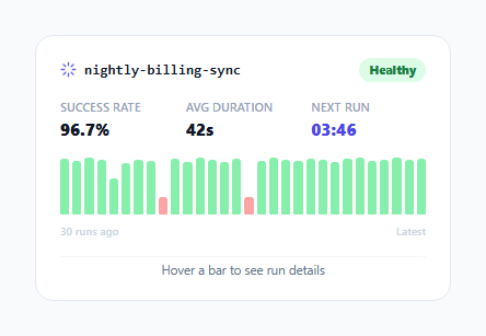
Dashboards for cron jobs, scheduled pipelines and background workers usually need to answer three questions fast: is this job currently healthy, when does it run next, and has it been flaky recently? This tile answers all three in a compact card by combining a live countdown with a horizontal history strip — a row of small bars, one per recent run, that doubles as both a health-at-a-glance visualization and a hoverable log.
Why height encodes duration, not just pass/fail color
Each bar's color is binary (green for pass, red for fail), but a passing run's *height* is also scaled to its duration — Math.max(18, (duration / 95) * 52) — so a viewer can spot a job that's technically still succeeding but has been creeping slower over recent runs, not just outright failures. Failed runs are deliberately rendered at a fixed short height regardless of how long they ran before timing out, since a failure's duration is rarely the meaningful signal.
A tooltip strip instead of 30 separate title attributes
Rather than relying on the native browser title tooltip (slow to appear, unstyled, and can't be positioned reliably), each bar has a mouseenter/mouseleave pair that writes a one-line description — "Run #14 — passed in 90s" or "Run #9 — failed (timeout after 90s)" — into a single shared .tile-foot element beneath the strip. This keeps the DOM lightweight (no tooltip element per bar) and gives a stable, always-in-the-same-place place to read run detail without a floating popover to position.
The live countdown as a trust signal
countdown ticks down every second via setInterval, converting a seconds-remaining integer into MM:SS. Beyond just being informative, a visibly *live* countdown reassures a dashboard viewer that the tile itself is actively connected and current — a static "next run: 3:47" label can't distinguish "the page loaded 3:47 ago and is now stale" from "there are genuinely 3:47 left," while a ticking number can only mean the latter.
Where this fits versus a full uptime page
A full status page (like the uptime-monitor pattern) is built for external, incident-level communication. This tile is the internal, operational counterpart — sized to sit in a grid of other small dashboard tiles, answering "is this specific background job okay" for an engineer glancing at an internal ops dashboard rather than a customer-facing status page.
Build with AI
Build, Understand, Optimize, and Extend It With AI
Ask an AI assistant to explain the tradeoff between encoding duration in a bar's height versus only encoding pass/fail in its color, and when a dashboard designer should choose one over the other for a metric like job run history. It's also worth asking for a version that computes the success-rate and average-duration stats live from the seed array instead of hardcoding them, or one that groups runs into hourly buckets for jobs that run far more than 30 times a day.
Prompt to recreate it
Copy this into your AI assistant of choice to build the effect from scratch, or as a jumping-off point for your own variant:
Build a dashboard tile in HTML, CSS and vanilla JavaScript that shows the health of a single scheduled/cron job — no external charting library.

Requirements:
- A header with the job's name and a status badge (e.g. "Healthy").
- A three-column stats row showing success rate, average run duration, and a live MM:SS countdown to the next scheduled run that ticks down every second via setInterval.
- A horizontal strip of small bars, one per recent run (at least 20-30), where a passing run's bar height is proportional to its duration and a failing run is rendered as a fixed short red bar clearly distinct from passing green bars.
- Hovering any bar in the strip must show a one-line description of that specific run (its number, pass/fail state, and duration or failure reason) in a single shared text element beneath the strip — not a separate floating tooltip per bar.
- Give the history strip an appropriate ARIA role and label so its overall meaning is conveyed to screen reader users even though the detail is only revealed on hover.
- Keep the whole tile compact enough to sit in a grid alongside other similar dashboard tiles.
Want to tighten it up first? Run this prompt through the AI Prompt Studio to score it across 8 quality dimensions, catch anti-patterns, and tune the wording for Claude, ChatGPT, or Gemini before you paste it in.
Step by step
How to Use
- 1Replace the seed array with real run dataThe seed array in the JS panel represents duration-in-seconds per run, with 0 meaning a failed run — swap it for data from your job scheduler's API.
- 2Update the job name and iconChange the text inside .job-name in the HTML panel to your actual job identifier.
- 3Wire the countdown to a real next-run timestampReplace secondsLeft with a value computed from your job scheduler's next-run time minus the current time.
- 4Adjust the badge stateSwap the badge.ok class and "Healthy" text for a warning/critical variant when the success rate drops below your threshold.
- 5Recompute the stat valuesUpdate the success rate and average duration numbers in the HTML to be derived from your real run-history data rather than hardcoded.
Real-world uses
Common Use Cases
Got questions?
Frequently Asked Questions
Failed runs are always rendered at a fixed short height (16px) regardless of how long they ran before failing, since duration is not usually the meaningful signal for a failure — only the pass/fail color and the tooltip detail matter there.
As a simple array of numbers, where each value is a run's duration in seconds and 0 is a sentinel value meaning that run failed — swap this array for real data from your scheduler's run-history API.
Not in this snippet — it counts down to zero and stops. In production, replace the countdown logic with one that recomputes secondsLeft from a real "next scheduled run" timestamp so it naturally resets after each run.
A single .tile-foot element updated on hover keeps the DOM lightweight (no positioning logic or extra elements per bar) and gives run detail a stable, predictable location beneath the strip rather than a floating popover that has to avoid clipping at the tile edges.
The demo seeds 30 runs, one bar each, but the strip is a flexbox row that will accept any array length — adjust the seed array's length to show more or fewer recent runs.
Yes — compute the success rate from the run array (percentage of non-zero values) in JavaScript and set the badge's class and text based on threshold checks, rather than hardcoding "Healthy".