Learn Coding Visually
Learn to code with interactive, live-preview playgrounds — HTML, CSS, JavaScript, React & more.
 HTML Playground42 lessons · Click-based · Live preview
 CSS PlaygroundLearn CSS with a live editor
 JavaScript Playground60 lessons · DOM · Async · Canvas
 React PlaygroundLearn React with a live code editor
 GSAP PlaygroundLearn GSAP animation interactively
 SVG Playground44 lessons · shapes · paths · animation
 SCSS Playground45 lessons · Sass modules · tokens
 Tailwind PlaygroundLearn Tailwind CSS with a live editor
 Bootstrap 5 Playground50 lessons · live preview
Environment Switcher with Color-Coded Persistent Banner — Production, Staging, Development
Environment Switcher with Color-Coded Persistent Banner · Dashboards · Plain HTML, CSS & JS · Live preview
What's included
Features
About this UI Snippet
Environment Switcher — Color-Coding Risk and Adding Friction Where It Matters
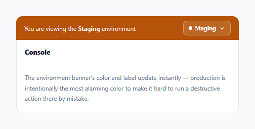
Internal tools and admin consoles that operate against multiple environments (production, staging, development) create a real, recurring risk: an engineer or support agent forgetting which environment they're currently pointed at, and running a command or clicking a button that was only meant to be safe in a test environment. This snippet addresses that with two coordinated pieces: a persistent, unmistakably color-coded banner, and *asymmetric* friction on the switch itself — specifically harder to move *into* production than out of it.
Color escalation mirrors actual risk level, not arbitrary branding
The three environments use green (development), amber (staging), and red (production) — deliberately following the same "escalating alarm" convention used in traffic lights and hazard warnings, not a neutral or brand-driven color choice. This isn't just aesthetic: a user's peripheral vision registers a shift toward red far more readily than a shift between two similarly-saturated brand colors would, which matters because the entire point of the banner is to be noticed *before* an action is taken, not just to be technically present somewhere on screen.
Switching into production gets one more step than switching out of it
The click handler on each environment option checks specifically whether the *target* environment is production and the *current* one isn't — only in that specific direction does it insert a native confirm() prompt before proceeding. Switching from production back to staging or development requires no extra confirmation at all. This asymmetry is deliberate: the actual risk in this pattern isn't "switching environments" in the abstract, it's specifically *ending up in production without having meant to* — so the friction is placed exactly where the risk is, rather than uniformly slowing down every switch regardless of direction.
The banner label and the dropdown's own label are always the same source of truth
setEnvironment() updates both bannerLabel.textContent and selectLabel.textContent together, in the same function call, from the same ENV_LABELS lookup — there's no separate state tracked for "what the banner shows" versus "what the dropdown button shows." This guarantees the two can never disagree with each other, which matters specifically because the banner's entire job is to be a *trustworthy* indicator of the current environment; if it could ever show something different from what the dropdown itself reports, its value as a safety mechanism would be undermined.
A standard accessible disclosure pattern for the dropdown itself
The environment picker follows the same conventions as any accessible dropdown: aria-haspopup/aria-expanded on the trigger button, closing on an outside click, and closing on Escape — nothing about the environment-specific logic (the color coding, the confirmation gate) needed to compromise on these baseline accessibility behaviors.
Build with AI
Build, Understand, Optimize, and Extend It With AI
Ask an AI assistant to discuss why placing confirmation friction asymmetrically (only when moving toward production) is a better design than uniformly confirming every environment switch, and what other admin actions might deserve the same kind of directional, risk-targeted friction. It's also worth asking for a version that persists the last-selected environment to localStorage or a URL parameter, or one that also disables specific high-risk actions elsewhere in the UI (like a "delete all records" button) with extra confirmation specifically while in production.
Prompt to recreate it
Copy this into your AI assistant of choice to build the effect from scratch, or as a jumping-off point for your own variant:
Build an environment switcher with a persistent color-coded banner in HTML, CSS, and vanilla JavaScript — no external library.

Requirements:
- A persistent banner above a representative app UI, showing the currently active environment name, with its background color changing based on environment: a calm color for development, a cautionary color for staging, and an urgent/alarming color for production — following an escalating risk-color convention.
- A dropdown selector (with proper aria-haspopup/aria-expanded attributes, closing on outside click and on Escape) listing all three environments, each with a short descriptive subtitle explaining what that environment represents.
- Update both the banner's label and the dropdown trigger's own displayed label together, from one single function/source of truth, whenever the environment changes — they must never be able to show different environments from each other even momentarily.
- Specifically when switching FROM a non-production environment INTO production, require an extra explicit confirmation step before the switch takes effect. Switching AWAY from production to any other environment must require no such extra confirmation — the friction must be intentionally one-directional.
- If the confirmation is declined, the environment must remain unchanged and the dropdown should close without applying the switch.
Want to tighten it up first? Run this prompt through the AI Prompt Studio to score it across 8 quality dimensions, catch anti-patterns, and tune the wording for Claude, ChatGPT, or Gemini before you paste it in.
Step by step
How to Use
- 1Observe the current environment bannerIts background color and label reflect the active environment — amber for staging in the initial state shown here.
- 2Click the environment selectorOpens a dropdown listing all three environments, each with a color-coded dot and a short description of what that environment represents.
- 3Select "Development" or "Staging"Switches immediately — the banner color, label, and dropdown label all update together in one atomic change.
- 4Select "Production" from a non-production environmentA confirmation prompt appears specifically for this direction of switch, requiring explicit confirmation before proceeding.
- 5Switch away from ProductionNo extra confirmation is required — the friction is intentionally one-directional, applied only when moving toward the highest-risk environment.
Real-world uses
Common Use Cases
Got questions?
Frequently Asked Questions
The actual risk this pattern protects against is specifically ending up in production without meaning to — not "switching environments" in general. Placing friction only on that one direction targets the real risk directly, rather than uniformly slowing down every switch regardless of which way it goes.
The escalating-alarm color convention is more immediately legible, especially in peripheral vision, than a shift between similarly-saturated neutral colors would be — and the entire point of the banner is to be noticed before an action is taken, so a more visually urgent color scheme for higher-risk environments directly serves that goal.
No — both are updated together inside the same setEnvironment() function call, reading from the same ENV_LABELS lookup, so there is exactly one source of truth and no code path where they could independently drift out of sync.
The environment does not change, and the dropdown menu closes — the banner and selector remain showing whatever environment was active before the switch attempt.
Swap the window.confirm() call for opening your own modal component, and move the setEnvironment(targetEnv) call into that modal's "confirm" button handler instead of the synchronous flow shown here, since a custom modal's confirmation is inherently asynchronous.
Add a new <li><button data-env="qa">…</button></li> entry to the menu, an entry to ENV_LABELS, and a new [data-env="qa"] .env-banner CSS rule with an appropriately risk-scaled color between staging and whichever environment it sits closest to in risk.