

Learn Coding Visually
Learn to code with interactive, live-preview playgrounds — HTML, CSS, JavaScript, React & more.
 HTML Playground42 lessons · Click-based · Live preview
 CSS PlaygroundLearn CSS with a live editor
 JavaScript Playground60 lessons · DOM · Async · Canvas
 React PlaygroundLearn React with a live code editor
 GSAP PlaygroundLearn GSAP animation interactively
 SVG Playground44 lessons · shapes · paths · animation
 SCSS Playground45 lessons · Sass modules · tokens
 Tailwind PlaygroundLearn Tailwind CSS with a live editor
 Bootstrap 5 Playground50 lessons · live preview
Admin Impersonation Mode Banner — "Viewing As" with a Safe, Confirmed Exit
Admin Impersonation Mode Banner — "Viewing As" with Safe Exit · Dashboards · Plain HTML, CSS & JS · Live preview
What's included
Features
About this UI Snippet
Impersonation Mode Banner — Making an Unusual, Risky State Impossible to Miss
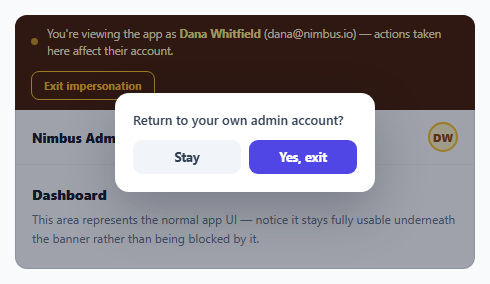
"Log in as this user" (impersonation) is a common support and debugging tool in admin panels — but it's also genuinely risky: an admin who forgets they're impersonating someone could take an action that silently affects that user's real account, believing they're still in their own. This snippet solves that with two deliberate design decisions: a banner that's visually impossible to mistake for normal UI, and an exit action that requires explicit confirmation rather than a single accidental click.
Why the banner uses a completely different visual language than the rest of the UI
The banner's dark amber/brown background and pulsing dot are intentionally jarring against the clean white app UI beneath it — this is not a subtle notification, it's meant to be the single most visually distinct element on the entire screen for as long as impersonation is active. A subtle badge or a small icon in a corner would be easy to stop consciously registering after a few seconds; a persistent, high-contrast, animated banner at the very top of the viewport is much harder to tune out, which is exactly the point given the stakes of forgetting this mode is active.
Exiting requires two separate, deliberate actions
Clicking "Exit impersonation" doesn't exit immediately — it opens a small confirmation step requiring a second, explicit "Yes, exit" click (or an Escape/Stay to cancel). This two-step pattern is a deliberate friction: unlike many confirm dialogs added merely to slow down a *destructive* action, this one exists because exiting impersonation *mid-task* — say, half-way through reproducing a support ticket on the user's behalf — could be just as disruptive as staying in it too long by accident. Requiring one extra explicit click ensures the admin only leaves impersonation mode when they actually mean to.
The avatar and banner change together, as one atomic visual transition
When exit is confirmed, the banner fades and slides out at the same time the header avatar swaps from the impersonated user's initials (amber-themed, matching the banner) back to the admin's own initials (blue-themed, matching the rest of the app's normal UI). Tying these two visual changes to the same transition means there's never a moment where the banner has disappeared but the avatar still shows the impersonated user, or vice versa — the whole UI transitions out of impersonation mode as one coherent, correctly-timed change.
`role="status"` on the banner, not a generic div
The banner carries role="status", marking it as a live region that assistive technology treats as informational and non-interruptive — appropriate for a persistent state indicator that a screen reader user should be made aware is present, without it demanding the same urgent, must-act-now announcement a role="alert" would trigger for what is, functionally, an ongoing state rather than a one-time event.
Build with AI
Build, Understand, Optimize, and Extend It With AI
Ask an AI assistant to discuss the UX tradeoff behind requiring a two-step confirmation to exit impersonation mode versus a single click, and what other genuinely risky-but-reversible admin actions might warrant the same deliberate friction. It's also worth asking for a version that also disables or clearly labels any destructive actions differently while impersonation is active (e.g. requiring an extra confirmation specifically because the action affects another user's account), or one that logs impersonation sessions with a start/end timestamp for audit purposes.
Prompt to recreate it
Copy this into your AI assistant of choice to build the effect from scratch, or as a jumping-off point for your own variant:
Build an admin impersonation-mode banner in HTML, CSS, and vanilla JavaScript — no external library.

Requirements:
- A persistent, visually distinct banner (using a noticeably different color scheme than the rest of the UI, with a subtly pulsing status indicator) fixed above a representative app UI, stating which user is currently being impersonated. The banner must never block or overlay interaction with the app content beneath it.
- Include a header element in the mocked-up app UI (like a user avatar) that visually reflects the impersonated user's identity while impersonation is active.
- An "Exit impersonation" action in the banner must NOT exit immediately on a single click — it must first open a small confirmation step with a "Stay" (cancel) option and a separate, explicit "Yes, exit" (confirm) option.
- Pressing Escape while that confirmation step is open must behave identically to clicking "Stay" — it must never be treated as equivalent to confirming the exit.
- On confirmed exit, animate the banner out and, in the same transition, update the header avatar (or equivalent identity indicator) back to the admin's own identity — both changes should complete together so there is no moment where one has updated and the other hasn't.
- Give the banner an appropriate ARIA role reflecting that it's an ongoing informational status rather than a one-time interrupting alert.
Want to tighten it up first? Run this prompt through the AI Prompt Studio to score it across 8 quality dimensions, catch anti-patterns, and tune the wording for Claude, ChatGPT, or Gemini before you paste it in.
Source Code
<div class="demo">
  <div class="imp-banner" id="impBanner" role="status">
    <div class="imp-left">
      <span class="imp-dot"></span>
      <span class="imp-text">
        You're viewing the app as <strong>Dana Whitfield</strong> (dana@nimbus.io) — actions taken here affect their account.
      </span>
    </div>
    <button class="imp-exit" id="impExit">Exit impersonation</button>
  </div>

  <div class="app-shell">
    <header class="app-header">
      <span class="app-brand">Nimbus Admin</span>
      <div class="app-avatar" id="appAvatar" title="Dana Whitfield">DW</div>
    </header>
    <main class="app-main">
      <h3>Dashboard</h3>
      <p class="app-note">This area represents the normal app UI — notice it stays fully usable underneath the banner rather than being blocked by it.</p>
    </main>
  </div>

  <div class="imp-confirm" id="impConfirm" hidden>
    <div class="imp-confirm-box">
      <p>Return to your own admin account?</p>
      <div class="imp-confirm-actions">
        <button class="btn ghost" id="stayBtn">Stay</button>
        <button class="btn primary" id="confirmExitBtn">Yes, exit</button>
      </div>
    </div>
  </div>
</div>
* { box-sizing: border-box; margin: 0; padding: 0; }
body { font-family: system-ui, sans-serif; background: #f8fafc; display: flex; align-items: center; justify-content: center; min-height: 100vh; padding: 24px; }
.demo { width: 460px; max-width: 100%; display: flex; flex-direction: column; position: relative; }
.imp-banner { display: flex; align-items: center; justify-content: space-between; gap: 12px; padding: 10px 16px; background: #451a03; color: #fef3c7; border-radius: 12px 12px 0 0; flex-wrap: wrap; }
.imp-left { display: flex; align-items: center; gap: 9px; }
.imp-dot { width: 7px; height: 7px; border-radius: 50%; background: #fbbf24; flex-shrink: 0; animation: pulse 1.6s ease infinite; }
@keyframes pulse { 0%,100% { opacity: 1; } 50% { opacity: 0.4; } }
.imp-text { font-size: 11.5px; line-height: 1.5; }
.imp-text strong { color: #fde68a; }
.imp-exit { flex-shrink: 0; border: 1.5px solid #fbbf24; background: transparent; color: #fbbf24; font-size: 11px; font-weight: 700; padding: 6px 12px; border-radius: 8px; cursor: pointer; font-family: inherit; }
.imp-exit:hover { background: rgba(251,191,36,0.12); }
.app-shell { border: 1px solid #e2e8f0; border-top: none; border-radius: 0 0 12px 12px; background: #fff; overflow: hidden; }
.app-header { display: flex; align-items: center; justify-content: space-between; padding: 12px 16px; border-bottom: 1px solid #f1f5f9; }
.app-brand { font-size: 13px; font-weight: 800; color: #111827; }
.app-avatar { width: 30px; height: 30px; border-radius: 50%; background: #fef3c7; color: #92400e; font-size: 11px; font-weight: 800; display: flex; align-items: center; justify-content: center; border: 2px solid #fbbf24; }
.app-main { padding: 20px 16px; }
.app-main h3 { font-size: 14px; font-weight: 800; color: #111827; margin-bottom: 6px; }
.app-note { font-size: 12px; color: #64748b; line-height: 1.6; }
.imp-confirm { position: absolute; inset: 0; background: rgba(15,23,42,0.4); display: flex; align-items: center; justify-content: center; border-radius: 12px; }
.imp-confirm-box { background: #fff; border-radius: 14px; padding: 18px; width: 260px; box-shadow: 0 20px 50px rgba(15,23,42,0.25); display: flex; flex-direction: column; gap: 12px; }
.imp-confirm-box p { font-size: 13px; color: #334155; font-weight: 600; }
.imp-confirm-actions { display: flex; gap: 8px; }
.btn { flex: 1; border: none; padding: 9px; border-radius: 9px; font-size: 12.5px; font-weight: 700; cursor: pointer; font-family: inherit; }
.btn.ghost { background: #f1f5f9; color: #334155; }
.btn.ghost:hover { background: #e2e8f0; }
.btn.primary { background: #4f46e5; color: #fff; }
.btn.primary:hover { background: #4338ca; }const impExit = document.getElementById('impExit');
const impConfirm = document.getElementById('impConfirm');
const stayBtn = document.getElementById('stayBtn');
const confirmExitBtn = document.getElementById('confirmExitBtn');
const impBanner = document.getElementById('impBanner');
const appAvatar = document.getElementById('appAvatar');
// Exiting impersonation is deliberately a two-step action (open a confirm
// step, then a second explicit click) rather than a single click — this is
// an intentionally "expensive to trigger accidentally" action given how
// disruptive it would be to silently keep acting as another user, or to
// exit at an inconvenient moment mid-task without meaning to.
impExit.addEventListener('click', () => {
impConfirm.hidden = false;
});
stayBtn.addEventListener('click', () => {
impConfirm.hidden = true;
});
confirmExitBtn.addEventListener('click', () => {
impConfirm.hidden = true;
// In a real app this triggers the actual session swap back to the admin's
// own account. Here we simulate the visible effect so the pattern is clear.
impBanner.style.transition = 'opacity 0.25s ease, transform 0.25s ease';
impBanner.style.opacity = '0';
impBanner.style.transform = 'translateY(-6px)';
setTimeout(() => {
impBanner.remove();
appAvatar.textContent = 'AD';
appAvatar.title = 'Admin (you)';
appAvatar.style.background = '#eef2ff';
appAvatar.style.color = '#4338ca';
appAvatar.style.borderColor = '#6366f1';
}, 250);
});
document.addEventListener('keydown', (e) => {
if (e.key === 'Escape' && !impConfirm.hidden) stayBtn.click();
});Step by step
How to Use
- 1Observe the banner while impersonation is activeA high-contrast, pulsing banner stays fixed above the normal app UI, naming exactly which user is being impersonated.
- 2Interact with the app underneath normallyThe banner never blocks the rest of the interface — it sits above it, always visible, while the admin continues working as the impersonated user.
- 3Click "Exit impersonation"Opens a small confirmation step rather than exiting immediately — a deliberate friction point given how disruptive an accidental exit or an accidental continued-impersonation could be.
- 4Click "Stay" or press EscapeCancels the exit and returns to impersonation mode with no change.
- 5Click "Yes, exit"The banner and the impersonated-user avatar transition out together, returning the interface to the admin's own identity as one coherent, correctly-synced change.
Real-world uses
Common Use Cases
Got questions?
Frequently Asked Questions
Because both leaving impersonation prematurely (mid-task) and staying in it too long unintentionally are genuinely disruptive outcomes. A single accidental click on an exit button could interrupt an in-progress support task; requiring an explicit second confirmation click ensures the admin only exits when they actually intend to.
A subtle indicator (a small badge or icon) is easy to stop consciously noticing after a few seconds of continuous exposure. The banner's deliberately jarring, high-contrast styling and pulsing dot are designed specifically to remain noticeable for the entire duration impersonation is active, given the real risk of an admin forgetting they're impersonating someone.
It has the same effect as clicking "Stay" — the confirmation closes and impersonation mode continues uninterrupted. Escape is treated as a safe cancel action here, never as a shortcut that could accidentally trigger the exit.
No — it's a persistent header element, not a modal overlay. The admin can continue using the rest of the interface completely normally while the banner remains visible above it as a constant reminder.
Tying both visual changes to the same transition timing guarantees there is never an inconsistent in-between moment where, for example, the banner has already disappeared but the header avatar still shows the impersonated user's initials.
role="alert" is meant for urgent, one-time interruptions that demand immediate attention. Impersonation is an ongoing state rather than a one-time event, so role="status" — a live region for informational, non-interruptive updates — is the more accurate semantic for a screen reader user encountering this banner.