Source Code
<div class="sp-card">
  <button type="button" class="sp-pill" id="spPill" aria-haspopup="listbox" aria-expanded="false">
    <span class="sp-dot" id="spDot"></span>
    <span class="sp-label" id="spLabel">Online</span>
    <svg class="sp-caret" viewBox="0 0 24 24" fill="none" stroke="currentColor" stroke-width="2.4" stroke-linecap="round" stroke-linejoin="round"><polyline points="6 9 12 15 18 9"></polyline></svg>
  </button>
  <ul class="sp-menu" id="spMenu" role="listbox" tabindex="-1"></ul>
</div>*{box-sizing:border-box;margin:0;padding:0}
body{font-family:system-ui,-apple-system,sans-serif;background:#0f172a;color:#e2e8f0;display:flex;justify-content:center;align-items:flex-start;min-height:100vh;padding:60px 18px}
.sp-card{position:relative;width:100%;max-width:220px}
.sp-pill{display:flex;align-items:center;gap:9px;width:100%;background:#1e293b;border:1px solid #334155;border-radius:999px;padding:9px 14px;cursor:pointer;font-family:inherit;color:#e2e8f0;transition:border-color .15s}
.sp-pill:hover{border-color:#475569}
.sp-dot{width:10px;height:10px;border-radius:50%;flex-shrink:0;background:var(--c,#22c55e);position:relative}
.sp-dot.pulse::after{content:'';position:absolute;inset:-3px;border-radius:50%;border:2px solid var(--c,#22c55e);animation:spPulse 1.6s ease-out infinite}
@keyframes spPulse{0%{transform:scale(.7);opacity:.7}100%{transform:scale(1.9);opacity:0}}
.sp-label{flex:1;text-align:left;font-size:13.5px;font-weight:700}
.sp-caret{width:15px;height:15px;color:#64748b;transition:transform .2s}
.sp-pill[aria-expanded=true] .sp-caret{transform:rotate(180deg)}
.sp-menu{position:absolute;top:calc(100% + 6px);left:0;right:0;list-style:none;background:#1e293b;border:1px solid #334155;border-radius:12px;padding:6px;box-shadow:0 16px 40px -16px rgba(0,0,0,.7);opacity:0;visibility:hidden;transform:translateY(-6px);transition:opacity .16s,transform .16s,visibility .16s;z-index:10}
.sp-menu.open{opacity:1;visibility:visible;transform:translateY(0)}
.sp-opt{display:flex;align-items:center;gap:9px;padding:8px 10px;border-radius:8px;cursor:pointer;font-size:13px;font-weight:600}
.sp-opt:hover,.sp-opt.active{background:#334155}
.sp-opt .sp-dot{cursor:pointer}
.sp-opt .sp-sub{margin-left:auto;font-size:10.5px;color:#94a3b8;font-weight:600}var STATES = [
{ id: 'online', label: 'Online', color: '#22c55e', sub: 'Active', pulse: true },
{ id: 'away', label: 'Away', color: '#f59e0b', sub: 'Idle', pulse: false },
{ id: 'busy', label: 'Do not disturb', color: '#ef4444', sub: 'Muted', pulse: false },
{ id: 'offline', label: 'Offline', color: '#64748b', sub: 'Invisible', pulse: false }
];
var pill = document.getElementById('spPill');
var menu = document.getElementById('spMenu');
var dot = document.getElementById('spDot');
var label = document.getElementById('spLabel');
var current = 'online';
function buildMenu() {
menu.innerHTML = '';
STATES.forEach(function (s) {
var li = document.createElement('li');
li.className = 'sp-opt' + (s.id === current ? ' active' : '');
li.setAttribute('role', 'option');
li.setAttribute('aria-selected', s.id === current ? 'true' : 'false');
li.innerHTML = '<span class="sp-dot" style="--c:' + s.color + '"></span>' +
'<span>' + s.label + '</span><span class="sp-sub">' + s.sub + '</span>';
li.addEventListener('click', function () { select(s.id); close(); });
menu.appendChild(li);
});
}
function paint() {
var s = STATES.filter(function (x) { return x.id === current; })[0];
dot.style.setProperty('--c', s.color);
dot.classList.toggle('pulse', s.pulse);
label.textContent = s.label;
}
function select(id) { current = id; paint(); buildMenu(); }
var open = false;
function toggle() { open ? close() : openMenu(); }
function openMenu() { open = true; menu.classList.add('open'); pill.setAttribute('aria-expanded', 'true'); }
function close() { open = false; menu.classList.remove('open'); pill.setAttribute('aria-expanded', 'false'); }
pill.addEventListener('click', function (e) { e.stopPropagation(); toggle(); });
document.addEventListener('click', function () { if (open) close(); });
document.addEventListener('keydown', function (e) { if (e.key === 'Escape' && open) close(); });
buildMenu();
paint();Learn Coding Visually
Learn to code with interactive, live-preview playgrounds — HTML, CSS, JavaScript, React & more.
 HTML Playground42 lessons · Click-based · Live preview
 CSS PlaygroundLearn CSS with a live editor
 JavaScript Playground60 lessons · DOM · Async · Canvas
 React PlaygroundLearn React with a live code editor
 GSAP PlaygroundLearn GSAP animation interactively
 SVG Playground44 lessons · shapes · paths · animation
 SCSS Playground45 lessons · Sass modules · tokens
 Tailwind PlaygroundLearn Tailwind CSS with a live editor
 Bootstrap 5 Playground50 lessons · live preview
Status Pill — Free Online Away Busy Presence JS Snippet
Status Pill · Cards · Plain HTML, CSS & JS · Live preview
What's included
Features
About this UI Snippet
Status Pill — Presence Selector with Pulsing Dot
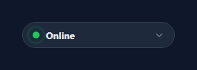
A status pill is the small presence control — Online, Away, Do not disturb, Offline — that apps like Slack, Discord, and Teams put on a profile so people know if you're reachable. This snippet builds a complete one in plain HTML, CSS, and vanilla JavaScript: a pill that shows the current state with a colored dot, a dropdown to change it, and a pulsing ring on the active state. No dependency.
One data array drives everything
A STATES array defines each presence with an id, label, color, sub-label, and a pulse flag. Both the menu and the pill render from it, so adding a state ("In a meeting") or recoloring one is a single edit — the dropdown options, the dot colors, and the selected display all stay in sync because they read from the same source.
Color via a CSS custom property
Each dot reads its color from a --c custom property set inline, so the same .sp-dot class renders green, amber, red, or grey purely from data. The "online" pulse is a CSS-only effect: a ::after ring that scales from 0.7× to 1.9× while fading out on an infinite spPulse keyframe, inheriting --c so the halo always matches the dot. Toggling the .pulse class turns the live indicator on only for active states.
An accessible dropdown
The trigger is a real <button> with aria-haspopup="listbox" and aria-expanded that flips as it opens, and the menu is a role="listbox" of role="option" items with aria-selected on the current one. The caret rotates 180° via an attribute selector on aria-expanded, so the open state is reflected in both ARIA and the visual without duplicate flags.
Open/close that behaves
The menu animates with opacity, transform, and visibility (so it's not focusable while hidden). It opens on click, closes when you click anywhere else — achieved by stopping propagation on the pill and listening for clicks on document — and closes on Escape. That's the standard, robust dropdown dismissal pattern without a library.
Wiring to real presence
Call select(id) from a websocket or your auth layer to reflect a user's real status, and POST from inside select() when the user changes their own. Because rendering flows through paint() and buildMenu(), the pill is a thin view over whatever presence value your backend holds.
Build with AI
Build, Understand, Optimize, and Extend It With AI
Rather than guessing how the pieces fit, paste this snippet's HTML, CSS, and JS into an AI coding assistant like Claude and ask it to trace exactly how the --c custom property lets one .sp-dot class render four different colors, or why the dropdown is closed with visibility plus opacity rather than display alone. It's a good partner for optimizing too — ask whether rebuilding the whole menu with buildMenu() on every select() call is wasteful for a list this small, or whether it would matter more at fifty states. For extending it, ask for a "Do Not Disturb with a custom message" state, a keyboard-navigable listbox using arrow keys instead of mouse-only selection, or a websocket-driven presence feed that calls select() automatically. Treat the code less like a finished artifact and more like a starting point for a conversation.
Prompt to recreate it
Copy this into your AI assistant of choice to build the effect from scratch, or as a jumping-off point for your own variant:
Build an accessible presence status pill in plain HTML, CSS, and JavaScript with no dependencies.

Requirements:
- A single data array of state objects, each with an id, label, color, sub-label, and a pulse boolean, that drives both the trigger pill and the dropdown menu so there is exactly one source of truth.
- The trigger must be a real button element with aria-haspopup="listbox" and an aria-expanded attribute that flips between "true" and "false" as the menu opens and closes.
- The dropdown must be a role="listbox" containing role="option" items, with aria-selected set on whichever option matches the current state.
- The colored status dot must use a single CSS class whose color comes from a CSS custom property set inline per state, not a separate CSS class per color.
- Only the state flagged as "pulse" should render an animated ring around its dot, built as a CSS keyframe on a ::after pseudo-element scaling outward while fading opacity, not a JS-driven animation.
- The dropdown must close on three triggers: clicking its own option, clicking anywhere outside the component (using a document-level click listener with propagation stopped on the trigger), and pressing Escape.
- Changing the selected state must update the trigger's dot color, label text, and rebuild the option list's active highlighting, all from a single render function reading the shared data array.
Want to tighten it up first? Run this prompt through the AI Prompt Studio to score it across 8 quality dimensions, catch anti-patterns, and tune the wording for Claude, ChatGPT, or Gemini before you paste it in.
Step by step
How to Use
- 1Paste HTML, CSS, and JSA status pill renders showing Online with a pulsing green dot.
- 2Click the pillA dropdown opens listing every presence state with its color.
- 3Pick a statusThe pill updates its dot color and label to the chosen state.
- 4Note the pulseOnly the active Online state shows the pulsing halo.
- 5Click away or press EscapeThe menu closes the standard way.
- 6Connect presenceCall select(id) from your websocket and POST on user changes.
Real-world uses
Common Use Cases
Got questions?
Frequently Asked Questions
Each dot reads its color from a --c CSS custom property set inline from the STATES data, so a single .sp-dot class renders green, amber, red, or grey. The pulsing halo is a ::after ring that also inherits --c, so the glow always matches whatever color the state defines.
Each state has a pulse flag in the data. paint() toggles a .pulse class on the dot only when that flag is true, and the class enables a CSS keyframe ring that scales out and fades. So the live, attention-drawing animation appears only for active presence and stays calm for Away, Busy, or Offline.
Yes. The trigger is a button with aria-haspopup="listbox" and an aria-expanded that flips on open, and the menu is a listbox of option items with aria-selected on the current state. The caret rotation is driven by an attribute selector on aria-expanded, so the visual and the ARIA never drift apart.
The pill stops click propagation, and a document-level click listener closes the menu whenever a click reaches it — which only happens for clicks outside the pill. An Escape keydown listener closes it too. The menu uses visibility:hidden while closed so it isn't focusable or interactive in the background.
Keep the current state id and open flag in component state, and render the pill and options from the STATES array. Move the document click and Escape listeners into a mount effect with cleanup on unmount. Call your presence API inside the select handler. In Tailwind, set the dot color with an inline --c style and style the rest with utilities.