Source Code
<div class="bat-card">
  <div class="bat-shell" id="batShell">
    <div class="bat-body">
      <div class="bat-fill" id="batFill"></div>
      <div class="bat-bolt" id="batBolt">
        <svg viewBox="0 0 24 24" fill="currentColor"><path d="M13 2 4 14h6l-1 8 9-12h-6z"></path></svg>
      </div>
      <span class="bat-pct" id="batPct">72%</span>
    </div>
    <div class="bat-cap"></div>
  </div>
  <label class="bat-slider">Level
    <input type="range" id="batRange" min="0" max="100" value="72">
  </label>
  <button type="button" class="bat-charge" id="batCharge">Toggle charging</button>
</div>*{box-sizing:border-box;margin:0;padding:0}
body{font-family:system-ui,-apple-system,sans-serif;background:#0f172a;color:#e2e8f0;display:flex;justify-content:center;padding:34px 18px}
.bat-card{background:#1e293b;border:1px solid #334155;border-radius:16px;padding:26px;width:100%;max-width:300px;text-align:center}
.bat-shell{display:inline-flex;align-items:center;margin-bottom:22px}
.bat-body{position:relative;width:150px;height:74px;border:3px solid #64748b;border-radius:11px;padding:5px;overflow:hidden;background:#0f172a}
.bat-cap{width:7px;height:30px;background:#64748b;border-radius:0 4px 4px 0;margin-left:2px}
.bat-fill{height:100%;border-radius:6px;width:72%;background:#22c55e;transition:width .45s cubic-bezier(.4,0,.2,1),background .35s}
.bat-shell.low .bat-fill{background:#f59e0b}
.bat-shell.crit .bat-fill{background:#ef4444}
.bat-pct{position:absolute;inset:0;display:flex;align-items:center;justify-content:center;font-size:21px;font-weight:800;color:#fff;text-shadow:0 1px 3px rgba(0,0,0,.55);font-variant-numeric:tabular-nums}
.bat-bolt{position:absolute;top:50%;left:50%;transform:translate(-50%,-50%);width:30px;height:30px;color:#fff;opacity:0;transition:opacity .25s;filter:drop-shadow(0 1px 3px rgba(0,0,0,.6))}
.bat-shell.charging .bat-bolt{opacity:1}
.bat-shell.charging .bat-pct{opacity:0}
.bat-shell.charging .bat-fill{animation:batPulse 1.6s ease-in-out infinite}
@keyframes batPulse{50%{opacity:.62}}
.bat-slider{display:block;font-size:11px;font-weight:700;color:#94a3b8;text-transform:uppercase;letter-spacing:.05em;text-align:left;margin-bottom:16px}
.bat-slider input{width:100%;margin-top:8px;accent-color:#22c55e;cursor:pointer}
.bat-charge{width:100%;background:#334155;color:#e2e8f0;border:1px solid #475569;border-radius:9px;padding:10px;font-size:12.5px;font-weight:700;cursor:pointer;font-family:inherit}
.bat-charge:hover{background:#3e4c63}
.bat-charge.on{background:#16a34a;border-color:#16a34a;color:#fff}var shell = document.getElementById('batShell');
var fill = document.getElementById('batFill');
var pct = document.getElementById('batPct');
var range = document.getElementById('batRange');
var chargeBtn = document.getElementById('batCharge');
var charging = false;
function paint() {
var level = Number(range.value);
fill.style.width = level + '%';
pct.textContent = level + '%';
// Color thresholds drive the green / amber / red states.
shell.classList.toggle('crit', level <= 12);
shell.classList.toggle('low', level > 12 && level <= 30);
}
range.addEventListener('input', paint);
chargeBtn.addEventListener('click', function () {
charging = !charging;
shell.classList.toggle('charging', charging);
chargeBtn.classList.toggle('on', charging);
chargeBtn.textContent = charging ? 'Charging\u2026 (stop)' : 'Toggle charging';
if (charging) creep();
});
// While charging, slowly fill toward 100% to simulate a live battery.
var timer = null;
function creep() {
clearInterval(timer);
timer = setInterval(function () {
if (!charging) { clearInterval(timer); return; }
var v = Number(range.value);
if (v >= 100) { clearInterval(timer); return; }
range.value = Math.min(100, v + 1);
paint();
}, 420);
}
paint();Learn Coding Visually
Learn to code with interactive, live-preview playgrounds — HTML, CSS, JavaScript, React & more.
 HTML Playground42 lessons · Click-based · Live preview
 CSS PlaygroundLearn CSS with a live editor
 JavaScript Playground60 lessons · DOM · Async · Canvas
 React PlaygroundLearn React with a live code editor
 GSAP PlaygroundLearn GSAP animation interactively
 SVG Playground44 lessons · shapes · paths · animation
 SCSS Playground45 lessons · Sass modules · tokens
 Tailwind PlaygroundLearn Tailwind CSS with a live editor
 Bootstrap 5 Playground50 lessons · live preview
Battery Indicator — Free CSS Battery Level HTML JS Snippet
Battery Indicator · Animations · Plain HTML, CSS & JS · Live preview
What's included
Features
About this UI Snippet
Battery Indicator — Animated Charge Level Widget
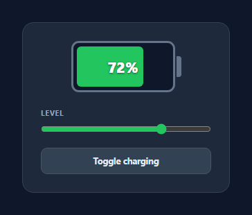
A battery indicator shows a device's charge as a familiar battery icon that fills and changes color — the control you see in status bars, IoT dashboards, EV apps, and laptop settings. This snippet builds one entirely from HTML, CSS, and vanilla JavaScript: a battery shell with a cap, a fill bar that animates between levels, color thresholds, and a charging mode with an animated bolt that slowly tops the battery up. No images, no SVG sprite sheet, no dependency.
The battery shape in pure CSS
The casing is a bordered rounded rectangle (.bat-body) with a small separate nub (.bat-cap) sitting against its right edge — together they read instantly as a battery. The fill is an absolutely-positioned inner div whose width is a percentage, so the charge level maps directly to a single CSS value. overflow:hidden on the body clips the fill to the rounded corners cleanly.
Color thresholds
Charge level drives three states via class toggles: at or below 12% the shell gets .crit (red), between 13–30% it gets .low (amber), and above that it stays green. The thresholds live in one paint() function with classList.toggle(name, condition), so the color logic is declarative — change the numbers in one place and both the bar and any themed elements follow.
Smooth level transitions
The fill's width and background are transitioned with a cubic-bezier ease, so dragging the slider or stepping the level animates fluidly rather than jumping. The percentage label is centered over the bar with a text shadow so it stays readable against both the dark empty track and the bright fill.
Charging mode
Toggling charge adds a .charging class that fades in a lightning-bolt SVG (hiding the percentage), runs a gentle batPulse opacity keyframe on the fill, and starts a setInterval that increments the level by 1% every 420ms until it reaches 100% — a believable "topping up" animation. Stopping charging clears the interval immediately so no timer leaks.
Wiring to real power data
Replace the slider with a real source: the browser navigator.getBattery() API exposes level and charging, or you can feed values from a device over WebSocket. Call paint() whenever the value changes; because all rendering is centralized there, the indicator stays a thin, stateless view over whatever charge number you give it.
Build with AI
Build, Understand, Optimize, and Extend It With AI
You don't have to trace the threshold and timer logic by hand to get the full picture here. Paste this snippet's HTML, CSS, and JS into an AI coding assistant like Claude and ask it to explain exactly why the crit and low classes are computed with classList.toggle and boolean conditions rather than separate if/else branches, or what would happen to the charging interval if the toggle button were clicked rapidly. The same assistant is useful for optimizing it — asking whether the setInterval-based creep should be replaced with a requestAnimationFrame-driven tween for smoother visual pacing, or whether paint() is doing more DOM writes than necessary on every input event. It's also a fast way to extend the widget: ask it to wire it up to the real navigator.getBattery() API, add a low-battery pulse warning, or support multiple battery indicators on one page sharing a single charging timer. Treat the code less like a finished artifact and more like a starting point for a conversation.
Prompt to recreate it
Copy this into your AI assistant of choice to build the effect from scratch, or as a jumping-off point for your own variant:
Build an animated "battery indicator" in plain HTML, CSS, and JavaScript using only div elements for the battery shape (no images, no icon fonts, no SVG battery outline) plus one inline SVG for the charging bolt.

Requirements:
- A battery shell made from a bordered, rounded rectangle body plus a small separate rectangular nub positioned against its right edge to read as the battery terminal.
- An inner fill element whose width is set as a percentage matching the current charge level, clipped to the body's rounded corners with overflow hidden, and animated with a CSS transition on both width and background-color so level changes ease smoothly rather than jumping.
- Three color states driven purely by numeric thresholds: green above 30%, amber between 13% and 30% inclusive, and red at 12% or below, toggled with classList.toggle calls rather than separate conditional blocks.
- A range input slider that drives the level in real time on its input event, updating both the fill width and a centered percentage label with a readable text-shadow.
- A "toggle charging" button that, when active, fades in a lightning-bolt icon centered over the battery (hiding the percentage label), runs a continuous subtle pulse animation on the fill, and starts an interval that increments the level by 1% at a fixed short delay until it reaches 100%, at which point the interval must stop itself.
- Clicking the charging button again while charging must immediately clear the running interval so no timer keeps firing in the background.
Want to tighten it up first? Run this prompt through the AI Prompt Studio to score it across 8 quality dimensions, catch anti-patterns, and tune the wording for Claude, ChatGPT, or Gemini before you paste it in.
Step by step
How to Use
- 1Paste HTML, CSS, and JSA battery shell renders with a fill bar and a percentage label.
- 2Drag the level sliderThe fill width animates and the percentage updates as you move it.
- 3Watch the color changeBelow 30% the fill turns amber, below 12% it turns red.
- 4Toggle chargingA lightning bolt appears and the bar pulses while the level creeps up.
- 5Let it reach fullCharging stops cleanly at 100% and the interval is cleared.
- 6Feed real dataReplace the slider with navigator.getBattery() and call paint().
Real-world uses
Common Use Cases
Got questions?
Frequently Asked Questions
The body is a div with a thick border and rounded corners, and the terminal is a separate small div (the cap) placed against its right edge. The colored fill is an inner div with a percentage width, and overflow:hidden on the body clips it to the rounded corners. The whole icon is three divs and no graphics.
The paint() function calls classList.toggle('crit', level <= 12) and classList.toggle('low', level > 12 && level <= 30). Those classes change the fill background to red or amber; above 30% neither class applies and it stays green. Adjusting the breakpoints is a one-line change.
A .charging class fades in a bolt SVG, hides the percentage, and runs a pulsing opacity animation on the fill. A setInterval then raises the level by 1% every 420ms until 100%, simulating a real charge. Toggling charging off clears the interval immediately, so there are no leftover timers.
Yes. The browser navigator.getBattery() API returns a promise with level (0–1) and charging fields plus change events. Multiply level by 100, set the slider or call paint() directly, and toggle the charging class from the API's charging value. Any live source — WebSocket, polling — works the same way.
Keep the level and charging flag in state and bind the fill width to a style with the percentage. Move the creep-up setInterval into an effect (useEffect, onMounted, or ngOnInit) and clear it on cleanup to avoid leaks. In Tailwind, set the fill width with an inline style and switch the green/amber/red background via conditional classes.