Source Code
<div class="rbc-card">
  <div class="rbc-head"><h3>Goal completion</h3></div>
  <div class="rbc-body">
    <svg class="rbc-svg" id="rbcSvg" viewBox="0 0 200 200" role="img" aria-label="Radial bar chart"></svg>
    <ul class="rbc-legend" id="rbcLegend"></ul>
  </div>
</div>*{box-sizing:border-box;margin:0;padding:0}
body{font-family:system-ui,-apple-system,sans-serif;background:#f1f5f9;min-height:100vh;display:flex;align-items:center;justify-content:center;padding:24px}
.rbc-card{background:#fff;border-radius:16px;padding:22px;width:100%;max-width:430px;box-shadow:0 18px 44px rgba(15,23,42,.08)}
.rbc-head h3{font-size:16px;font-weight:800;color:#0f172a;margin-bottom:14px}
.rbc-body{display:flex;align-items:center;gap:18px}
.rbc-svg{width:188px;height:188px;flex-shrink:0}
.rbc-track{fill:none;stroke:#eef2f7}
.rbc-arc{fill:none;stroke-linecap:round;transition:stroke-dashoffset 1s cubic-bezier(.22,1,.36,1)}
.rbc-legend{list-style:none;display:flex;flex-direction:column;gap:9px;flex:1}
.rbc-legend li{display:flex;align-items:center;gap:9px;font-size:12.5px;color:#475569}
.rbc-dot{width:10px;height:10px;border-radius:3px;flex-shrink:0}
.rbc-name{font-weight:600}
.rbc-val{margin-left:auto;font-weight:800;color:#0f172a;font-variant-numeric:tabular-nums}var DATA = [
{ name: 'Steps', value: 86, color: '#6366f1' },
{ name: 'Exercise', value: 64, color: '#22c55e' },
{ name: 'Sleep', value: 92, color: '#f59e0b' },
{ name: 'Water', value: 48, color: '#0ea5e9' },
];
var svg = document.getElementById('rbcSvg');
var legend = document.getElementById('rbcLegend');
var SVGNS = 'http://www.w3.org/2000/svg';
var CX = 100, CY = 100;
var R0 = 86, GAP = 4, THICK = 13; // outer radius, gap between rings, ring thickness
function el(n, a) { var e = document.createElementNS(SVGNS, n); for (var k in a) e.setAttribute(k, a[k]); return e; }
// Each category is a concentric ring; the arc length encodes value (0-100%).
function render() {
svg.innerHTML = '';
DATA.forEach(function (d, i) {
var r = R0 - i * (THICK + GAP);
var circ = 2 * Math.PI * r;
// Background track (full ring).
svg.appendChild(el('circle', { class: 'rbc-track', cx: CX, cy: CY, r: r, 'stroke-width': THICK }));
// Value arc — start at 12 o'clock by rotating -90deg around the centre.
var arc = el('circle', {
class: 'rbc-arc', cx: CX, cy: CY, r: r, stroke: d.color, 'stroke-width': THICK,
'stroke-dasharray': circ, 'stroke-dashoffset': circ,
transform: 'rotate(-90 ' + CX + ' ' + CY + ')',
});
svg.appendChild(arc);
// Animate the arc to its value on the next frame.
requestAnimationFrame(function () { arc.setAttribute('stroke-dashoffset', circ * (1 - d.value / 100)); });
});
legend.innerHTML = DATA.map(function (d) {
return '<li><span class="rbc-dot" style="background:' + d.color + '"></span>' +
'<span class="rbc-name">' + d.name + '</span><span class="rbc-val">' + d.value + '%</span></li>';
}).join('');
}
render();Learn Coding Visually
Learn to code with interactive, live-preview playgrounds — HTML, CSS, JavaScript, React & more.
 HTML Playground42 lessons · Click-based · Live preview
 CSS PlaygroundLearn CSS with a live editor
 JavaScript Playground60 lessons · DOM · Async · Canvas
 React PlaygroundLearn React with a live code editor
 GSAP PlaygroundLearn GSAP animation interactively
 SVG Playground44 lessons · shapes · paths · animation
 SCSS Playground45 lessons · Sass modules · tokens
 Tailwind PlaygroundLearn Tailwind CSS with a live editor
 Bootstrap 5 Playground50 lessons · live preview
Radial Bar Chart — Circular Bar Chart HTML CSS JS
Radial Bar Chart · Charts · Plain HTML, CSS & JS · Live preview
What's included
Features
About this UI Snippet
Radial Bar Chart — Concentric Ring Arcs That Encode Value as Arc Length
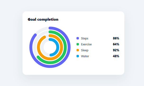
A radial bar chart (or circular bar chart / progress rings) wraps each category into a concentric ring, with the arc length around the ring encoding its value — the look popularised by fitness trackers and dashboard progress widgets. This snippet builds it in plain HTML, CSS, SVG, and vanilla JavaScript, with animated arcs and a legend — no charting library.
Each category is a ring
Categories are drawn as concentric circles at decreasing radii (outer ring first), each a fixed thickness with a small gap between them. For every ring there is a faint full-circle track and a coloured value arc on top. Laying categories out as nested rings (rather than wedges like a pie or polar chart) is what defines a radial bar chart, and it reads naturally as a set of progress dials stacked into one compact graphic.
Arc length via stroke-dashoffset
The value arc is a stroked circle whose stroke-dasharray equals its full circumference (2πr), so the whole stroke is one dash exactly as long as the ring. Setting stroke-dashoffset to circumference × (1 − value/100) reveals just the fraction of the ring corresponding to the value — 86% fills 86% of the circle. This dash-offset technique is the standard, dependency-free way to draw any circular progress arc, applied here per ring with each ring's own circumference (since radius, and therefore circumference, differs per ring).
Starting at the top, with round caps
Each ring is rotated −90° around the centre so its arc begins at twelve o'clock, the orientation people expect for progress. Round line caps give the arcs the soft, pill-ended look of fitness rings. Because each arc is its own SVG circle, rings animate and can be styled independently.
Animated fill
The arcs start empty (offset at full circumference) and animate to their values on the next animation frame via a CSS transition on stroke-dashoffset — the requestAnimationFrame defer that lets the transition run from the start state. Each ring sweeps to its value, giving the satisfying "rings filling" reveal.
Legend and data-driven
A legend lists each category with its colour and percentage. Everything renders from a DATA array of { name, value, color } (values 0–100), so swapping in your metrics — goal completion, KPI attainment, capacity used — updates the rings and legend together. It is a clear reference for concentric ring layout and per-ring dash-offset arcs that power radial bar and progress-ring charts. Keep in mind that nesting more than four or five rings starts to hurt readability: each successive ring is both thinner in absolute terms relative to its smaller circumference and physically harder to compare to the others at a glance, so beyond that count a small multiples layout of separate single-ring gauges usually communicates the same data more clearly than one crowded radial stack.
Build with AI
Build, Understand, Optimize, and Extend It With AI
You do not have to work through the per-ring circumference math on your own. Paste this snippet's HTML, CSS, and JS into an AI coding assistant like Claude and ask it to explain exactly why each ring recomputes its own 2 times pi times r for stroke-dasharray rather than sharing one constant, and why the -90 degree rotate transform is what makes every arc start at 12 o'clock instead of the SVG default of 3 o'clock. The same assistant can help you optimize it — ask at what ring count (given R0, THICK, and GAP) the innermost ring's radius gets so small that its arc becomes unreadable, and whether that's better solved with a small-multiples layout of separate gauges instead of more nested rings. It's also useful for extending the chart: ask it to add hover tooltips showing exact values, animate ring changes when the DATA array updates instead of only on first load, or add a center label showing an aggregate metric. Treat the code less like a finished artifact and more like a starting point for a conversation.
Prompt to recreate it
Copy this into your AI assistant of choice to build the effect from scratch, or as a jumping-off point for your own variant:
Build a radial (circular) bar chart in plain HTML, CSS, and JavaScript using inline SVG circles created with createElementNS — no charting library, no canvas.

Requirements:
- Render each category from a data array as its own concentric ring: for ring index i, compute its radius as an outer radius minus i times (ring thickness plus a fixed gap), so rings nest inward without touching.
- For every ring draw two circles at the same center and radius: a faint full background "track" circle with no value information, and a colored "value arc" circle on top of it.
- Give the value arc a stroke-dasharray equal to that specific ring's own circumference (2 times pi times its own radius, not a shared constant) so the dash length matches the ring exactly regardless of nesting depth.
- Set the value arc's stroke-dashoffset to circumference times (1 minus value/100) so only the value's percentage of the ring is visible, and animate this from a fully-hidden offset (equal to the full circumference) to the final value via a CSS transition triggered one animation frame after the element is created, so the ring visibly sweeps in on load rather than snapping to its final state.
- Rotate every ring -90 degrees around the shared center point so each arc begins at the 12 o'clock position and sweeps clockwise, matching how people read progress indicators.
- Use round line caps on the value arcs, and render a legend listing each category's name, color swatch, and percentage value alongside the rings.
Want to tighten it up first? Run this prompt through the AI Prompt Studio to score it across 8 quality dimensions, catch anti-patterns, and tune the wording for Claude, ChatGPT, or Gemini before you paste it in.
Step by step
How to Use
- 1Paste HTML, CSS, and JSA radial bar chart renders with four concentric rings that animate to their values.
- 2Read the ringsEach ring's coloured arc length is its value as a percentage; the legend lists the figures.
- 3Swap in your dataReplace the DATA array with your own { name, value, color } items (values 0-100).
- 4Adjust the ringsChange R0, THICK, and GAP to size and space the rings.
- 5Restyle itEdit the colours, track colour, or cap style to match your design.
- 6Wire to an APIMap your metrics into the DATA shape and call render().
Real-world uses
Common Use Cases
Got questions?
Frequently Asked Questions
Each value arc is a stroked SVG circle with stroke-dasharray equal to its circumference (2 pi r), making the stroke one dash as long as the ring. Setting stroke-dashoffset to circumference × (1 − value/100) hides that fraction of the stroke, leaving the value's portion visible — so 86% reveals 86% of the ring. Each ring computes its own circumference because radius differs per ring.
A pie or polar-area chart divides one circle into angular wedges. A radial bar chart instead stacks each category as its own concentric ring, encoding value by how far the arc travels around that ring (arc length), not by wedge angle. It reads as a set of progress dials and is ideal for comparing several percentages or goal-completion metrics.
SVG circle strokes start at the 3 o'clock position by default. Rotating the arc -90 degrees around the centre moves the start to 12 o'clock, which is the orientation people expect for progress indicators (filling clockwise from the top). The rotation is applied per arc around the chart's centre point.
Add or remove entries in the DATA array for more or fewer rings. Adjust R0 (outer radius), THICK (ring thickness), and GAP (spacing) so the innermost ring still has a positive radius — roughly R0 minus (count − 1) × (THICK + GAP) should stay comfortably above zero. The arc math adapts to each ring's radius automatically.
In React, hold the data in useState and render rings from .map(), setting the dashoffset in a useEffect so the arcs animate after mount; in Vue, use v-for with onMounted; in Angular, *ngFor with ngAfterViewInit. The circumference and dashoffset math is framework-agnostic — only the state and the deferred offset-set move into the framework.