Source Code
<header class="pfd-bar">
<span class="pfd-logo">◆ Acme</span>
<div class="pfd-wrap" id="pfdWrap">
<button type="button" class="pfd-trigger" id="pfdTrigger" aria-haspopup="menu" aria-expanded="false">
<span class="pfd-avatar">AM</span>
<span class="pfd-name">Alex Morgan</span>
<svg class="pfd-caret" width="14" height="14" viewBox="0 0 24 24" fill="none" stroke="currentColor" stroke-width="2.4" stroke-linecap="round" stroke-linejoin="round"><polyline points="6 9 12 15 18 9"/></svg>
</button>
<div class="pfd-menu" id="pfdMenu" role="menu">
<div class="pfd-head">
<span class="pfd-avatar lg">AM</span>
<div class="pfd-head-text">
<strong>Alex Morgan</strong>
<span>alex@acme.io</span>
</div>
</div>
<div class="pfd-plan"><span>Pro plan</span><a href="#">Manage</a></div>
<nav class="pfd-list">
<a href="#" role="menuitem"><svg viewBox="0 0 24 24" fill="none" stroke="currentColor" stroke-width="2"><circle cx="12" cy="8" r="4"/><path d="M4 20c0-4 3.6-7 8-7s8 3 8 7"/></svg> Your profile</a>
<a href="#" role="menuitem"><svg viewBox="0 0 24 24" fill="none" stroke="currentColor" stroke-width="2"><circle cx="12" cy="12" r="3"/><path d="M19.4 15a1.65 1.65 0 0 0 .33 1.82l.06.06a2 2 0 1 1-2.83 2.83l-.06-.06a1.65 1.65 0 0 0-1.82-.33 1.65 1.65 0 0 0-1 1.51V21a2 2 0 0 1-4 0v-.09A1.65 1.65 0 0 0 9 19.4a1.65 1.65 0 0 0-1.82.33l-.06.06a2 2 0 1 1-2.83-2.83l.06-.06a1.65 1.65 0 0 0 .33-1.82 1.65 1.65 0 0 0-1.51-1H3a2 2 0 0 1 0-4h.09A1.65 1.65 0 0 0 4.6 9a1.65 1.65 0 0 0-.33-1.82l-.06-.06a2 2 0 1 1 2.83-2.83l.06.06a1.65 1.65 0 0 0 1.82.33H9a1.65 1.65 0 0 0 1-1.51V3a2 2 0 0 1 4 0v.09a1.65 1.65 0 0 0 1 1.51 1.65 1.65 0 0 0 1.82-.33l.06-.06a2 2 0 1 1 2.83 2.83l-.06.06a1.65 1.65 0 0 0-.33 1.82V9a1.65 1.65 0 0 0 1.51 1H21a2 2 0 0 1 0 4h-.09a1.65 1.65 0 0 0-1.51 1z"/></svg> Settings</a>
<a href="#" role="menuitem"><svg viewBox="0 0 24 24" fill="none" stroke="currentColor" stroke-width="2"><path d="M9 18V5l12-2v13"/><circle cx="6" cy="18" r="3"/><circle cx="18" cy="16" r="3"/></svg> Billing</a>
<a href="#" role="menuitem"><svg viewBox="0 0 24 24" fill="none" stroke="currentColor" stroke-width="2"><circle cx="12" cy="12" r="10"/><path d="M9.09 9a3 3 0 0 1 5.83 1c0 2-3 3-3 3"/><line x1="12" y1="17" x2="12" y2="17"/></svg> Help & support</a>
</nav>
<button type="button" class="pfd-signout" role="menuitem"><svg viewBox="0 0 24 24" fill="none" stroke="currentColor" stroke-width="2"><path d="M9 21H5a2 2 0 0 1-2-2V5a2 2 0 0 1 2-2h4"/><polyline points="16 17 21 12 16 7"/><line x1="21" y1="12" x2="9" y2="12"/></svg> Sign out</button>
</div>
</div>
</header>*{box-sizing:border-box;margin:0;padding:0}
body{font-family:system-ui,-apple-system,sans-serif;background:#f1f5f9;min-height:100vh}
.pfd-bar{display:flex;align-items:center;justify-content:space-between;background:#fff;padding:12px 20px;border-bottom:1px solid #e2e8f0}
.pfd-logo{font-size:15px;font-weight:800;color:#0f172a}
.pfd-wrap{position:relative}
.pfd-trigger{display:flex;align-items:center;gap:9px;background:none;border:1.5px solid transparent;border-radius:999px;padding:4px 10px 4px 4px;cursor:pointer;font-family:inherit;transition:background .15s,border-color .15s}
.pfd-trigger:hover{background:#f8fafc}
.pfd-wrap.open .pfd-trigger{background:#f1f5f9;border-color:#e2e8f0}
.pfd-avatar{width:32px;height:32px;border-radius:50%;background:linear-gradient(135deg,#6366f1,#8b5cf6);color:#fff;font-size:12px;font-weight:800;display:flex;align-items:center;justify-content:center;flex-shrink:0}
.pfd-avatar.lg{width:40px;height:40px;font-size:14px}
.pfd-name{font-size:13.5px;font-weight:700;color:#1e293b}
.pfd-caret{color:#94a3b8;transition:transform .2s}
.pfd-wrap.open .pfd-caret{transform:rotate(180deg)}
.pfd-menu{position:absolute;top:calc(100% + 9px);right:0;width:250px;background:#fff;border:1px solid #e2e8f0;border-radius:13px;box-shadow:0 20px 48px rgba(15,23,42,.16);z-index:30;overflow:hidden;
opacity:0;transform:translateY(-8px) scale(.97);transform-origin:top right;pointer-events:none;transition:opacity .16s,transform .16s}
.pfd-wrap.open .pfd-menu{opacity:1;transform:translateY(0) scale(1);pointer-events:all}
.pfd-head{display:flex;align-items:center;gap:11px;padding:14px}
.pfd-head-text{min-width:0}
.pfd-head-text strong{display:block;font-size:13.5px;font-weight:800;color:#0f172a}
.pfd-head-text span{display:block;font-size:11.5px;color:#94a3b8;white-space:nowrap;overflow:hidden;text-overflow:ellipsis}
.pfd-plan{display:flex;align-items:center;justify-content:space-between;margin:0 14px 8px;background:#eef2ff;border-radius:8px;padding:7px 11px;font-size:11.5px;font-weight:700;color:#4338ca}
.pfd-plan a{color:#6366f1;text-decoration:none}
.pfd-list{padding:4px;border-top:1px solid #f1f5f9}
.pfd-list a,.pfd-signout{display:flex;align-items:center;gap:11px;width:100%;padding:9px 11px;border-radius:8px;font-size:13px;font-weight:600;color:#334155;text-decoration:none;border:none;background:none;cursor:pointer;font-family:inherit;text-align:left;transition:background .12s}
.pfd-list a svg,.pfd-signout svg{width:16px;height:16px;flex-shrink:0;color:#94a3b8}
.pfd-list a:hover{background:#f8fafc}
.pfd-signout{color:#dc2626;border-top:1px solid #f1f5f9;border-radius:0 0 4px 4px;margin-top:2px}
.pfd-signout svg{color:#f87171}
.pfd-signout:hover{background:#fef2f2}var wrap = document.getElementById('pfdWrap');
var trigger = document.getElementById('pfdTrigger');
var menu = document.getElementById('pfdMenu');
function open() { wrap.classList.add('open'); trigger.setAttribute('aria-expanded', 'true'); }
function close() { wrap.classList.remove('open'); trigger.setAttribute('aria-expanded', 'false'); }
trigger.addEventListener('click', function () {
wrap.classList.contains('open') ? close() : open();
});
// Close on outside click and on Escape (returning focus to the trigger).
document.addEventListener('click', function (e) {
if (!wrap.contains(e.target)) close();
});
document.addEventListener('keydown', function (e) {
if (e.key === 'Escape' && wrap.classList.contains('open')) { close(); trigger.focus(); }
});
// Basic arrow-key navigation through the menu items.
menu.addEventListener('keydown', function (e) {
var items = Array.prototype.slice.call(menu.querySelectorAll('a, button'));
var i = items.indexOf(document.activeElement);
if (e.key === 'ArrowDown') { e.preventDefault(); (items[i + 1] || items[0]).focus(); }
if (e.key === 'ArrowUp') { e.preventDefault(); (items[i - 1] || items[items.length - 1]).focus(); }
});Learn Coding Visually
Learn to code with interactive, live-preview playgrounds — HTML, CSS, JavaScript, React & more.
 HTML Playground42 lessons · Click-based · Live preview
 CSS PlaygroundLearn CSS with a live editor
 JavaScript Playground60 lessons · DOM · Async · Canvas
 React PlaygroundLearn React with a live code editor
 GSAP PlaygroundLearn GSAP animation interactively
 SVG Playground44 lessons · shapes · paths · animation
 SCSS Playground45 lessons · Sass modules · tokens
 Tailwind PlaygroundLearn Tailwind CSS with a live editor
 Bootstrap 5 Playground50 lessons · live preview
Profile Dropdown Menu — Account Menu HTML CSS JS
Profile Dropdown Menu · Navigation · Plain HTML, CSS & JS · Live preview
What's included
Features
About this UI Snippet
Profile Dropdown Menu — Avatar Account Menu with Keyboard Navigation
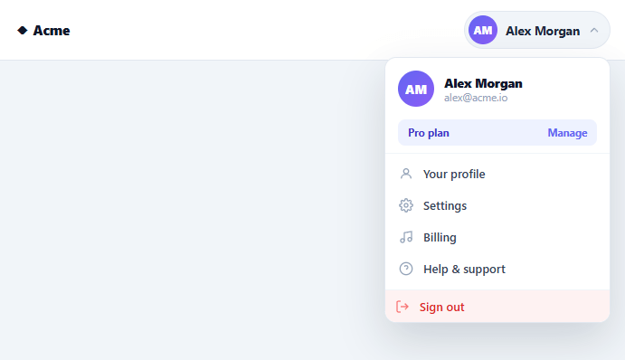
The avatar in the top-right corner that opens to reveal your account details, settings links, and sign-out is on virtually every app's navbar — and it's the kind of component developers rebuild constantly. This snippet provides a complete, polished profile dropdown in plain HTML, CSS, and vanilla JavaScript: a trigger showing the user's avatar and name, and a rich menu with account info, a plan badge, navigation links, and a distinct sign-out action, all keyboard accessible.
A trigger that shows who's signed in
The trigger isn't just an avatar — it pairs the user's initials-avatar with their name and a caret, so a glance confirms which account is active (important for anyone who switches between work and personal logins). The avatar uses a gradient background with initials, so no profile image is required, and the whole trigger is a pill that subtly highlights on hover and when open. The caret rotates to signal the menu's state.
A menu that's more than links
The dropdown opens with a header repeating the avatar plus the full name and email — the standard confirmation of the signed-in identity — followed by a plan badge ("Pro plan · Manage") that surfaces subscription status and a quick path to billing. Below that sit the navigation links (profile, settings, billing, help), each with an icon, and finally a visually separated, red-tinted "Sign out" — deliberately set apart so the destructive/exit action is never confused with a normal nav link. This information hierarchy (identity → status → navigation → exit) is what users expect from an account menu.
Keyboard accessible by design
The trigger carries aria-haspopup="menu" and a toggled aria-expanded, the menu is role="menu" with role="menuitem" entries, and the script wires the expected keyboard behavior: Escape closes the menu and returns focus to the trigger (so keyboard users aren't stranded), and Arrow Up/Down move focus through the menu items, wrapping at the ends. This is the accessibility most hand-built profile menus skip — a menu you can only operate with a mouse excludes keyboard and screen-reader users from a core navigation control.
Smooth, correctly-anchored animation
The menu animates in with opacity and transform (a slight rise and scale) from a top right transform origin, so it appears to grow out of the avatar in the corner rather than sliding in from nowhere. Using transform and opacity only keeps it smooth and crash-safe across every framework export. It's right-aligned to the trigger so it never overflows the viewport edge on a top-right navbar placement.
Outside-click dismissal and clean state
A document-level click listener closes the menu when you click anywhere outside it, and the trigger toggles open/closed on click — the standard, expected behavior. The component is self-contained: drop it into a navbar, swap the name, email, initials, plan, and links for your real user data, and wire the sign-out button to your auth logout. The structure stays identical whether the user is on a free or paid plan.
Build with AI
Build, Understand, Optimize, and Extend It With AI
You don't have to reverse-engineer every accessibility wire-up by hand. Paste this snippet's HTML, CSS, and JS into an AI coding assistant like Claude and ask it to walk through exactly how the document-level click listener decides an outside click occurred using wrap.contains(e.target), or why the menu animates with opacity and transform from a top-right transform-origin instead of sliding in from the edge. The same assistant is useful for optimizing it too, for example checking whether attaching a new document click listener is necessary at all versus a single delegated listener, or whether the arrow-key handler's items query should be cached instead of rebuilt on every keydown. It's just as good for extending the menu: ask it to add a submenu for account switching, trap Tab focus inside the menu while open, or animate the caret and avatar together on hover. Treat the code less like a finished artifact and more like a starting point for a conversation.
Prompt to recreate it
Copy this into your AI assistant of choice to build the effect from scratch, or as a jumping-off point for your own variant:
Build a "profile dropdown menu" (the avatar-triggered account menu found in app navbars) in plain HTML, CSS, and JavaScript with no framework and no libraries.

Requirements:
- A trigger button showing an initials avatar, the user's name, and a caret icon, carrying aria-haspopup="menu" and an aria-expanded attribute that toggles between "true" and "false".
- A menu panel with role="menu" containing: a header repeating the avatar (larger) plus full name and email, a plan/status badge with a manage link, a list of navigation links each with role="menuitem", and a visually distinct sign-out control (different color, separated by a divider) as its own role="menuitem".
- The menu must be positioned absolutely relative to the trigger's wrapper, right-aligned so it never overflows a top-right navbar placement, and animate open/closed using only opacity and transform (translateY plus scale) from a top-right transform-origin — no width/height animation, no JavaScript-driven position calculation.
- Clicking the trigger must toggle the menu open state by adding/removing a class on the wrapper (which CSS then keys off to reveal the menu), not by directly toggling inline styles.
- A document-level click listener must close the menu whenever a click lands outside the wrapper element (checked via a contains() call), and a document-level keydown listener must close the menu on Escape and return keyboard focus to the trigger button.
- A keydown listener scoped to the menu must let ArrowDown and ArrowUp move focus between the menu's focusable link and button elements, wrapping around from the last item back to the first and vice versa.
Want to tighten it up first? Run this prompt through the AI Prompt Studio to score it across 8 quality dimensions, catch anti-patterns, and tune the wording for Claude, ChatGPT, or Gemini before you paste it in.
Step by step
How to Use
- 1Paste HTML, CSS, and JSA navbar renders with an avatar + name trigger in the top right. Click it to open the account menu.
- 2Explore the menuSee the header (avatar, name, email), a plan badge, navigation links with icons, and a separated sign-out.
- 3Use the keyboardOpen it, then Arrow Up/Down to move between items, and Escape to close and return focus to the trigger.
- 4Click outside to dismissClicking anywhere outside the menu closes it — the standard dropdown behavior.
- 5Add your user dataReplace the name, email, initials, plan, and links with your real signed-in user's details.
- 6Wire up sign-outConnect the "Sign out" button to your auth provider's logout, and point the links at your real routes.
Real-world uses
Common Use Cases
Got questions?
Frequently Asked Questions
Replace the static name, email, and initials with your user object's values (compute initials from the name, e.g. first letters of the first two words), set the plan badge from their subscription, and point the links at your routes. If you have a profile image, swap the initials avatar for an <img> with the initials div as a fallback when no image is set.
This snippet handles Escape-to-close-with-focus-return and Arrow key navigation. For complete menu semantics, also move focus to the first item when the menu opens, trap Tab within the menu while open, and ensure each item is reachable — the role="menu"/"menuitem" attributes are already in place so screen readers announce it correctly.
Attach a handler to the .pfd-signout button that calls your auth provider's logout (Auth0 logout(), Firebase signOut(), Supabase auth.signOut(), or your own endpoint), then redirect to the login or home page. Keep it as a button (not a link) since it triggers an action rather than navigating to a URL.
Sign-out is a state-changing, session-ending action, so visually grouping it with ordinary navigation links risks accidental clicks. Giving it a divider, distinct red color, and its own position at the bottom follows the established convention that makes the exit action deliberate and unmistakable.
In React, hold the open state in useState, render the user data from props, and handle outside-click with a useEffect document listener cleaned up on unmount; in Vue, use ref() with onMounted/onUnmounted; in Angular, use a component field with HostListener('document:click'). The keyboard and ARIA wiring port directly — only the open state and outside-click move into the framework's lifecycle.