Source Code
<header class="exs-bar">
  <span class="exs-logo">◆ Acme</span>
  <nav class="exs-nav">
    <a href="#">Products</a>
    <a href="#">Pricing</a>
    <a href="#">Docs</a>
  </nav>

  <div class="exs-search" id="exsSearch">
    <button type="button" class="exs-icon" id="exsToggle" aria-label="Search" aria-expanded="false">
      <svg width="18" height="18" viewBox="0 0 24 24" fill="none" stroke="currentColor" stroke-width="2" stroke-linecap="round"><circle cx="11" cy="11" r="8"/><path d="M21 21l-4.3-4.3"/></svg>
    </button>
    <input type="text" id="exsInput" placeholder="Search products, docs, settings…" aria-label="Search">
    <button type="button" class="exs-clear" id="exsClear" aria-label="Clear">
      <svg width="15" height="15" viewBox="0 0 24 24" fill="none" stroke="currentColor" stroke-width="2.4" stroke-linecap="round"><path d="M18 6L6 18M6 6l12 12"/></svg>
    </button>
    <kbd class="exs-kbd">/</kbd>
  </div>
</header>

<div class="exs-page">Press <kbd>/</kbd> anywhere, or click the search icon, to expand the bar.</div>*{box-sizing:border-box;margin:0;padding:0}
body{font-family:system-ui,-apple-system,sans-serif;background:#f8fafc;min-height:100vh}
.exs-bar{display:flex;align-items:center;gap:22px;background:#fff;padding:13px 20px;border-bottom:1px solid #e2e8f0}
.exs-logo{font-size:15px;font-weight:800;color:#0f172a}
.exs-nav{display:flex;gap:18px;margin-right:auto}
.exs-nav a{font-size:13.5px;font-weight:600;color:#64748b;text-decoration:none}
.exs-nav a:hover{color:#0f172a}
.exs-search{position:relative;display:flex;align-items:center;height:40px;width:40px;background:#f1f5f9;border:1.5px solid transparent;border-radius:999px;overflow:hidden;
transition:width .32s cubic-bezier(.4,0,.2,1),background .2s,border-color .2s}
.exs-search.open{width:320px;background:#fff;border-color:#6366f1;box-shadow:0 0 0 3px rgba(99,102,241,.12)}
.exs-icon{width:40px;height:40px;border:none;background:none;color:#64748b;cursor:pointer;flex-shrink:0;display:flex;align-items:center;justify-content:center}
.exs-search.open .exs-icon{color:#6366f1;cursor:default}
.exs-input{}
.exs-search input{flex:1;min-width:0;border:none;outline:none;background:none;font-size:14px;font-family:inherit;color:#0f172a;opacity:0;transition:opacity .2s;padding:0}
.exs-search.open input{opacity:1}
.exs-clear{width:30px;height:30px;border:none;background:none;color:#94a3b8;cursor:pointer;flex-shrink:0;display:none;align-items:center;justify-content:center;border-radius:50%}
.exs-clear:hover{background:#f1f5f9;color:#475569}
.exs-search.open.has-text .exs-clear{display:flex}
.exs-kbd{flex-shrink:0;margin-right:10px;font-size:11px;font-weight:700;color:#94a3b8;background:#fff;border:1px solid #e2e8f0;border-radius:5px;padding:1px 6px;font-family:inherit}
.exs-search.open .exs-kbd{display:none}
.exs-page{padding:50px 24px;text-align:center;color:#94a3b8;font-size:14px;font-weight:600}
.exs-page kbd{background:#fff;border:1px solid #e2e8f0;border-radius:5px;padding:1px 7px;font-size:12px;font-weight:700;color:#475569;font-family:inherit}var search = document.getElementById('exsSearch');
var toggle = document.getElementById('exsToggle');
var input = document.getElementById('exsInput');
var clear = document.getElementById('exsClear');
function open() {
search.classList.add('open');
toggle.setAttribute('aria-expanded', 'true');
setTimeout(function () { input.focus(); }, 80);
}
function close() {
search.classList.remove('open', 'has-text');
toggle.setAttribute('aria-expanded', 'false');
input.value = '';
input.blur();
}
toggle.addEventListener('click', function () {
search.classList.contains('open') ? (input.value ? null : close()) : open();
});
input.addEventListener('input', function () {
search.classList.toggle('has-text', this.value !== '');
});
clear.addEventListener('click', function () {
input.value = '';
search.classList.remove('has-text');
input.focus();
});
// "/" shortcut to open (ignored while typing in another field), Escape to close.
document.addEventListener('keydown', function (e) {
var typing = /^(input|textarea|select)$/i.test((e.target.tagName || ''));
if (e.key === '/' && !search.classList.contains('open') && !typing) { e.preventDefault(); open(); }
if (e.key === 'Escape' && search.classList.contains('open')) close();
});
// Collapse when clicking away, but only if the field is empty.
document.addEventListener('click', function (e) {
if (!search.contains(e.target) && search.classList.contains('open') && !input.value) close();
});Learn Coding Visually
Learn to code with interactive, live-preview playgrounds — HTML, CSS, JavaScript, React & more.
 HTML Playground42 lessons · Click-based · Live preview
 CSS PlaygroundLearn CSS with a live editor
 JavaScript Playground60 lessons · DOM · Async · Canvas
 React PlaygroundLearn React with a live code editor
 GSAP PlaygroundLearn GSAP animation interactively
 SVG Playground44 lessons · shapes · paths · animation
 SCSS Playground45 lessons · Sass modules · tokens
 Tailwind PlaygroundLearn Tailwind CSS with a live editor
 Bootstrap 5 Playground50 lessons · live preview
Expandable Search Bar — Animated Search HTML CSS JS
Expandable Search Bar · Navigation · Plain HTML, CSS & JS · Live preview
What's included
Features
About this UI Snippet
Expandable Search Bar — Icon-to-Input Expand with Keyboard Shortcut
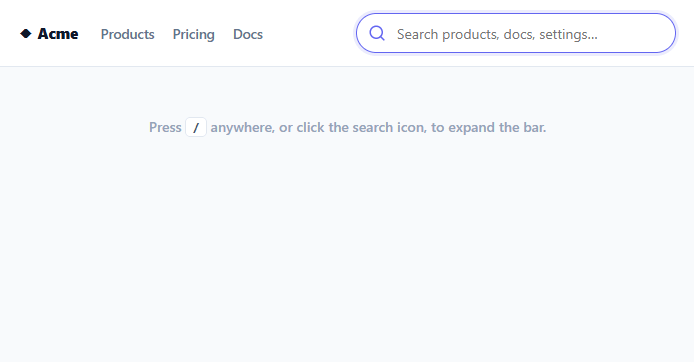
A search bar that sits as a compact icon and smoothly expands into a full input when needed keeps a navbar clean while making search one click — or one keystroke — away. This snippet builds that expandable search in plain HTML, CSS, and vanilla JavaScript: click the icon (or press "/") to expand, type, clear, and have it collapse again when empty, with the animation done purely by transitioning width.
Width transition, not display toggling
The expand is a single CSS transition on width — collapsed the search is a 40px circle (just the icon), and adding the .open class animates it to a full 320px pill. The input inside fades in via opacity as the bar widens, so it doesn't awkwardly appear before there's room for it. Animating width on a fixed-height element (rather than toggling display) is what makes the expansion smooth and reversible, and it's a case where a width transition is exactly right because the container's height never changes.
The "/" keyboard shortcut
Power users expect to press "/" to jump straight to search — a convention popularized by GitHub, Slack, and countless apps. A document-level keydown listener opens the bar and focuses the input when "/" is pressed, but only when the user isn't already typing in another input, textarea, or select (so typing a slash in a form field doesn't hijack focus). A small <kbd>/</kbd> hint sits in the collapsed bar to advertise the shortcut, and disappears once expanded. Escape closes the bar, the matching convention.
Collapse-when-empty, persist-when-typed
The collapse behavior is deliberately smart: clicking away or pressing Escape collapses the bar *only if it's empty*. If the user has typed a query, clicking elsewhere leaves the bar expanded with their text intact — because collapsing and discarding a half-typed search would be infuriating. The toggle button also respects this: clicking the icon on an expanded bar with text does nothing (the text stays), while on an empty expanded bar it collapses. This "don't throw away the user's input" rule is the detail that makes the component feel considerate rather than fussy.
A clear button that appears on demand
A clear (✕) button appears inside the bar only when there's text (.has-text), letting the user wipe the query in one click without collapsing the bar. It's hidden when the field is empty so it never sits there as dead UI. Clearing refocuses the input so the user can immediately type a new query.
Focus timing that matches the animation
When the bar opens, focus is set after a short delay so the cursor lands in the input as it finishes widening rather than before it's visible — a small touch that avoids the jarring feel of focusing an element mid-transition. On close, the input is blurred and cleared so the next open starts fresh.
Accessible and unobtrusive
The toggle is a real button with an aria-label and a toggled aria-expanded, and the input has its own label, so the control is announced correctly. Collapsed, it takes minimal space in the navbar; expanded, it's a full search field — giving you the best of both without a permanent wide input crowding the header on every page.
Build with AI
Build, Understand, Optimize, and Extend It With AI
You don't have to reason through every edge case in the collapse logic by yourself. Paste this snippet's HTML, CSS, and JS into an AI coding assistant like Claude and ask it to explain exactly why the toggle button's click handler checks input.value before deciding whether to close the bar, and how that interacts with the separate outside-click listener's own empty-value check. The same assistant can help optimize it — ask whether the "/" shortcut's typing-target check (matching against input, textarea, select tag names) is complete enough to also exclude contenteditable elements, and whether debouncing belongs in this component or in whatever wires up the actual search results. It's also useful for extending the bar: ask it to add a live results dropdown that appears below the expanded input, recent-searches memory shown when the bar opens empty, or an animated placeholder that cycles through example queries while collapsed. Treat the code less like a finished artifact and more like a starting point for a conversation.
Prompt to recreate it
Copy this into your AI assistant of choice to build the effect from scratch, or as a jumping-off point for your own variant:
Build an expandable search bar in plain HTML, CSS, and JavaScript that starts as a compact icon and widens into a full input — no library.

Requirements:
- A pill-shaped container that starts sized to fit only its icon button (a fixed circular size) and transitions its width property (not display, not visibility) to a much wider value when an "open" state class is added, with the input's opacity fading in as the width animates so it doesn't appear before there's room for it.
- A document-level keydown listener that opens and focuses the search when the forward-slash key is pressed, but only when the currently focused element is not itself an input, textarea, or select, so typing a literal slash into an unrelated form field is never hijacked.
- A small keyboard-shortcut hint badge visible only in the collapsed state that disappears once the bar expands.
- Clicking the icon button when the bar is already open and empty must collapse it; clicking it when open and containing text must do nothing, since a typed query should never be silently discarded by clicking the icon.
- A document-level click listener that collapses the bar when a click lands outside of it, but only if the input is currently empty — a bar with an in-progress typed query must stay open when the user clicks elsewhere.
- Pressing Escape must collapse the bar under the same empty-only rule as outside-click, and a visible clear button must appear only once there is text in the field, clearing the input and refocusing it without collapsing the bar.
- After opening, delay focusing the input by a short amount so the cursor visibly lands only once the width transition has mostly finished, rather than focusing instantly while the bar is still animating open.
- Give the toggle button a proper aria-label and a toggled aria-expanded attribute reflecting the open/closed state.
Want to tighten it up first? Run this prompt through the AI Prompt Studio to score it across 8 quality dimensions, catch anti-patterns, and tune the wording for Claude, ChatGPT, or Gemini before you paste it in.
Step by step
How to Use
- 1Paste HTML, CSS, and JSA navbar renders with a compact search icon (showing a "/" hint) on the right.
- 2Expand itClick the search icon, or press "/" anywhere on the page, and the bar smoothly widens into a full input and focuses.
- 3Type a queryAs you type, a clear (✕) button appears so you can wipe the query without collapsing the bar.
- 4See collapse-when-emptyClick away or press Escape — the bar collapses only if empty; if you've typed something, it stays open with your text.
- 5Wire up real searchAdd an input handler to filter results or call your search API, optionally showing a results dropdown below the bar.
- 6Adjust the widthChange the .exs-search.open width to fit your navbar; the transition adapts automatically.
Real-world uses
Common Use Cases
Got questions?
Frequently Asked Questions
Toggling display:none can't be transitioned, so the bar would pop open instantly. Animating width on a fixed-height element lets the browser interpolate the size smoothly, and fading the input's opacity as it widens avoids the input appearing before there's room. Width transitions are safe here precisely because the height stays constant, so there's no layout-shift jank.
The keydown handler checks whether the event target is an input, textarea, or select before acting on "/", so typing a slash inside any form field is left alone and only a slash pressed on the page (not in a field) opens search. This is the standard guard for single-key shortcuts.
Collapsing a search bar that contains a typed-but-unsubmitted query would discard the user's work, which is frustrating. The rule "collapse only if empty" preserves intent: an empty bar is clearly done with, while a bar with text is mid-task. Both Escape and outside-click respect this, and the toggle button does too.
Add an input listener that filters your data (or debounces a call to a search API) and render a results dropdown positioned below the expanded bar — similar to the address autocomplete pattern. Keep the bar expanded while results show, and collapse only when both the field and results are dismissed.
In React, hold open and query state in useState, toggle a class via className, and attach the "/" and outside-click listeners in a useEffect cleaned up on unmount; in Vue, use ref() with onMounted/onUnmounted; in Angular, use a field with HostListener. The width-transition CSS does the animation — only the state and global listeners move into the framework.