You Might Also Like
Learn Coding Visually
Learn to code with interactive, live-preview playgrounds — HTML, CSS, JavaScript, React & more.
 HTML Playground42 lessons · Click-based · Live preview
 CSS PlaygroundLearn CSS with a live editor
 JavaScript Playground60 lessons · DOM · Async · Canvas
 React PlaygroundLearn React with a live code editor
 GSAP PlaygroundLearn GSAP animation interactively
 SVG Playground44 lessons · shapes · paths · animation
 SCSS Playground45 lessons · Sass modules · tokens
 Tailwind PlaygroundLearn Tailwind CSS with a live editor
 Bootstrap 5 Playground50 lessons · live preview
Sidebar Mini — Free HTML CSS JS Collapsible Icon Sidebar Nav
Sidebar Mini · Navigation · Plain HTML, CSS & JS · Live preview
What's included
Features
About this UI Snippet
Sidebar Mini — A Collapsible Icon-Rail Navigation
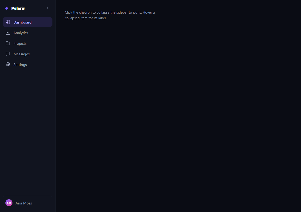
The sidebar mini is the collapsible app navigation that shrinks from a full labelled column to a slim icon-only rail and back — the space-saving sidebar used in dashboards, editors, and admin panels. This snippet builds it with plain HTML, CSS transitions, and a tiny vanilla JavaScript toggle, including hover tooltips that appear only when collapsed.
One width variable drives the collapse
The sidebar's width is a CSS custom property (--w) with a transition, and collapsing simply swaps that variable from 236px to 74px via an is-collapsed class. Because everything inside is laid out with flexbox, the icons stay put on the left while the labels are clipped by the narrowing container — there's no per-element width juggling. Animating the width gives the smooth expand/contract that makes the rail feel like a single moving panel.
Labels fade as the rail narrows
The text labels are faded out with opacity (and clipped by overflow: hidden) when collapsed, rather than removed, so they don't reflow or pop — they dissolve as the icons slide to the centre of the rail. The chevron toggle button also rotates 180° to mirror the open/closed direction, a small affordance that signals what the click will do.
Tooltips, but only when collapsed
When the labels are hidden, the navigation would be cryptic, so each item exposes its name through a data-tip attribute that a CSS ::after tooltip reads — but only under the .is-collapsed selector. So in the expanded state the labels are visible and there are no tooltips; collapsed, hovering an icon reveals its label in a floating chip beside the rail. This is the standard pattern for icon-rail navigation and keeps the collapsed state usable.
Active state and structure
Clicking a nav item moves an is-active highlight to it, and the layout reserves a pinned user row at the bottom with a gradient initials avatar. The whole thing is built from real anchor elements with inline SVG icons, so it's lightweight, themeable with currentColor, and easy to wire to a router.
Accessibility
The toggle updates aria-expanded and its aria-label ("Collapse"/"Expand") as the state changes, so assistive tech announces the control correctly. Icons pair with text labels (visible when expanded, tooltip when collapsed), so navigation is never conveyed by icon shape alone.
Customizing it
Change the two widths, the transition speed, the accent, or the icon set; persist the collapsed state to localStorage; or collapse automatically below a breakpoint. Pair it with a sidebar nav, a dashboard layout, or a floating dock.
Build with AI
Build, Understand, Optimize, and Extend It With AI
You don't need to work out how one custom property drives the entire collapse by hand. Paste this snippet's HTML, CSS, and JS into an AI coding assistant like Claude and ask it to explain exactly why swapping the --w custom property is enough to animate the whole rail while flexbox keeps the icons pinned to the left, or how scoping the tooltip's ::after rule under is-collapsed prevents it from ever appearing in the expanded state. The same assistant can help optimize it, for example checking whether the label opacity transition and the width transition are properly synchronized so labels don't visibly clip mid-transition on a slow device. It's also useful for extending the feature: ask it to persist the collapsed state to localStorage so it survives a reload, auto-collapse below a viewport breakpoint, or add a second-level flyout submenu that appears next to a collapsed parent item. Treat the code less like a finished artifact and more like a starting point for a conversation.
Prompt to recreate it
Copy this into your AI assistant of choice to build the effect from scratch, or as a jumping-off point for your own variant:
Build a collapsible icon-rail sidebar navigation in plain HTML, CSS, and JavaScript, no framework, no libraries.

Requirements:
- Drive the sidebar's width from a single CSS custom property (not two separate hardcoded width rules) with a transition on width, and switch between an expanded value and a collapsed value by toggling one class on the sidebar container.
- Lay out the sidebar's internals with flexbox so that icons remain pinned to the same horizontal position whether the rail is expanded or collapsed, with no separate positioning logic needed for the two states.
- Text labels next to each icon must fade out via opacity (combined with overflow hidden to prevent reflow) when collapsed, rather than being removed from the DOM or using display none, so they dissolve smoothly instead of popping.
- Each navigation item must carry its label in a data attribute, and a CSS-only tooltip (using a pseudo-element that reads that attribute via the CSS content: attr() function) must appear on hover only when the sidebar has the collapsed class — it must never appear when expanded, since the text label is already visible then.
- A toggle button must rotate its chevron icon 180 degrees when collapsing, and must update its aria-expanded and aria-label attributes to reflect the current state, so assistive technology announces the control correctly.
- Clicking a navigation item must move a single active-item highlight class to it and remove it from all siblings, independent of the collapsed/expanded state.
Want to tighten it up first? Run this prompt through the AI Prompt Studio to score it across 8 quality dimensions, catch anti-patterns, and tune the wording for Claude, ChatGPT, or Gemini before you paste it in.
Step by step
How to Use
- 1Paste HTML, CSS, and JSA full labelled sidebar renders beside content.
- 2Click the chevronThe sidebar collapses to an icon rail.
- 3Hover a collapsed iconA tooltip shows that item's label.
- 4Click a nav itemThe active highlight moves to it.
- 5Expand againThe chevron flips and labels fade back in.
- 6Tune the widthsChange the expanded and collapsed --w values.
Real-world uses
Common Use Cases
Got questions?
Frequently Asked Questions
The sidebar width is a CSS custom property --w with a transition, and the is-collapsed class swaps it from 236px to 74px. Because the interior is laid out with flexbox, the icons stay on the left while labels are clipped by the narrowing container, so the whole rail animates as one panel with no per-element width changes.
Each item carries its name in a data-tip attribute, and a CSS ::after tooltip reads it — but the rule is scoped under the .is-collapsed selector. Expanded, the labels are visible and there are no tooltips; collapsed, hovering an icon reveals its label in a floating chip. This keeps the icon-only state usable without redundant tooltips when text is already shown.
The labels are faded with opacity and clipped by overflow: hidden rather than removed from the DOM, so they dissolve as the rail narrows instead of reflowing or popping out. This makes the collapse read as a smooth visual change rather than a layout jump.
The toggle button updates aria-expanded and its aria-label between Collapse and Expand as the state changes, so screen readers announce the control correctly. Every nav item pairs an icon with a text label — visible when expanded, shown as a tooltip when collapsed — so navigation is never conveyed by icon shape alone.
Hold a collapsed boolean in state and bind the is-collapsed class to it, persisting to localStorage if you want it to stick. Render nav items from an array with their icon, label, and tip. Keep the active route in state or derive it from the router. All the width, fade, and tooltip behaviour is CSS, so it ports unchanged.