You Might Also Like
Learn Coding Visually
Learn to code with interactive, live-preview playgrounds — HTML, CSS, JavaScript, React & more.
 HTML Playground42 lessons · Click-based · Live preview
 CSS PlaygroundLearn CSS with a live editor
 JavaScript Playground60 lessons · DOM · Async · Canvas
 React PlaygroundLearn React with a live code editor
 GSAP PlaygroundLearn GSAP animation interactively
 SVG Playground44 lessons · shapes · paths · animation
 SCSS Playground45 lessons · Sass modules · tokens
 Tailwind PlaygroundLearn Tailwind CSS with a live editor
 Bootstrap 5 Playground50 lessons · live preview
Breadcrumb Dropdown — Free HTML CSS JS Collapsed Path Nav
Breadcrumb Dropdown · Navigation · Plain HTML, CSS & JS · Live preview
What's included
Features
About this UI Snippet
Breadcrumb Dropdown — Collapse Deep Paths Without Losing Them
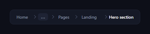
The breadcrumb dropdown solves the problem of long navigation trails: instead of wrapping a deep path across several lines, the middle segments collapse into a single "…" button that opens a menu of the hidden levels. This snippet builds it with a semantic ordered list, CSS, and a small vanilla JavaScript dropdown controller.
A semantic, accessible trail
The breadcrumb is a real <nav aria-label="Breadcrumb"> wrapping an ordered list, with the current page marked aria-current="page" and rendered as plain text rather than a link. This is the structure search engines and screen readers expect from a breadcrumb, so the collapse is an enhancement layered on top of correct semantics, not a replacement for them.
CSS chevron separators
The arrows between crumbs aren't characters or images — each non-first <li> draws a chevron with a ::before made from two borders rotated 45°. Generating separators in CSS means they never get selected or copied with the text, scale crisply, and recolour with a single property. The trail uses flex with flex-wrap, so on a truly tiny screen it can still wrap gracefully as a fallback.
The collapsed middle
The middle segment is a bd-collapsed list item holding a "…" button and a hidden menu of the levels it represents. Keeping the hidden crumbs in the DOM (inside the dropdown) rather than removing them means the full path is still available to anyone who wants it — you've folded the trail, not truncated it. The button carries aria-haspopup and aria-expanded so assistive tech knows it opens a menu and whether it's open.
The dropdown mechanics
Clicking "…" toggles an is-open class that fades and scales the menu in from its top-left origin with a short transition; pointer-events are disabled while closed so the hidden menu never blocks clicks. The controller closes the menu on an outside click (using menu.contains to ignore clicks inside it) and on the Escape key — the two dismissals every dropdown should support. stopPropagation on the button prevents its own click from immediately triggering the outside-click close.
Why collapse the middle, not the ends
The first crumb (home/root) and the last two (parent and current page) are the most useful for orientation, so those stay visible and only the deep middle folds away. This mirrors how file managers and IDEs handle long paths, keeping the trail compact while preserving the context that matters.
Customizing it
Choose how many crumbs to keep on each side before collapsing, restyle the chevrons and menu, or build the list dynamically and only insert the dropdown when the path exceeds a length. Pair it with a breadcrumb, a nested dropdown, or a sidebar nav.
Build with AI
Build, Understand, Optimize, and Extend It With AI
You don't have to trace the event propagation by hand to see why the dropdown never closes itself accidentally. Paste this snippet's HTML, CSS, and JS into an AI coding assistant like Claude and ask it to explain exactly why stopPropagation is called in the more button's click handler and how the document-level click listener uses menu.contains to distinguish an inside click from an outside one. The same assistant can help optimize it — asking whether attaching the outside-click and Escape listeners only while the menu is open (instead of permanently on document) would be cheaper, or whether the chevron separators could be replaced with a single reusable CSS class shared across other nav snippets. It's also useful for extending the pattern: ask it to auto-collapse crumbs based on measured container width instead of a fixed hidden set, add keyboard arrow navigation inside the opened menu, or animate the chevrons in sync with the menu opening. Treat the code less like a finished artifact and more like a starting point for a conversation.
Prompt to recreate it
Copy this into your AI assistant of choice to build the effect from scratch, or as a jumping-off point for your own variant:
Build a "breadcrumb with a collapsed middle dropdown" in plain HTML, CSS, and JavaScript using a semantic nav and ordered list — no icon library, no images for the separators.

Requirements:
- A nav element with an aria-label of "Breadcrumb" wrapping an ordered list of crumbs, where the final crumb is rendered as plain text (not a link) and marked aria-current="page".
- Chevron separators between crumbs must be generated purely in CSS using a ::before pseudo-element with two borders rotated 45 degrees — no separator characters, glyphs, or background images anywhere.
- One list item in the middle of the trail must represent multiple collapsed path levels: it contains a toggle button labeled with an ellipsis and a hidden dropdown menu listing the levels it stands in for, with those levels remaining real DOM links (not deleted), so the full path is always reachable.
- The toggle button must carry aria-haspopup and aria-expanded attributes that update correctly on open and close, and the dropdown menu itself must use role="menu" with menuitem roles on its links.
- Clicking the toggle button must open the dropdown with a fade-and-scale-in transition from its top-left corner, and clicking the toggle again, clicking anywhere outside the menu, or pressing Escape must all close it — with the button's own click never being misinterpreted as an outside click that immediately closes the menu it just opened.
- While closed, the dropdown menu must not intercept any clicks (even though it exists in the DOM), and it must not affect the layout or wrapping of the visible breadcrumb trail.
Want to tighten it up first? Run this prompt through the AI Prompt Studio to score it across 8 quality dimensions, catch anti-patterns, and tune the wording for Claude, ChatGPT, or Gemini before you paste it in.
Step by step
How to Use
- 1Paste HTML, CSS, and JSA breadcrumb renders with a … in the middle.
- 2Click the …A menu of the hidden path levels opens.
- 3Click outsideThe menu closes; Escape closes it too.
- 4Follow a crumbEach link navigates to that level.
- 5Choose what collapsesDecide how many crumbs stay on each side.
- 6Recolor the chevronsEdit the ::before border colors.
Real-world uses
Common Use Cases
Got questions?
Frequently Asked Questions
The first crumb (root) and the last two (parent and current page) give the most orientation, so they stay visible and only the deep middle folds into the … menu. This mirrors how file managers and IDEs handle long paths, keeping the trail compact while preserving the context that matters most.
Yes. The collapsed crumbs stay in the DOM inside the dropdown rather than being removed, so the full path is available to anyone who opens the menu — you fold the trail rather than truncate it. The toggle button carries aria-haspopup and aria-expanded so assistive tech knows it opens a menu and its state.
Each non-first list item draws a chevron with a ::before made from two borders rotated 45 degrees. Generating them in CSS means the arrows are never selected or copied with the text, scale crisply, and recolour with one property — cleaner than slash characters or separator images.
Clicking … toggles an is-open class that fades and scales the menu in. A document click handler closes it when the click is outside the menu, using menu.contains to ignore inside clicks, and an Escape keydown also closes it. stopPropagation on the button keeps its own click from instantly triggering the outside-click close.
Render the crumbs from a path array and, when it exceeds a length, slice out the middle into the dropdown while keeping the first and last items visible. Hold an open boolean in state for the menu, and add document listeners for outside-click and Escape in a mount effect with cleanup. The chevron and menu CSS port unchanged.