Learn Coding Visually
Learn to code with interactive, live-preview playgrounds — HTML, CSS, JavaScript, React & more.
 HTML Playground42 lessons · Click-based · Live preview
 CSS PlaygroundLearn CSS with a live editor
 JavaScript Playground60 lessons · DOM · Async · Canvas
 React PlaygroundLearn React with a live code editor
 GSAP PlaygroundLearn GSAP animation interactively
 SVG Playground44 lessons · shapes · paths · animation
 SCSS Playground45 lessons · Sass modules · tokens
 Tailwind PlaygroundLearn Tailwind CSS with a live editor
 Bootstrap 5 Playground50 lessons · live preview
Floating Dock — Free HTML CSS JS macOS Dock Snippet
Floating Dock · Navigation · Plain HTML, CSS & JS · Live preview
What's included
Features
1 + (MAX_SCALE - 1) * t² where t = 1 - dist/SPREAD — a quadratic falloff that mirrors the physical feel of the macOS Dock precisely.--scale and --ty are set per-icon via JS and consumed by the CSS transform. The CSS transition interpolates between values, eliminating the need for a JS animation loop.element.animate() fires a 3-keyframe bounce on click — scale up 15%, lift 8px, return — without requiring class toggles or event listener cleanup.backdrop-filter: blur(20px) + rgba background + subtle white border creates the frosted-glass dock shelf, matching the macOS aesthetic.translateY negative), so the bottom edges stay aligned to the dock shelf while the tops extend upward — exactly like macOS.tabindex="0" and a keydown handler for Enter/Space — the bounce fires on keyboard activation too.MAX_SCALE (default 1.8) and SPREAD (default 120px) are top-of-file constants — one line to change the effect intensity or reach.About this UI Snippet
Floating Dock — macOS Magnification Effect, Gaussian Proximity Scale & CSS Custom Property Animation
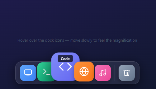
The macOS Dock's icon magnification is one of the most studied interaction effects in UI design — smooth, responsive, and physically intuitive. This snippet reproduces it in pure HTML, CSS, and JavaScript: a glassmorphism toolbar with coloured icon tiles that scale up toward the cursor using a Gaussian proximity formula, lift off the shelf, and bounce on click — with CSS custom properties driving every transform frame.
The macOS Dock icon magnification effect is one of the most recognisable and studied animations in software UI. It demonstrates a core principle: interactions should feel physical, as though the cursor is pushing objects rather than toggling states. This snippet reproduces the full effect — proximity-based magnification, smooth falloff, vertical lift, click bounce, label tooltip, glassmorphism container, and separator line — in pure HTML, CSS, and vanilla JavaScript with zero dependencies.
The magnification math: Gaussian proximity formula
The core of the effect is a distance-based scale calculation. When the cursor is at pixel X, for each dock icon the code computes dist = Math.abs(mouseX - iconCenter). It then computes t = 1 - dist / SPREAD — a linear falloff where t = 1 at the cursor and t = 0 at distance = SPREAD (120px by default). The scale is computed as 1 + (MAX_SCALE - 1) * t * t — squaring t makes the falloff nonlinear (Gaussian-like), so nearby icons grow large quickly while distant icons barely move. The vertical lift is LIFT * t * t — a negative value (−12px) that moves icons upward proportionally to their scale. Both are written to CSS custom properties (--scale and --ty) on each item element so the CSS transform expression reads them: transform: scale(var(--scale)) translateY(var(--ty)).
CSS custom properties as per-element animation state
Writing magnification data to CSS custom properties on individual elements (rather than inline transforms) has an important advantage: the CSS transition declaration on .icon-bg animates between the old and new custom property values automatically. When the cursor moves and --scale updates, the transition interpolates from the previous scale to the new one — giving the spring-ease feel without any JavaScript animation loop. The transition uses cubic-bezier(.34,1.56,.64,1), the same spring-overshoot easing used throughout the snippet collection, which gives the icons a slight bounce when they reach their peak.
The click bounce using Web Animations API
Clicking an icon triggers a programmatic keyframe animation using the Web Animations API (element.animate()). The three keyframes scale the icon up 15% and lift it an extra 8px before returning to the base value. The easing is the same spring cubic-bezier. Using element.animate() for the click bounce is preferable to adding/removing a CSS class because: it doesn't require a transitionend or animationend cleanup listener, it composes with the existing CSS transition without conflict, and it fires once and cleans itself up.
Glassmorphism container
The dock container uses background: rgba(255,255,255,0.08), backdrop-filter: blur(20px), and a 1px border: rgba(255,255,255,0.12) — the standard glassmorphism recipe. Icons are coloured <div> tiles with border-radius: 14px and individual linear-gradient backgrounds, matching the macOS icon aesthetic.
Customising the dock
Change MAX_SCALE (default 1.8) and SPREAD (default 120px) to tune magnification intensity and spread. Increase MAX_SCALE to 2.2 for a more dramatic effect. Change the icon SVGs and gradient colours to match your app. Add or remove .dock-item divs — the layout is display:flex; align-items:flex-end so all icons naturally bottom-align and taller magnified icons push upward rather than downward. Pair with a hamburger nav for a full navigation system.
Build with AI
Build, Understand, Optimize, and Extend It With AI
You don't have to work out the falloff math by hand. Paste this snippet's HTML, CSS, and JS into an AI coding assistant like Claude and ask it to explain exactly why the scale formula squares t instead of using it linearly, and why writing to CSS custom properties (rather than setting inline transform directly) is what lets the existing CSS transition animate the magnification smoothly. The same assistant can help optimize it — ask whether recalculating every icon's bounding rect on every single mousemove event is worth caching, or whether the mousemove handler should be throttled with requestAnimationFrame for very large docks. It's also a good way to extend the effect: have it add a 2D (vertical plus horizontal) proximity falloff instead of horizontal-only, a right-click context menu per icon, or a "running app" indicator dot beneath active icons. Treat the code less like a finished artifact and more like a starting point for a conversation.
Prompt to recreate it
Copy this into your AI assistant of choice to build the effect from scratch, or as a jumping-off point for your own variant:
Build a macOS-style floating dock with proximity-based icon magnification, in plain HTML, CSS, and JavaScript using CSS custom properties for the animated state — no libraries.

Requirements:
- A horizontal glassmorphism bar (translucent background, backdrop-filter blur, subtle border) fixed near the bottom of the viewport, containing several icon tiles and at least one vertical separator.
- Each icon tile must expose two CSS custom properties, a scale and a vertical translate, consumed by its transform, with a CSS transition on transform so changes to those custom properties animate automatically without any JavaScript animation loop.
- On mousemove over the dock, compute for every icon the horizontal distance between the cursor and that icon's center. If the distance is under a configurable spread radius, calculate a falloff value that is 1 at zero distance and 0 at the spread radius, square it for a nonlinear (fast near, gentle far) curve, then derive the icon's scale (up to a configurable maximum) and vertical lift from that squared falloff. Icons outside the radius must reset to scale 1 and zero lift. On mouseleave from the dock, reset every icon to its resting state.
- Because icons are bottom-aligned in a flex row, magnified icons must grow and lift upward without shifting the row's bottom alignment.
- On click, use the Web Animations API (element.animate with keyframes), not a CSS class toggle, to play a brief bounce — scale up further and lift further, then return to the icon's current magnified transform — so the bounce composes cleanly with the existing hover-driven transform instead of conflicting with it.
- Each icon must show a small tooltip label above it on hover/focus via a CSS opacity transition, and be keyboard-operable: focusable, with Enter or Space triggering the same click bounce as a mouse click.
Want to tighten it up first? Run this prompt through the AI Prompt Studio to score it across 8 quality dimensions, catch anti-patterns, and tune the wording for Claude, ChatGPT, or Gemini before you paste it in.
Step by step
How to Use
- 1Load the snippetPaste the HTML, CSS, and JS into your page. A glassmorphism dock bar appears at the bottom with five colour-coded app icons and a trash icon after a separator.
- 2Move the cursor slowly over the dockIcons near the cursor magnify smoothly up to 1.8× their size and lift slightly off the shelf. Icons further away scale proportionally less — the falloff is Gaussian, not linear.
- 3Move across the full dockAs the cursor moves, the magnification wave follows — each icon grows and shrinks based on its real-time distance from the cursor, just like the macOS Dock.
- 4Click any iconThe clicked icon bounces up 8px and scales to 115% before springing back to its current magnified size, providing satisfying click feedback.
- 5Hover to see the labelA small tooltip label appears above each icon on hover — "Finder", "Terminal", etc. It fades in with a CSS opacity transition.
- 6Customise icons and coloursSwap each
.icon-bggradient and SVG to match your app's icons. AdjustMAX_SCALEandSPREADin the JS to tune the magnification intensity and reach.
Real-world uses
Common Use Cases
Got questions?
Frequently Asked Questions
Increase MAX_SCALE at the top of the JS (default 1.8). Try 2.2 for a more dramatic macOS-like effect or 1.4 for a subtle zoom. Increase SPREAD (default 120px) to make the magnification wave wider — more icons are affected as the cursor approaches.
Duplicate a .dock-item div in the HTML. Set the data-label attribute for the tooltip text, change the background gradient on .icon-bg, and swap the SVG icon. The JS reads all .dock-item elements automatically.
Setting an inline style.transform directly would conflict with the CSS transition declaration — the browser would skip the transition because the old value is the same inline style that was just overwritten. Writing to CSS custom properties (--scale, --ty) consumed by the CSS transform expression lets the transition engine compare the old and new custom property values and interpolate between them.
Yes. Use the JSX, Vue, Angular, or Tailwind export buttons on this page. In React, attach the mousemove and mouseleave handlers to the dock container via a ref in useEffect with cleanup. Keep the per-icon --scale values in a useRef (not useState) to avoid re-renders on every mouse move — write directly to the DOM element's CSS custom properties for smooth 60fps updates. In Vue, use a template ref and onMounted; in Angular, use @ViewChild and ngAfterViewInit.
Set opacity: 0; transform: translateY(100%) on .dock-wrap by default, then add a :hover or a class that sets opacity: 1; transform: translateY(0). Trigger the class on body:hover or bind it to a bottom-of-screen IntersectionObserver trigger.