Learn Coding Visually
Learn to code with interactive, live-preview playgrounds — HTML, CSS, JavaScript, React & more.
 HTML Playground42 lessons · Click-based · Live preview
 CSS PlaygroundLearn CSS with a live editor
 JavaScript Playground60 lessons · DOM · Async · Canvas
 React PlaygroundLearn React with a live code editor
 GSAP PlaygroundLearn GSAP animation interactively
 SVG Playground44 lessons · shapes · paths · animation
 SCSS Playground45 lessons · Sass modules · tokens
 Tailwind PlaygroundLearn Tailwind CSS with a live editor
 Bootstrap 5 Playground50 lessons · live preview
Bottom Navigation — Free HTML CSS JS Mobile Snippet
Mobile Bottom Nav · Navigation · Plain HTML, CSS & JS · Live preview
What's included
Features
About this UI Snippet
Mobile Bottom Navigation — data-page Routing, Notification Badge & iOS Phone Mockup
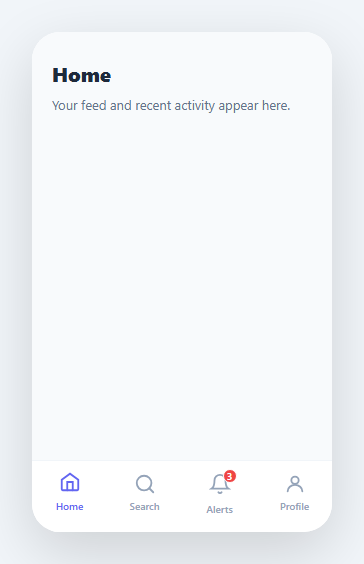
A bottom navigation bar is the dominant primary navigation pattern for mobile apps — iOS, Android, and mobile-first Progressive Web Apps all rely on it. Placing navigation at the thumb-reach zone at the bottom of the screen dramatically improves one-handed usability compared to hamburger menus or top navigation bars. This snippet implements a complete, interactive iOS-style bottom tab bar (the desktop equivalent is the tab bar) inside a realistic phone mockup, complete with page switching, active state indication, a notification badge counter, and smooth page transition animations.
The switchPage() routing system
The switchPage(btn) JavaScript function is the core of this component. When a navigation tab is clicked, the function reads btn.dataset.page — the value stored in the button's data-page HTML attribute. It then calls querySelectorAll('.nav-item').forEach(b => b.classList.remove('active')) to clear all active states, followed by querySelectorAll('.page').forEach(p => p.classList.remove('active')) to hide all page panels. Finally it adds .active back to just the clicked button and to the matching page div via document.getElementById('pg-' + btn.dataset.page). This data-attribute routing pattern requires zero JavaScript mapping objects — the HTML itself defines the relationship between each tab and its page via the data-page value.
The active tab indicator with icon lift
The .nav-item.active CSS rule applies color: #6366f1 to change the icon and label from muted grey to the accent colour. A subtle transform: translateY(-2px) on .nav-item.active svg lifts the active icon slightly upward, giving a physical feel to the selection. Both the colour and transform transition over 0.15s–0.2s for a polished tap response.
The notification badge
The Alerts tab demonstrates a notification badge: a small red circle positioned absolutely over the bell icon using position: absolute; top: -4px; right: -6px. The badge has min-width: 14px so it expands horizontally for two-digit counts. A white border around the badge (border: 1.5px solid #fff) creates a gap between the badge and the icon, preventing them from visually merging.
Page transition animation
Each .page element is display: none by default. When .active is added, a @keyframes fadeIn animation runs: from { opacity: 0; transform: translateY(6px) } to { opacity: 1; transform: none } over 0.2s. This gives each page switch a subtle reveal motion that communicates forward navigation without being distracting.
The phone mockup frame
The outer .phone div has border-radius: 28px; overflow: hidden; height: 500px which clips all content to the rounded rectangle frame, creating a realistic device mockup directly in the browser. This makes the snippet presentation-ready for client demos, design presentations, and portfolio showcases.
Build with AI
Build, Understand, Optimize, and Extend It With AI
You don't have to trace the data-page wiring by hand to see why it works. Paste this snippet's HTML, CSS, and JS into an AI coding assistant like Claude and ask it to explain exactly how switchPage reads btn.dataset.page and constructs the target page's id string, and why that eliminates the need for any JavaScript mapping object between tabs and pages. The same assistant can help optimize it — asking whether querying all .nav-item and .page elements on every single click is wasteful for a five-tab bar versus caching the node lists once, or whether the notification badge should be updated via a MutationObserver-safe pattern instead of direct textContent writes. It's also useful for extending the bar: ask it to add a center elevated "create" tab, swipe gestures between pages, or a route-synced version using the History API instead of pure data attributes. Treat the code less like a finished artifact and more like a starting point for a conversation.
Prompt to recreate it
Copy this into your AI assistant of choice to build the effect from scratch, or as a jumping-off point for your own variant:
Build a mobile "bottom navigation" tab bar inside a phone mockup frame using plain HTML, CSS, and JavaScript, with data-attribute based routing and no URL changes.

Requirements:
- A phone frame div with fixed width and height, rounded corners, and overflow hidden, containing a scrollable content area and a fixed bottom tab bar.
- Each tab button carries a data-page attribute, and each corresponding content page is a div with an id built from a "pg-" prefix plus that same data-page value, so a single JavaScript function can map any button to its page purely by string concatenation, without a lookup object.
- A switchPage function that removes an active class from every tab button and every page, then adds it back only to the clicked button and to the page whose id matches "pg-" plus that button's data-page value.
- The active tab must change color and lift its icon slightly upward with a CSS transform, both transitioning smoothly.
- The newly shown page must fade and slide in slightly from below using a CSS keyframe animation triggered by the active class being added.
- One tab must show a small numeric notification badge positioned absolutely over its icon, styled so it never visually merges with the icon it overlaps.
- Adding a new tab and its page must require zero changes to the JavaScript — only a new button with a data-page value and a matching page div with the corresponding id.
Want to tighten it up first? Run this prompt through the AI Prompt Studio to score it across 8 quality dimensions, catch anti-patterns, and tune the wording for Claude, ChatGPT, or Gemini before you paste it in.
Source Code
<div class="phone">
  <div class="screen">
    <div class="content" id="content">
      <div class="page active" id="pg-home">
        <h2>Home</h2><p>Your feed and recent activity appear here.</p>
      </div>
      <div class="page" id="pg-search">
        <h2>Search</h2><p>Find anything across the platform.</p>
      </div>
      <div class="page" id="pg-notif">
        <h2>Notifications</h2><p>You have 3 unread notifications.</p>
      </div>
      <div class="page" id="pg-profile">
        <h2>Profile</h2><p>Manage your account and settings.</p>
      </div>
    </div>
  </div>
  <nav class="bottom-nav">
    <button class="nav-item active" data-page="home" onclick="switchPage(this)">
      <svg width="22" height="22" viewBox="0 0 24 24" fill="none" stroke="currentColor" stroke-width="2" stroke-linecap="round"><path d="M3 9.5L12 3l9 6.5V20a1 1 0 0 1-1 1H4a1 1 0 0 1-1-1V9.5z"/><path d="M9 21V12h6v9"/></svg>
      <span>Home</span>
    </button>
    <button class="nav-item" data-page="search" onclick="switchPage(this)">
      <svg width="22" height="22" viewBox="0 0 24 24" fill="none" stroke="currentColor" stroke-width="2" stroke-linecap="round"><circle cx="11" cy="11" r="8"/><line x1="21" y1="21" x2="16.65" y2="16.65"/></svg>
      <span>Search</span>
    </button>
    <button class="nav-item" data-page="notif" onclick="switchPage(this)">
      <div class="icon-wrap">
        <svg width="22" height="22" viewBox="0 0 24 24" fill="none" stroke="currentColor" stroke-width="2" stroke-linecap="round"><path d="M18 8A6 6 0 0 0 6 8c0 7-3 9-3 9h18s-3-2-3-9"/><path d="M13.73 21a2 2 0 0 1-3.46 0"/></svg>
        <span class="notif-badge">3</span>
      </div>
      <span>Alerts</span>
    </button>
    <button class="nav-item" data-page="profile" onclick="switchPage(this)">
      <svg width="22" height="22" viewBox="0 0 24 24" fill="none" stroke="currentColor" stroke-width="2" stroke-linecap="round"><circle cx="12" cy="8" r="4"/><path d="M4 20c0-4 3.6-7 8-7s8 3 8 7"/></svg>
      <span>Profile</span>
    </button>
  </nav>
</div>
* { box-sizing: border-box; margin: 0; padding: 0; }
body { font-family: system-ui, sans-serif; background: #f1f5f9; display: flex; align-items: center; justify-content: center; min-height: 100vh; }
.phone { width: 300px; background: #fff; border-radius: 28px; overflow: hidden; box-shadow: 0 20px 60px rgba(0,0,0,0.15); display: flex; flex-direction: column; height: 500px; }
.screen { flex: 1; overflow: hidden; background: #f8fafc; }
.content { height: 100%; }
.page { display: none; padding: 28px 20px; height: 100%; }
.page.active { display: block; animation: fadeIn 0.2s ease; }
@keyframes fadeIn { from { opacity:0; transform:translateY(6px); } to { opacity:1; transform:none; } }
.page h2 { font-size: 20px; font-weight: 800; color: #1e293b; margin-bottom: 8px; }
.page p { font-size: 13px; color: #64748b; line-height: 1.6; }
.bottom-nav {
display: flex;
background: #fff;
border-top: 1px solid #f1f5f9;
padding: 8px 0 12px;
}
.nav-item {
flex: 1; display: flex; flex-direction: column; align-items: center; gap: 4px;
background: none; border: none; cursor: pointer; font-family: inherit;
color: #94a3b8; transition: color 0.15s;
padding: 4px 0;
}
.nav-item.active { color: #6366f1; }
.nav-item span { font-size: 10px; font-weight: 600; }
.nav-item svg { transition: transform 0.2s; }
.nav-item.active svg { transform: translateY(-2px); }
.icon-wrap { position: relative; }
.notif-badge {
position: absolute; top: -4px; right: -6px;
min-width: 14px; height: 14px;
background: #ef4444; color: #fff;
font-size: 8px; font-weight: 700;
border-radius: 10px; padding: 0 3px;
display: flex; align-items: center; justify-content: center;
border: 1.5px solid #fff;
}function switchPage(btn) {
document.querySelectorAll('.nav-item').forEach(b => b.classList.remove('active'));
document.querySelectorAll('.page').forEach(p => p.classList.remove('active'));
btn.classList.add('active');
document.getElementById('pg-' + btn.dataset.page).classList.add('active');
}Step by step
How to Use
- 1Click each tab in the phone mockup to switch pagesClick the Home, Search, Alerts, and Profile tabs to switch between pages. Watch the active tab highlight in indigo, the icon lift slightly, and the new page fade in from below. The notification badge on the Alerts tab shows a count of 3.
- 2Update the tab labels, icons, and data-page valuesIn the HTML panel, change the SVG icon paths for each .nav-item, update the <span> label text, and change the data-page attribute value. The data-page value must match the id of the corresponding .page div: data-page='messages' maps to id='pg-messages'.
- 3Add page content to each tab's screen panelIn the HTML panel, find the .page divs with ids like pg-home, pg-search, etc. Replace the placeholder h2 and p elements with your actual page content — lists, cards, forms, or any HTML you want to show when that tab is active.
- 4Add a fifth tab and page panelDuplicate one .nav-item button, give it a new data-page value like 'messages', and add a new <div class='page' id='pg-messages'> inside the .screen .content element. The switchPage() function handles the new tab automatically because it uses data-page to look up the page by ID.
- 5Update the notification badge count dynamicallyThe .notif-badge span shows a static count of 3. To update it dynamically from JavaScript: document.querySelector('.notif-badge').textContent = newCount. To hide it when count is zero: badge.style.display = count > 0 ? 'flex' : 'none'. Call this whenever your notification state changes.
- 6Export for use outside the phone mockupClick 'HTML' or 'JSX' to export. To use without the phone frame in a real app, remove the .phone wrapper and apply position: fixed; bottom: 0; left: 0; right: 0; to .bottom-nav. Add padding-bottom: 60px to the main content area to prevent content hiding under the fixed bar.
Real-world uses
Common Use Cases
Got questions?
Frequently Asked Questions
switchPage(btn) reads btn.dataset.page to get the page identifier (e.g. 'home', 'search'). It then calls document.querySelectorAll('.nav-item').forEach(b => b.classList.remove('active')) to clear all active tab states, and document.querySelectorAll('.page').forEach(p => p.classList.remove('active')) to hide all page panels. Finally it calls btn.classList.add('active') to highlight the clicked tab, and document.getElementById('pg-' + btn.dataset.page).classList.add('active') to show the matching page panel. The data-page attribute on each button acts as a direct reference to the page panel's ID suffix, eliminating any need for a JavaScript mapping object.
Add a new button element inside .bottom-nav with class='nav-item', data-page='yourpage', and onclick='switchPage(this)'. Give it an SVG icon and a label span. Then add a new <div class='page' id='pg-yourpage'> inside .screen .content with your page content. The switchPage() function constructs the target element ID as 'pg-' + btn.dataset.page, so as long as your data-page value matches the ID suffix of your page div, no JavaScript changes are needed.
The badge is a span with class 'notif-badge' inside .icon-wrap. To update it: const badge = document.querySelector('.nav-item[data-page="notif"] .notif-badge'); badge.textContent = newCount. To show or hide it based on whether there are notifications: badge.style.display = newCount > 0 ? 'flex' : 'none'. Call this function whenever your notification count changes — for example, after polling a notifications API or receiving a WebSocket push event.
Yes. Remove the .phone and .screen wrapper divs. Apply position: fixed; bottom: 0; left: 0; right: 0; z-index: 100; to the .bottom-nav element so it stays anchored to the bottom of the viewport. Add padding-bottom: 64px to your main content container to prevent the last content item from being hidden behind the fixed navigation bar. On iOS Safari, also add padding-bottom: max(64px, env(safe-area-inset-bottom)) to respect the iPhone home indicator safe area.