
Learn Coding Visually
Learn to code with interactive, live-preview playgrounds — HTML, CSS, JavaScript, React & more.
 HTML Playground42 lessons · Click-based · Live preview
 CSS PlaygroundLearn CSS with a live editor
 JavaScript Playground60 lessons · DOM · Async · Canvas
 React PlaygroundLearn React with a live code editor
 GSAP PlaygroundLearn GSAP animation interactively
 SVG Playground44 lessons · shapes · paths · animation
 SCSS Playground45 lessons · Sass modules · tokens
 Tailwind PlaygroundLearn Tailwind CSS with a live editor
 Bootstrap 5 Playground50 lessons · live preview
Notification Badge — Free HTML CSS JS Snippet
Notification Badge · Buttons · Plain HTML, CSS & JS · Live preview
What's included
Features
About this UI Snippet
Notification Badge — Count Badges, Status Dots, Pulse Animation & Nav Item Badges
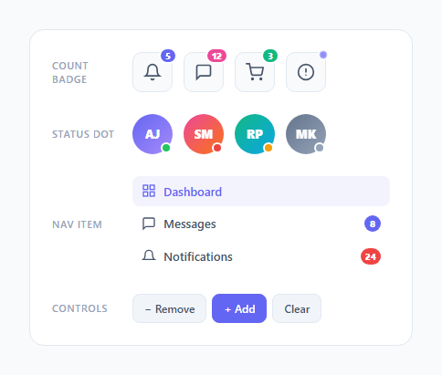
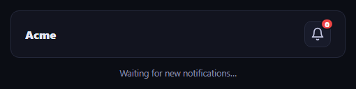
Notification badges are one of the most ubiquitous UI patterns — the red number on an app icon, the green dot on a user avatar, the unread count in a sidebar nav. This snippet provides all four badge variants in one component: count badges on icon buttons, a pulsing dot badge for live alerts, status indicator dots on user avatars, and unread count badges inside navigation items.
The count badge positioning
Badges use position: absolute on a relatively positioned .badge-wrap container. The count badge sits at top: -5px, right: -5px — overlapping the icon button corner. The border: 2px solid #fff creates a white gap between the badge and the underlying element, making the badge appear to float above the button even when backgrounds differ. This border-white separation trick is the standard count badge pattern used across all major platforms.
The 99+ overflow
When count exceeds 99, badge.textContent is set to '99+'. The min-width: 18px on the badge ensures it never collapses, and padding: 0 5px gives the '99+' text room. The border-radius: 999px (pill) adapts to any text length. This overflow pattern is used by iOS, Android, and all major social platforms.
The pulsing dot badge
The .dot.pulse class applies a CSS @keyframes animation that scales the dot from 1 to 1.3 and back with opacity oscillation. This creates a "heartbeat" effect that communicates live activity — new data arriving, a user typing, or a system alert. The pulse communicates urgency without a number.
Status indicator dots
Four colours communicate four presence states: green (online), red (busy/do not disturb), amber (away), grey (offline). Each uses position: absolute at bottom: 1px, right: 1px on the avatar — placed at the bottom-right corner, the universally recognised position for status dots in chat and collaboration apps.
The scale-pop animation on update
When the count changes, a brief transform: scale(1.3) is applied, then reset. The 150ms setTimeout removes the scale. This gives users clear visual feedback that the count has changed — a pattern used in WhatsApp and iOS notification counts.',
Animating the badge in when count goes from zero to one
When count changes from 0 to 1 (badge becomes visible), add an entrance animation: badge.style.animation = "none"; badge.offsetHeight; badge.style.animation = "badgeIn 0.3s cubic-bezier(0.34,1.56,0.64,1)"; and define @keyframes badgeIn { from { transform: scale(0); } to { transform: scale(1); } }. The offsetHeight forces a reflow between clearing and resetting the animation, ensuring it triggers correctly.
Build with AI
Build, Understand, Optimize, and Extend It With AI
Rather than eyeballing the badge positioning offsets, paste this snippet's HTML, CSS, and JS into an AI coding assistant like Claude and ask it to explain exactly why the count badge's white border is what makes it read as floating above the icon button regardless of the button's own background color, and how the update() function's scale-pop animation avoids fighting with the badge's own hide/show display toggle. The same assistant can help optimize it, for instance asking whether reusing one update() function across the count badge, the nav-item badges, and the status dots would reduce duplication, or whether the badgePulse keyframe's infinite animation should pause when the tab is backgrounded to save battery. It's also useful for extending the component: ask it to add the badge-entrance scale animation described in the FAQ for when a count goes from zero to one, wire the status dots to real presence data from a WebSocket, or add a maximum-badges-visible rule so a page with many icon buttons doesn't feel noisy. Treat the code less like a finished artifact and more like a starting point for a conversation.
Prompt to recreate it
Copy this into your AI assistant of choice to build the effect from scratch, or as a jumping-off point for your own variant:
Build a set of "notification badge" variants in plain HTML, CSS, and JavaScript — count badges, a pulsing alert dot, avatar status dots, and nav-item unread counts — no icon or badge library.

Requirements:
- A reusable wrapper pattern: any icon button or avatar sits inside a relatively positioned container, and a badge element is absolutely positioned inside it, so the same wrapper pattern works for every badge type.
- A numeric count badge pinned to the top-right corner of an icon button, pill-shaped (fully rounded regardless of digit count), with a solid two-pixel border in the surrounding page/card background color so it reads as separated from the button underneath rather than blended into it; when the count exceeds 99, display "99+" instead of the raw number, and when the count is exactly zero, hide the badge entirely rather than showing a "0".
- A small pulsing dot badge (no number) that continuously scales up and fades slightly using a CSS keyframe animation, to signal live/ongoing activity without a specific count.
- Avatar status dots pinned to the bottom-right corner of circular avatars, using distinct solid colors for online, busy, away, and offline states, again separated from the avatar by a border matching the background.
- An unread-count badge inside a horizontal navigation item that is pushed to the far right edge of the row (not absolutely positioned relative to an icon), with a visually distinct "urgent" color variant for high-priority counts.
- JavaScript controls (increment, decrement, clear) that update the count badge's displayed number, hide it at zero, and play a brief scale-up-then-reset "pop" animation on every change so the update is visually noticeable.
Want to tighten it up first? Run this prompt through the AI Prompt Studio to score it across 8 quality dimensions, catch anti-patterns, and tune the wording for Claude, ChatGPT, or Gemini before you paste it in.
Source Code
<div class="page">

  <!-- Icon button with count badge -->
  <div class="demo-row">
    <span class="demo-label">Count badge</span>
    <div class="demo-group">
      <div class="badge-wrap">
        <button class="icon-btn" aria-label="Notifications">
          <svg width="20" height="20" viewBox="0 0 24 24" fill="none" stroke="currentColor" stroke-width="2" stroke-linecap="round"><path d="M18 8A6 6 0 0 0 6 8c0 7-3 9-3 9h18s-3-2-3-9"/><path d="M13.73 21a2 2 0 0 1-3.46 0"/></svg>
        </button>
        <span class="badge count" id="notif-count">5</span>
      </div>

      <div class="badge-wrap">
        <button class="icon-btn" aria-label="Messages">
          <svg width="20" height="20" viewBox="0 0 24 24" fill="none" stroke="currentColor" stroke-width="2" stroke-linecap="round"><path d="M21 15a2 2 0 0 1-2 2H7l-4 4V5a2 2 0 0 1 2-2h14a2 2 0 0 1 2 2z"/></svg>
        </button>
        <span class="badge count" style="background:#ec4899">12</span>
      </div>

      <div class="badge-wrap">
        <button class="icon-btn" aria-label="Cart">
          <svg width="20" height="20" viewBox="0 0 24 24" fill="none" stroke="currentColor" stroke-width="2" stroke-linecap="round"><circle cx="9" cy="21" r="1"/><circle cx="20" cy="21" r="1"/><path d="M1 1h4l2.68 13.39a2 2 0 0 0 2 1.61h9.72a2 2 0 0 0 2-1.61L23 6H6"/></svg>
        </button>
        <span class="badge count" style="background:#10b981">3</span>
      </div>

      <div class="badge-wrap">
        <button class="icon-btn" aria-label="Alerts">
          <svg width="20" height="20" viewBox="0 0 24 24" fill="none" stroke="currentColor" stroke-width="2" stroke-linecap="round"><circle cx="12" cy="12" r="10"/><line x1="12" y1="8" x2="12" y2="12"/><line x1="12" y1="16" x2="12.01" y2="16"/></svg>
        </button>
        <span class="badge dot pulse"></span>
      </div>
    </div>
  </div>

  <!-- Avatar with online status -->
  <div class="demo-row">
    <span class="demo-label">Status dot</span>
    <div class="demo-group">
      <div class="badge-wrap">
        <div class="avatar-btn" style="background:linear-gradient(135deg,#6366f1,#a78bfa)">AJ</div>
        <span class="badge status online"></span>
      </div>
      <div class="badge-wrap">
        <div class="avatar-btn" style="background:linear-gradient(135deg,#ec4899,#f97316)">SM</div>
        <span class="badge status busy"></span>
      </div>
      <div class="badge-wrap">
        <div class="avatar-btn" style="background:linear-gradient(135deg,#10b981,#0ea5e9)">RP</div>
        <span class="badge status away"></span>
      </div>
      <div class="badge-wrap">
        <div class="avatar-btn" style="background:linear-gradient(135deg,#64748b,#94a3b8)">MK</div>
        <span class="badge status offline"></span>
      </div>
    </div>
  </div>

  <!-- Nav item with badge -->
  <div class="demo-row">
    <span class="demo-label">Nav item</span>
    <div class="nav-list">
      <a href="#" class="nav-item active">
        <svg width="16" height="16" viewBox="0 0 24 24" fill="none" stroke="currentColor" stroke-width="2" stroke-linecap="round"><rect x="3" y="3" width="7" height="7"/><rect x="14" y="3" width="7" height="7"/><rect x="3" y="14" width="7" height="7"/><rect x="14" y="14" width="7" height="7"/></svg>
        Dashboard
      </a>
      <a href="#" class="nav-item">
        <svg width="16" height="16" viewBox="0 0 24 24" fill="none" stroke="currentColor" stroke-width="2" stroke-linecap="round"><path d="M21 15a2 2 0 0 1-2 2H7l-4 4V5a2 2 0 0 1 2-2h14a2 2 0 0 1 2 2z"/></svg>
        Messages
        <span class="nav-badge">8</span>
      </a>
      <a href="#" class="nav-item">
        <svg width="16" height="16" viewBox="0 0 24 24" fill="none" stroke="currentColor" stroke-width="2" stroke-linecap="round"><path d="M18 8A6 6 0 0 0 6 8c0 7-3 9-3 9h18s-3-2-3-9"/></svg>
        Notifications
        <span class="nav-badge red">24</span>
      </a>
    </div>
  </div>

  <!-- Live controls -->
  <div class="demo-row">
    <span class="demo-label">Controls</span>
    <div class="controls">
      <button class="ctrl" onclick="change(-1)">− Remove</button>
      <button class="ctrl accent" onclick="change(1)">+ Add</button>
      <button class="ctrl" onclick="clear()">Clear</button>
    </div>
  </div>

</div>
* { box-sizing: border-box; margin: 0; padding: 0; }
body { font-family: system-ui, sans-serif; background: #f8fafc; min-height: 100vh; display: flex; align-items: center; justify-content: center; padding: 32px 24px; }
.page { width: 100%; max-width: 420px; display: flex; flex-direction: column; gap: 24px; background: #fff; border-radius: 16px; padding: 24px; border: 1px solid #e2e8f0; }
.demo-row { display: flex; align-items: center; gap: 16px; }
.demo-label { font-size: 11px; font-weight: 600; text-transform: uppercase; letter-spacing: 0.6px; color: #94a3b8; width: 72px; flex-shrink: 0; }
.demo-group { display: flex; gap: 12px; align-items: center; }
/* Badge wrap */
.badge-wrap { position: relative; display: inline-flex; }
/* Icon buttons */
.icon-btn { width: 44px; height: 44px; border-radius: 10px; border: 1.5px solid #e2e8f0; background: #f8fafc; color: #475569; cursor: pointer; display: flex; align-items: center; justify-content: center; transition: all 0.12s; }
.icon-btn:hover { border-color: #6366f1; color: #6366f1; background: rgba(99,102,241,0.04); }
/* Avatar */
.avatar-btn { width: 44px; height: 44px; border-radius: 50%; color: #fff; font-size: 13px; font-weight: 800; display: flex; align-items: center; justify-content: center; }
/* Badges */
.badge { position: absolute; font-size: 10px; font-weight: 800; line-height: 1; }
/* Count badge */
.badge.count { min-width: 18px; height: 18px; padding: 0 5px; border-radius: 999px; background: #6366f1; color: #fff; top: -5px; right: -5px; display: flex; align-items: center; justify-content: center; border: 2px solid #fff; }
/* Dot badge */
.badge.dot { width: 10px; height: 10px; border-radius: 50%; background: #6366f1; top: -2px; right: -2px; border: 2px solid #fff; }
.badge.dot.pulse { animation: badgePulse 2s ease-in-out infinite; }
@keyframes badgePulse { 0%,100%{transform:scale(1);opacity:1} 50%{transform:scale(1.3);opacity:0.7} }
/* Status dots */
.badge.status { width: 12px; height: 12px; border-radius: 50%; bottom: 1px; right: 1px; border: 2px solid #fff; }
.badge.status.online { background: #22c55e; }
.badge.status.busy { background: #ef4444; }
.badge.status.away { background: #f59e0b; }
.badge.status.offline { background: #94a3b8; }
/* Nav list */
.nav-list { display: flex; flex-direction: column; gap: 2px; flex: 1; }
.nav-item { display: flex; align-items: center; gap: 8px; padding: 8px 10px; border-radius: 8px; font-size: 13px; font-weight: 500; color: #475569; text-decoration: none; transition: background 0.12s, color 0.12s; }
.nav-item:hover { background: #f8fafc; color: #0f172a; }
.nav-item.active { background: rgba(99,102,241,0.08); color: #6366f1; font-weight: 600; }
.nav-badge { margin-left: auto; min-width: 18px; height: 18px; padding: 0 5px; border-radius: 999px; background: #6366f1; color: #fff; font-size: 10px; font-weight: 800; display: flex; align-items: center; justify-content: center; }
.nav-badge.red { background: #ef4444; }
/* Controls */
.controls { display: flex; gap: 6px; }
.ctrl { background: #f1f5f9; border: 1px solid #e2e8f0; border-radius: 8px; padding: 7px 12px; font-size: 12px; font-weight: 600; color: #475569; cursor: pointer; transition: all 0.12s; font-family: inherit; }
.ctrl.accent { background: #6366f1; color: #fff; border-color: #6366f1; }
.ctrl:hover { border-color: #6366f1; color: #6366f1; }
.ctrl.accent:hover { background: #4f46e5; }let count = 5;
const badge = document.getElementById('notif-count');
function change(delta) {
count = Math.max(0, count + delta);
update();
}
function clear() {
count = 0;
update();
}
function update() {
if (count === 0) {
badge.style.display = 'none';
} else {
badge.style.display = '';
badge.textContent = count > 99 ? '99+' : count;
}
// Scale-pop animation
badge.style.transform = 'scale(1.3)';
setTimeout(() => { badge.style.transform = ''; }, 150);
badge.style.transition = 'transform 0.15s';
}Step by step
How to Use
- 1Click + Add and − Remove to change the notification countThe badge updates with a scale-pop animation. Click Clear to hide the badge entirely when count reaches zero. Count automatically shows "99+" when it exceeds 99.
- 2Apply count badges to any buttonWrap your button in a .badge-wrap div and add a <span class="badge count">N</span> inside it. The badge positions itself top-right via absolute positioning. Change the background colour via inline style or CSS.
- 3Use status dots on user avatarsWrap the avatar in .badge-wrap and add <span class="badge status online"> (or busy/away/offline). The dot positions at bottom-right. Change the state by swapping the class name.
- 4Add nav item badgesInside any nav link, add <span class="nav-badge">8</span> at the end. It pushes to the right via margin-left: auto. Add class="nav-badge red" for critical/alert counts.
- 5Hide badge when count is zeroThe update() function sets badge.style.display = "none" when count === 0. This is the correct pattern — do not show a "0" badge, hide it entirely. Restore display when count increases.
- 6Export in your formatClick "HTML" for a standalone file, "JSX" for a React component with count in useState, or "Tailwind" for a React + Tailwind CSS version.
Real-world uses
Common Use Cases
Got questions?
Frequently Asked Questions
The count badge has border: 2px solid #fff. This white ring appears between the badge and the button underneath. When the button has a white or light background, the white border blends with the background and makes the badge appear to float above the button. The effect also works on coloured backgrounds — the white border creates separation that makes the badge stand out regardless of what is underneath it. This is the standard technique used by iOS, Android, and virtually every web notification badge implementation.
Connect a WebSocket: const ws = new WebSocket("wss://your-server.com/notifications"); ws.onmessage = event => { const data = JSON.parse(event.data); if (data.type === "notification_count") { count = data.count; update(); } }. Call update() whenever the count changes. The scale-pop animation provides visual feedback each time a new notification arrives. For a smoother experience, update() could also show a brief toast: "New message from Alex".
In the update() function, when count goes from 0 to 1 (badge changes from display:none to visible), add an entrance animation: badge.style.animation = "none"; badge.offsetHeight; badge.style.animation = "badgeIn 0.3s cubic-bezier(0.34,1.56,0.64,1)"; with @keyframes badgeIn { from { transform: scale(0); } to { transform: scale(1); } }. The offsetHeight forces a reflow between clearing and re-setting the animation, triggering it correctly.
Click "JSX" to download. Manage count with useState(5). The badge renders conditionally: {count > 0 && <span className="badge count">{count > 99 ? "99+" : count}</span>}. For the scale-pop on change: use a useEffect that watches count and applies a CSS class for 150ms. For status dots, derive the status class from a user.status prop: className={"badge status " + user.status}.