Source Code
<div class="page">
  <div class="bell-wrap">
    <button class="bell-btn" id="bell" onclick="toggle()">
      <svg width="18" height="18" viewBox="0 0 24 24" fill="none" stroke="currentColor" stroke-width="2" stroke-linecap="round"><path d="M18 8A6 6 0 0 0 6 8c0 7-3 9-3 9h18s-3-2-3-9"/><path d="M13.73 21a2 2 0 0 1-3.46 0"/></svg>
      <span class="badge" id="badge">3</span>
    </button>

    <div class="notif-panel" id="panel">
      <div class="notif-head">
        <span class="notif-title">Notifications</span>
        <button class="mark-all" onclick="markAll()">Mark all read</button>
      </div>
      <div class="notif-list" id="notif-list">
        <div class="notif unread" data-id="1">
          <div class="notif-avatar" style="background:#6366f1">PS</div>
          <div class="notif-body">
            <div class="notif-text"><strong>Puneet</strong> commented on your post</div>
            <div class="notif-time">2 min ago</div>
          </div>
          <div class="notif-dot"></div>
        </div>
        <div class="notif unread" data-id="2">
          <div class="notif-avatar" style="background:#10b981">💰</div>
          <div class="notif-body">
            <div class="notif-text">Invoice <strong>#1042</strong> was paid — $2,400</div>
            <div class="notif-time">1 hour ago</div>
          </div>
          <div class="notif-dot"></div>
        </div>
        <div class="notif unread" data-id="3">
          <div class="notif-avatar" style="background:#f59e0b">⚠️</div>
          <div class="notif-body">
            <div class="notif-text">Storage at <strong>90%</strong> — upgrade your plan</div>
            <div class="notif-time">3 hours ago</div>
          </div>
          <div class="notif-dot"></div>
        </div>
        <div class="notif" data-id="4">
          <div class="notif-avatar" style="background:#8b5cf6">🚀</div>
          <div class="notif-body">
            <div class="notif-text">Deployment <strong>v2.4.1</strong> succeeded</div>
            <div class="notif-time">Yesterday</div>
          </div>
        </div>
      </div>
      <div class="notif-foot">
        <a href="#" class="view-all">View all notifications →</a>
      </div>
    </div>
  </div>
</div>
* { box-sizing: border-box; margin: 0; padding: 0; }
body { font-family: system-ui, sans-serif; background: #0f172a; display: flex; align-items: flex-start; justify-content: center; min-height: 100vh; padding: 40px 20px; }
.page { display: flex; justify-content: center; }
.bell-wrap { position: relative; }
.bell-btn {
position: relative; width: 40px; height: 40px; border-radius: 10px;
background: #1e293b; border: 1px solid #334155;
display: flex; align-items: center; justify-content: center;
cursor: pointer; color: #94a3b8; transition: border-color 0.15s, color 0.15s;
}
.bell-btn:hover { border-color: #6366f1; color: #f1f5f9; }
.badge {
position: absolute; top: -4px; right: -4px;
min-width: 16px; height: 16px;
background: #ef4444; color: #fff;
font-size: 9px; font-weight: 700;
border-radius: 20px; padding: 0 4px;
display: flex; align-items: center; justify-content: center;
border: 2px solid #0f172a;
transition: transform 0.2s;
}
.badge.hidden { display: none; }
.badge.bump { transform: scale(1.3); }
.notif-panel {
position: absolute; top: calc(100% + 8px); right: 0;
width: 320px;
background: #1e293b; border: 1px solid #334155;
border-radius: 14px; overflow: hidden;
box-shadow: 0 16px 48px rgba(0,0,0,0.4);
display: none; z-index: 100;
}
.notif-panel.open { display: flex; flex-direction: column; }
.notif-head { display: flex; align-items: center; justify-content: space-between; padding: 14px 16px 10px; border-bottom: 1px solid #334155; }
.notif-title { font-size: 13px; font-weight: 700; color: #f1f5f9; }
.mark-all { font-size: 11px; font-weight: 600; color: #6366f1; background: none; border: none; cursor: pointer; font-family: inherit; }
.mark-all:hover { color: #a78bfa; }
.notif-list { overflow-y: auto; max-height: 300px; }
.notif {
display: flex; align-items: flex-start; gap: 10px;
padding: 12px 16px; cursor: pointer; position: relative;
transition: background 0.1s;
}
.notif:hover { background: #334155; }
.notif.unread { background: rgba(99,102,241,0.06); }
.notif.unread:hover { background: rgba(99,102,241,0.12); }
.notif-avatar { width: 36px; height: 36px; border-radius: 50%; display: flex; align-items: center; justify-content: center; font-size: 12px; font-weight: 700; color: #fff; flex-shrink: 0; }
.notif-body { flex: 1; min-width: 0; }
.notif-text { font-size: 12.5px; color: #94a3b8; line-height: 1.5; }
.notif-text strong { color: #f1f5f9; }
.notif-time { font-size: 11px; color: #475569; margin-top: 3px; }
.notif-dot { width: 7px; height: 7px; border-radius: 50%; background: #6366f1; flex-shrink: 0; margin-top: 5px; }
.notif-foot { padding: 10px 16px; border-top: 1px solid #334155; }
.view-all { font-size: 12px; font-weight: 600; color: #6366f1; text-decoration: none; }
.view-all:hover { color: #a78bfa; }function toggle() {
const panel = document.getElementById('panel');
panel.classList.toggle('open');
}
function markAll() {
document.querySelectorAll('.notif.unread').forEach(n => {
n.classList.remove('unread');
n.querySelector('.notif-dot')?.remove();
});
const badge = document.getElementById('badge');
badge.classList.add('hidden');
}
document.addEventListener('click', e => {
if (!e.target.closest('.bell-wrap')) document.getElementById('panel').classList.remove('open');
});Learn Coding Visually
Learn to code with interactive, live-preview playgrounds — HTML, CSS, JavaScript, React & more.
 HTML Playground42 lessons · Click-based · Live preview
 CSS PlaygroundLearn CSS with a live editor
 JavaScript Playground60 lessons · DOM · Async · Canvas
 React PlaygroundLearn React with a live code editor
 GSAP PlaygroundLearn GSAP animation interactively
 SVG Playground44 lessons · shapes · paths · animation
 SCSS Playground45 lessons · Sass modules · tokens
 Tailwind PlaygroundLearn Tailwind CSS with a live editor
 Bootstrap 5 Playground50 lessons · live preview
Notification Bell — Free HTML CSS JS Dropdown Snippet
Notification Bell · Dashboards · Plain HTML, CSS & JS · Live preview
What's included
Features
About this UI Snippet
Notification Bell — Unread Badge, Toggle Dropdown & Mark All Read
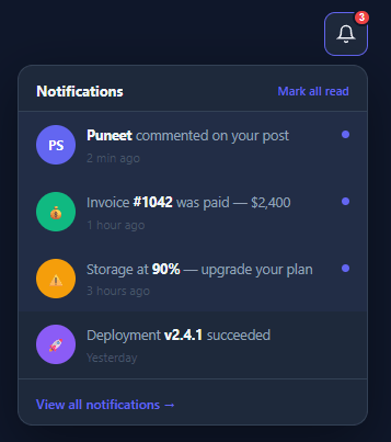
A notification bell in the app header gives users a quick glance at pending alerts without navigating away from their current view — the full list typically lives in a notification center. The red unread badge communicates urgency; the dropdown reveals the notification list; Mark all read clears the badge. This is a complete, production-quality implementation with click-outside close.
The unread badge
The bell button has an absolutely positioned .badge div showing the unread count. It starts with a display: none state that can be shown conditionally. When there are unread notifications, the badge appears with a red background and white count number.
The dropdown toggle
toggle() calls panel.classList.toggle('open'). The .panel.open CSS rule transitions opacity from 0 to 1 and transform from translateY(-8px) to translateY(0). pointer-events: none when closed prevents the invisible panel from intercepting clicks. The dropdown has a fixed width and max-height with overflow-y: auto for long notification lists.
Unread notification styling
Notifications with .unread class have a blue .notif-dot indicator and a slightly tinted background. The .unread class drives all visual differences — removing it marks the notification as read.
Mark all read
markAll() queries all .notif.unread elements, removes the .unread class, removes the .notif-dot element, then hides the badge if the unread count reaches zero. This is the minimum viable implementation — in production, it would also fire an API call.
Click-outside close
A document.addEventListener('click', e => { if (!e.target.closest('.bell-wrap')) panel.classList.remove('open'); }) closes the panel when the user clicks outside. This is the same closest() pattern used in the Dropdown Menu snippet.
The badge counter
The unread badge uses position: absolute; top: -4px; right: -4px to sit above the bell icon. It shows a count number and uses min-width: 16px so it looks correct for single and double digit counts. When count exceeds 9, display "9+" instead of the full number. The badge disappears (display: none) when count reaches 0.
The dropdown open/close
Clicking the bell toggles .open on the dropdown panel, which uses scale(0.95) + opacity: 0 in the closed state and scale(1) + opacity: 1 in the open state. This CSS transition matches the popover pattern. The dropdown is positioned using position: absolute; right: 0; top: calc(100% + 8px). Click-outside detection uses document.addEventListener('click', e => { if (!e.target.closest('.bell-wrap')) close(); }).
Mark as read interaction
Each notification item has a "Mark read" button. Clicking it removes the .unread class from the notification and decrements the badge count. The mark-all-read button iterates all .unread items and marks them simultaneously. Both patterns update the badge count immediately — optimistic UI that syncs to the backend separately.
Build with AI
Build, Understand, Optimize, and Extend It With AI
Instead of tracing the dropdown's dismissal logic by hand, paste this snippet's HTML, CSS, and JS into an AI coding assistant like Claude and ask it to explain exactly how the document-level click listener's e.target.closest('.bell-wrap') check avoids immediately closing the panel on the same click that opened it, and why markAll() has to both remove the unread class and delete the notif-dot element rather than just one or the other. The same assistant can help optimize it, for instance asking whether toggling classList on every notif row during markAll() would still be fast with a very long notification list, or whether the panel's open/close transition should account for prefers-reduced-motion. It's also useful for extending the bell: ask it to add per-notification "mark as read" on click (not just mark-all), prepend newly arriving notifications from a WebSocket with their own entrance animation, or group notifications by day with sticky section headers. Treat the code less like a finished artifact and more like a starting point for a conversation.
Prompt to recreate it
Copy this into your AI assistant of choice to build the effect from scratch, or as a jumping-off point for your own variant:
Build a "notification bell" dropdown in plain HTML, CSS, and JavaScript with an unread badge and click-outside dismissal — no dropdown library.

Requirements:
- A bell icon button with an absolutely positioned unread-count badge in its top-right corner, bordered to separate it from the button's background; the badge must be capable of being hidden entirely (not just showing "0").
- Clicking the bell toggles a dropdown panel open and closed using a single class toggle (not separate open/close functions), positioned below and right-aligned to the bell, that transitions in with an opacity and vertical-offset animation and must not intercept clicks while closed (its closed state must not be clickable even though the closed DOM technically still exists).
- A scrollable list of notification rows inside the panel, each with an avatar, message text, and a relative timestamp; unread rows must be visually distinguished from read ones (a tinted background plus a small colored dot) purely through one class name difference.
- A "Mark all read" action that removes the unread distinction (both the tint and the dot) from every currently-unread row in one action, and hides the bell's badge once no unread rows remain.
- The panel must close automatically when the user clicks anywhere outside the bell-and-panel wrapper, implemented with a single document-level click listener using closest() to detect clicks inside versus outside the component — this must not require a listener on every notification row.
- A footer link inside the panel for viewing the full notification history, visually separated from the list by a border.
Want to tighten it up first? Run this prompt through the AI Prompt Studio to score it across 8 quality dimensions, catch anti-patterns, and tune the wording for Claude, ChatGPT, or Gemini before you paste it in.
Step by step
How to Use
- 1Click the bell iconClick the bell icon in the preview to open the notification panel. Click it again or click outside to close.
- 2Click "Mark all read"Click the Mark all read link to remove the unread styling from all notifications and hide the red badge.
- 3Update notification contentIn the HTML panel, update the .notif elements with real notification text, timestamps, and icons.
- 4Add new notificationsCopy a .notif div and paste it inside the notifications list. Add .unread to mark it as new. Update the badge count.
- 5Fire an API on mark-all-readIn the JS panel, add a fetch() call inside markAll() after the DOM changes to sync the read state with your backend.
- 6Export in your formatClick "HTML" for a standalone file, "JSX" for a React component, or "Tailwind" for a React + Tailwind version.
Real-world uses
Common Use Cases
Got questions?
Frequently Asked Questions
toggle() calls panel.classList.toggle("open"). The CSS .panel.open rule transitions opacity from 0 to 1 and transform from translateY(-8px) to translateY(0) over 0.2s. pointer-events: none when closed prevents invisible click interception.
markAll() queries all .notif.unread elements. For each: it removes .unread, finds and removes the .notif-dot element inside it. After the loop, it checks if any .unread remain — if none, it hides the badge element.
A document click listener checks !e.target.closest(".bell-wrap"). If the click was outside the bell wrapper (no ancestor with that class), panel.classList.remove("open") closes the panel. This is the same pattern as the Dropdown Menu snippet.
Fetch notifications from your API and update the badge textContent with the unread count. Add .unread class to unread notification elements. Show or hide the badge based on count > 0.
Listen to a WebSocket or Server-Sent Events stream. On new notification, create a .notif div with .unread, prepend it to the notification list, increment the badge count, and show the badge if hidden.
Yes. Click "JSX" for a React component. Manage open state with useState, notifications as an array with useState, and the unread count derived from filter. Use useEffect to add and clean up the document click listener.