Learn Coding Visually
Learn to code with interactive, live-preview playgrounds — HTML, CSS, JavaScript, React & more.
 HTML Playground42 lessons · Click-based · Live preview
 CSS PlaygroundLearn CSS with a live editor
 JavaScript Playground60 lessons · DOM · Async · Canvas
 React PlaygroundLearn React with a live code editor
 GSAP PlaygroundLearn GSAP animation interactively
 SVG Playground44 lessons · shapes · paths · animation
 SCSS Playground45 lessons · Sass modules · tokens
 Tailwind PlaygroundLearn Tailwind CSS with a live editor
 Bootstrap 5 Playground50 lessons · live preview
Notification Center — Free HTML CSS JS Snippet
Notification Center · Navigation · Plain HTML, CSS & JS · Live preview
What's included
Features
About this UI Snippet
Notification Center — HTML CSS JavaScript
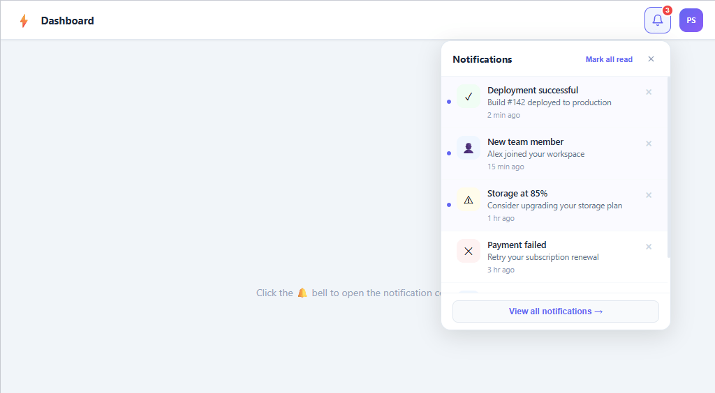
Accessible notification center with animated panel, badge counter, mark-as-read, dismiss, and empty state. Pure HTML/CSS/JS, no dependencies.
A notification center is one of the most common UI patterns in modern web apps — every SaaS product, admin dashboard, and collaboration tool relies on it to surface system events without interrupting the primary workflow. This snippet builds a fully functional, accessible notification panel using pure HTML, CSS, and vanilla JavaScript with zero dependencies.
Panel animation without display toggling
The notification panel is an absolutely-positioned element anchored top: calc(100% + 10px); right: 0 on the bell wrapper. Instead of toggling display: none — which removes the element from the render tree and prevents CSS transitions from firing — the panel uses opacity: 0 and transform: translateY(-8px) scale(0.97) combined with pointer-events: none in the closed state. Adding the .open class resets both properties and re-enables pointer events. The 18ms transition creates the slide-and-scale entrance that characterises polished notification UIs. This is the canonical pattern for animating overlays in production code.
Badge counter mechanics
The red badge sits position: absolute; top: -5px; right: -5px on the bell button with a border: 2px solid #fff halo to separate it visually from the button. The count is derived by filtering the notifications array for unread: true entries on every render call and hidden with display: none when the count reaches zero. A CSS @keyframes bump animation briefly scales the badge to 1.35× when the count changes, giving tactile feedback that a new event arrived.
Notification data model
Each notification object carries id, type (success/warning/info/error), icon, title, desc, time, and unread fields. The renderList() function maps over the live array and generates list items with a conditional unread class. Unread items get an absolutely-positioned indigo dot — rendered via a .notif-dot span whose opacity is set to zero on read items rather than being removed, to avoid layout reflow during the transition. The four type variants drive tinted icon backgrounds through .notif-icon--success, .notif-icon--warning, etc.
Read and dismiss event delegation
A single click listener on the <ul> handles both dismissal and mark-as-read via event delegation — e.target.closest('.notif-dismiss') intercepts dismiss clicks, and e.target.closest('.notif-item') handles row clicks. This avoids attaching one listener per notification, which matters when the list can grow to dozens of items. e.stopPropagation() on the dismiss handler prevents the event from bubbling to the row handler, which would otherwise attempt a mark-as-read on an item that is about to be removed.
Click-outside close pattern
A document-level click listener closes the panel when focus leaves the bell wrapper. The check is !document.getElementById('bell-wrap').contains(e.target) — clicks anywhere inside the wrapper (panel, bell button, or dismiss buttons) are excluded. The bell button itself calls e.stopPropagation() so the document listener does not immediately close a panel that was just opened.
Customisation path
Replace the static NOTIFICATIONS array with a WebSocket or fetch-based push to get live notifications. Persist read state between page loads with localStorage.setItem('notifs', JSON.stringify(notifications)) after every mutation and read it back on init. Add a group field and render date-separator <li> elements in renderList() to group today vs. yesterday vs. older events.
Build with AI
Build, Understand, Optimize, and Extend It With AI
Instead of tracing the event-delegation logic by hand, paste this snippet's HTML, CSS, and JS into an AI coding assistant like Claude and ask it to explain exactly why the panel animates with opacity, transform, and pointer-events instead of toggling display, and how the single click listener on the notif-list uses closest() to distinguish a dismiss-button click from a row click without attaching a handler to every item. The same assistant can help optimize it, for instance asking whether re-running innerHTML on the entire list after every dismiss or mark-as-read is wasteful compared to removing just the affected list item node, or whether the notifications array needs a cap to avoid an unbounded list. It's also useful for extending the center: ask it to persist read/dismissed state to localStorage as the FAQ suggests, group notifications by day with sticky headers, or wire real-time push notifications in over a WebSocket with their own entrance animation. Treat the code less like a finished artifact and more like a starting point for a conversation.
Prompt to recreate it
Copy this into your AI assistant of choice to build the effect from scratch, or as a jumping-off point for your own variant:
Build a "notification center" dropdown panel in plain HTML, CSS, and JavaScript with a badge counter, mark-as-read, and dismiss — no framework, no notification library.

Requirements:
- A bell button in a top bar with an absolutely positioned unread-count badge; the badge must derive its number by filtering a notifications array for unread items on every render and hide itself entirely when that count is zero, plus play a brief scale "bump" animation whenever the count changes.
- Clicking the bell toggles a dropdown panel anchored below it; the panel must animate open and closed using opacity and transform (never display: none), and must have pointer-events disabled while closed so an invisible panel can't intercept clicks.
- Each notification row shows a type-tinted icon (at least four types: success, warning, info, error, each with a distinct background tint), a title, description, relative timestamp, an unread indicator dot, and a small dismiss (x) button.
- Implement dismiss and mark-as-read entirely through one delegated click listener on the list container, distinguishing which sub-element was clicked with closest() rather than attaching a listener to every row or every dismiss button.
- Clicking a row (not the dismiss button) must mark it read, removing its unread styling and dot and decrementing the badge; clicking a row's dismiss button must remove that notification permanently from the array and re-render, without also triggering the mark-as-read behavior on the same click.
- A "Mark all read" header action must clear the unread state from every notification at once. Clicking anywhere outside the bell/panel wrapper must close the panel, and the list must show a distinct friendly empty state when there are zero notifications left.
Want to tighten it up first? Run this prompt through the AI Prompt Studio to score it across 8 quality dimensions, catch anti-patterns, and tune the wording for Claude, ChatGPT, or Gemini before you paste it in.
Step by step
How to Use
- 1Click the bell iconThe notification panel slides down from the button with a scale-and-fade animation. The red badge shows the unread count.
- 2Click a notification rowThe unread dot disappears and the background lightens from the tinted unread state to white. The badge counter decrements instantly.
- 3Dismiss a notificationClick the × button on any row to remove it from the list entirely. The panel height adjusts and the badge updates.
- 4Mark all as readClick "Mark all read" in the panel header to clear all unread indicators at once and reset the badge to zero.
- 5Close the panelClick the × in the header, click the bell button again, or click anywhere outside the panel — all three paths call the same closePanel() function.
- 6Connect real dataEdit the NOTIFICATIONS array at the top of the JS, or replace it with a fetch/WebSocket call. Each object needs id, type, icon, title, desc, time, and unread fields.
Real-world uses
Common Use Cases
Got questions?
Frequently Asked Questions
Replace the static NOTIFICATIONS array with a WebSocket message handler or a polling fetch. On each new event, push an object into the array, call renderList() and updateBadge(). To animate the badge bump, add the "bump" class then remove it after 300ms with setTimeout.
After every mutation call localStorage.setItem("notifs", JSON.stringify(notifications)). On init, read it back: const stored = JSON.parse(localStorage.getItem("notifs") || "null"); and fall back to the default array if null.
Add a date field to each object (e.g. "Today", "Yesterday"). In renderList(), use reduce() to bucket items by date into a Map, then render a <li class="date-separator"> header before each group.
display:none removes the element from the render tree before the transition can sample the start state. opacity and pointer-events:none keep the element in layout so the CSS transition engine can interpolate between open and closed states.
After pushing a new notification to the array, call new Audio("/notification.mp3").play() for sound or navigator.vibrate(200) for mobile haptics. Both are one-liners that slot in after the renderList() call.
Yes. Use the React, Vue, Angular, or Tailwind export buttons above the preview to download a ready-made component. In React, hold the notifications in useState and map them to JSX instead of building innerHTML strings; in Vue use a reactive ref array with v-for; in Angular use a component property with *ngFor. The slide-down panel animation, the unread badge counter, the mark-as-read toggle, and the click-outside-to-close logic all translate directly — only the rendering layer changes between frameworks. The Tailwind export rewrites every CSS rule as utility classes so you can drop the panel straight into a Tailwind project without a separate stylesheet.