You Might Also Like
Learn Coding Visually
Learn to code with interactive, live-preview playgrounds — HTML, CSS, JavaScript, React & more.
 HTML Playground42 lessons · Click-based · Live preview
 CSS PlaygroundLearn CSS with a live editor
 JavaScript Playground60 lessons · DOM · Async · Canvas
 React PlaygroundLearn React with a live code editor
 GSAP PlaygroundLearn GSAP animation interactively
 SVG Playground44 lessons · shapes · paths · animation
 SCSS Playground45 lessons · Sass modules · tokens
 Tailwind PlaygroundLearn Tailwind CSS with a live editor
 Bootstrap 5 Playground50 lessons · live preview
Control Center Panel — Free HTML CSS JS Snippet
Control Center Panel · Mobile · Plain HTML, CSS & JS · Live preview
What's included
Features
About this UI Snippet
Control Center Panel — iOS-Style Toggle Tiles & Custom Vertical Sliders in Vanilla JS
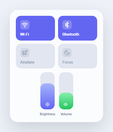
iOS Control Center is one of the most recognizable pieces of mobile UI in existence: a frosted-glass card of square toggle tiles for Wi-Fi, Bluetooth, Airplane Mode and Focus, sitting alongside vertical sliders for brightness and volume that fill from the bottom as you drag. None of that is achievable with native HTML form controls — a checkbox does not bounce or recolor on toggle, and <input type="range"> is permanently horizontal with no supported way to rotate it into a bottom-up vertical fill bar without breaking its hit-testing and accessibility semantics. This snippet rebuilds the whole panel from primitive <button> elements and raw Pointer Events, giving full control over the visual state machine and letting the entrance, toggle, and drag interactions all be tuned independently.
Toggle tiles: a data attribute as the single source of truth
Each tile is a plain <button> with a data-on="true" or data-on="false" attribute — that attribute is the entire state model, and CSS attribute selectors (.tile[data-on="true"]) handle all the visual differences: background color, icon color, and icon-well opacity. Clicking a tile simply flips the attribute string and lets CSS transitions animate the background-color and color changes over 220ms. Airplane Mode and Focus get their own override colors (orange and indigo) when active, matching how iOS visually distinguishes different toggle categories rather than using one blanket "on" color for everything.
The bounce: retriggering a CSS animation from JavaScript
A naive classList.add('bounce') on a class that is already present does nothing, because the browser has no new animation to start. The fix used here is the classic reflow trick: classList.remove('bounce'), then read tile.offsetWidth (a layout property, forcing the browser to flush pending style changes synchronously), then classList.add('bounce') again. That forced read is what makes the browser treat the second add as a genuinely new animation start rather than a no-op, so every single click gets its own fresh scale-down-then-spring-back bounce, even multiple rapid clicks in a row.
The vertical slider: translating pointer Y into a 0-100% fill
This is the part a native <input type="range"> fundamentally cannot do cleanly. setupVerticalSlider() attaches pointerdown/pointermove/pointerup listeners to a track div, and on every relevant pointer event calls valueFromClientY(clientY), which does three things: reads the track's getBoundingClientRect() to get its position and height, subtracts the rect's top from the pointer's clientY to get a relative offset inside the track, and then computes 1 - (relY / rect.height) — the *inversion* is the key detail, since a lower relative Y (near the top of the track) should mean a higher value, and a relative Y near the track's bottom should mean a value near zero, the opposite of how Y coordinates normally increase downward. The result is multiplied by 100 and rounded to a clean percentage, then clamped between 0 and 100 in applyValue() before being written directly to the fill element's height style, so the colored bar visually grows from the bottom exactly where the pointer is.
Why Pointer Events and setPointerCapture, not mousedown/touchstart
Using the unified Pointer Events API means one set of listeners handles mouse, touch, and stylus input identically — no separate touch handler branch is needed. track.setPointerCapture(e.pointerId) on pointerdown is what keeps pointermove firing on the track element even if the user's finger or cursor drifts outside the narrow 46px-wide track mid-drag; without it, a fast or imprecise drag would stop updating the slider the instant the pointer left the element's bounding box, which feels broken on a control this narrow.
Entrance animation: double rAF to guarantee the transition fires
The panel starts at opacity: 0; transform: scale(0.82) in its base CSS, and the .mounted class (which triggers the spring keyframe animation) is added inside a nested pair of requestAnimationFrame calls rather than immediately on script load. A single rAF is sometimes not enough — the browser can still batch the class addition into the same style-calculation pass as the initial render, skipping the "from" state entirely and causing the animation to appear to snap instead of transition. Nesting two rAF calls guarantees the initial styles have been painted at least once before the animation-triggering class is applied, which is a reliable, dependency-free way to force an entrance animation to actually run from its starting state.
Build with AI
Build, Understand, Optimize, and Extend It With AI
Give this snippet's code to an AI assistant like Claude and ask it to walk through why valueFromClientY() inverts the percentage calculation (1 minus the ratio, not just the ratio) — it's a small line that is easy to get backwards and worth understanding fully. Then try asking for a horizontal-lock so slider drags ignore horizontal pointer movement, a double-tap-to-mute gesture on the volume tile, or a version where toggling Airplane Mode also visually disables the Wi-Fi and Bluetooth tiles, the way real iOS behaves.
Prompt to recreate it
Copy this into your AI assistant of choice to build the effect from scratch, or as a jumping-off point for your own variant:
Build an iOS-style Control Center panel in plain HTML, CSS, and JavaScript — no frameworks, no native input type="range".

Requirements:
- A rounded, frosted-glass-styled card containing a 2x2 grid of toggle tiles for Wi-Fi, Bluetooth, Airplane Mode, and Focus/Do Not Disturb, each with a distinct SVG icon.
- Each tile's on/off state should be tracked with a single data attribute (not multiple classes), and clicking a tile should flip that attribute and transition its background color and icon color smoothly, with a couple of the tiles (like Airplane Mode) using a different accent color than the default when active.
- Every tile click must also play a quick squash-and-spring bounce animation, and it must replay correctly even on rapid repeated clicks on the same tile (hint: you cannot just re-add a class that's already present — you need to force a reflow between removing and re-adding it).
- Build at least one custom vertical slider (brightness or volume) as a div-based track with a fill element that grows from the bottom, NOT using input type="range", implemented with Pointer Events (pointerdown/pointermove/pointerup) and setPointerCapture so dragging keeps working even if the pointer strays outside the narrow track.
- The vertical slider's core math must convert a pointer's clientY position into a 0-100% value using the track's bounding rect, correctly inverting the axis so higher on the track means a higher percentage.
- Give the whole panel a spring-like scale-and-fade entrance animation when it first mounts, using a technique that reliably triggers the CSS transition from its starting state rather than snapping instantly (a double requestAnimationFrame is one valid approach).
Want to tighten it up first? Run this prompt through the AI Prompt Studio to score it across 8 quality dimensions, catch anti-patterns, and tune the wording for Claude, ChatGPT, or Gemini before you paste it in.
Step by step
How to Use
- 1Watch the panel spring open on loadThe whole card scales up from slightly smaller than full size with a gentle overshoot and fades in, mimicking the swipe-down reveal of the real iOS Control Center.
- 2Click the Wi-Fi or Bluetooth tile to toggle it offThe tile background fades from solid indigo back to a dim neutral gray, the icon dims to match, and the tile plays a quick squash-and-spring bounce on every click.
- 3Click Airplane Mode or Focus to turn them onAirplane Mode turns orange and Focus turns deep indigo when active, each with the same bounce feedback, showing how different toggle categories get distinct active colors.
- 4Press and drag inside the Brightness sliderThe blue fill bar grows or shrinks from the bottom of the track, following your pointer position continuously as you drag up or down — not jumping in fixed steps.
- 5Click anywhere in the Volume track to jump directly to that levelA single click (without dragging) instantly sets the fill height to match the vertical position you clicked, exactly like adjusting brightness in Control Center with a tap.
- 6Drag past the top or bottom edge of a sliderThe fill value clamps cleanly at 0% or 100% instead of erroring or overshooting visually, even if your pointer moves outside the track while dragging thanks to pointer capture.
Real-world uses
Common Use Cases
Got questions?
Frequently Asked Questions
Rotating a native range input with CSS transform: rotate(-90deg) is a common workaround, but it breaks the input's hit-testing box (clicks land in the wrong place relative to what is visually shown), makes styling the fill-from-bottom track nearly impossible across browsers, and creates accessibility inconsistencies between screen readers reading the rotated versus visual orientation. Building the slider from a plain div and Pointer Events, as this snippet does, gives full control over the fill direction, hit area, and visual styling at the cost of manually implementing keyboard accessibility if you need it.
setupVerticalSlider() returns an object with get() and set(value) methods. The two slider instances are stored in the brightness and volume variables, so call brightness.get() to read the current 0-100 value at any time, or brightness.set(30) to programmatically move the slider (for example, syncing it to a real system brightness API).
Duplicate one .v-slider block in the HTML with new track/fill element IDs, add a matching CSS gradient rule if you want a distinct color, and call setupVerticalSlider("track-yourid", "fill-yourid", initialValue) in the script — the function is fully reusable and does not assume there are only two sliders on the page.
Yes. Model each tile's on/off state and each slider's value as component state (React useState, Vue ref, Angular component properties) rather than reading data-on attributes directly, and drive the pointer listeners from useEffect / onMounted / ngAfterViewInit, attaching them to a ref instead of getElementById. Remove the pointerdown/pointermove/pointerup listeners in the effect cleanup (React's returned cleanup function, onUnmounted, or ngOnDestroy) to avoid leaking listeners if the panel is conditionally unmounted while a drag is in progress.
A single rAF call can still land in the same style-calculation batch as the element's very first paint, so the browser never registers a distinct "before" state and the animation appears to snap instantly to its end state instead of transitioning. Nesting a second rAF inside the first guarantees at least one full frame has been painted with the initial (pre-animation) styles before the class that triggers the keyframe animation is applied, which reliably forces the transition to run from its starting values every time.