You Might Also Like
Learn Coding Visually
Learn to code with interactive, live-preview playgrounds — HTML, CSS, JavaScript, React & more.
 HTML Playground42 lessons · Click-based · Live preview
 CSS PlaygroundLearn CSS with a live editor
 JavaScript Playground60 lessons · DOM · Async · Canvas
 React PlaygroundLearn React with a live code editor
 GSAP PlaygroundLearn GSAP animation interactively
 SVG Playground44 lessons · shapes · paths · animation
 SCSS Playground45 lessons · Sass modules · tokens
 Tailwind PlaygroundLearn Tailwind CSS with a live editor
 Bootstrap 5 Playground50 lessons · live preview
Swipe Tab Switcher — Free HTML CSS JS Snippet
Swipe Tab Switcher · Mobile · Plain HTML, CSS & JS · Live preview
What's included
Features
About this UI Snippet
Swipe Tab Switcher — Click-and-Swipe Tabs With a Shared Index + Drag-Offset State Model, in Vanilla JS
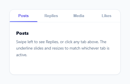
Instagram profile tabs and Twitter's timeline both let you either tap a tab label or swipe the content area itself to move between sections, and both keep the underline indicator perfectly synced no matter which method you use. That sync is the actual hard part. Most naive implementations end up with two separate systems — one that moves panels when you click a tab, another that moves panels when you drag — that each independently try to own "where are we now," and inevitably drift apart the moment a user starts one interaction and finishes with the other. This snippet is built around a deliberately different architecture: one shared piece of state, read and written by both the click handler and the drag handler, so there is structurally nothing for them to disagree about.
The two numbers that describe the entire UI: currentIndex and dragOffsetPx
The whole component's position is fully described by exactly two variables. currentIndex is which panel is currently "settled" — the panel that renders when no drag is in progress. dragOffsetPx is how far the track is currently displaced, in pixels, away from currentIndex's resting position because of an active drag; it is always 0 when nothing is being dragged. Every rendering function — applyTransform() for the panel track, moveIndicator() for the underline — computes its output purely from these two numbers. A tab click doesn't "do something different" from a drag release; it just calls the exact same goToIndex() function that a completed drag calls, which sets currentIndex and resets dragOffsetPx to 0. There is only one code path that ever changes which panel is showing.
The indicator: measuring real layout instead of assuming equal-width tabs
moveIndicator() does not divide the tab bar into four equal fractions and assume each tab is the same width — it reads activeTab.offsetLeft and activeTab.offsetWidth directly from the DOM and animates the indicator's transform: translateX() and width to match exactly. This means the underline works correctly even with tab labels of very different lengths ("Posts" vs. "Notifications"), because it is driven by the real rendered geometry of the button it needs to sit under, not a guessed percentage. The CSS transition on transform and width (rather than animating left, which would trigger layout on every frame) keeps the slide on the compositor thread for smooth 60fps motion.
Live-interpolating the indicator during an active drag
The interesting part is what happens to the indicator *while* the user is mid-drag, before they have released. onPointerMove() computes a dragRatio between -1 and 1 representing how far through the transition to the neighboring panel the drag currently is, identifies which neighbor tab is being dragged toward, and then linearly interpolates both the indicator's width and left position between the current tab's geometry and that neighbor's geometry using that ratio. The underline doesn't just jump to the next tab when the swipe completes — it visibly stretches and slides in real time as you drag, exactly tracking your finger, which is what makes the swipe feel connected to the indicator rather than the indicator looking like an afterthought that catches up later.
Committing or reverting: the drag threshold
On pointerup, onPointerUp() compares the final dragOffsetPx against viewportWidth * DRAG_THRESHOLD_RATIO (28% of the viewport width). Cross that threshold in either direction and goToIndex() commits to the neighboring panel; fail to cross it and the exact same goToIndex(currentIndex, true) call runs instead, snapping back to wherever the drag started. Because both outcomes funnel through the same function, "commit" and "revert" are not two different animations bolted on separately — they are the same state update landing on two different target indices, one of which happens to be the panel you started on.
Resisting overscroll at the first and last tab
When the user drags past the leftmost or rightmost panel, onPointerMove() multiplies the raw drag delta by 0.35 instead of applying it 1:1, producing a soft rubber-band resistance rather than either a hard stop or unbounded free scrolling into empty space. This is a small but important UX signal: it tells the user "you have reached the edge" through feel, the same way iOS scroll views resist and bounce back at their content boundaries, without needing any extra visual cue.
Build with AI
Build, Understand, Optimize, and Extend It With AI
Give this snippet's JS to an AI assistant like Claude and ask it to explain exactly how currentIndex and dragOffsetPx together fully describe the UI's state, and why routing both the click handler and the drag-release handler through the same goToIndex() function is what keeps them from ever disagreeing — that shared-state architecture is the real lesson here, more than the swipe mechanics themselves. It's also worth asking how you would add momentum (continuing to the next panel on a fast flick even if the drag distance didn't cross the threshold) without breaking that shared-state model. Good extensions to request: vertical swipe support, a lazy-loaded panel that only renders its content once its tab becomes active, or persisting the active tab index to the URL hash so a reload keeps the same section open.
Prompt to recreate it
Copy this into your AI assistant of choice to build the effect from scratch, or as a jumping-off point for your own variant:
Build a swipeable tab interface in plain HTML, CSS, and JavaScript with an animated sliding underline indicator, no libraries.

Requirements:
- A row of tab buttons above a horizontally scrolling set of content panels, one panel per tab.
- An underline indicator that animates its width and position to exactly match the currently active tab button's real measured offsetLeft and offsetWidth (not a fixed fraction of the tab bar), sliding smoothly rather than snapping instantly.
- The content area must support horizontal dragging via pointer events (pointerdown/pointermove/pointerup), moving the panels in real time in sync with the pointer, and also support plain clicking on a tab button to jump directly to that panel.
- Drive both the click-based and drag-based navigation from one shared piece of state (e.g. a current panel index plus a live drag offset), routed through a single function that actually changes which panel is current, so the two input methods can never fall out of sync with each other.
- While dragging, interpolate the underline indicator live between the current tab and whichever neighboring tab is being dragged toward, in proportion to how far the drag has progressed — it should visibly track the gesture, not just jump at the end.
- On release, commit to the neighboring panel if the drag distance crossed a threshold (e.g. a percentage of the viewport width), or smoothly revert back to the original panel and tab if it did not.
- Add rubber-band resistance when dragging past the first or last panel instead of allowing free overscroll or a hard stop.
Want to tighten it up first? Run this prompt through the AI Prompt Studio to score it across 8 quality dimensions, catch anti-patterns, and tune the wording for Claude, ChatGPT, or Gemini before you paste it in.
Step by step
How to Use
- 1Look at the underline beneath the active tabA solid indigo bar sits under "Posts" by default, sized exactly to that tab's width and position, not a fixed fraction of the bar.
- 2Click a different tab, like "Media"The content panel slides horizontally to the Media panel and the underline animates smoothly to the new tab's exact width and position at the same time.
- 3Press and drag the content area itself left or rightThe panels move in real time with your pointer, and the underline simultaneously stretches and slides between the current and neighboring tab in proportion to how far you have dragged.
- 4Release the drag past roughly a quarter of the widthThe swipe commits — the panel finishes sliding to the neighboring tab and the underline snaps cleanly to match it, exactly as if you had clicked that tab directly.
- 5Release the drag before crossing that thresholdThe panel springs back to where it started and the underline returns to the original tab, since the shared state never actually changed which index was "current."
- 6Try dragging past the first or last tabThe panel resists with a soft rubber-band pull instead of sliding freely into empty space, signalling you have reached the end of the tab set.
Real-world uses
Common Use Cases
Got questions?
Frequently Asked Questions
Both interactions read from and write to the exact same two variables, currentIndex and dragOffsetPx, and both ultimately call the same goToIndex() function to commit a change. A tab click sets currentIndex directly and resets dragOffsetPx to zero; a completed swipe past the threshold does the exact same thing with a different target index. Because there is only one function that actually changes which panel is showing, and both input methods route through it, there is no possibility of the two systems disagreeing about the current state.
Jumping only at the end would make the underline feel disconnected from the swipe gesture the user is actively performing — they would see the panel sliding under their finger but the indicator sitting motionless until release. Instead, onPointerMove() computes how far through the transition the drag currently is (as a ratio from -1 to 1) and linearly interpolates the indicator's width and position between the current tab and whichever neighbor tab is being dragged toward, so the underline visibly tracks the gesture in real time, the same way the panel itself does.
Add more <button class="sts-tab"> elements to the tab bar and matching <div class="sts-panel"> elements to the track in the same order — PANEL_COUNT is derived automatically from tabs.length, so no other constant needs updating. To change how far a user must drag before the swipe commits, adjust DRAG_THRESHOLD_RATIO (currently 0.28, meaning 28% of the viewport width); a lower value makes swipes commit with a shorter drag, a higher value requires a more deliberate swipe.
Yes. Keep currentIndex in component state (since changing it should trigger a re-render) but keep dragOffsetPx, the pointerId, and the drag start coordinates in a ref, since they update on every pointermove and applying them directly to the DOM (as this snippet does) avoids re-rendering the whole component on every pixel of movement. Attach the pointer listeners in a useEffect/onMounted/ngAfterViewInit after the viewport element exists, and remove them (plus cancel any in-flight transition) in the corresponding cleanup function so a drag cannot keep writing to a detached element after unmount.
onPointerMove() multiplies the raw drag delta by a small damping factor (0.35) whenever currentIndex is already at the first or last panel and the drag direction would go further past it, producing a soft rubber-band pull rather than an abrupt hard stop. This mirrors how native scroll views like iOS Safari behave at their content boundaries and communicates "you have reached the end" through feel, without needing a disabled-looking visual state or a separate boundary indicator.