You Might Also Like
Learn Coding Visually
Learn to code with interactive, live-preview playgrounds — HTML, CSS, JavaScript, React & more.
 HTML Playground42 lessons · Click-based · Live preview
 CSS PlaygroundLearn CSS with a live editor
 JavaScript Playground60 lessons · DOM · Async · Canvas
 React PlaygroundLearn React with a live code editor
 GSAP PlaygroundLearn GSAP animation interactively
 SVG Playground44 lessons · shapes · paths · animation
 SCSS Playground45 lessons · Sass modules · tokens
 Tailwind PlaygroundLearn Tailwind CSS with a live editor
 Bootstrap 5 Playground50 lessons · live preview
Dynamic Tabs — Add, Close & Reorder Tabs (JS)
Dynamic Tabs · Navigation · Plain HTML, CSS & JS · Live preview
What's included
Features
About this UI Snippet
Dynamic Tabs — Browser-Style Add, Close, Middle-Click & Drag-to-Reorder Tabs
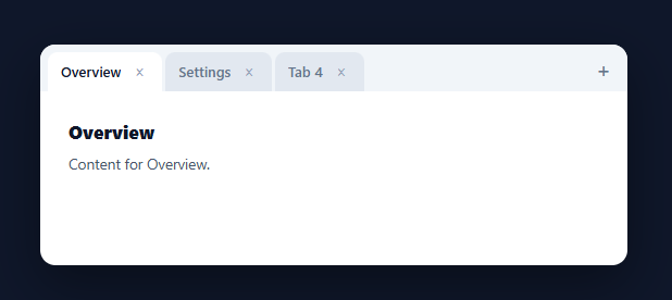
Most tab components are static — a fixed set you switch between. Dynamic tabs behave like a browser's: you can add new ones, close any of them, reorder by dragging, and the right tab activates when you close the current one. This snippet builds that full browser-style tab strip in plain HTML, CSS, and vanilla JavaScript, with no library.
State-driven, rendered from an array
Tabs live in a tabs array of { id, title, content }, with an activeId pointing at the current one. Every interaction mutates that array (or the active id) and calls render(), which redraws the strip and the body from state. This single-source-of-truth model is what keeps adding, closing, and reordering consistent — there's no DOM bookkeeping to drift, because the DOM is always a pure function of the array. Unique incrementing ids (not array indices) key each tab so reordering and closing never mix tabs up.
Smart activation when closing
The detail that makes closing feel right is which tab becomes active afterward. When you close the active tab, the component activates its neighbour — the tab that slid into its position, or the previous one if you closed the last — exactly like a browser. Closing a non-active tab leaves your selection alone. And closing the final tab drops to a clean empty state inviting a new tab. Getting this neighbour logic right is the difference between a polished tab strip and one that dumps you on a random tab.
Browser conventions: + , × and middle-click
A + button appends a new tab and scrolls the strip to reveal it; each tab has an × close button; and middle-clicking a tab closes it too (via the auxclick event with button === 1), matching the muscle memory of every browser user. Click handling is delegated — one listener on the strip routes clicks to close-vs-activate by checking closest('.dt-close') first — so it works for any number of tabs including ones added later.
Drag to reorder
Tabs are draggable, and dragstart/dragover reorder the array live: as you drag a tab over another, the dragged item is spliced into the new position and the strip re-renders, so tabs rearrange under the cursor. Reordering the array (not the DOM nodes) means the new order is real state you could persist, not just a visual shuffle.
Overflow, ellipsis, and drop-in use
The strip scrolls horizontally with a hidden scrollbar when tabs overflow, and long titles truncate with an ellipsis inside a max width, so the layout never breaks no matter how many tabs or how long their names. Because everything derives from the tabs array, you can seed it from saved state, cap the number, or wire each tab to real content — a complete reference for browser-style dynamic tabs covering add, close, reorder, and activation.
Build with AI
Build, Understand, Optimize, and Extend It With AI
Instead of tracing the neighbor-activation logic yourself, paste this snippet's HTML, CSS, and JS into an AI coding assistant like Claude and ask it to explain exactly how closeTab() decides which tab becomes active when you close the currently active one (looking at tabs[i] versus tabs[i - 1]), and why every tab is keyed by an incrementing id rather than its array index. The same assistant can help optimize it, for instance checking whether re-rendering the entire tabs array's innerHTML on every single dragover event during a drag is too aggressive for a strip with many tabs. It's also useful for extending the component: ask it to persist the tabs array and active id to sessionStorage so a refresh restores the open tabs, add a keyboard shortcut like Ctrl+W to close the active tab, or add a right-click context menu with "close others" and "close all". Treat the code less like a finished artifact and more like a starting point for a conversation.
Prompt to recreate it
Copy this into your AI assistant of choice to build the effect from scratch, or as a jumping-off point for your own variant:
Build a browser-style dynamic tab strip in plain HTML, CSS, and JavaScript with no library, supporting add, close, middle-click close, and drag-to-reorder.

Requirements:
- Keep all tab state in a single array of objects (each with a unique incrementing id, a title, and content) plus a separate variable tracking the currently active tab's id, and make one render function the only place that ever touches the DOM, rebuilding the tab strip and the content area purely from that array and the active id on every change.
- Never use array index to identify a tab in event handlers or data attributes; always use the unique id, so reordering or closing tabs can never cause the wrong tab to be acted upon.
- Implement an add button that pushes a new tab object onto the array, makes it active, re-renders, and scrolls the tab strip container to reveal the newly added tab if it overflows.
- Implement closing a tab (via a small close button on each tab) that removes it from the array, and when the closed tab was the active one, activates whichever tab slid into its former array position, or the previous tab if the closed one was the last in the list, falling back to a clear empty state if no tabs remain.
- Support closing a tab via the middle mouse button (the browser's auxclick event with button equal to 1), matching the same closing logic used by the visible close button, and prevent the default middle-click behavior.
- Make each tab draggable and reorder the underlying array (not just the visual DOM order) live during a drag-over, so dropping a tab in a new position updates real application state, and use one delegated click listener on the tab strip container to distinguish clicks on the close button from clicks on the tab body itself.
- Make the tab strip scroll horizontally with a hidden scrollbar when tabs overflow the container width, and truncate long tab titles with ellipsis inside a fixed maximum width so the layout never breaks regardless of tab count or title length.
Want to tighten it up first? Run this prompt through the AI Prompt Studio to score it across 8 quality dimensions, catch anti-patterns, and tune the wording for Claude, ChatGPT, or Gemini before you paste it in.
Step by step
How to Use
- 1Paste HTML, CSS, and JSA tabbed window renders with three seeded tabs and a + button.
- 2Add a tabClick + to append a new tab; the strip scrolls to reveal it and it becomes active.
- 3Close a tabClick its × or middle-click it; the neighbour activates if you closed the active one.
- 4Reorder by draggingDrag a tab over another to rearrange the order live.
- 5Switch tabsClick any tab to activate it and show its content below.
- 6Wire in real contentReplace each tab's content (and seed from saved state) to drive your own panels.
Real-world uses
Common Use Cases
Got questions?
Frequently Asked Questions
If you close a non-active tab, your current selection is untouched. If you close the active tab, the component activates its neighbour — the tab that shifts into the closed one's index, or the previous tab if you closed the last one — exactly like a browser. Closing the final tab leaves a clean empty state. This neighbour logic is what makes closing feel natural rather than dumping you on a random tab.
Indices change when you reorder or close tabs, so using them to identify tabs leads to mix-ups — closing tab 2 could appear to close a different one after a reorder. Each tab gets a unique incrementing id, and all operations (activate, close, reorder, drag) reference that id. The DOM carries the id in data-id, so events always act on the intended tab regardless of position.
Tabs are draggable. On dragstart the dragged tab's id is recorded; on dragover (with preventDefault to allow dropping) the code finds the dragged tab and the tab under the cursor in the array, splices the dragged one into the new position, and re-renders. Because it reorders the underlying array rather than shuffling DOM nodes, the new order is real state you could save.
Middle-clicks fire the auxclick event (not click) with e.button === 1. A delegated auxclick listener on the strip checks for the middle button, finds the tab via closest('.dt-tab'), and closes it — matching the browser convention users already know. preventDefault stops any default middle-click behaviour like autoscroll.
Hold the tabs array and activeId in state (useState / ref / component properties) and render from it. Add, close, and reorder become state updates; use the framework's drag events or a small drag library for reordering. The neighbour-activation logic and id model are framework-agnostic — only the rendering and event binding change.