You Might Also Like
Learn Coding Visually
Learn to code with interactive, live-preview playgrounds — HTML, CSS, JavaScript, React & more.
 HTML Playground42 lessons · Click-based · Live preview
 CSS PlaygroundLearn CSS with a live editor
 JavaScript Playground60 lessons · DOM · Async · Canvas
 React PlaygroundLearn React with a live code editor
 GSAP PlaygroundLearn GSAP animation interactively
 SVG Playground44 lessons · shapes · paths · animation
 SCSS Playground45 lessons · Sass modules · tokens
 Tailwind PlaygroundLearn Tailwind CSS with a live editor
 Bootstrap 5 Playground50 lessons · live preview
Tag Cloud — Weighted Tag Cloud HTML CSS JS
Tag Cloud · Navigation · Plain HTML, CSS & JS · Live preview
What's included
Features
About this UI Snippet
Tag Cloud — Tags Sized and Coloured by Weight, with Click-to-Filter
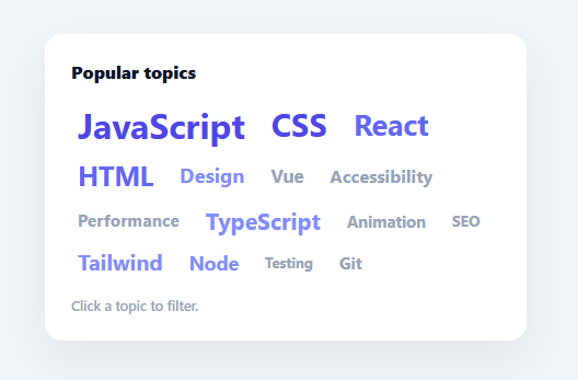
A tag cloud (or word cloud) shows a set of tags with the most frequent ones rendered larger, so popularity is visible at a glance. It is a compact way to surface topics, skills, or keywords and let users jump to one. This snippet builds a weighted, clickable tag cloud in plain HTML, CSS, and vanilla JavaScript — sizing and colouring each tag by its count — with no library.
Weight mapped to size and colour
Each tag has a count, and the snippet maps that count onto a font-size between a min and max, and onto a colour band, by normalising it against the smallest and largest counts in the set (band() returns 0–1). So the busiest tag is the biggest and boldest-coloured, the rarest the smallest and faintest, and everything scales in between. Encoding weight two ways — size *and* hue — makes the relative popularity readable even for users who find size-only clouds hard to compare, and it degrades gracefully whatever the actual count range is because it is relative, not absolute.
Real buttons, not styled text
Each tag is a <button>, so it is keyboard-focusable and announces as actionable to assistive tech — important because a tag cloud is navigation, not decoration. They wrap naturally with flexbox (flex-wrap) and align to a common baseline despite their different sizes, and each scales up slightly on hover for a tactile, clearly-clickable feel. A title shows the exact count on hover.
Click to filter
Clicking a tag marks it active (highlighted) and updates a status line; clicking it again clears the filter — a toggle. In a real app this is where you would filter your list or results by the selected tag; the snippet centralises that so wiring real filtering is a one-line addition in the click handler. Single-active toggling is the common tag-cloud interaction: pick a topic to narrow, click again to reset.
Relative, robust scaling
Because sizing is relative to the data's own min and max, the cloud looks right whether counts range 5–50 or 500–50,000 — you never have to retune the pixel sizes for a new dataset. The min/max font sizes and the colour palette are the two knobs you adjust for your design.
Data-driven and drop-in
The whole cloud renders from a TAGS array of { label, count }. Swap in your tags — blog topics, product categories, skills, search keywords — and it sizes, colours, and lays them out. It is a clear, dependency-free reference for weighted typographic scaling and accessible tag navigation. The code comment about shuffling is worth acting on for a real cloud: rendering tags in their source order (as this demo does, sorted roughly by count) makes the size gradient look deliberate and orderly, while a genuine word-cloud feel — where size, not position, carries the meaning — comes from shuffling the array before rendering so big and small tags interleave throughout the layout.
Build with AI
Build, Understand, Optimize, and Extend It With AI
You don't have to derive the normalization formula by hand. Paste this snippet's HTML, CSS, and JS into an AI coding assistant like Claude and ask it to explain exactly how the band function maps a raw count into a 0-to-1 value against the dataset's own min and max, and why that makes the font-size and color-band math work identically whether counts range from 5 to 50 or 500 to 50,000. The same assistant can help optimize it — for instance whether rendering tags in strict count order (as this demo does) undermines the classic word-cloud feel compared to shuffling them before render, or whether the four-color COLORS band is coarse enough to make visually similar-weight tags indistinguishable. It's also useful for extending the cloud: ask it to support multi-tag selection instead of a single active toggle, animate tags resizing when the underlying counts update live, or add a search box that filters the visible tags. Treat the code less like a finished artifact and more like a starting point for a conversation.
Prompt to recreate it
Copy this into your AI assistant of choice to build the effect from scratch, or as a jumping-off point for your own variant:
Build a weighted, clickable "tag cloud" in plain HTML, CSS, and JavaScript using relative min/max normalization — no charting library, no framework.

Requirements:
- A data array of tag objects, each with a label and a numeric count, with no fixed or hardcoded size/color values anywhere in the data itself.
- Compute the minimum and maximum count across the entire dataset once, then write a normalization function that maps any single tag's count to a value between 0 and 1 relative to that min and max (not relative to any fixed absolute scale).
- Use that normalized value to interpolate each tag's font-size between a minimum and maximum pixel size, and separately to pick a color from a small ordered palette array (so the least frequent tags get the first/faintest color and the most frequent get the last/boldest).
- Render every tag as a real button element (not a styled span or div) so each is keyboard-focusable and accessible, laid out with flex-wrap so tags of wildly different sizes still wrap and roughly baseline-align.
- Give every tag button a hover state that scales it up slightly for tactile feedback, and a native title/tooltip attribute showing its exact underlying count.
- Clicking a tag must toggle it as the single active filter: clicking an already-active tag clears the filter, clicking a different tag makes it the new active one, and exactly one status line of text must update to reflect either "no filter" or "filtering by X" — with the active tag visually highlighted and every other tag's highlight removed.
Want to tighten it up first? Run this prompt through the AI Prompt Studio to score it across 8 quality dimensions, catch anti-patterns, and tune the wording for Claude, ChatGPT, or Gemini before you paste it in.
Step by step
How to Use
- 1Paste HTML, CSS, and JSA tag cloud renders with each tag sized and coloured by its count.
- 2Read the weightsBigger, bolder-coloured tags are more popular; hover shows the exact count.
- 3Click to filterClick a tag to mark it active; click again to clear. The status line updates.
- 4Wire real filteringIn the click handler, filter your list or results by the active tag.
- 5Swap in your dataReplace the TAGS array with your own { label, count } items.
- 6Tune the scaleAdjust MIN_PX/MAX_PX and the COLORS palette to fit your design.
Real-world uses
Common Use Cases
Got questions?
Frequently Asked Questions
Every tag's count is normalised to 0-1 against the smallest and largest counts in the set (band() = (count − min) / (max − min)), then mapped to a font-size between MIN_PX and MAX_PX and to a colour band. So the most frequent tag is the largest and most saturated, the least frequent the smallest and faintest, scaled relative to your data — not to fixed thresholds.
Relative scaling means the cloud looks balanced for any dataset — counts of 5 to 50 or 500 to 50,000 both span the full size range — so you never have to retune pixel sizes when the data changes. Absolute thresholds would make a low-count set all tiny or a high-count set all huge. The min/max normalisation adapts automatically.
A tag cloud is interactive navigation, not decorative text, so each tag is a real <button>: it is keyboard-focusable, works with Enter/Space, and is announced as a control by screen readers. Styling spans would look the same but lose all of that. Using buttons keeps the cloud accessible while still letting CSS make them look like sized text.
The click handler already tracks the active tag and toggles it. Add your filtering where noted: filter your list/results array by the active label (or null for no filter) and re-render. Because the active state is centralised, you can also drive it from the URL (e.g. ?tag=react) so filters are shareable and survive reloads.
Compute the size and colour for each tag from the data (a useMemo in React, computed in Vue, a getter in Angular) and render buttons from the TAGS array. Hold the active tag in state, toggle it on click, and derive your filtered content from it. The band()/scaling math is framework-agnostic — only the active state and rendering move into the framework.