You Might Also Like
Learn Coding Visually
Learn to code with interactive, live-preview playgrounds — HTML, CSS, JavaScript, React & more.
 HTML Playground42 lessons · Click-based · Live preview
 CSS PlaygroundLearn CSS with a live editor
 JavaScript Playground60 lessons · DOM · Async · Canvas
 React PlaygroundLearn React with a live code editor
 GSAP PlaygroundLearn GSAP animation interactively
 SVG Playground44 lessons · shapes · paths · animation
 SCSS Playground45 lessons · Sass modules · tokens
 Tailwind PlaygroundLearn Tailwind CSS with a live editor
 Bootstrap 5 Playground50 lessons · live preview
Page Minimap — Scrollable Overview & Viewport Indicator
Page Minimap · Navigation · Plain HTML, CSS & JS · Live preview
What's included
Features
About this UI Snippet
Page Minimap — Proportional Page Overview with Draggable Viewport
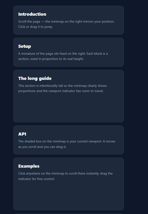
A page minimap is the miniature overview — familiar from code editors like VS Code — that shows the whole document at a glance with a box marking where you are, and lets you click or drag to jump anywhere. This snippet builds one for a scrolling page from its sections, with proportional blocks, a live viewport indicator, and drag-to-navigate, in plain HTML, CSS, and vanilla JavaScript.
Proportional, not a pixel clone
Rather than rendering a scaled screenshot of the page (expensive and fragile), the minimap represents each section as a block sized in proportion to that section's real height. A tall guide section gets a tall block; a short FAQ gets a short one. The whole stack is scaled to a fixed minimap height, so the map is a faithful structural overview that's cheap to build and easy to style.
A live viewport indicator
A translucent box on the minimap represents the current viewport. Its top is the scroll position times the scale factor, and its height is the window height times the same factor — so it grows and shrinks to reflect how much of the page is visible and slides as you scroll. Listening to scroll with a passive listener keeps it smooth without blocking scrolling.
Click and drag to navigate
Clicking anywhere on the minimap scrolls the page so that point sits at the centre of the viewport, with smooth behaviour; pressing and dragging scrolls continuously as you move, for fine control. The mapping is a single ratio — pointer position within the map equals scroll position within the page — which keeps navigation predictable in both directions.
Active-section highlight
The block nearest the viewport's centre is highlighted, giving an at-a-glance "you are here" beyond the viewport box — useful when sections are uneven. The highlight is recomputed on each scroll from the sections' offsets, so it stays accurate as content changes.
Responsive and self-rebuilding
On resize the minimap rebuilds its blocks and rescales, because section heights change with width — so the proportions always match the real page. The whole thing is a build function and a scroll update with no dependencies, a clean reference for the editor-style minimap pattern applied to long pages and docs.
Build with AI
Build, Understand, Optimize, and Extend It With AI
You don't have to work through the scale math yourself. Paste this snippet's HTML, CSS, and JS into an AI coding assistant like Claude and ask it to explain exactly how the build function derives the scale factor from page.scrollHeight and mapInner, and why that same scale factor is reused both to size each section's block and to position and size the viewport indicator in update. The same assistant can help optimize it, for instance asking whether recomputing the active section on every scroll event by looping through all sections is fine at typical page lengths or whether it should be throttled for a very long document with hundreds of sections. It's also a good way to extend the component: ask it to add zoomed-in thumbnails of each section's actual content instead of flat colored blocks, animate the viewport box with a spring instead of a direct style write, or make the minimap collapse to an edge strip on narrow viewports. Treat the code less like a finished artifact and more like a starting point for a conversation.
Prompt to recreate it
Copy this into your AI assistant of choice to build the effect from scratch, or as a jumping-off point for your own variant:
Build a "page minimap" navigation overview in plain HTML, CSS, and JavaScript, with no scaled screenshot or DOM-cloning approach — represent structure with proportionally sized blocks only.

Requirements:
- A main scrolling page made of several section elements of varying heights, and a separate fixed-position minimap panel.
- A build function that computes a fixed minimap height bounded between a minimum and maximum pixel value, derives a single scale factor as that minimap height divided by the page's total scroll height, then creates one block element per section whose height is that section's real offsetHeight multiplied by the same scale factor (accounting for the small gaps between blocks), so tall sections get proportionally tall blocks and short sections get short ones.
- A translucent viewport-indicator element overlaid on the minimap whose top position equals the current window scroll position multiplied by the scale factor, and whose height equals the window's inner height multiplied by the scale factor, updated on every scroll event using a passive listener so it never blocks scrolling.
- Determine which section is "active" by finding the section whose vertical extent contains the vertical center of the current viewport, and highlight only that section's block.
- Clicking anywhere on the minimap must scroll the main page so that the corresponding point (mapped by the same ratio, inverted) becomes vertically centered in the viewport, using smooth scrolling behavior; pressing down and dragging on the minimap must continuously update the scroll position as the pointer moves, using pointerdown/pointermove/pointerup listeners (not native HTML5 drag events).
- On window resize, the minimap must fully rebuild its blocks and recompute its scale factor, since section heights change when the page reflows at a new width.
Want to tighten it up first? Run this prompt through the AI Prompt Studio to score it across 8 quality dimensions, catch anti-patterns, and tune the wording for Claude, ChatGPT, or Gemini before you paste it in.
Step by step
How to Use
- 1Paste HTML, CSS, and JSA long page renders with a minimap fixed on the right.
- 2ScrollThe viewport box moves and the active section block highlights.
- 3Click the mapThe page scrolls so that point centers in the viewport.
- 4Drag the mapPress and move to scrub through the page continuously.
- 5Mark sectionsEach .pm-sec becomes a proportional block automatically.
- 6ResizeThe minimap rebuilds so proportions stay accurate.
Real-world uses
Common Use Cases
Got questions?
Frequently Asked Questions
Cloning and scaling the real DOM (or a screenshot) is expensive, breaks with dynamic content, and is hard to keep in sync. Representing each section as a proportionally sized block captures the page structure faithfully at a fraction of the cost, is trivial to style, and rebuilds instantly on resize. It is the same idea as an outline view rather than a literal thumbnail.
The minimap is the page height multiplied by a scale factor. The box's top is window.scrollY times that scale, and its height is window.innerHeight times the scale, so it represents exactly the visible portion and moves as you scroll. The scroll listener is passive, so updating the box never blocks or janks the actual scrolling.
Both use one ratio: the pointer's vertical position within the minimap divided by the minimap height equals the target position within the page. Clicking scrolls (smoothly) so that target sits at the viewport centre; dragging applies the same mapping continuously on pointermove for scrubbing. This symmetry makes the map predictable to use.
Yes. Section heights depend on viewport width (text reflows), so the minimap rebuilds its blocks and recomputes the scale on resize. If your content changes dynamically, call the build function again after the change and the proportions and viewport box will re-sync to the new page height.
Measure the page and section heights after render (in an effect) and store them in state to render the blocks; recompute on a resize listener. Track scrollY in state via a passive scroll listener to position the viewport box, and implement click/drag handlers that call scrollTo with the mapped target. Tailwind users swap the classes for utilities; the scaling math is unchanged.