You Might Also Like
Learn Coding Visually
Learn to code with interactive, live-preview playgrounds — HTML, CSS, JavaScript, React & more.
 HTML Playground42 lessons · Click-based · Live preview
 CSS PlaygroundLearn CSS with a live editor
 JavaScript Playground60 lessons · DOM · Async · Canvas
 React PlaygroundLearn React with a live code editor
 GSAP PlaygroundLearn GSAP animation interactively
 SVG Playground44 lessons · shapes · paths · animation
 SCSS Playground45 lessons · Sass modules · tokens
 Tailwind PlaygroundLearn Tailwind CSS with a live editor
 Bootstrap 5 Playground50 lessons · live preview
Brightness Slider — Free CSS Filter Control JS Snippet
Brightness Slider · Forms · Plain HTML, CSS & JS · Live preview
What's included
Features
About this UI Snippet
Brightness Slider — Live CSS brightness() Filter Control
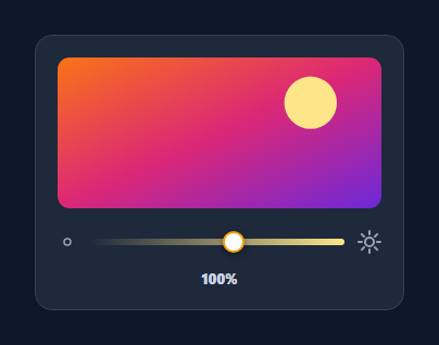
A brightness slider lets a user dim or brighten an image, screen preview, or theme — the control in photo editors, display settings, and reading apps. This snippet wires a range input to the CSS brightness() filter so a preview updates live, with a gradient track and a sun icon that grows and glows as you push past full brightness. It's pure HTML, CSS, and vanilla JavaScript with no canvas and no dependency.
brightness() does the heavy lifting
The whole effect is one CSS filter: filter: brightness(factor), where 1 is the original, below 1 darkens, and above 1 over-brightens. The slider's raw 20–160 value is divided by 100 to produce a 0.2–1.6 factor, so the range covers a meaningful dimming-to-blown-out span. A short transition on the filter keeps dragging buttery rather than steppy, and because it's GPU-composited it stays smooth even on large images.
A gradient track that reads as brightness
The range's background is a left-to-right linear-gradient from near-black to warm yellow, so the track itself communicates "dark on the left, bright on the right" before you read any number. The thumb is styled across ::-webkit-slider-thumb and ::-moz-range-thumb so it looks consistent in both engines.
An icon that responds to the value
The sun glyph isn't static — paint() scales its SVG from about 0.78× up to 1.3× as brightness rises, and adds a .bright class above 100% that tints it amber and applies a drop-shadow glow. This gives an analog, at-a-glance sense of intensity that complements the percentage readout, and it's all driven from the same single render function.
One render path
Every change runs through paint(), which reads the slider once and updates the filter, the label, and the icon together. There's no duplicated state, so the preview, the number, and the sun can never disagree — a pattern that scales cleanly if you later add presets or sync to a stored setting.
Beyond images
The same brightness() filter applies to any element — a full theme container, a video, a map, or a canvas — so you can dim an entire UI for night reading by putting the filter on a wrapper. Pair it with contrast() or saturate() in the same filter string to build a complete display-adjustment panel from the same approach.
Build with AI
Build, Understand, Optimize, and Extend It With AI
You don't have to reverse-engineer the scale formula by hand to see how the sun icon tracks the slider. Paste this snippet's HTML, CSS, and JS into an AI coding assistant like Claude and ask it to explain exactly how the raw 20-160 range gets converted into both the brightness() filter factor and the separate 0.78-to-1.3 icon scale factor in the same paint function, and why those two mappings use different formulas even though they're driven by the same slider value. The same assistant can help optimize it — asking whether the CSS transition on the filter property is redundant given the input event already fires continuously while dragging, or whether the icon scale calculation could be simplified into a shared helper. It's also a good way to extend the widget: ask it to add contrast() and saturate() sliders sharing one combined filter string, persist the chosen brightness to localStorage, or apply the filter to a live video element instead of a static image. Treat the code less like a finished artifact and more like a starting point for a conversation.
Prompt to recreate it
Copy this into your AI assistant of choice to build the effect from scratch, or as a jumping-off point for your own variant:
Build a "brightness slider" in plain HTML, CSS, and JavaScript that live-dims or brightens a preview element using only the CSS brightness() filter — no canvas, no per-pixel image manipulation.

Requirements:
- A range input whose min and max represent a brightness percentage wider than 0-100 (allow both under- and over-brightening, e.g. 20 to 160), with a track styled as a left-to-right linear-gradient from dark to a bright warm color so the slider itself visually communicates the range before any value is read.
- On every input event, convert the raw slider value into a CSS filter factor by dividing by 100, and apply it as filter: brightness(factor) to a preview image element, with a short CSS transition on the filter property so the visual change during dragging is smooth rather than stepped.
- Display the current raw percentage value as text, updating on every input event from the same handler that updates the filter.
- Render an icon (e.g. a sun) next to the slider whose visual scale grows continuously as the value increases across the full range, computed with its own separate formula from the same slider value (not simply mirroring the filter factor), and add a distinct glow/color-change state on the icon specifically when the value exceeds the normal 100% baseline.
- Consolidate all of this — the filter update, the label text, and the icon scale and glow state — into a single function that runs on every input event, so the preview, the numeric readout, and the icon can never fall out of sync with each other.
- Make sure the technique generalizes: the same filter approach must be usable on any element (a video, a wrapper div, a canvas), not hardcoded to only work on the one image in the demo.
Want to tighten it up first? Run this prompt through the AI Prompt Studio to score it across 8 quality dimensions, catch anti-patterns, and tune the wording for Claude, ChatGPT, or Gemini before you paste it in.
Step by step
How to Use
- 1Paste HTML, CSS, and JSA preview image renders above a gradient brightness slider.
- 2Drag the sliderThe preview brightens or dims live via the CSS brightness() filter.
- 3Watch the sun iconIt scales up as you increase brightness and glows past 100%.
- 4Read the percentageThe value label shows the exact brightness from 20% to 160%.
- 5Swap the previewPoint the filter at any image, video, or wrapper element.
- 6Combine filtersAdd contrast() or saturate() to the same filter string.
Real-world uses
Common Use Cases
Got questions?
Frequently Asked Questions
It uses the CSS filter: brightness(factor) property on the image. A factor of 1 is the original, below 1 darkens, and above 1 over-brightens. The slider's 20–160 value is divided by 100 to make a 0.2–1.6 factor, so nothing about the pixel data changes — the browser composites the adjustment on the GPU.
The filter has a short CSS transition, and brightness() is GPU-composited, so updates don't trigger layout or repaint of the underlying bitmap. Even on a large image, dragging stays fluid because the work happens on the compositor, not the main thread.
The paint() function scales the sun SVG from about 0.78× to 1.3× based on the slider value and adds a .bright class above 100% that tints it amber with a drop-shadow glow. It gives an analog sense of intensity that complements the numeric percentage, all from the same render call.
Yes. The brightness() filter works on any element, so applying it to a wrapper div dims everything inside — useful for a night or reading mode. You can also chain it with contrast() and saturate() in one filter string to build a complete display-adjustment panel.
Hold the value in state and bind the target element's filter style to brightness(value/100). Compute the icon scale and glow class from the same value in render. Tailwind users can use the brightness-* utilities for fixed steps, but for a continuous slider bind an inline filter style to the live value instead.