
Learn Coding Visually
Learn to code with interactive, live-preview playgrounds — HTML, CSS, JavaScript, React & more.
 HTML Playground42 lessons · Click-based · Live preview
 CSS PlaygroundLearn CSS with a live editor
 JavaScript Playground60 lessons · DOM · Async · Canvas
 React PlaygroundLearn React with a live code editor
 GSAP PlaygroundLearn GSAP animation interactively
 SVG Playground44 lessons · shapes · paths · animation
 SCSS Playground45 lessons · Sass modules · tokens
 Tailwind PlaygroundLearn Tailwind CSS with a live editor
 Bootstrap 5 Playground50 lessons · live preview
Range Slider — Free HTML CSS JS Custom Slider Snippet
Range Slider · Forms · Plain HTML, CSS & JS · Live preview
What's included
Features
About this UI Snippet
Range Slider — Custom CSS Track & Thumb, accent-color, Live Value Display
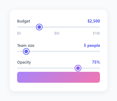
The range slider is one of the most useful but hardest-to-style native form elements — for a two-handle version see the multi-range slider, and for a circular control the rotary knob. The default <input type="range"> looks different on every browser and operating system. This snippet shows three techniques for styling it consistently and wiring live value display.
The accent-color approach
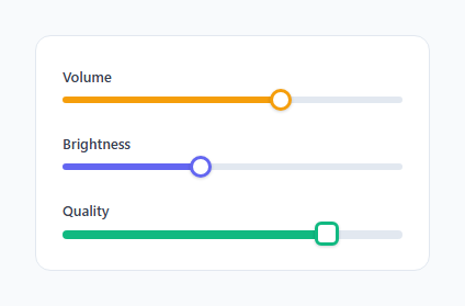
input[type="range"] { accent-color: #6366f1 } is the modern approach — it recolours the thumb and filled track portion using the browser's native accent-color support. This is the simplest cross-browser technique and works in all modern browsers without any pseudo-element overrides — the usage calculator builds on it for live pricing. For the purple variant, input[type="range"].purple { accent-color: #8b5cf6 } swaps the colour with a single property.
Custom WebKit thumb
For precise thumb styling in Chrome and Safari, ::-webkit-slider-thumb overrides the native thumb: width: 18px; height: 18px; border-radius: 50%; background: #6366f1; border: 3px solid #fff; box-shadow: 0 0 0 2px #6366f1. The white border and matching box-shadow create a ringed thumb that looks clean on any background.
Live value display
Each slider calls a dedicated update function via oninput. updateBudget(v) sets the text of a <span id="budget-val"> with formatted output: `'
The accent-color property
Modern browsers support accent-color: #6366f1 on range inputs to colour the track fill and thumb with one CSS property. For browsers that do not support it, the WebKit and Mozilla pseudo-element overrides provide consistent cross-browser styling. Both approaches are included in the snippet.
Customising the live value format
Each slider calls a dedicated update function on oninput. Change the format string in each function to match your use case: currency with toLocaleString(), distance as Nkm, time as Nh Nm, weight as Nkg. The format function runs on every input event at the native frame rate — no debounce is needed for simple text updates because range inputs only fire while the user is dragging.
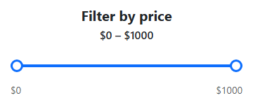
Dual-handle range slider for price range selection
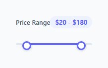
For a min/max selector with two handles, use two overlapping range inputs. Enforce constraints in JavaScript: the lower handle cannot exceed the upper, and vice versa. A CSS gradient between the two current values fills only the selected range area, giving users clear visual feedback about the selected window. Use input.value and the min/max attributes to enforce that neither handle crosses the other.
The accent-color property
Modern browsers support accent-color: #6366f1 on range inputs to colour the track fill and thumb with one CSS property. For browsers that do not support it, the WebKit and Mozilla pseudo-element overrides provide consistent cross-browser styling. Both approaches are included in the snippet.
Customising the live value format
Each slider calls a dedicated update function on oninput. Change the format string in each function to match your use case: currency with toLocaleString(), distance as Nkm, time as Nh Nm, weight as Nkg. The format function runs on every input event at the native frame rate — no debounce is needed for simple text updates because range inputs only fire while the user is dragging.
Dual-handle range slider for price range selection
For a min/max selector with two handles, use two overlapping range inputs. Enforce constraints in JavaScript: the lower handle cannot exceed the upper, and vice versa. A CSS gradient between the two current values fills only the selected range area, giving users clear visual feedback about the selected window.
The accent-color property
Modern browsers support accent-color: #6366f1 on range inputs to colour the track fill and thumb with one CSS property. For browsers that do not support it, the WebKit and Mozilla pseudo-element overrides provide consistent cross-browser styling. Both approaches are included in the snippet.
Customising the live value format
Each slider calls a dedicated update function on oninput. Change the format string in each function to match your use case: currency with toLocaleString(), distance as Nkm, time as Nh Nm, weight as Nkg. The format function runs on every input event at the native frame rate — no debounce is needed for simple text updates because range inputs only fire while the user is dragging.
Dual-handle range slider for price range selection
For a min/max selector with two handles, use two overlapping range inputs. Enforce constraints in JavaScript: the lower handle cannot exceed the upper, and vice versa. A CSS gradient between the two current values fills only the selected range area, giving users clear visual feedback about the selected window.
Build with AI
Build, Understand, Optimize, and Extend It With AI
You do not have to reason through the cross-browser styling quirks alone. Paste this snippet's HTML, CSS, and JS into an AI coding assistant like Claude and ask it to explain exactly why both accent-color and a webkit-slider-thumb override are present together rather than relying on just one, and what would visibly differ in Firefox versus Chrome if the webkit-specific rules were removed. The same assistant can help you optimize it — ask whether the three separate oninput handlers (updateBudget, updateTeam, updateOpacity) could be collapsed into one generic formatter-driven function without losing the singular/plural handling on the team slider. It's also useful for extending the sliders: ask it to add a native datalist for tick-snapping, build a true dual-handle range slider using two overlapping range inputs with a constrained min/max relationship, or add a live CSS gradient fill showing progress up to the thumb. Treat the code less like a finished artifact and more like a starting point for a conversation.
Prompt to recreate it
Copy this into your AI assistant of choice to build the effect from scratch, or as a jumping-off point for your own variant:
Build three styled range slider inputs in plain HTML, CSS, and JavaScript with no library — a budget slider, a team-size slider, and an opacity slider that live-updates a preview element.

Requirements:
- Style every native input of type range with the CSS accent-color property so the browser paints its own thumb and filled track using that color, as the primary cross-browser approach.
- In addition to accent-color, override ::-webkit-slider-thumb to a custom circular thumb with a white inner border and a matching colored outer box-shadow ring, for finer control in Chrome and Safari specifically.
- Each slider must call its own dedicated update function on its oninput event (not a shared generic one) that writes a live-formatted value into an adjacent text element: the budget slider formats its value with thousands separators via toLocaleString, the team-size slider must correctly switch between the singular word "person" and the plural "people" based on the numeric value, and the opacity slider must both display a percentage and set a separate preview element's CSS opacity style directly from the slider's value divided by 100.
- Give the opacity slider a distinct accent color from the other two sliders via a separate CSS class, confirming that changing accent-color per-input is enough to re-theme an individual slider without touching the others.
- Add tick label captions (e.g. $0, $5k, $10k) beneath at least one slider purely with a flexbox row of spans, not the native datalist element.
Want to tighten it up first? Run this prompt through the AI Prompt Studio to score it across 8 quality dimensions, catch anti-patterns, and tune the wording for Claude, ChatGPT, or Gemini before you paste it in.
Source Code
<div class="demo">
  <div class="field">
    <div class="row"><label>Budget</label><span id="budget-val">$2,500</span></div>
    <input type="range" id="budget" min="0" max="10000" value="2500" step="100" oninput="updateBudget(this.value)" />
    <div class="ticks"><span>$0</span><span>$5k</span><span>$10k</span></div>
  </div>
  <div class="field">
    <div class="row"><label>Team size</label><span id="team-val">5 people</span></div>
    <input type="range" id="team" min="1" max="50" value="5" oninput="updateTeam(this.value)" />
  </div>
  <div class="field">
    <div class="row"><label>Opacity</label><span id="opacity-val">75%</span></div>
    <input type="range" id="opacity" min="0" max="100" value="75" class="purple" oninput="updateOpacity(this.value)" />
    <div class="preview-box" id="preview-box"></div>
  </div>
</div>
* { box-sizing: border-box; margin: 0; padding: 0; }
body { font-family: system-ui, sans-serif; background: #f8fafc; display: flex; align-items: center; justify-content: center; min-height: 100vh; padding: 20px; }
.demo { background: #fff; border-radius: 16px; padding: 28px 24px; width: 320px; display: flex; flex-direction: column; gap: 24px; box-shadow: 0 4px 20px rgba(0,0,0,0.07); }
.field { display: flex; flex-direction: column; gap: 10px; }
.row { display: flex; justify-content: space-between; align-items: center; }
label { font-size: 13px; font-weight: 600; color: #475569; }
.row span { font-size: 13px; font-weight: 700; color: #6366f1; }
input[type="range"] { -webkit-appearance: none; width: 100%; height: 4px; background: #e2e8f0; border-radius: 4px; outline: none; cursor: pointer; accent-color: #6366f1; }
input[type="range"].purple { accent-color: #8b5cf6; }
input[type="range"]::-webkit-slider-thumb { -webkit-appearance: none; width: 18px; height: 18px; border-radius: 50%; background: #6366f1; border: 3px solid #fff; box-shadow: 0 0 0 2px #6366f1; cursor: pointer; }
input[type="range"].purple::-webkit-slider-thumb { background: #8b5cf6; box-shadow: 0 0 0 2px #8b5cf6; }
.ticks { display: flex; justify-content: space-between; font-size: 11px; color: #94a3b8; }
.preview-box { height: 36px; border-radius: 8px; background: linear-gradient(135deg, #8b5cf6, #ec4899); opacity: 0.75; }function updateBudget(v) { document.getElementById('budget-val').textContent = '$' + (+v).toLocaleString(); }
function updateTeam(v) { document.getElementById('team-val').textContent = v + ' ' + (+v === 1 ? 'person' : 'people'); }
function updateOpacity(v){ document.getElementById('opacity-val').textContent = v + '%'; document.getElementById('preview-box').style.opacity = v / 100; }Step by step
How to Use
- 1Drag all three slidersDrag the Budget, Team size, and Opacity sliders in the preview. Each shows a different live value format and the third changes the preview box opacity.
- 2Change the min, max, and stepIn the HTML panel, update the min, max, and step attributes on each input[type="range"] to match your data range.
- 3Update the value formatIn the JS panel, update the update functions to format the value for your use case — currency, percentage, unit label.
- 4Change the accent colourUpdate accent-color: #6366f1 in the CSS panel to your brand colour. Also update the matching thumb background and box-shadow.
- 5Set the initial valueUpdate the value attribute on the input and call the corresponding update function once on page load to show the initial formatted value.
- 6Export in your formatClick "HTML" for a standalone file, "JSX" for a React component, or "Tailwind" for a React + Tailwind version.
Real-world uses
Common Use Cases
Got questions?
Frequently Asked Questions
accent-color: #6366f1 is a CSS property that recolours interactive elements — checkboxes, radios, progress bars, and range inputs — using the browser native rendering. It colours both the thumb and the filled track portion without requiring pseudo-element overrides. It is the simplest cross-browser approach for basic colour theming.
::-webkit-slider-thumb sets background: #6366f1 and border: 3px solid #fff (white border). box-shadow: 0 0 0 2px #6366f1 adds a matching outer ring. The white border separates the thumb from the ring, creating a bullseye appearance. This works in Chrome and Safari; Firefox uses -moz-range-thumb.
Each slider has an oninput="updateX(this.value)" attribute. The update function receives the string value, formats it (currency, plural, percentage), and sets the textContent of the matching display span. The +v coercion converts the string to a number for calculations.
Add a <datalist id="ticks"> with <option value="0">, <option value="50">, <option value="100"> etc. Add list="ticks" to the input. The browser renders native tick marks at each option value. The .ticks div in this snippet is a manual CSS alternative for more styling control.
Call the update function once on page load with the slider's initial value: updateBudget(document.querySelector("input").value). Or set the display span text directly in the HTML to match the input value attribute.
Yes. Click "JSX" for a React component. Use a controlled input: <input type="range" value={value} onChange={e => setValue(+e.target.value)} />. Display the formatted value next to the slider. The CSS accent-color and ::-webkit-slider-thumb styles work unchanged in React.