Source Code
<div class="cmp-page">
  <div class="cmp-grid" id="cmpGrid">
    <div class="cmp-product" data-id="1" data-name="Studio Headphones" data-emoji="🎧" data-price="$199">
      <div class="cmp-img">🎧</div>
      <div class="cmp-pname">Studio Headphones</div>
      <div class="cmp-price">$199</div>
      <button class="cmp-toggle" onclick="toggleCompare(this)">Compare</button>
    </div>
    <div class="cmp-product" data-id="2" data-name="Field Watch" data-emoji="⌚" data-price="$249">
      <div class="cmp-img">⌚</div>
      <div class="cmp-pname">Field Watch</div>
      <div class="cmp-price">$249</div>
      <button class="cmp-toggle" onclick="toggleCompare(this)">Compare</button>
    </div>
    <div class="cmp-product" data-id="3" data-name="Mirrorless Camera" data-emoji="📷" data-price="$899">
      <div class="cmp-img">📷</div>
      <div class="cmp-pname">Mirrorless Camera</div>
      <div class="cmp-price">$899</div>
      <button class="cmp-toggle" onclick="toggleCompare(this)">Compare</button>
    </div>
    <div class="cmp-product" data-id="4" data-name="Smart Speaker" data-emoji="🔊" data-price="$129">
      <div class="cmp-img">🔊</div>
      <div class="cmp-pname">Smart Speaker</div>
      <div class="cmp-price">$129</div>
      <button class="cmp-toggle" onclick="toggleCompare(this)">Compare</button>
    </div>
    <div class="cmp-product" data-id="5" data-name="Mechanical Keyboard" data-emoji="⌨️" data-price="$159">
      <div class="cmp-img">⌨️</div>
      <div class="cmp-pname">Mechanical Keyboard</div>
      <div class="cmp-price">$159</div>
      <button class="cmp-toggle" onclick="toggleCompare(this)">Compare</button>
    </div>
    <div class="cmp-product" data-id="6" data-name="Wireless Mouse" data-emoji="🖱️" data-price="$79">
      <div class="cmp-img">🖱️</div>
      <div class="cmp-pname">Wireless Mouse</div>
      <div class="cmp-price">$79</div>
      <button class="cmp-toggle" onclick="toggleCompare(this)">Compare</button>
    </div>
  </div>

  <div class="cmp-bar" id="cmpBar">
    <div class="cmp-slots" id="cmpSlots"></div>
    <div class="cmp-actions">
      <span class="cmp-count" id="cmpCount">0 selected</span>
      <button class="cmp-clear" onclick="clearCompare()">Clear</button>
      <button class="cmp-go" id="cmpGo" onclick="doCompare()" disabled>Compare</button>
    </div>
  </div>
</div>*{box-sizing:border-box;margin:0;padding:0}
body{font-family:system-ui,-apple-system,sans-serif;background:#f1f5f9;min-height:100vh;padding:24px 16px 120px}
.cmp-page{max-width:560px;margin:0 auto}
.cmp-grid{display:grid;grid-template-columns:repeat(3,1fr);gap:12px}
@media(max-width:520px){.cmp-grid{grid-template-columns:repeat(2,1fr)}}
.cmp-product{background:#fff;border:1.5px solid #e2e8f0;border-radius:14px;padding:14px;text-align:center;transition:border-color .15s,box-shadow .15s}
.cmp-product.comparing{border-color:#6366f1;box-shadow:0 0 0 3px rgba(99,102,241,.12)}
.cmp-img{width:54px;height:54px;margin:0 auto 8px;border-radius:12px;background:linear-gradient(135deg,#eef2ff,#e0e7ff);display:flex;align-items:center;justify-content:center;font-size:28px}
.cmp-pname{font-size:12px;font-weight:700;color:#1e293b;line-height:1.3;min-height:31px}
.cmp-price{font-size:13px;font-weight:800;color:#6366f1;margin:2px 0 10px}
.cmp-toggle{width:100%;padding:7px;background:#f1f5f9;color:#475569;border:none;border-radius:8px;font-size:12px;font-weight:700;cursor:pointer;font-family:inherit;transition:background .15s,color .15s}
.cmp-toggle:hover{background:#e2e8f0}
.cmp-product.comparing .cmp-toggle{background:#6366f1;color:#fff}
.cmp-product.comparing .cmp-toggle::before{content:'✓ '}
.cmp-bar{position:fixed;left:50%;bottom:18px;transform:translate(-50%,150%);width:calc(100% - 32px);max-width:560px;background:#1e293b;border-radius:16px;padding:12px 14px;display:flex;align-items:center;gap:14px;box-shadow:0 16px 40px rgba(0,0,0,.3);transition:transform .35s cubic-bezier(.2,.9,.3,1)}
.cmp-bar.show{transform:translate(-50%,0)}
.cmp-slots{display:flex;gap:8px;flex:1;min-width:0}
.cmp-slot{position:relative;width:46px;height:46px;border-radius:10px;background:rgba(148,163,184,.15);display:flex;align-items:center;justify-content:center;font-size:22px;flex-shrink:0;animation:cmp-pop .2s ease}
.cmp-slot.empty{border:1.5px dashed rgba(148,163,184,.35);font-size:0}
@keyframes cmp-pop{from{transform:scale(.6);opacity:0}to{transform:scale(1);opacity:1}}
.cmp-x{position:absolute;top:-5px;right:-5px;width:18px;height:18px;border-radius:50%;background:#ef4444;color:#fff;border:2px solid #1e293b;font-size:11px;line-height:1;cursor:pointer;display:flex;align-items:center;justify-content:center;padding:0;font-family:inherit}
.cmp-actions{display:flex;align-items:center;gap:10px;flex-shrink:0}
.cmp-count{font-size:12px;color:#94a3b8;font-weight:600;white-space:nowrap}
.cmp-clear{background:none;border:none;color:#cbd5e1;font-size:12px;font-weight:700;cursor:pointer;font-family:inherit}
.cmp-clear:hover{color:#fff}
.cmp-go{padding:9px 18px;background:#6366f1;color:#fff;border:none;border-radius:10px;font-size:13px;font-weight:800;cursor:pointer;font-family:inherit;transition:background .15s;white-space:nowrap}
.cmp-go:hover:not(:disabled){background:#4f46e5}
.cmp-go:disabled{background:rgba(148,163,184,.25);color:#64748b;cursor:not-allowed}
@media(max-width:520px){.cmp-count{display:none}}var MAX = 4;
var selected = [];
function toggleCompare(btn) {
var card = btn.closest('.cmp-product');
var id = card.dataset.id;
var i = selected.indexOf(id);
if (i !== -1) {
selected.splice(i, 1);
card.classList.remove('comparing');
} else {
if (selected.length >= MAX) { flashLimit(); return; }
selected.push(id);
card.classList.add('comparing');
}
render();
}
function removeFromBar(id) {
var i = selected.indexOf(id);
if (i !== -1) selected.splice(i, 1);
var card = document.querySelector('.cmp-product[data-id="' + id + '"]');
if (card) card.classList.remove('comparing');
render();
}
function clearCompare() {
selected = [];
document.querySelectorAll('.cmp-product').forEach(function (c) { c.classList.remove('comparing'); });
render();
}
function doCompare() {
if (selected.length < 2) return;
var go = document.getElementById('cmpGo');
go.textContent = 'Comparing ' + selected.length + '…';
setTimeout(function () { go.textContent = 'Compare'; }, 1400);
}
function flashLimit() {
var count = document.getElementById('cmpCount');
count.textContent = 'Max ' + MAX + ' items';
count.style.color = '#fca5a5';
setTimeout(render, 1200);
}
function render() {
var slots = document.getElementById('cmpSlots');
var html = '';
for (var i = 0; i < MAX; i++) {
var id = selected[i];
if (id) {
var card = document.querySelector('.cmp-product[data-id="' + id + '"]');
html += '<div class="cmp-slot">' + card.dataset.emoji +
'<button class="cmp-x" onclick="removeFromBar(\'' + id + '\')" aria-label="Remove">×</button></div>';
} else {
html += '<div class="cmp-slot empty"></div>';
}
}
slots.innerHTML = html;
var count = document.getElementById('cmpCount');
count.textContent = selected.length + ' selected';
count.style.color = '';
document.getElementById('cmpGo').disabled = selected.length < 2;
document.getElementById('cmpBar').classList.toggle('show', selected.length > 0);
}Learn Coding Visually
Learn to code with interactive, live-preview playgrounds — HTML, CSS, JavaScript, React & more.
 HTML Playground42 lessons · Click-based · Live preview
 CSS PlaygroundLearn CSS with a live editor
 JavaScript Playground60 lessons · DOM · Async · Canvas
 React PlaygroundLearn React with a live code editor
 GSAP PlaygroundLearn GSAP animation interactively
 SVG Playground44 lessons · shapes · paths · animation
 SCSS Playground45 lessons · Sass modules · tokens
 Tailwind PlaygroundLearn Tailwind CSS with a live editor
 Bootstrap 5 Playground50 lessons · live preview
Product Compare Bar — HTML CSS JS Snippet
Product Compare Bar · Navigation · Plain HTML, CSS & JS · Live preview
What's included
Features
selected id array drives the grid highlights, the tray, the count, the button, and bar visibility — nothing can fall out of sync.render always shows MAX slots, filling chosen products and rendering the rest as dashed empties so remaining capacity is visible.flashLimit, briefly showing "Max 4 items" in red instead of an intrusive alert.selected array.disabled until at least two products are selected, since comparing one is meaningless.About this UI Snippet
Product Compare Bar — Sticky Selection Tray, Max-Items Cap & Gated Compare Action
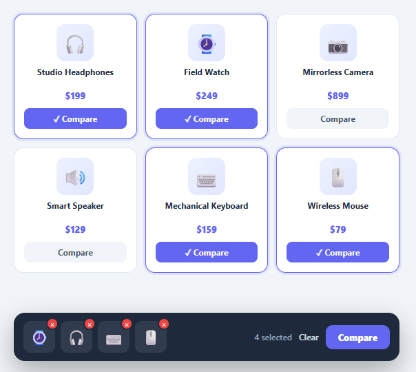
"Compare" is a core shopping behaviour for considered purchases — electronics, appliances, plans, cars. Shoppers want to pick a few candidates from a grid and line them up side by side. The pattern that makes this smooth is a floating compare bar: a sticky tray that collects selected products as thumbnails, caps the selection at a sensible maximum, and offers a compare action once at least two are chosen. This snippet implements it in plain HTML, CSS, and vanilla JavaScript: a product grid with compare toggles, a slide-up tray with thumbnail slots, a max-items limit, per-item removal, clear-all, and a gated compare button.
A single selection array as the source of truth
All state lives in one selected array of product ids. toggleCompare adds or removes the card's id, toggles the card's .comparing highlight, and calls render. render rebuilds the tray, the count, the compare button's disabled state, and the bar's visibility entirely from that array — so the grid, the tray, and the button can never disagree about what is selected.
Thumbnail slots with a visible cap
The tray always shows MAX slots (four here). render fills the first slots with selected products' thumbnails and renders the remaining ones as dashed "empty" placeholders, so users can see both what they have chosen and how many more they may add. Each filled slot carries a small × button that calls removeFromBar(id) — removing an item from the tray also un-highlights its card in the grid, because both read from the same array.
Enforced maximum with feedback
Comparison tables become useless past a handful of columns, so the bar enforces MAX. When a user tries to add a fifth item, toggleCompare calls flashLimit, which briefly turns the count text red with "Max 4 items" and then restores the normal count — clear feedback without an intrusive alert. New slots animate in with a pop keyframe so additions feel responsive.
Gated compare and graceful empty
You cannot compare one product, so the compare button is disabled until at least two are selected. The whole bar slides up from below (transform: translate with a spring curve) only when the selection is non-empty, and slides away when cleared — it never occupies space when there is nothing to compare. doCompare is where you would open a comparison view; here it shows a brief "Comparing 3…" state.
Pair this compare bar with a product card grid, a comparison table as the destination view, or a faceted filter sidebar to narrow candidates first.
Build with AI
Build, Understand, Optimize, and Extend It With AI
You don't have to reverse-engineer why the tray, grid, and button never disagree just by reading the render function once. Paste this snippet's HTML, CSS, and JS into an AI coding assistant like Claude and ask it to explain exactly why a single selected array is treated as the only source of truth, and why render() rebuilds the slot HTML, the count, the disabled state, and the bar's visibility together rather than updating each independently. The same assistant can help optimize it — for instance asking whether rebuilding the entire slots innerHTML on every toggle is necessary versus patching just the changed slot. It is also a good way to extend the bar: ask it to persist the selection to sessionStorage so it survives navigation between category pages, add drag-to-reorder within the tray, or wire doCompare() to actually open a comparison table view instead of the placeholder timeout. Treat the code less like a finished artifact and more like a starting point for a conversation.
Prompt to recreate it
Copy this into your AI assistant of choice to build the effect from scratch, or as a jumping-off point for your own variant:
Build a floating "product compare" bar in plain HTML, CSS, and JavaScript — no state library, no frameworks.

Requirements:
- A grid of product cards, each with a "Compare" toggle button, where clicking it adds or removes that product's id from a single shared selection array (the only source of truth for the entire UI).
- A fixed-position tray that always renders exactly MAX slots (e.g. four), filling the first slots with the thumbnails of currently selected products in selection order and rendering any remaining slots as visually distinct empty/dashed placeholders, so users can see both what's selected and how much room is left.
- The tray must slide up into view from off-screen using a transform-based transition only when the selection is non-empty, and slide back out of view when the selection becomes empty — it must not occupy layout space when nothing is selected.
- Enforce the MAX cap: attempting to add a selection beyond the limit must not silently fail or add anyway — it must give brief, visible feedback (e.g. the count text flashing a warning color and message) and then return to normal after a short delay.
- Each filled tray slot needs its own small remove (×) control that deselects that specific product, updating both the tray and un-highlighting the corresponding product card in the grid simultaneously, since both read from the same array.
- A single render function must be the only place that writes the tray's HTML, the selected-count text, the compare button's disabled state, and the tray's visibility — driven entirely by reading the current selection array, so no other code path can leave any of those four things out of sync with each other.
- The compare action button must stay disabled until at least two products are selected, since comparing a single item is meaningless.
- A "Clear" action that empties the entire selection, un-highlights every card, and slides the tray away in one call.
Want to tighten it up first? Run this prompt through the AI Prompt Studio to score it across 8 quality dimensions, catch anti-patterns, and tune the wording for Claude, ChatGPT, or Gemini before you paste it in.
Step by step
How to Use
- 1Paste HTML, CSS, and JSA grid of six products appears, each with a "Compare" button; no bar is visible yet.
- 2Add a productClick "Compare" on a card — it highlights with a check, and a tray slides up from the bottom showing the product's thumbnail in the first slot.
- 3Add moreSelect another — its thumbnail fills the next slot, the count updates, and the "Compare" action unlocks once two are chosen.
- 4Hit the limitTry to add a fifth item — the count flashes "Max 4 items" in red and the selection is blocked.
- 5Remove from the trayClick the × on any slot — the item leaves the tray and its card un-highlights in the grid simultaneously.
- 6Compare or clearClick "Compare" to proceed (shows a brief comparing state), or "Clear" to empty the tray and slide the bar away.
Real-world uses
Common Use Cases
Got questions?
Frequently Asked Questions
In doCompare, navigate to a comparison page passing the selected ids (e.g. location.href = '/compare?ids=' + selected.join(',')) or open a modal that fetches those products and renders them as columns in a comparison table. Keep selected in sessionStorage so the shortlist survives navigation between the grid and the comparison view.
Edit the MAX constant. render draws exactly MAX slots and the cap logic uses it, so changing one number updates the tray, the placeholders, and the limit feedback together. Three to four is the sweet spot — comparison tables become hard to read with more columns, especially on mobile.
Write selected to localStorage or sessionStorage inside render, and read it back on load to restore the tray and re-highlight cards. This lets shoppers add items from different category pages into one comparison shortlist — a common requirement on large stores.
Make the toggles convey state with aria-pressed, announce tray changes via an aria-live="polite" region (e.g. "Studio Headphones added, 2 selected"), and ensure the × remove buttons have aria-labels (they do). The bar should be reachable in the tab order; keep the compare button's disabled state in sync so keyboard users are not sent to an empty comparison.
In React, hold selected in useState, derive the tray slots and button disabled state from it, and toggle ids on click — no manual DOM writes. In Vue, use a ref array with v-for over computed slots. In Angular, keep the array on the component and bind [class.comparing] and [disabled]. The slide-up bar and slot CSS port unchanged.