Learn Coding Visually
Learn to code with interactive, live-preview playgrounds — HTML, CSS, JavaScript, React & more.
 HTML Playground42 lessons · Click-based · Live preview
 CSS PlaygroundLearn CSS with a live editor
 JavaScript Playground60 lessons · DOM · Async · Canvas
 React PlaygroundLearn React with a live code editor
 GSAP PlaygroundLearn GSAP animation interactively
 SVG Playground44 lessons · shapes · paths · animation
 SCSS Playground45 lessons · Sass modules · tokens
 Tailwind PlaygroundLearn Tailwind CSS with a live editor
 Bootstrap 5 Playground50 lessons · live preview
Changelog / Release Notes Feed — HTML CSS JS Snippet
Changelog / Release Notes · Cards · Plain HTML, CSS & JS · Live preview
What's included
Features
About this UI Snippet
Changelog Feed — Version Timeline, Type Badges & Filter Tabs
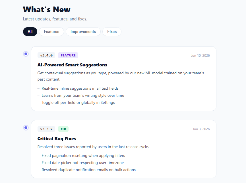
A changelog or release notes page is a high-search-intent component for SaaS products, developer tools, and open-source libraries because it is both a trust signal and a product communication channel — the forward-looking counterpart is the product roadmap, and the in-app version is the activity feed. This snippet provides a complete changelog feed with a vertical timeline, version number badges, type-coloured labels (feature, improvement, fix, security), per-entry bullet points, filter tabs to isolate a change type, and a "new" indicator on recent entries.
The data model
The entries array is the single source of truth: each entry has a version string, a type, a date, a title, an optional body paragraph, and an optional items array of bullet points. The renderer maps over this array to produce the HTML, so adding a release is as simple as prepending a new object. In production this array would be fetched from an API or loaded from a JSON file maintained alongside the product codebase.
Timeline connector
The feed container uses a left-border pseudo-element for the vertical timeline line, and each entry has a small circle pseudo-element positioned over that line. Recent entries (isNew: true) get a filled indigo circle with a glow ring; older entries get a neutral grey. This visual encoding gives readers an immediate at-a-glance sense of recency without reading the dates.
Type badges and filter tabs
Each entry is labelled with a colour-coded type badge: purple for features, blue for improvements, green for fixes, and red for security. The filter tabs at the top toggle the activeFilter variable and re-render the list, adding a hidden class to non-matching entries. This client-side filter is fast and requires no server round-trip for a typical changelog of 20–100 entries.
Version number styling
The version string is displayed in a monospace badge with a subtle dark background, matching the convention users expect from developer-facing changelogs and making the version easy to scan or search visually.
Accessibility and extensibility
The semantic structure (h1 header, version strings, dated entries, bullet lists) is easily crawlable for SEO and screenreader-readable. Extending the snippet with anchor-linked entries (id per version), a search input, or pagination for long changelogs are all natural next steps that fit the existing structure.
Build with AI
Build, Understand, Optimize, and Extend It With AI
Rather than tracing the filter-and-rerender cycle by hand, paste this snippet's HTML, CSS, and JS into an AI coding assistant like Claude and ask it to explain exactly why setFilter() re-renders the entire feed from the entries array instead of just toggling a hidden class on existing DOM nodes, and how that choice trades off against the alternative. The same assistant can help you optimize it — ask whether rebuilding every entry's innerHTML string on every filter click would start to feel slow with a hundred-plus entries, and what a more surgical update (only touching visibility) would look like. It's also useful for extending the feed: ask it to add anchor-linkable version IDs so #v3-4-0 URLs scroll to the right entry, persist a "last seen" timestamp to only badge genuinely new releases, or add a search box that filters entries by keyword in addition to type. Treat the code less like a finished artifact and more like a starting point for a conversation.
Prompt to recreate it
Copy this into your AI assistant of choice to build the effect from scratch, or as a jumping-off point for your own variant:
Build a "changelog / release notes feed" in plain HTML, CSS, and JavaScript — no framework, no build step.

Requirements:
- Render the entire feed from a single JavaScript array of release objects (each with a version string, a type like feature/improvement/fix, a date, a title, an optional body paragraph, and an optional array of bullet-point strings) — no hardcoded entry markup in the HTML.
- A vertical timeline rendered with CSS pseudo-elements: a continuous connecting line down the left side of the list, and a small circular dot per entry positioned over that line, where entries flagged as new get a distinct filled, glowing dot style and older entries get a neutral one.
- Each entry must show a monospace version badge, a color-coded type badge (a different background/text color per type value), and a right-aligned relative date, followed by the title, optional body text, and an optional bulleted list of changes.
- Filter tabs (e.g. All, Features, Improvements, Fixes) that, when clicked, update an active-filter variable and re-render the full list from the source array, applying a hidden state to entries that don't match the current filter rather than removing them from the underlying data.
- Adding a new release must require nothing more than prepending one object to the source array — the timeline dot styling, badge coloring, and filter behavior must all apply automatically with no other code changes.
Want to tighten it up first? Run this prompt through the AI Prompt Studio to score it across 8 quality dimensions, catch anti-patterns, and tune the wording for Claude, ChatGPT, or Gemini before you paste it in.
Step by step
How to Use
- 1Browse the timelineScroll through the release history. The timeline dot glows for recent entries and the version badge, type, and date are immediately visible.
- 2Filter by typeClick Features, Improvements, or Fixes to show only that change type. Click All to show the full history.
- 3Add a new releasePrepend a new object to the entries array with version, type, date, title, and optionally body and items. Set isNew: true to glow the timeline dot.
- 4Add a new typeAdd a new type value (e.g. "security"), define a .type-security CSS class with the appropriate colour, and use it in entries.
- 5Load from an APIReplace the entries array with a fetch() call to your releases endpoint. Render the feed in the fetch callback, applying the same template.
- 6Export for your frameworkClick "React" for a component with entries as props and filter state in useState. Click "Vue" for a Vue 3 SFC with a computed filteredEntries.
Real-world uses
Common Use Cases
Got questions?
Frequently Asked Questions
Replace the static entries array with a fetch() call in a DOMContentLoaded listener. Your API returns entries as JSON in the same shape. For Markdown, parse each file's frontmatter (version, type, date, title) into the object schema and the body into the body string. Store entries newest-first in the response so rendering order is correct without client-side sorting.
Add an id attribute to each entry card derived from the version string: id="v3-4-0" (replacing dots with dashes). The browser will scroll to the anchor on load. Optionally add a copy-link icon beside the version badge that writes location.origin + "#" + id to the clipboard, giving users a shareable deep link to any specific release.
Store a lastSeen ISO date in localStorage when the user closes the changelog (or on any page load). When rendering, compare each entry's date to lastSeen and set isNew accordingly. Add a badge count to the "What's new?" trigger showing how many unseen entries there are, and mark them as seen when the user opens the panel.
Accept entries as a prop (or fetch them in useEffect). Keep activeFilter in useState. Derive filteredEntries with useMemo(() => filter === "all" ? entries : entries.filter(e => e.type === filter), [entries, filter]). Map filteredEntries to JSX entry cards. The filter tabs call setFilter; the timeline dot styling applies based on entry.isNew. This pattern cleanly separates data from presentation. For the Tailwind version, click "Tailwind" to get the same markup with utility classes instead of a scoped stylesheet.